Peter Carnival
Category: HW1_Composition (Page 2 of 3)
For my assignment, I chose a portrait photograph by Suzanne Stein. Suzanne Stein is a social documentary/street photographer currently in New York City. Through her photography, Suzanne captures the intensity and emotions of those living and suffering with addiction on the streets. The portrait I was drawn to the most was from her ‘Kensington’ project, where Suzanne captured the raw life of Philadelphia’s drug ridden side of the city. The portrait instantly reminded me of a time I lived near the same area of Philadelphia and how I would avoid the ‘zombie-land’. The photograph I chose, by Suzanne, was one of a subject’s portrait, where I believe their intention is to show a side of beauty even through disasterous circumstances.
Suzanne encapsulates the subject’s beauty with a close-up portrait, in the highlight of a sunny day in Kensington, Philadelphia. This method of portraying the subject creates a tremendous contrast between the subject and their environment. What is key in this photograph is the ability to see these contrasts and understand the difference between a subjective- and objective-view. My biased opinion is that the subject is attractive, whereas some others would see the subject and look at them in distaste for being from the drug infested environment, or even in pity for partaking in such drastic activities.
The photograph depicts a young brunette with European facial features and freckles over the ridge of their nose. The subject holds a sultry gaze over you, with parts of their hair billowing over their face. The photographer chose this subject as part of their ‘Kensington’ photo project, so I am to assume the subject is also one of the unfortunate citizens of the ‘zombie-land’. In the portrait, the photograph uses a few compositional aspects as once, such as “Center the Dominant Eye”—centering the subject’s eye along an intersection—“Fill the Frame”, where the subject is taking up the entire portrait, and “Figure to Ground”—using the darkness of the subject’s hair to contrast with their skin tone and face.
Linked below is the photograph, by Suzanne Stein, and their project on ‘Kensington’.
The Photograph below is called, “Moon Over Downtown”, New York City, USA, 2006 by Michael Kenna. This photograph stood out to me because of its scenery and photograph elements. You can clearly see that the main object being focused on it the city in the back. It kind of shows a strong connection towards Manhattan being an island. Showing off the emptiness of the photograph with the ocean then with the city’s bright lights and atmosphere. It gives off a sort of quiet and tense feeling of the city being surrounded by endless ocean. Could also represent the sense of opportunities, where the moon is guiding us by its light path leading to the city. As well as the gloomy or vibrant old style colors with the grays along side the white from the lights.
Some elements within this photograph would be Leading Lines, Figure to Ground & Symmetry. Figure to Ground strongly affects this by the ocean taking up most of the photograph and the city being place in the middle but far into the background. Another would be Symmetry because when you fold this photograph, both sides look very similar to each other thanks to the city being at the center. Lastly, Leading lines with the light from the moon casting off on the ocean showcasing a sort of “path” leading towards the city. Even though its very limited, the moon’s light helps guide my eyes towards the city in the back. Overall if I had to structure the elements by the photo, 1st would be Figure to Ground, 2nd is Symmetry & 3rd would be Leading Lines.
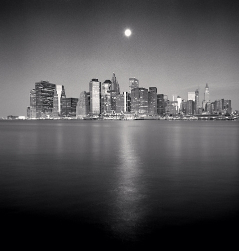
https://www.michaelkenna.net/gallery.php?id=14
This is photograph is by Micheal Kenna “Central Park Reservoir, New York City, USA, 1998”. I picked this image because I’m a fan of the frame within a frame rule. The image has you looking through a fence where in the distance there is a city with a symmetrical building in the middle. I think the intent of this photograph might have been to show the viewer this quiet serene scene. The city that is usually so loud and chaotic looks so simple and silent being so far away. The feeling I get from this photograph is peace. Micheal Kenna work is done in black and white with a minimal style to capture images. So I think his work have that same peaceful feeling to them.
In this image I instantly noticed the frame within a frame element which in this case is a wire fence. The fence frame is very thin and has some plants as a silhouette at the bottom. Another element that I noticed after looking through the fence is the symmetrical building. The buildings have spiky cone shaped roofs that stand tall above the rest. The third element that I think works in this image is figure to foreground. We just have to look through the fence to see the subject is the buildings. The dark buildings contrast with the bright white background. I think with all these elements combined make for an interesting image.
The photo I selected was B-BOYS, 1981 by Janette Beckman. The picture depicts three African American youths striking a group dance pose. The subject matter is the three men striking similar poses, they are located at a hotel lobby. Based on the description this photo depicts B-Boy dancers in the early 80s. The intention of the photographer is to show African American youth culture in the 80’s. The boys are dressed in eccentric clothing and seem to have a positive attitude. I get the feeling of fun, excitement, and a cool atmosphere.
The three elements that stood out in this photo are Repetition, Diagonals, and leading lines. I see repetition in the 3 B-Boys because they are in similar poses and dressed very similarly. The staircase highlights a diagonal in the photo making it more interesting. Finally, the 3 B-Boys are a good example of leading line because they are aligned in a straight line, forcing your eyes to view them one after the other.


Recent Comments