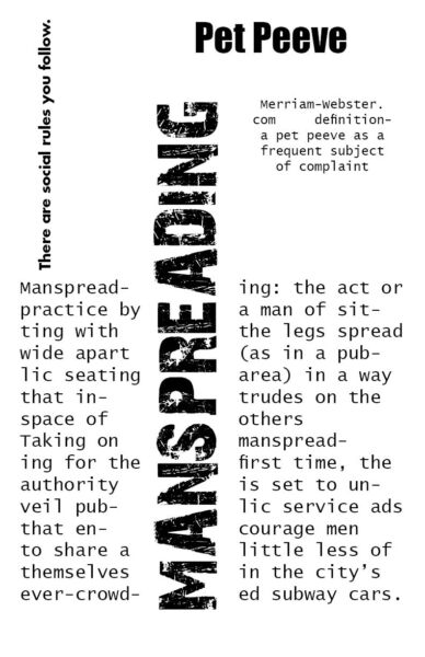

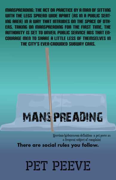

This poster doesn’t work because it is hard to read, with no clear area of attention that the designer wants the reader to look at. This seems like it might even frustrate some readers when trying to understand what the text is trying to say because of the lack of diversity in the text
The one on the left I feel works the least because all the information feels too clustered into one spot making it feel very unbalanced and overwhelming at first glance. The one on the right is the one I feel works the best because all the information is displayed simply and clearly.

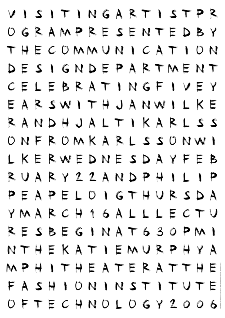
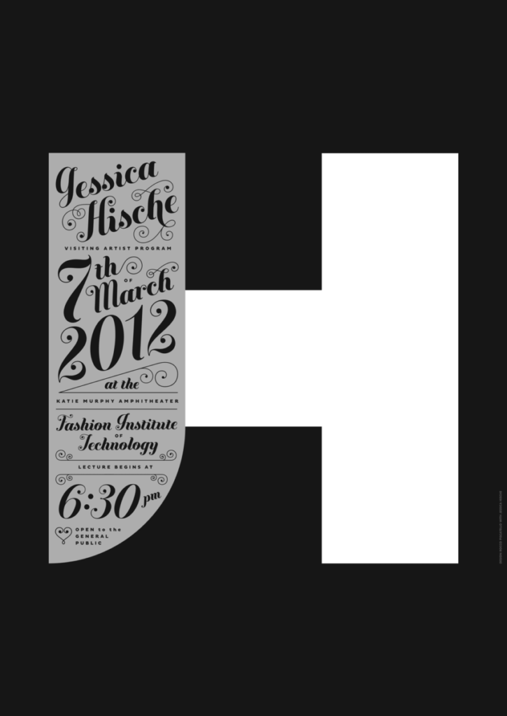
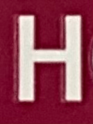
From both of these posters, the one that did not work for me was the one with the letter h blended in the colors of black and white and grey. The small words being expressed diagonally across the h are too small and the colors within the sentence are too light to read. Overall, with small size font and long sentence with a light grey color does not fit well with the overall design.

Project 1 pages 1-5
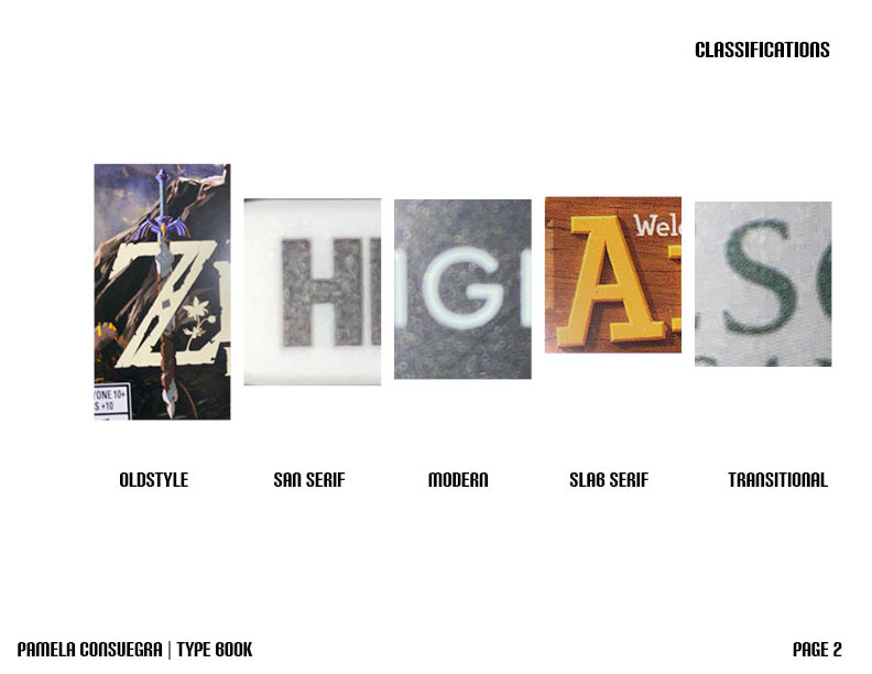
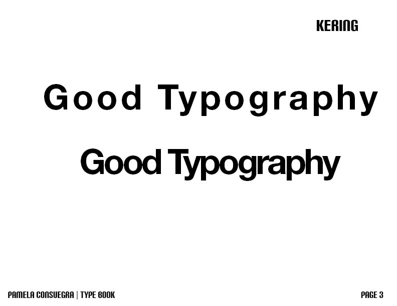
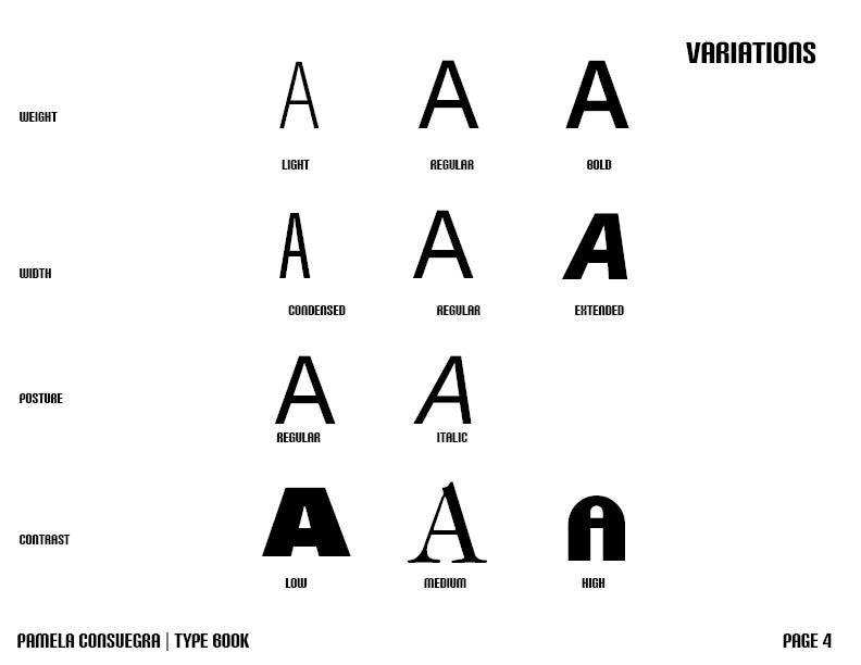
Type Vocabulary, Classifications, Kering, Variations, Legibility

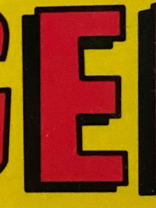

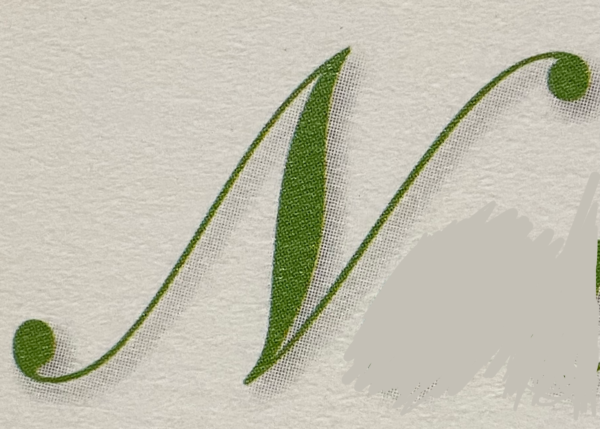


I chose this type of font because I like having strokes on my font therefore, I wanted my choice of font to be clear and still have a satisfying appearance.
Assignments are always due the day before next class by 11:30pm, and must be posted to OpenLab or uploaded as instructed
The OpenLab is an open-source, digital platform designed to support teaching and learning at City Tech (New York City College of Technology), and to promote student and faculty engagement in the intellectual and social life of the college community.