Consuegra_Pamela_ TC_ET
Leave a reply


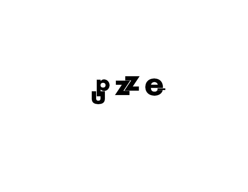
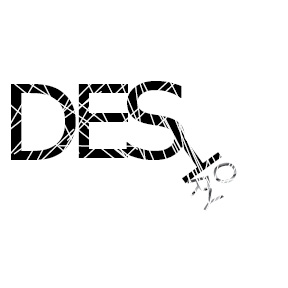
The First image places the words in an eye catching shape. This secures the attention of the audience and is a very creative way to use type. Technically it is a type within a type. The second image uses overlapping layers to contrast letters and different colors helps to differentiate between the background and overlaying text. While one of these is neater than the other I feel they both work in terms of aesthetic and uniqueness.
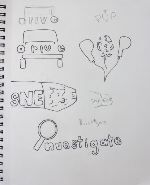

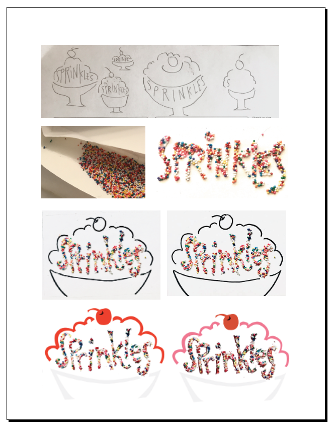
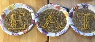
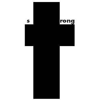
I couldn’t choose between two words but after the drawing I think I’m going to go with pasta
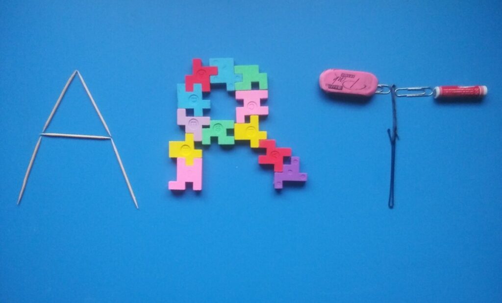
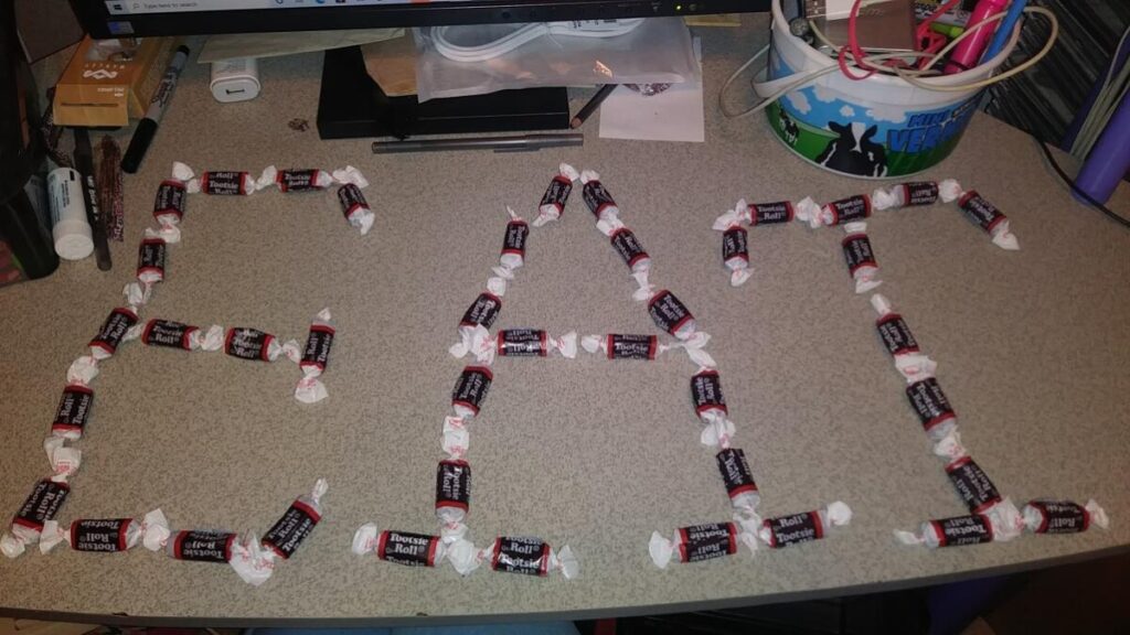
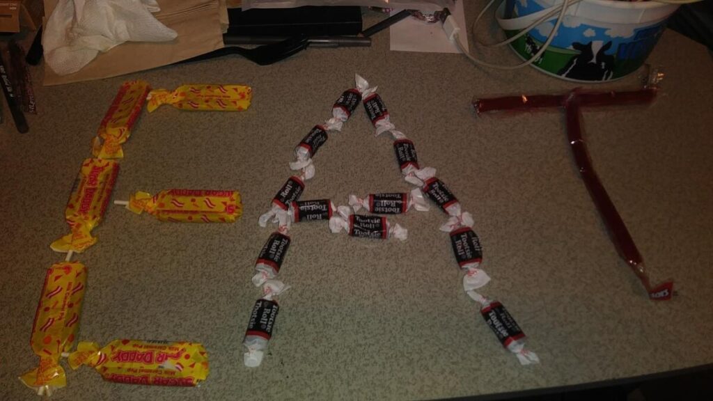
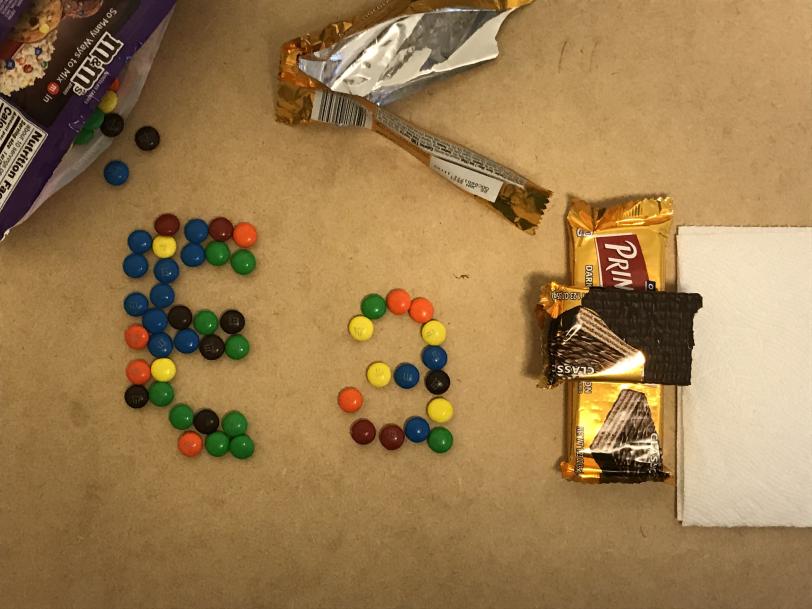
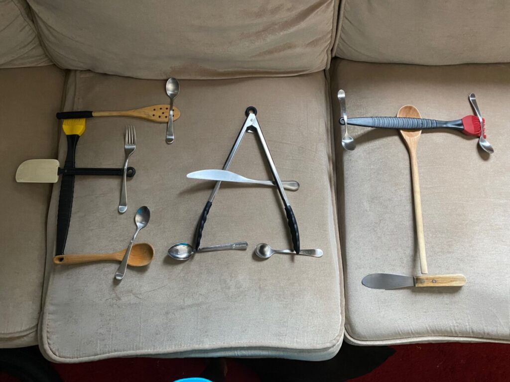
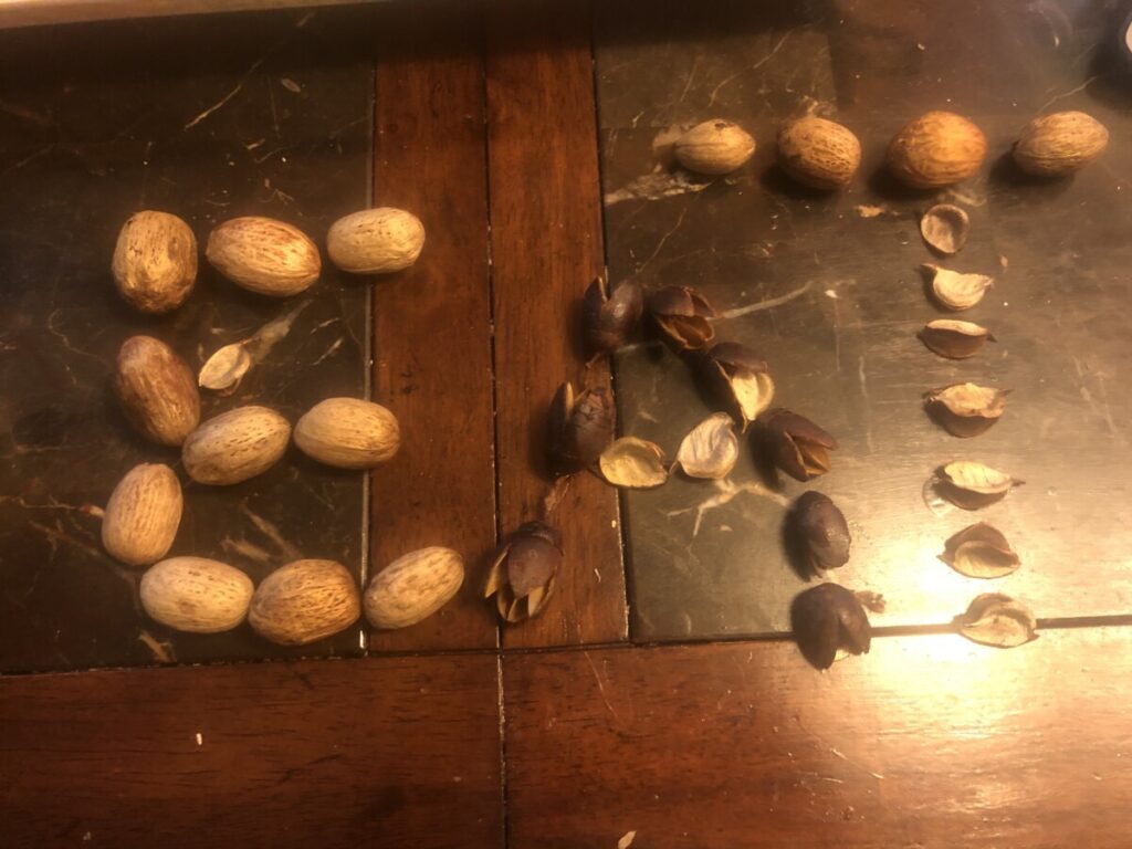
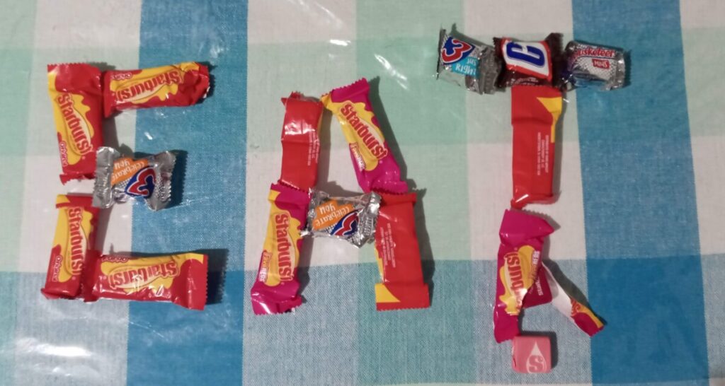
Found Alphabet
Expressive lettering Filmore
https://www.typeroom.eu/
https://www.studiofeixen.ch/

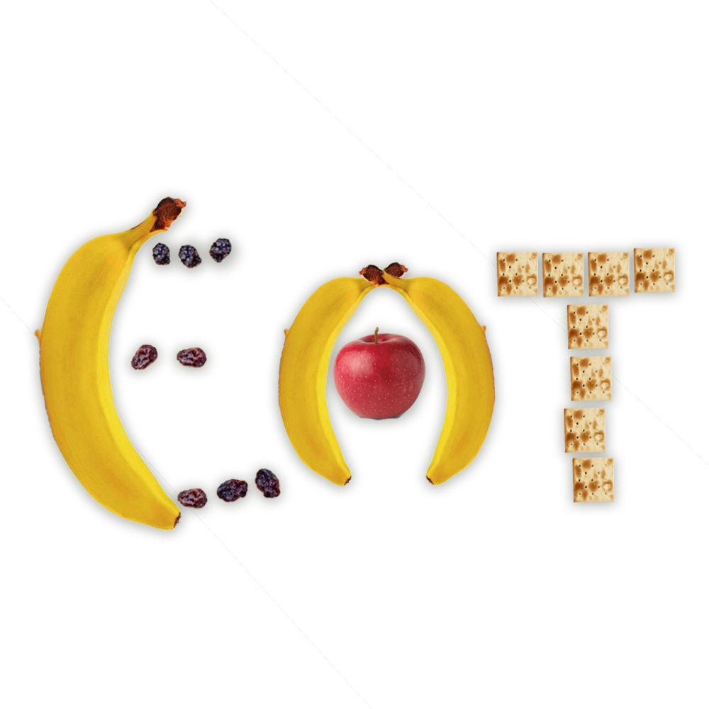
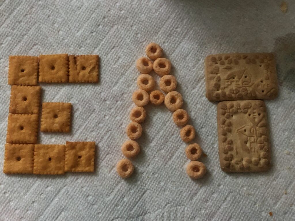


FINALS ON TOP


ORIGINAL ON BOTTOM


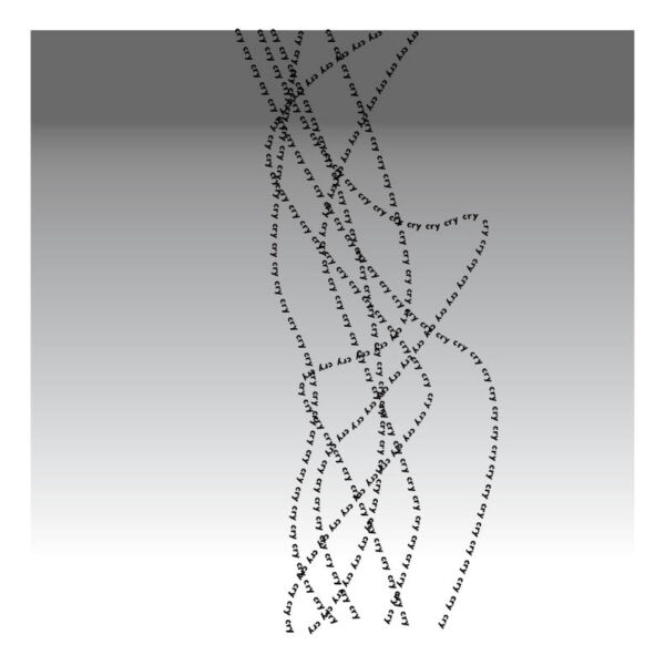
What I like about these is just how much the text forms into a cohesive structure. The first one uses various fonts and weights, the bolder weights acting as more of a skeleton for the lighter weights on the outside. For the second one, I like the way the text wraps into a sort of triangle or pyramid, pointing to the text on the left. The text on the left is also laid out very neatly into columns. The word “meccanici” acts as a sort of support or rest for the list of words to the left of it.


The OpenLab is an open-source, digital platform designed to support teaching and learning at City Tech (New York City College of Technology), and to promote student and faculty engagement in the intellectual and social life of the college community.

