If you are still having problems getting interactive buttons to work in your projects, here is a video which may help.
Interactive Buttons for PDF, Flash and DPS
This is a foundation course in typography with an emphasis on using type for a multiple of industry related applications ranging from print to interactive.
If you are still having problems getting interactive buttons to work in your projects, here is a video which may help.
Interactive Buttons for PDF, Flash and DPS
During class we reviewed letterspacing/tracking and kerning. We also began to explore the working environment of Adobe InDesign.
Areas covered:
We also discussed increments of measurements:
If you missed the class, or need a review, here is a video that might help you with getting started in InDesign. It is a bit long but pretty thorough in helping your get started:
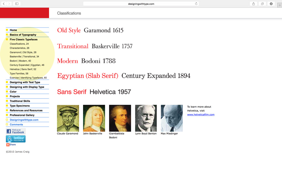
The main topic of the discussion was kerning, tracking and letterspace. We also did an introduction to the InDesign workspace. As a review of the Five Families of Type, here’s a link to an added resource. Navigate through the links highlighted in yellow: Designing with Type

Do you know the difference between kerning and tracking? You need to make sure you understand.
kerning = adjustment of the space between two letters to improve the appearance. Kerning is more specific than tracking. Kerning becomes more important with large or display type.
tracking = adjustment of the space between letters for the a whole word, sentence, page or document.
This video was shown during class on Mon, Jan 30, 2017. Review it if you need to take notes.
This animated video about Johannes Gutenberg was shown during class on Mon, Jan 30, 2017. Review it if you need to take notes.
© 2025 COMD1127-D124 Type & Media, SP2019
Theme by Anders Noren — Up ↑
Recent Comments