This is a foundation course in typography with an emphasis on using type for a multiple of industry related applications ranging from print to interactive.

Tag: Assignment

Let’s Wrap it Up with a Poster

Now that we are at the end of the semester, it is time to show what you’ve learned by creating a poster that creatively describes the Type & Media course.

Here is the brief which will describe the assignment:

  • Using words, shapes and everything that we have covered this semester to create a poster that can be used to let others know what the Type & Media course is all about. Not only should your poster tell what the course covered, but it show what was covered. For example, you don’t want to only use the words like kerning, tracking, type on a path, but you want to show these things.
  • Size: 11″x17″
  • Full color can be used or you can do it entirely in black & white, but your design shouldn’t depend on color
  • You are allowed to use some geometric shapes, but this poster should be TYPE, not drawings. If you are not sure what this would look like, do a Google search for typography posters.
  • Use the accurate terminology covered in the course
  • Pay attention to spelling
  • The sample below were not selected because they were the best, just to give an idea of what other students did.
  • DUE: Wed, May 17th


 Samples:


The Type Book: How to Assemble and What to Include

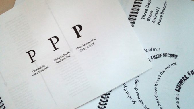
Every type book exercise is to be included. All of the exercises are listed below, including the very last one, which is a poster showing all that you’ve learned so far from this project. The titles are based on the assignment sheets. Some of those handouts included more than one exercise. Hopefully this list is clear. If you have questions, please ask for clarification. Use the handout as a guide for the number of pages included for each exercise

  • Front Cover
  • Anatomy
  • 5 Families (5 pages)
  • Variations (6 pages)
  • Alignment
  • Alignment 2
  • Leading (2 pages)
  • Tracking (2 pages)
  • Kerning
  • Type on a Path
  • Legibility (in color)
  • Type Color
  • Hierarchy
  • Grid (2 pages)
  • Pattern
  • Embellished Quote
  • Logotype
  • Putting it All Together Poster (a typography poster design that incorporates everything you have learned about typography. In the 5th column, the Title will be Putting it All Together. You will use columns 1-4 only for your design).  Use the name of your character.

These books will be printed out and bound along the short left edge, where we left space for such details. They should have a clear vinyl front cover and a black vinyl back cover with spiral binding along the left side. You can print the pages out in class, in lab or your own printer. The only page printed in color is the Legibility: Type Color page. The spiral binding is done at Staples or FedEx Kinkos. Don’t wait until the last minute to get this done because they may require that you pick it up the next day.

The finished books are to be submitted no later than Wednesday, April 5, 2017.  This is right before spring break. All projects submitted late will have lowered grades.