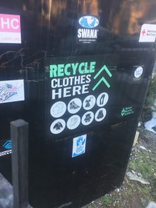
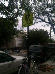
Before I get into depth about kerning in my neighborhood, some of the pictures here are from when I used to take a photography class in my last year of high school. Not once have I realized or notice the significance of kerning. Ever since I started taking this class i never realized how kerning and typography was all around me. Here are some photos from the neighborhoods i used to live in and the neighborhood i currently. In the first image about recycling clothes i never realized how perfectly spaced even the small words in the font of the text. The word “Recycle” itself took my attention the most, mostly because it’s written in caps and in my eyes its kerned better than all the other words written down below/ on top of it. The 2nd image is a common a sign that you can spot in multiple neighborhoods but i just like the fact that its in a yellow background that brings out the text/even better. The kerning of the text in this sign in my eyes i think is really important since the texts cant be too close nor to far mainly because if its too close it’ll be too difficult for anyone to read unless they are up close, and if its to spaced out the letters wouldn’t necessarily be comprehensible. With that being said i personally think kerning is a really important tool that can be used in pretty much anything in society. My last message is free writting words/graffiti that doesn’t necessarily have any kerning which proves to be difficult to understand. Not to mention that there isn’t any spacing between any of these multiple type faces. In conclusion Kerning is every where even the places we least expect as long as there is texts there. Kerning is important since it can bring out the depending how you space out the letters. Im personally grateful since because imagining not having kerning in our society everything would just be munched up together.
Author: Brian Gaston
Calendar of Posts
| S | M | T | W | T | F | S |
|---|---|---|---|---|---|---|
| 1 | 2 | 3 | 4 | 5 | ||
| 6 | 7 | 8 | 9 | 10 | 11 | 12 |
| 13 | 14 | 15 | 16 | 17 | 18 | 19 |
| 20 | 21 | 22 | 23 | 24 | 25 | 26 |
| 27 | 28 | 29 | 30 | |||
 Updates from Smash Magazine
- Boosting Up Your Creativity Without Endless Reference ScrollingWhile it is clear that creativity is driven by both the left and right hemispheres, an important question remains: how can we boost creativity while keeping the process enjoyable? It may not be obvious, but non-design-related activities can, in fact, be an opportunity to enhance creativity.
- Building An Offline-Friendly Image Upload SystemPoor internet connectivity doesn’t have to mean poor UX. With PWA technologies like `IndexedDB`, service workers, and the Background Sync API, you can build an offline-friendly image upload system that queues uploads and retries them automatically — so your users can upload stress-free, even when offline.
- What Does It Really Mean For A Site To Be Keyboard NavigableKeyboard navigation is a vital aspect of accessible web design, and a detail-oriented approach is crucial. Prioritizing keyboard navigation prioritizes the user experience for a diverse audience, extending your reach while simultaneously fostering a more inclusive web environment.
- Fostering An Accessibility CultureWhile there’s no definitive playbook for building an accessibility culture, Dani shares lessons from his experience in shaping it through habits rather than mandates.
- Inclusive Dark Mode: Designing Accessible Dark Themes For All UsersDark mode isn’t just a trendy aesthetic. It’s a gateway to more inclusive digital experiences, but only if designed thoughtfully. Discover how to craft dark modes that don’t just look good but work for everyone, from those with light sensitivity to machine learning algorithms.
- Gild Just One Lily“Gilding the lily” isn’t always bad. In design, a touch of metaphorical gold — a subtle animated transition, a hint of color, or added depth in a drop shadow — can help communicate a level of care and attention that builds trust. But first? You need a lily. Nail the fundamentals. Then, gild it carefully.
 How Design News
- An error has occurred, which probably means the feed is down. Try again later.


Recent Comments