Author Archives: Monica Rodriguez

final proposal

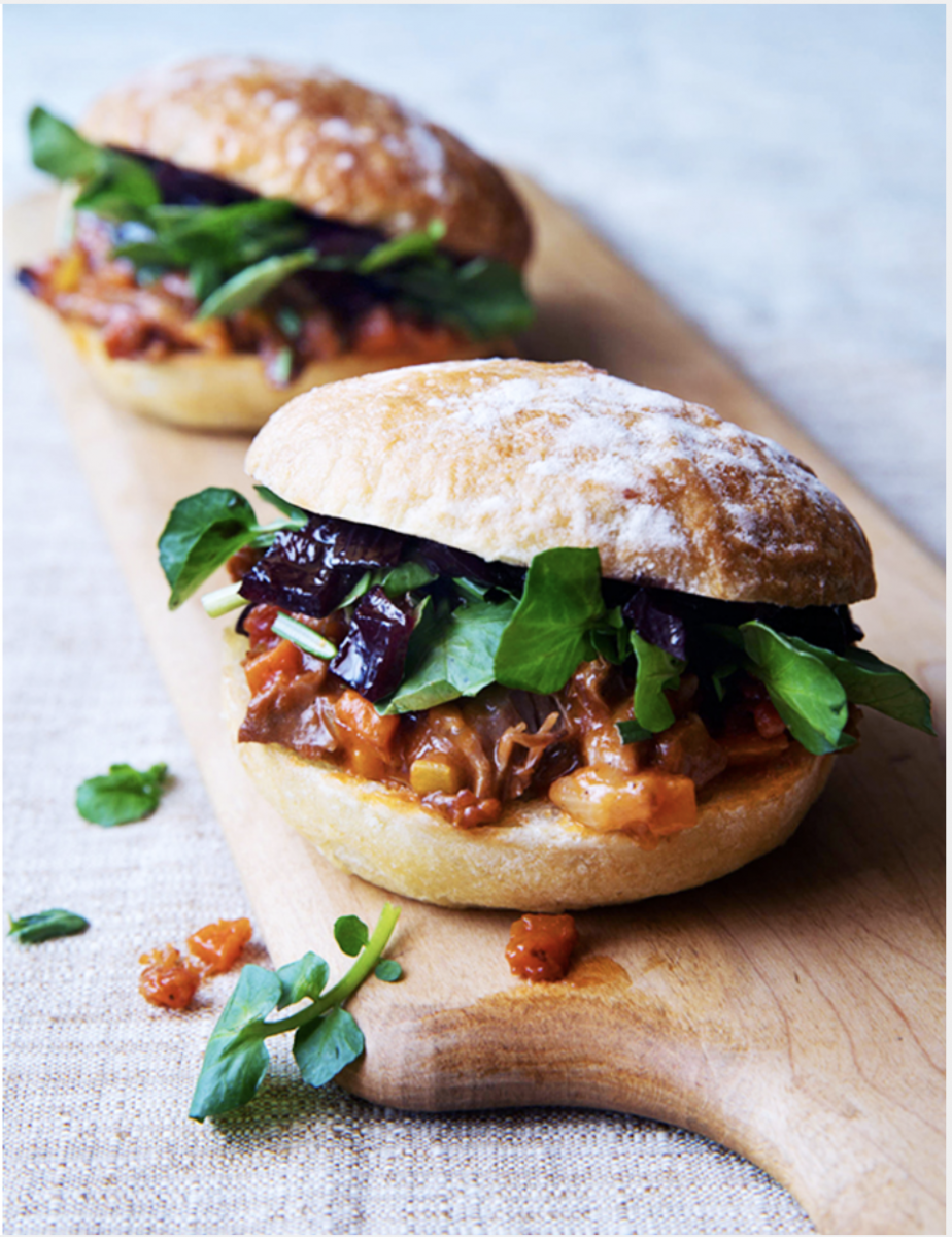
For my final, I want to do food photography and my subject will Mexican sweet bread (pan dulce), it will be an advertisement for a baking magazine. My target audience will be for people who are interested in baking, as well as for people who like Mexican pastry. I want this to give off two different tones with different backgrounds, white background for it to feel cheerful and a black background to feel warm. This bread can be enjoyed at different times of the year, the way I would execute this besides the background will be the props needed and different variety of bread. As well as capture three-quarter view and overhead shots, as well as the depth of field, is key to emphasize the bread.


Jill Keller

This photograph tells an American meal, It gives off a feel of “get ready to dig in.”   The large portion of meat patty catches the eye because as a consumer a good burger depends on amount of meat. Besides the meat the toppings as well we see every ingredient in this three quarter view, on a plate that doesn’t distract use from the burger. Accompanied by some french fries and a drink, and sauces. The napkin on the bottom right corner adds to the story because your hands and mouth get messy when eating a burger, The lighting adds to the food looking appetizing because it’s coming from both sides or a reflector was used as well. Lastly, some choices that the photographer added to this photograph is that the fries stay stacked up and not on the side of the burger. The main focus is the burger, the bottle cap as well to adds reality to the drink although the cup is full of the drink.

Marcel Christ

Marcel Christ’s photograph of the red drink in a glass cup, we only see one third of the cup in a third-quarter view. Including visible ingredients such as a lemon on the left bottom, basil on the right bottom, ice, and a straw on the right. On either side there is a light pink, it makes the drink more appetizing. The success for this photograph is that you don’t really need the whole drink to know what’s in it. The frame is filled and the composition of each ingredient placed is cut off but doesn’t necessarily need to be shown whole because just a bit is cut off. As well as the lighting of this photograph, I think a three point lighting. I am sure that there is a main light and a filter light that makes the drink pop out more.

Andrew Scrivani

In the photograph what I find appealing about is the dish is off center, following the rule of thirds horizontally. It is angled at a three quarter view, it allows us to view each ingredient and mostly see the rice. If it were overhead we would only see the shrimp and greens, Moreover, the dish has vibrant colors and the natural lighting coming from the top makes it appetizing. The wooden surface makes it modern and the detail of the green herb on the bottom left of the photograph makes it more vibrant. That the dish be presented neatly.

Quentin Bacon

  • depth of field
  • white background
  • not too busy
  • neutral to the subject

The photograph is appetizing because of the composition, the way it’s plated evenly on the to wooden board. The two separated sandwiches that creates depth of field, as we focus on the centered sandwich. The background is white and does not distract the audience from the subject, the cloth underneath the wooden bounces light onto the board and sandwiches. The use of natural/available light makes the sandwich refreshing, as it is a healthy looking sandwich. Moreover, the use of extra ingredients such as the herb and the tomato directs us to the sandwich. Plus, the angle that the photograph was taken compliments the sandwich because the bread is tilted slightly so we can view the ingredients but can still see the bread.
What I noticed about his style of food photography is that they make use of filling the frame or not, high angle, a few are at eye level.  As well as make us of his props and background, some props make the image feel more authentic and tells a story of the creation of said food. The background enhances the subject and the details.

Inspiration 3

Gregory Heiseler uses a split light on the person and vegetable. We are able to see their expression as they look directly at the camera. A serious face, it expresses hard work and passion toward their profession. The portrait being black and white emphasizes how fierce the person is. There is also light in the background where the vegetable is, there is a focus on it creating a silhouette. The overall composition and lighting of the portrait is direction of the eye, we look at the person, then the knife, lastly the vegetable. As well, that the person is cut off from their left arm, seeing part of his left hand and him holding the knife gives continuity to the portrait. Moreover, the shadows show a lot of detail to the portrait.

Inspiration #2

Yousuf Karsh portraits are all in black and white, a mix of him filling the frame with his subject’s face or showing a background.  The portraits make a silhouette with the lighting and the dark background. It makes the subject pop more, it being black and white there are more details seen and highlights. The use of body gestures and covering certain parts of the face as the viewer we can guess how the shape is formed. It creates continuity among the shadows and highlights of the face. 


Nadav Kander portraits are a mix of conceptual and close up of the subjects. In three quarter view, the majority of her images look away from the camera. I noticed their facial expressions are key to the portraits rather than the gestures or posture of their body. Her use of light that reflects onto her subject, such as one side the light hitting the side of their face. Or a specific light that she uses that lights up only a small part of her subjects face and shadows created show two different tones to the portrait. 

Overall, 

Dawoud Bey

In Dawoud Bey’s Class Pictures, he balances his subject in his pictures. The expression of the subject is looking straight at the camera. The subject either has a calm, serious, or calm expression. Also, the gestures that the subject relays, it makes the photograph feel natural. As well as the subject does not fill the frame, there is space to view the background and environment where the subject is. It is a balance between the foreground and the background. Moreover, the lighting on the subject is on their side and a few subjects are near a wall that reflects light and lightens the shadow of the subject. Lastly, to approach portrait photography is to make emphasize your subject based on the background or location you’re placing them in. As well as their gestures and how they are dressed, create a balance of the background and the foreground. The subject is the main focus but as well as their gestures and posture that give meaning or a message in the photograph.