Author Archives: Fernanda Cajas

final proposal


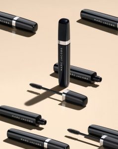
For my final project, my idea is to photograph beauty products for the company, Clinique. My target audience are beauty guru’s or people who are part of the makeup industry. My images will include still life photography with objects such as mascaras, lipsticks, cleansers, masks, etc. My goal is to create clean and crisp, catalog-looking products. Lighting should be bright with no silhouette in the back. The lighting should be almost as that of butterfly lighting, on a white background. The tone/ mood is going to be kind of sensuous and cheerful. I then plan to edit them in photoshop, and possibly add their logo or text to create ad campaigns.


Richard Foster

Richard Foster’s photographs are all very interesting. From the crisp and clear detail to the aesthetically pleasing shadows that are created in most of his pieces. Even though, I enjoy all of his photographs, the ones that caught my attention the most were Audemar Piguet. One of the reasons is because I, myself, work with jewelry and watches. Automatic ones, usually referred to as “open heart” have always been one of my favorite ones because of how much detail, one can see, was put into the creation of them. Foster did a precise job using a black/dark background for these shots. The watches stand out due to all the light that is hitting them from the front. Main lights and a diffused light with a softbox were most likely used so that there wouldn’t be a hard light hitting them, instead there would be an even amount of light hitting the watch from all angles. The photos are so crisp that one could imagine a longer macro lens, probably a 100/105mm was used so that there could be a greater focus so that the subject could appear larger. The composition of them is very well done because they are all put straight in the center, except the first one. The way the watch is positioned, even though a part of the right side is missing, is well captured because the viewer knows what the subject is. The detail in the mechanics make up for the missing space.

Brian Rodgers Jr

Seeing Brian Rodgers Jr.’s photographs was very interesting. They all seem as if they took a lot of setup time and retouching in order to get that nice, crisp, high-end magazine/catalog style that defines his work. One of the many photographs that caught my attention was the commercial beer and splash. The beer bottle caught my attention at first glance by the way it is outlined by, what seems to be, a very lit back light. The contrast between the actual bottle and background is intense, in my opinion. Reason being, because the bottle is sort of a bright scarlet color that is outlined with white, and then the background is very dark, except in the center. The background lights bring out the bottle more, even besides the fact that it is the main center focus while everything else is out of focus. The shadows work well because of the strong light at the right that creates a shadow at the foot of the bottom left side of the beer bottle. The droplets of “condensation” on the bottle create a more realistic look. As if the beer were fresh out the fridge. This “trick” was done very nicely because there is not too much or too little of it. The image to the right is also one of my favorites because of how the liquid seems to be falling out of the glass cup. The moment was captured at the right moment. There must’ve been a fast shutter speed used since it lets in less light and gives the effect of freezing an object in motion, such as the liquid that was poured.

Jill Keller

Jill Keller is a photo stylist who’s also a City Tech graduate, has captured several food moments, from raw ingredients, to amazingly created dished. One of the photographs that caught my attention the most is the first one from her Pasta album. As soon as I saw this photo, I imagined a whole scenario. This takes place in the country side. A family of 4, the parents and two sisters. They are having a gathering because it is the younger girls’ birthday and she did not want a party, only a small gathering with her parents where they could enjoy their mothers homemade cooking and talk about what careers they want to pursue in the future. Their mothers’ specialty is pastas. As she was creating the pasta, her oldest daughter wanted to capture this moment right before her mother mixed the dry ingredients with the wet ones. She thought to herself, “the best of both worlds”. The flour, the salt and the raw eggs, in general don’t make the photograph appetizing, but what does make the photo appetizing is the fact that the viewer knows that the results from these ingredients mixed together will create fresh and delicious pasta. Nothing compares to handmade pasta. It’s nothing like buying pre-made pasta which who knows how long has been sitting in a plastic bag for. What makes this image look like it’s telling a story is the fact that it is not a crisp steady image. The hands, specifically the left one, is out of focus which makes the viewer think that it was taken while the subject was actually making the pasta. The lighting is well used because we can see that there is light coming from the left side which is causing for there to be soft shadows around the right side of the bowls where the egg shells, eggs and salt are.

Andrew Scrivani

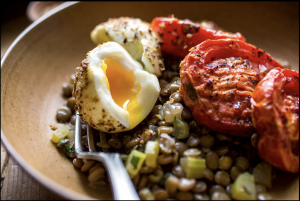
Andrew Scrivani, photographer, director and producer has several photographs that capture my attention. The one that stands out the most, amongst the rest is the image below, with the eggs, lentil salad and tomatoes. What I enjoy about the image is that it is places on the grid which makes it look like the rule of thirds was used. The food is placed on the further right, leaving a small space between the plate and the food. Even though the photographer cropped out a small piece of the plate, I think the image is complete, and nothing is missing from it. When it comes to contrast, the viewer can see the details of each and every example that was used in the red subject which is are the tomatoes. The lentils of this photograph are half focused and half out of focus. The reason is because the photographer decided to create a depth look within the image. He tried to capture the most important aspects of the setup which were the bigger elements such as the eggs and tomatoes. The scallion added to a more fun look because it is a yellow-greenish color, which isn’t seen anywhere else in the photograph. The view of this image is more of an overhead, but not to dramatic. It is definitely not eye level, but more like an in between eye level and overhead. This angle makes it have more of a realistic effect since the viewer can see the 3D aspect of it. The background was wisely chosen in my opinion because it is not too dark and not to subtle. It is a right color so that the main focus would be the plate on the food. However, the photographer did a good job using a wooden-like plate because it brings all the food together to form an interesting photograph.

Quentin Bacon

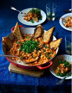
Quentin Bacon, uses his background to connect with the subject, which are the different kinds of foods and drinks. For example, he does not use a solid white background, as seen with other photographers, who make the food the only subject in the image. The background he uses includes cups, silverware, ingredients used, etc. The image below is of what seems like a bean stew with bread on the side. In this photograph the viewer can see that there is a variety of colors and contrast between the background and the main dish. The table cloth is a vibrant dark blue color that brings out the color of the food because of its orange color. Bacon did this intentionally because blue and orange are complementary colors. The photograph was taken on an overhead angle slanted a little to the right, since the image is not centered and not on eye level. When it comes to composition, I think the plates could’ve been organized differently because the far right hand plate is cropped out, therefore making the image distracting. I believe there was no need to add a third plate and if it was necessary then it could’ve been more towards the center and out of focus. The green parsley in the photo makes the orange beans have even more contrast between them. The crumbs on the left hand side give the image a more realistic mood because when food is being served, it can get messy at times. The lighting used does a good job at focusing primarily on the big pan with the bread pointing out. The details of the bread are crisp and clear. Overall, the photo was well taken and the viewer can tell that the main subject is the big pan towards the front since most of the surrounding items are out of focus.


Peter Hurley, Celeste Sloman

Peter Hurley, a New York City photographer specialized in headshots and portraits. At first glance the viewer can see that, even though there is three point lighting, he has a specific style for the most part, which is butterfly lighting. There is a lot of lighting coming from over the models’ heads, which is one of the most favorable styles when shooting portraits. The lighting just hits the skin and it fills the texture of it which lead to there being softness in his photographs. Also, the eyes are a significant point of attention in his photographs. The reflection of the lights create a depth into the models’ eyes. When it comes to composition, in his People Portraits, the models are centered and have more of a serious tone to them due to their facial expressions. Even though, there is a lot going on in the background, Hurley did a great job making sure the main focus was the model by putting more lights on them. There is contrast between their faces and the rest of the photographs.


Celeste Sloman, is also a photographer specialized in portraits. The difference between her and Peter Hurley, is that her photographs are mainly from the subjects’ shoulder, up, instead of full body or three quarters. The main focus is their facial expressions, which, for the most part, are subtle and calm. The background is a solid color, or very little movement going on, which brings out the subject more since there are no distracting objects in the way. I enjoy the way Sloman uses objects or sunlight to create shadows, that have become patterns, in the subjects’ faces. She has a minimalist and simple style which is why the viewer can tell that there is not an overuse of light.


Week 3

Gregory Heisler , photographer born in 1954, has created amazing pieces of art. In his portfolio are included Quiet, Vibrant, Contextual and Dynamic, amongst many others. The one that caught my attention the most was Dynamic. The way these images were captured, with blurred background, make the images come alive, in a way. Every photo creates a sense as if you were physically there as the camera, witnessing the subjects’ every movement. This was created by slowing down the shutter speed. The movement blur was created because the shutter of the camera was opened long enough to allow the sensor to capture the movement. Images like these are one of my favorite types because the viewer can feel the movement. For photographs like these I do not imagine there being a light set up. In my opinion, these are more of a daily life thing. Things that happen unexpectedly that can be captured to later tell a story. The somewhat high saturation is very noticeable in these photographs. Most of them are very sharp and have high contrasts. Another portfolio art piece that captured my attention was Miners. These set of photographs are very different than Dynamic, but at the same time very similar. In these, the viewers can see several men whom, from the name of the piece, we know are Miners. These are portraits, unlike the others which were full body photographs. You can even see the details of the eyes in some of these. We can see that the contrast is also very prominent because of all the detail in the face. I enjoy the way the aperture was controlled because the background is blurred so the main focus is put on the miners. The lighting style seems the same for all of the set of images, key, with a possible softbox.

Yousuf Karsh & Nadav Kander

When looking at Yousuf Karsh’s photography work, one can see that there is a theme going on. All of his photos are portraits in black and white, showing less than half of his subjects’ body, or a medium close up, while they are pensive, or lost in thought. There is a lot of contrast because we can clearly see the details and expressions in each image. The lighting style, short light, for most of them is also the same, considering that the poses are all three quarter views. We know this because the lighting is coming from their left side which causes for there to be a shadow on their right side which seems to have been diffused. Karsh did a good job framing and capturing the photo because none of the subjects’ head is cut off at the top. He does a great job overall setting a tone to the images he captures.


Nadav Kander, on the other hand, has a tendency to lean more towards, what seems like, gel filters. In this case, there is a constant use of blues and greens. Even though his photographs also consist of a lot of portraits, most of them are using broad lighting. Just like Karsh, he uses a three quarter view, where you can barely see one side of the face, but are still able to see both eyes. There is also a theme of transparency in his photos. Some have an image placed behind them that bleeds through the main image, which is the subject and the others have a very blurred out background which could mean that he used a very low aperture.

Dawoud Bey

In Dawoud Bey’s, Class pictures, the subjects, in this case his students, were placed in a school/classroom environment, which is blurred out in the background, so that the main focus could be his students, and not the objects behind them that could be distracting. The subject in the photographs are very nicely framed. They’re all positioned in the center, even though they are all in different positions. All of the subjects are looking straight ahead at the camera which cause for there to be a certain connection between the viewer and the subjects, almost as if they were actually sitting in front of one, having a somewhat deep conversation. Dawoud did a very nice job in capturing his student’s expressions. What Ii also realized about the photographs is that the lighting is subtle, and not dramatic. There is no harsh split lighting. It’s more of a clamshell lighting with a diffuser being used. The photographs seem like genuine high school students and not just some models that were hired. What I enjoy about them is the diversity that we see in all of those set of images. The expressions on the subjects have a subtle mystery to them, as if each one had a story that hasn’t been told yet. The idea that I got about how I might approach photography from looking at this work is that next time I could tell my subject to not force a smile or a pose, just let them do what makes them feel more comfortable because, this way my subjects will have more of a genuine feeling to them, just like in these photographs.