Blog #9 Wrapping up the Flyer Project & Self-evaluate

The WAC Program flyers project is finished. Unlike the Research Mixer Poster Project, the WAC Program flyers project is my first project in which I have to create something for a real client. I am lucky to have Aracely as my mentor for this project because she also did a similar project with the WAC Program last semester. Aracely always gave me suggestions on how to refine the poster, and she always encouraged me which helped me have more confidence in myself. 

Instead of meeting Professor Bannett and Professor ElHitti directly, I met with Osha everytime after I submitted drafts. Osha is nice and clever, not only giving me a flexible schedule on working the project, but also gave me a lot of ideas and inspiration for the projects.

After finishing this project, I learned that the feedback and suggestions from the clients are also important. Even though our clients are not design experts, a lot of them know what they want and because they work for their department, they have a deeper understanding of the expectation of the product.
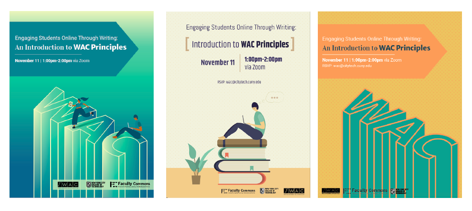
Digital Draft for Faculty Workshop, An Introduction to WAC Principles
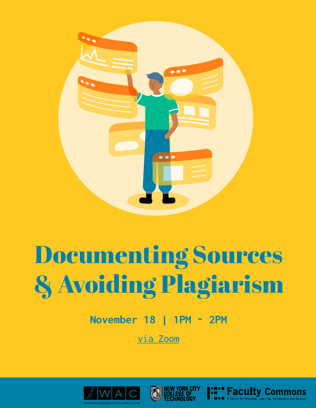
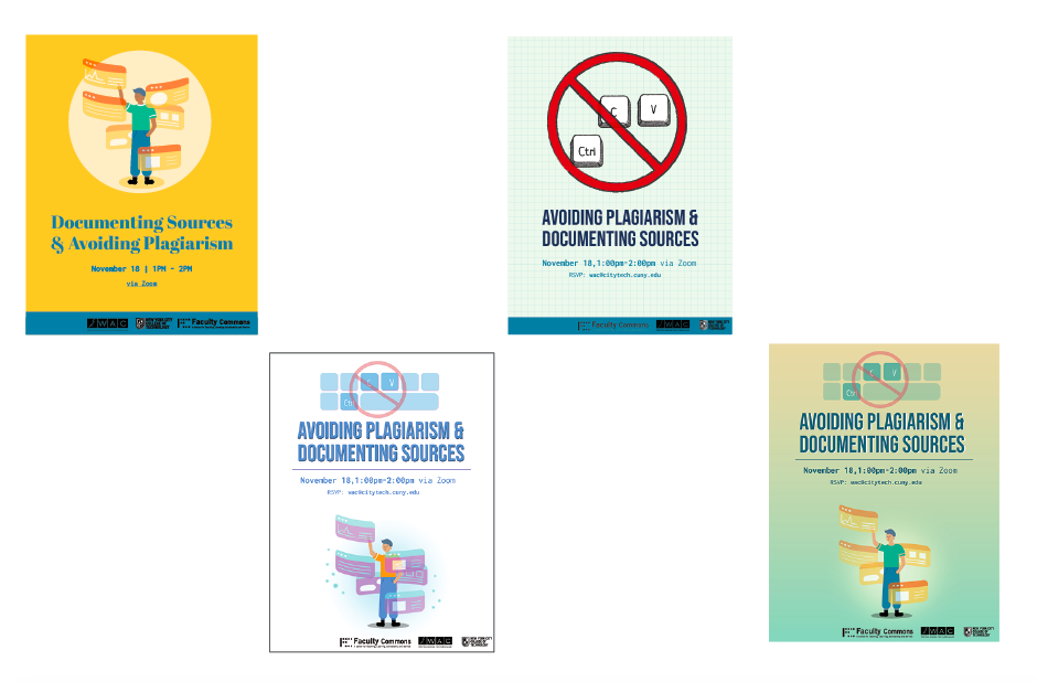
Digital Draft for Student Workshop, Avoiding Plagiarism & Documenting Sources

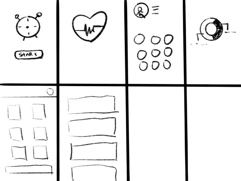
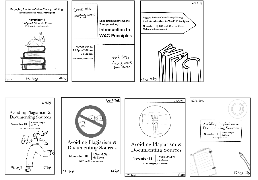
During working on the student workshop flyer, I created different sketches, however the workshop contains different contents. One of them is teaching students to avoid plagiarism, another one is teaching students documenting sources. After they review the sketches, they have different opinions on choosing the sketches. Osha scheduled a meeting with me, after our conversation, we decided to work on the two sketches that they chose and also work on one that combined the two ideas. I struggled because the illustrations for these two ideas were not in the same style and texture, and I also worried about the spacing in the flyer. After a couple days of trying, I combined the two ideas into one flyer. The design team also gave me a lot of feedback, including color matching and positioning of the two illustrations. 

For the Faculty workshop flyer, I was struggling with the logo placement. In the flyer, there are light color strokes on a darker shade gradient background at the bottom which was an issue for the legibility of the logo. At first, I tried to use white color logo which could increase the legibility. However, the WAC Program only has a black color logo. There were several suggestions from the design team about how to fix this problem during the weekly meeting. Eventually, we chose to add a light color label with semi-opaque at the bottom and put the black version of logos on the label. By this way, we increased the legibility of the logos and we still can see the detail behind the label through the semi-opaque color.

These two are the final draft that I made for the workshops. I embedded the zoom link in the student flyer so whoever wants to join the workshop, they can just join it through the flyer. For the faculty flyer there is no embedded link because they didn’t want to have the link in the flyer, I also made one with the embedded link in case they changed their mind. According to Osha, the flyers were circulated in different departments to advertise the workshops, over 90 students attended the student workshop, and some of the faculty who attended the faculty workshop decided to join the Writing Intensive Certification program next semester. 
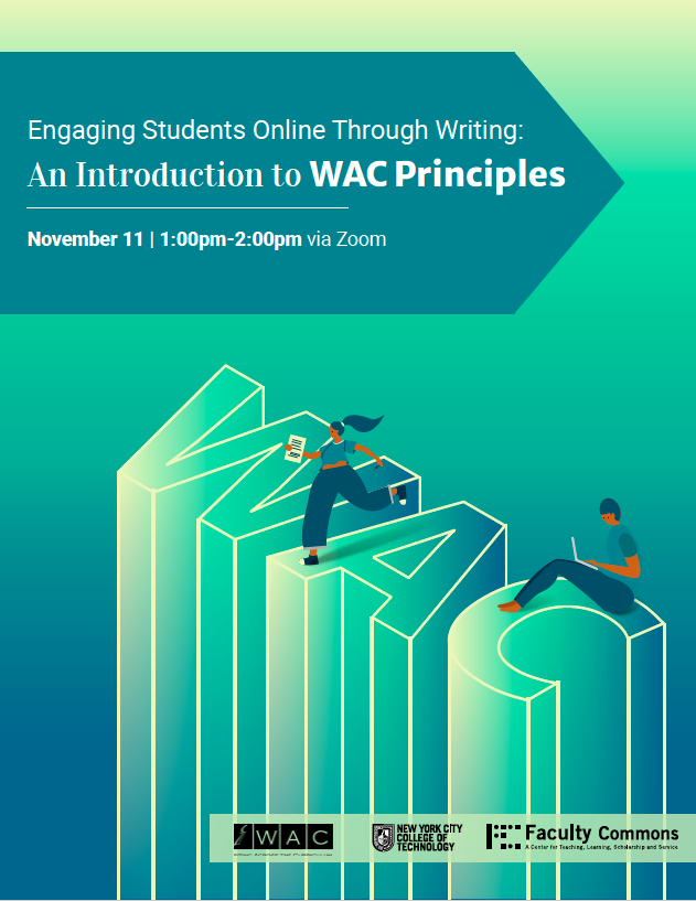
Final Draft for Faculty Workshop, An Introduction to WAC Principles
Final Draft for Student Workshop, Avoiding Plagiarism & Documenting Sources

Self-evaluate:

I put a lot of effort on this project and I am really happy to see the final product. My client and team members are also happy with these flyers I made. In this project, I made sure that the illustration can help our audience to understand the workshop better and I also made sure that the typography arrangements were clear to show the visual hierarchy so they audience can catch the important part in the flyers. One thing I think I should improve is the ability to connect the topic. In the student flyer, I tried to connect both topic with different illustration, even though my team like the version that I combined but my client eventually chose the one with only one illustration.

Overall, I enjoyed working on this project. Before this project, I was always scared to show my illustration, but everyone in the design team helped me go through this and they also told me to be confident in my work. This project also let me see that there are more possibilities I could be as long as I am willing to put effort.

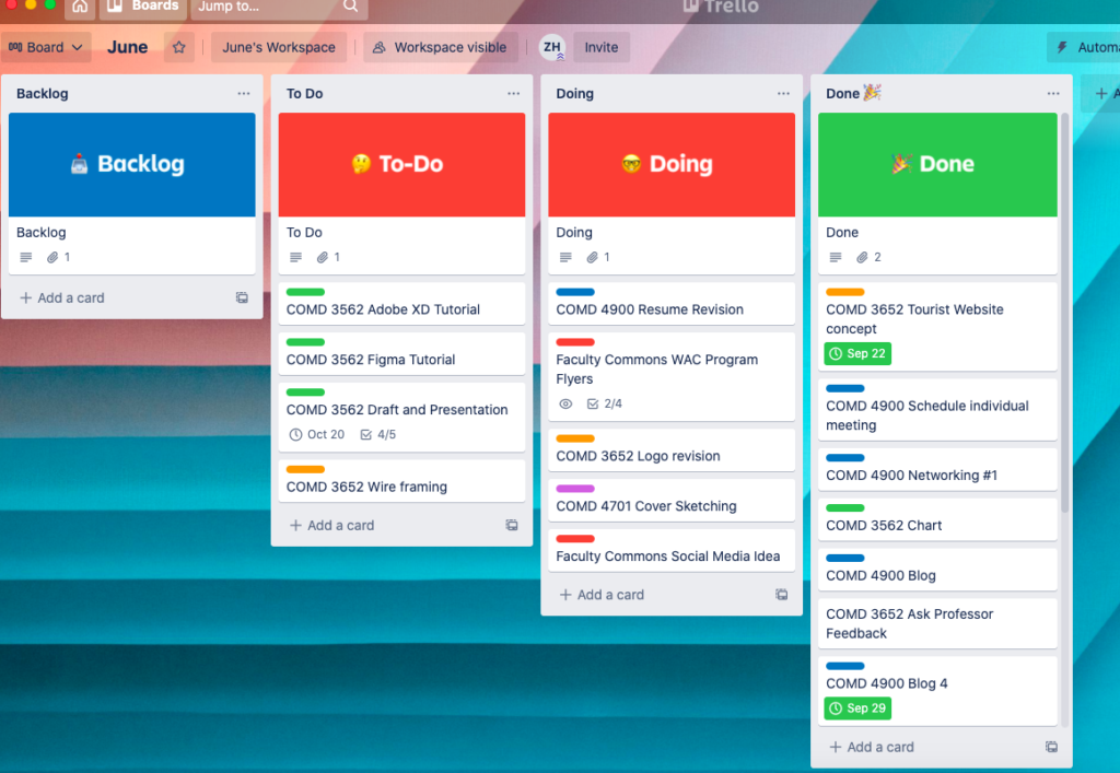
Blog #8 App Review#1 Trello

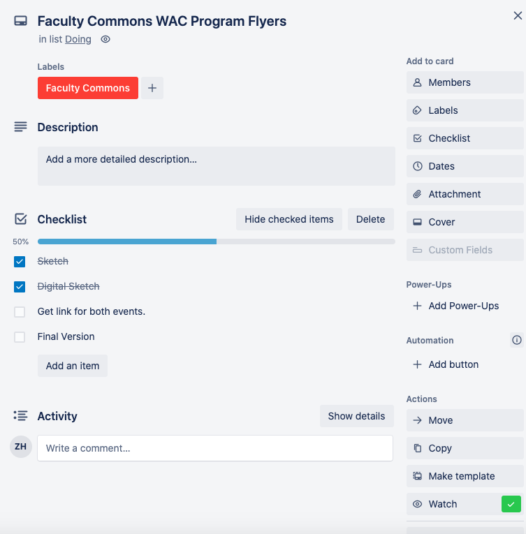
The app I chose to test is Trello. Trello is a collaboration tool that helps us to manage our projects into boards. This is a web based, kanban -tyle application which allows team members to check the project progress and update the progress in the same board. My UI/UX instructor, Professor Whysel recommended this application to us. I found this application is beneficial and convenient for both individual and group projects. Users could download this application in their devices using the same account, the data will be synced once users edited any card in the board. It also allows users to create a checklist in each card, so once users finish a step they can cross out the step and move on to another step. Users can also add different details in the card such as due day, description, and label colors.

Overall, this application helps us to organize our project well. In addition, once the user finishes a task, users can drag the card to the “Done” list, and there will be fireworks popping up which will motivate users. Currently, I am using Trello to organize to assignments and the project for my internship. My board looks a little messy right now because I was not familiar enough before, but now I will start to clean up it a little bit and keep using it since I am getting use to it now.

Kanban-style Board
Functions that help us organize each project or assignment.

Blog #7 Networking: Design Thinking 101

Today I attended a virtual networking event, Design Thinking 101 which was an event for people who were interested in UI/UX design. The speakers were Christine Chiang and Joshua Davis. Christine Chiang is an expert in UX design, Joshua Davis was a web designer and now he is also a UX designer. Their conversation was very inspiring. During the event, they talked about what design thinking is. Design thinking is actually problem solving, which starts with empathy. Overall, there are 5 stages of design thinking: Empathize, Define, Ideate, Prototype and Test. During their conversation, I gained a deeper understanding about design thinking, as designers we have to develop human centric solutions so that the user will come back to our product.

After they talked about the 5 stages of the design thinking, they brought up two interesting topics, sketching and testing often. Sketching is important, even though now a lot of people use Adobe xd and other digital tools, sketching is a fast and easy way to develop ideas. During the sketching, designers visualize their idea instead of just thinking in their mind which helps the team and client to see how the idea came from. To test often is also important because once we have the idea and prototype, we have to test and we get the results. The results can reflect the weakness of the prototype and we can go back to our idea and then make a difference so we can test again. This semester, I also have the UI/UX course because I am interested in UI/UX design. This event brought a lot of information to me and the experience of meeting these expert taught me that it’s essential to understand and actually do the 5 stages of the design thinking, because all the steps are connected together. 

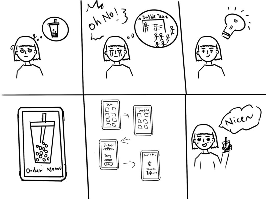
Story board/empathy map sketching
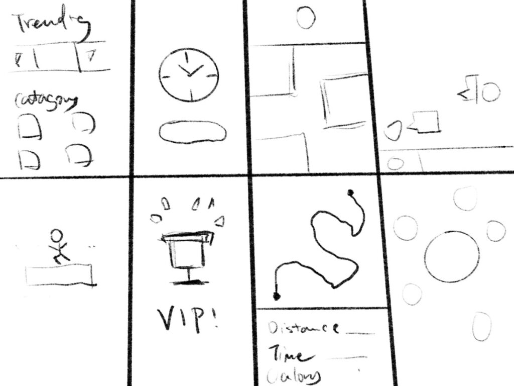
Speed Sketching Practice for COMD3562 (UI/UX)

Blog #6 Sketch & Feedback from the Team

This week I am continuing working on the WAC Program project. After I got the feedback from the design team, I came up with more sketches. The due date of the rough draft is coming soon. One of the most important things I learnt this week was I have to clarify the target audience of the product. 

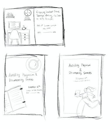
One thing I found confusing when I was brainstorming ideas was that both of the flyers are about writing so I was stuck because I have to find a solution to differentiate these two flyers. Even Though these two flyers are from the same program, their target audience is different. One is for school faculty, another one is for students. In addition, the topics are also different which means I can follow the title that Osha provides and brainstorm different ideas for them. I came up with these sketches and I sent them to my mentor Aracely, she gave me some feedback and I started to make digital versions of them this week.

Sketches

Blog #5 New Project! WAC Program Flyers

This week I am assigned a new client. It’s the WAC Program in City Tech. I had a meeting with Professor Bannett, Professor ElHitti and Osha. The meeting went well, it was actually their meeting about the project. I am glad that I attended this meeting because by listening to their brainstorm session I can know more about their perspective and the project. I also found some previous works that Faculty Commons interns had done for the WAC program on openlab website, they are very useful as reference.

After the meeting, Osha sent me the details of the project and he also scheduled the feature meeting for us to share ideas and opinions. I’ve been collecting inspirations and ideas on different platforms such as pinterest and behance. I came up with a few sketches so far. I shared my sketches to my mentor and also the Faculty Commons design team, they gave me some useful feedback. Lu, one of my trainers, suggested that I should make more connections between the illustration and the topic that was given. I think it’s very useful feedback because I was struggling about this while I was making the sketches. She suggested that for the faculty workshop I can try making the illustration looks more professional instead of just making a study scene illustration.

Sketches

Overall, I think I learned a lot this week. The meeting with my clients was really a good experience because now I am less nervous when I introduce myself in front of the client. The weekly meeting of Faculty Commons also taught me a lot, not only because I got feedback, but also I can see other great works from the Faculty Commons Design Team and how all of us communicate about how we can enhance our works . 

Blog #4 Collaborative Project Experience

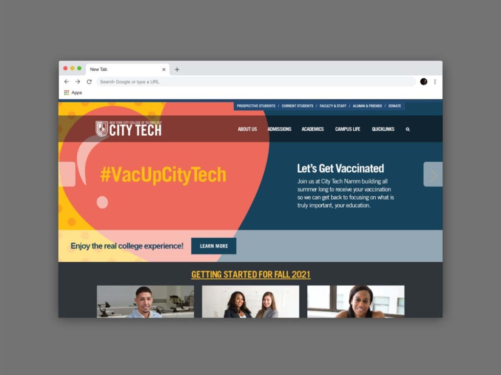
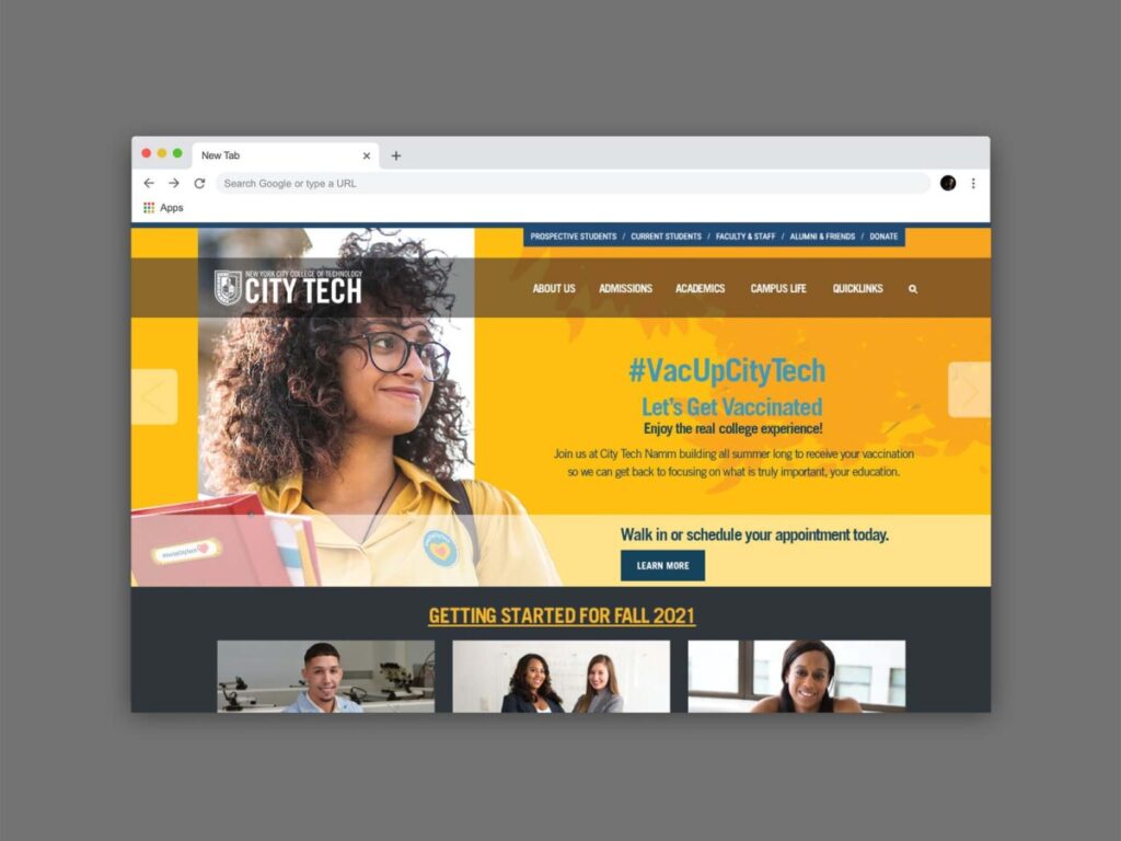
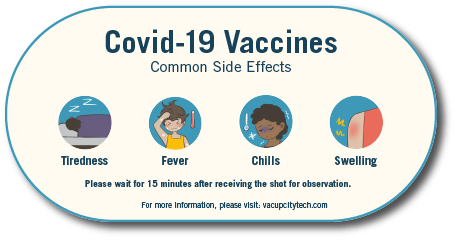
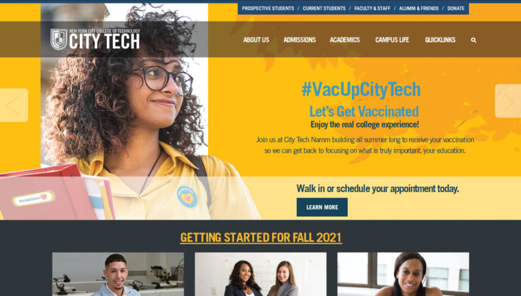
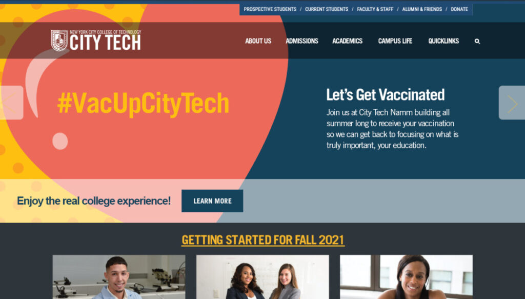
In summer, we were assigned to create a Covid-19 Vaccination Campaign to encourage students to get vaccinated. This was a group project and there were 4 of us working on this project. After we got the project brief, we decided to create a discord group chat where we can communicate with each other about the project. We had a hard time choosing what to create, especially me. At that time, I was so used to getting a project from a professor and knowing what I needed to do. I chose a face mask and t-shirt design at the beginning but they did not work well. At the end, with my trainers’ suggestions, I chose to create a web banner which can show up on our school site and a symptom card which students get after vaccination. We only had 3 days to work with this project. Once I had a sketch and draft, I made sure I shared them with my team members and my trainers. We also decided to have a one hour meeting everyday to give each other feedback and suggestions. When I was working on the symptom card, Evelyn was so nice that she helped me with the illustration. I also helped Evelyn to brainstorm her work which was the Zoom background.In the web banner with a real person image, I also asked help from Anai because she was creating the stickers, I decided to have her stickers on the student’s image which make this project more realistic. 

Web Banner
Web Banner
Symptom Card

The project went very well, all of us were happy with what we did. I learned that helping each other is important in terms of teamwork projects. The success of this project is everything is done by different people but somehow they look like they are done by the same person. During the time we were working on this project, we made sure that we had the same style guide and we also helped out each other when they were facing a wall. I appreciate that all of my team members are supportive

Blog #3 Culture in Faculty Commons & First Project

Since the pandemic is still going on, our workspace is at home. We meet each other once a week to talk about our current project. I dressed business casual during our Zoom meeting because all of us would turn on our cameras to show respect to each other. 

As design interns, we provided our availability schedule to our supervisor and she will try her best to arrange our weekly meeting. During our work day, we will email our clients or schedule a zoom meeting with our clients to talk about the assigned projects. Normally, we will have a one hour lunch break. My group members have a discord group chat to communicate with each other, we share information and help each other.

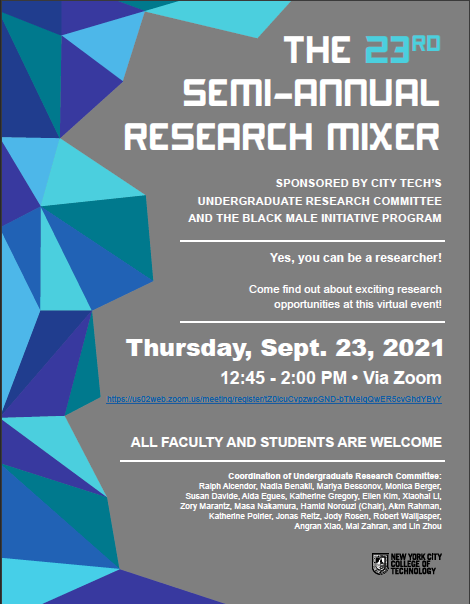
This week I was assigned to update the Research Mixer Poster. I received the old version of the poster from my mentor, Savonne and my client Professor Norouzi also provided the updated information. I used inDesign to update the poster and then I scheduled a zoom meeting with Professor Norouzi, Savonne also joined us. The meeting went well, and Professor Norouzi was nice and helped me go through the updated information in the poster.

After I updated the poster, I received an email from Professor Blake, I realized it was an email that Professor Blake sent to student about the event and the poster that I updated was also included in the email. The poster is now posted in their openlab site (Research Mixer openlab site)

Updated Poster

What I learned this week:

This week I learned that detail is the evil. I heard this phrase so many time in class COMD 3601 from Prof. Cole, and I could met her requirement in terms of leading, point size, and file types etc. In class, we always have opportunity to ask professor or revise, working as an intern is different because we are facing real clients. Even though this project is just to update the information in the poster, I did everything carefully. I had to change the point size because the information changed. I also made sure the credit at the bottom was correct because the member list changed as well.

Blog #2 My role in Faculty Commons & How I get the opportunity

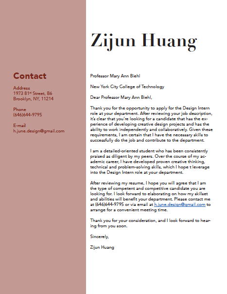
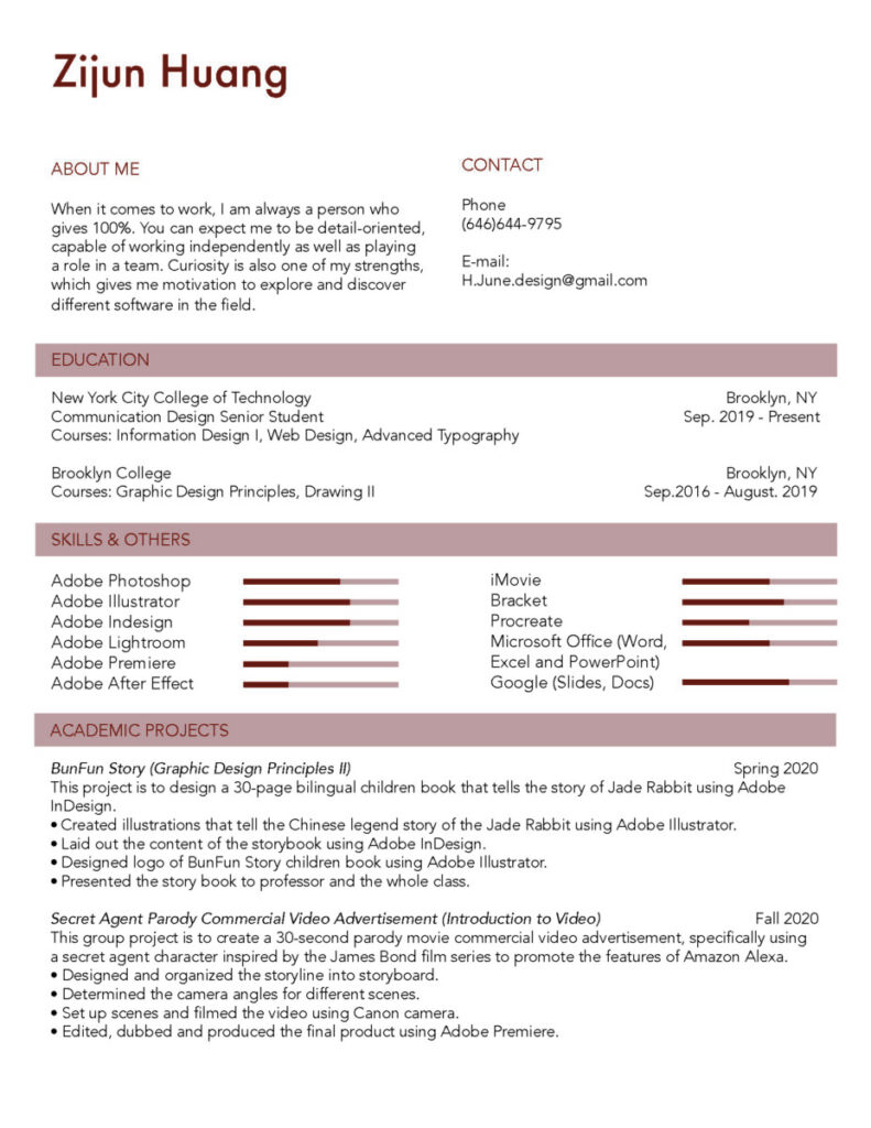
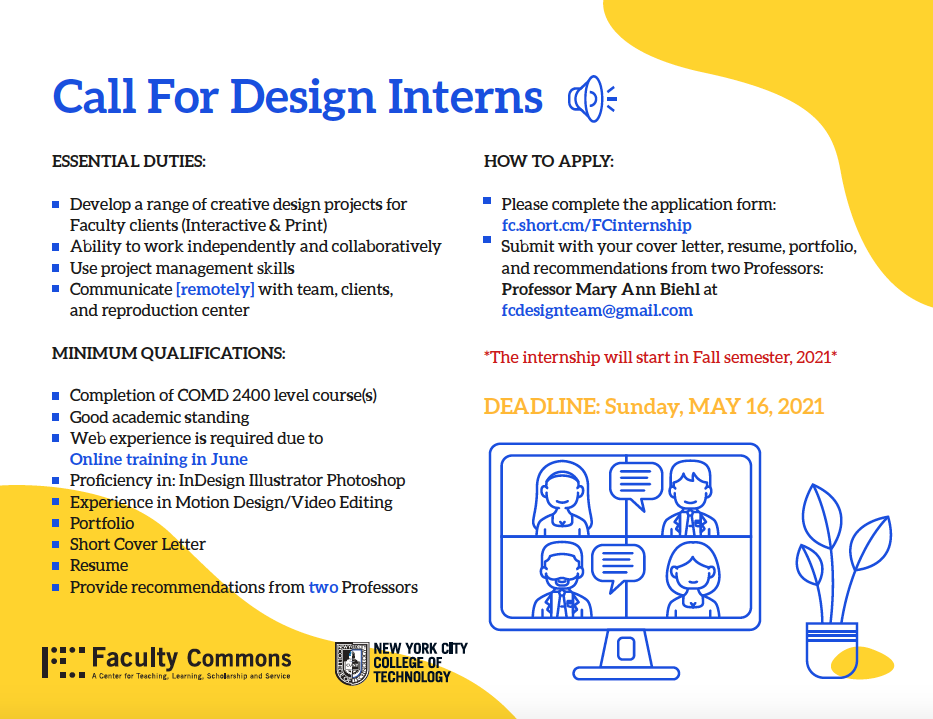
My role in Faculty Commons is intern in their design team. My supervisor is Professor Biehl, she is also the director of Faculty Commons. Last semester, I received the application emails on this position from several professors. I asked professors about the information about this position and they also encouraged me to take this opportunity. I didn’t really have time to prepare because the application deadline was soon and it was at the end of the semester. I spent a day creating a resume, cover letter and gathered some of my works from different classes. In the mean time, I also did some research on questions that might be asked during interview. I prepared a Q&A list for myself and practiced with my sister, she had a lot of experience in how to prepare an interview.

Cover Letter
Resume

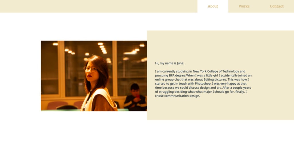
After about one week, I received an email notifying me to prepare for an interview and prepare a portfolio site. I was lucky that I just took Web Design 2 with Professor Wong by that time, so I had some knowledge on creating a website and I have a domain. I created a simple portfolio site which have an about me page, contact page and project page that shows my work.

Portfolio Site

The interview was held in Zoom. I was interviewed by Lu first, a college designer and then I was interviewed by Professor Biehl. They asked me some questions during the interview such as my strengths and weaknesses, the reason I chose to be a designer, what make me a good designer, and they also asked me to describe a time when I have a conflict at work etc. After a series of question, they asked me to go through my portfolio site and my personal feelings about my work.

I was very nervous during the interview, but Lu and Professor Biehl were nice. They encourage me to challenge myself and also gave me some useful feedback on my previous project in class. It was a good experience.

Blog #1 Faculty Commons Design Team

The Faculty Commons Department dedicated their effort to City Tech’s faculty members and students since 2005. It’s a non profit organization center for teaching, learning, scholarship and service coordinates all professional development, grants and assessment activities of faculty at New York City College of Technology(CUNY). The members in Faculty Commons Design Team are mainly students major in Communication Design in City Tech and the director are Professor Mary Ann Biehl and Professor Shelley E Smith. There are currently 8 designers, 1 webmaster and 4 design interns. Faculty Commons design team works with City Tech Library, Human Research Protection Program, School of Arts and Sciences, and a lot of different clients in the school. As the design team of the department we create material such as poster, web banner and t-shirt to promote workshops and events which help faculty and students to have better experience. They also published “Nucleus,” a quarterly news letter which demonstrates the creative and academic faculty activity at City Tech undertaken through the Faculty Commons.

One of the recent events of Faculty Commons is “Faculty Friday: Supporting First-Year Student Success,” which was an event that the director of First Year Programs held. In this event, they share tips and strategies on how to help new students successfully adapt to college life.  Another recent event is “Transitioning to Hybrid Courses,” this event helps professors and students to design their hybrid course because of the pandemic.

Faculty Commons is located at City Tech in Namm Building room 227. Because of the pandemic, all of us are working from home. We communicate with each other through Zoom meetings, e-mail, and sometimes mobile phone chatting applications. Every week, we will have a weekly meeting to share our updated works and receive feedback.

_________________________________________________________________________________________

Last semester, I started to worry about when I should get my internship. I noticed there are positions in our school which were the design intern positions in Faculty Commons. I applied for it and also went through the interview. I was surprised that I was selected. I also went through a week of the training program in summer with other interns and our trainers. 

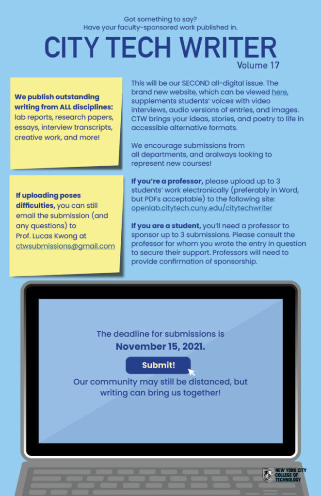
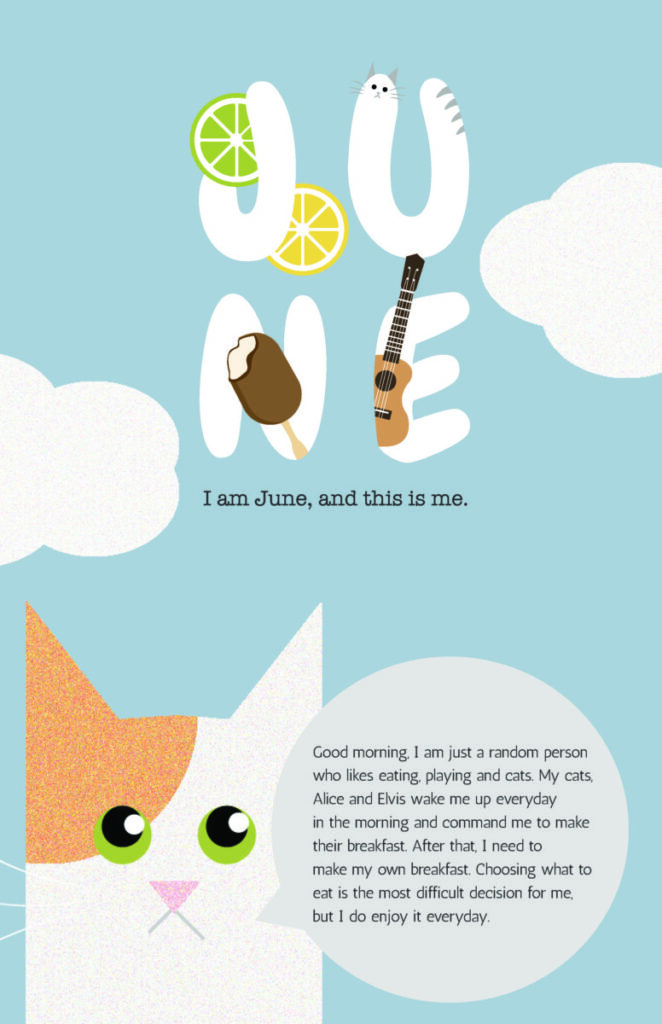
During the training program, we were assigned to work on City Tech Writer Posters, personal poster that reflects ourselves and a group project that make a campaign for encouraging students to get vaccinated. It was intense, because we need to finished these project in just one week. Our trainers were very patience and willing to give us useful feedback. I was lucky that my group members were friendly, we talk to each other everyday. Some of my group members also help me with illustrations because I was not good at illustration.

City Tech Writer Poster
Personal Poster
VacUpCityTech Web Banner
VacUpCityTech symptoms card Front
VacUpCityTech symptoms card Back
Call For Design Interns, Faculty Commons