Blog #19 WAC Program Logo Profile Photo & Team Project

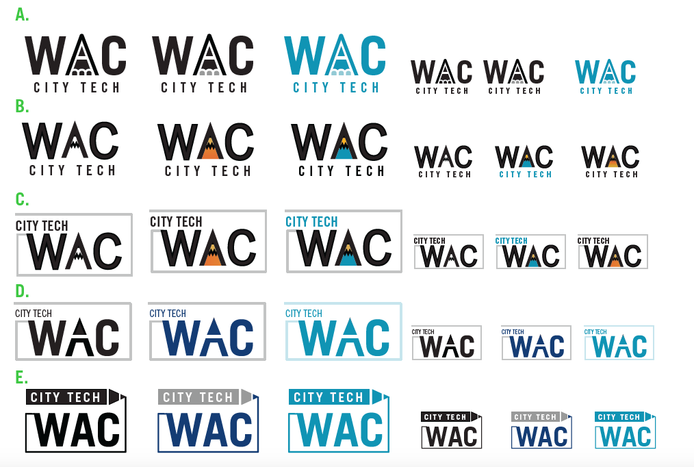
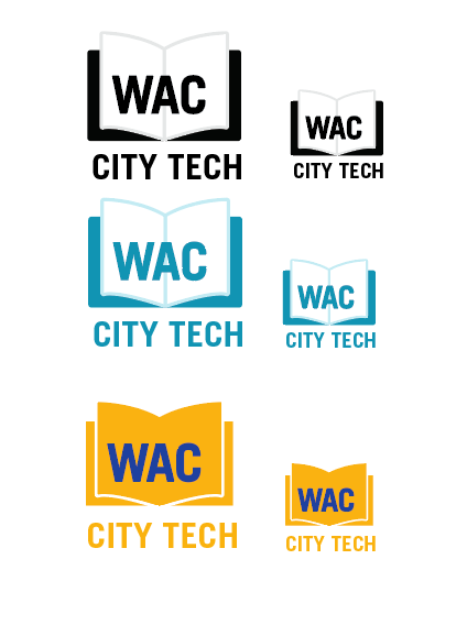
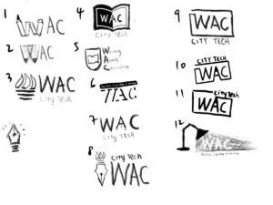
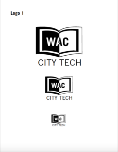
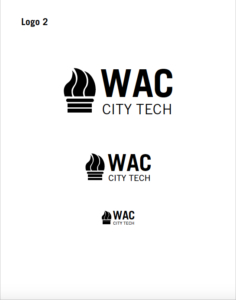
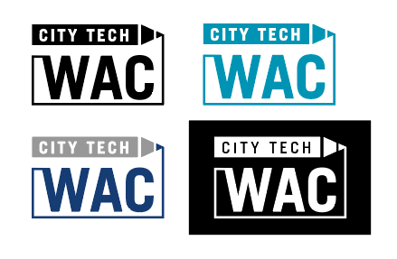
This week, I received an email from Osha, he told me that WAC Program wanted to use the logo I created to be their Zoom profile photo. The issue was that zoom cropped the logo so they wanted me to create a file that fit in zoom.  I was really happy that they love the logo. I checked the zoom profile requirement, I noticed that zoom will crop the photo into a square size. Eventually I made a file that has negative white space around the logo. I also tested with my own zoom account to make sure it works properly. Here is the logo profile in zoom. Before I sent to Osha, I also sent it to Aracely to make sure that it looks good to others’ perspective.

What I learned this week:

Time management is KEY. This week I am very busy on final projects for my classes. I am very appreciate that WAC Program gave me a flexible schedule. Osha told me that they want the whole project done at the end of November to make sure I have time to work on my final in December. I am glad that they satisfy with the logo so I don’t need to worry too much on this one. I finished the logo profile picture very fast because the logo was done and there is no adjustment needed. Before this semester, I did not manage my time a lot, because I had plenty of time to work on my assignment. This semester, I am a student and also an intern, I have my responsibility, so I started to plan my schedule in order to satisfy both clients and professors. After I received Osha’s email, I knew I have some spare time to work on the profile photo based on the schedule I made for today. Time management is not easy, but it is an important task that we have to learn.

——————————–

Team Virtual Event:

We are also assigned to create a team project which is to build Faculty Commons Design Team Profile. The project should be done at the end of the semester. Aracely and Or came up with an idea a couple weeks ago which we all agree to work in this direction. Instead of showing our own photos, we decided to change the photo to a gif file or video, and all of us could have some connection, for example, passing something to the next person. This idea is lovely and creative. Evelyn and I were thinking one of us could throw the Pokemon ball and the other one could catch a Pokemon in her end since both of us have a Pokemon stuffed toy. Since we decided the major direction, we are also facing different issues. Or brought out that this direction might cause the page to load slowly and I also asked about the file format because if we passed something to the next person we have to think of the order and how we manipulate when will the gif start to play. We also came up with so many creative ideas like each of us holding our favorite thing and then passing it to the next person. 

There were a lot of fun ideas today, and everyone contributed their own effort in terms of brainstorming the project. We haven’t settled down which idea we are going to use yet, but each of us will make some mockup of their own idea and show them in the next meeting. Aracely and Or always provide us useful information and ideas, both of them are clever and doing their best to make the work done. I really appreciate their hard work, I also see them as my role model because they are very confident and willing to share ideas with the team.

Blog #18 Ted Talks Review

Both of the Ted Talks are meaningful, especially for us, who will need to to present our ideas to clients in our future career. 

Chris Anderson

In Chris Anderson’s speech, he explained to us what made a good speech. I strongly agreed with his speech that one of the most important things we wanted to do was to connect with our audience. Curiosity is what makes our audience want to stay focused on a talk. Once the audience finds that the topics are related to them, then it means they are connected to the speaker so the speaker can start building ideas to the audience. Another thing Anderson pointed out was we should focus on one major idea in the entire speech. To focus on one idea does not mean we just repeat one topic over and over again. In order to focus on one idea, we should make examples that are vivid. This idea should be a theme throughout the talk. I was also impressed by the last point he mentioned in the speech, which was making the idea worth sharing. In this case, we have to understand our audience because if the topic was not beneficial to our audience they would lose interest in our speech.

Ms. Cuddy’s Presentation

In Amy Cuddy’s speech, “Your Body Language May Shape Who You are,” she explained how important our body language is. We are always so fascinated by human body language, because body language helps us to express ideas, emotion and also give others a sense of who we are. However, Ms. Cuddy’s speech was more than that. Ms. Cuddy used different examples and experiment results to prove that body language could also shape our personality. She also stated at the end of the speech that “Fake it until you become it.” I agree with the whole speech she gave, and I think I learned a lot from the speech. I remember when I was taking the public speaking class, our instructor kept asking us to stand straight while we were giving a speech. From the moment that she tapped my back to remind me to stand straight, I immediately felt more confident than a second before. During Ms. Cuddy’s speech, there were a lot of scenes that appeared in my brain which I related to the topic that she focused on. When I started my college life, I always sat in the back and listened to my instructor, but I never raised my hand or asked questions during the lecture. At that time, attending classes was boring to me. I talked to my life coach(also my elder sister) and she told me that I have to try to participate in class, by this way, I could get engaged with the class topic. So I started to push myself during classes, I pretended I didn’t care about how other students thought about me, I also pretended I was not nervous. It was a hard time for me to adapt to this way of acting, but this actually worked. Now, I always ask questions during class to make sure I understand the content and the requirements which also increase my grade. All I did was force myself to ask questions one or two times in the class and now I adapted this way and I also get more confidence when showing my own work to the class.

Blog #17 Final Logo For WAC Program

Logo Drafts
Logo Drafts

After the last conversation with Osha, I was informed that they didn’t want the logo to be very related to city tech, so we decided to continue the logo with a completely different style from our school logo but keeping the “City Tech” in the logo to indicate it is WAC at City Tech. From the feedback they provided, I know they like the pencil idea, so I created some variation from the pencil idea. I also started to add color. I mainly used the CityTech color to keep the connection between WAC and our school. After I created these variations, I also tested them in different scales to make sure of the legibility. I showed all the variation to the design team, everyone was happy about the logos. We also discussed the color of the logo, because if we have a complex background, it would be better to have a white color logo. 

Final Logo

At the end, Professor Bannett and Professor ElHitti  chose this logo as their final selection. I will send them all the logo files by the end of November. Because this is the first time I made a logo for a real client, I also asked my mentors Aracely and Savonne about the file format to make sure I send the logo in the correct way. Savonne told me it is better to send them both PNG and EPS files and explain to them that the EPS files are for the future designer.

What I learned this week:

After this project, I learned that it is important to communicate with both clients and team members. My team members can always find out some details that I should fix because they have fresh eyes to look at my work and they are all experienced designers. Throughout the project, I made sure that I understood my client’s needs through email and zoom meetings. I also learned that asking questions is essential in the design process. I always write down questions before meeting with clients. Sometimes clients don’t know what they want, but we can figure out what they want through asking different questions. 

It was nice to work with the WAC Program, everyone was nice to me and willing to provide me information. I appreciate that they gave me a flexible schedule because they also want me to work on my class projects. Working at Faculty Commons as a designer is also a great opportunity for me. I was really afraid that I couldn’t fit in because of language issues, but everyone in the department was friendly and every time I asked questions they were patient. One major difference between class and work at Faculty Commons is everyone in the department gave useful feedback to me. In class, we are always afraid to hurt our classmates’ feelings, but in Faculty Commons, we want to make sure the product is successful.

Blog #16 Webinar

The webinar I chose is “2021 Website Trends – What You Need to Know,” presented by TopSpot Internet Marketing. The speakers were Jordan Peddicord and Josh Blankenship. This webinar covered the Google Algorithm update and the trending of web design in 2021. 

2021 Website Trends – What You Need to Know

I learned a lot of knowledge after listening to this webinar. Most things I learned from school about web design were coding and using wordpress to create a website. In this webinar I learned that it’s important to get the information up to date. In 2020, most of us had to quarantine at home to prevent the spread of the virus. By the meantime, there is a significant increase of the population choosing digital self service and will continue doing this because it is safer and flexible on schedule. One of the Google algorithm updates is “Mobile First Index,” which pointed out the importance of responsive design(mobile-friendly design). Peddicord also mentioned that 50% of searches everyday are from mobile devices, and this showed how mobile friendly design can impact on a business. From the design aspect, I also learned that we should keep the website easy to use, and the information should be easy to find.

Example of a Mega Menu

One of the design trends that Blankenship mentioned was the Mega Menu, the case he showed was interesting. There is a web banner image and the mega menu is placed above the web banner image, once the user hovers the button, another image appears on top of the web banner image, and the banner image becomes darker which drives the user’s eyes to the image in the mega menu.

I think this webinar brought a lot of useful information to me, the speakers were professional and explained their point of views very well and organized. I also learned a lot of professional phrases in the industry which I should adapt soon for my future career. One of the most important things I learned from this webinar is, besides making the website appealing, we also need to think of how we can make a website that is easy to use and help the user to engage the digital experience.

Blog #15 Virtual Trip to Gordon Parks Exhibition

This week, I visited the Gordon Parks virtual exhibition, the Atmosphere of Crime. The Atmosphere of Crime is a book that was published in 1957 by Gordon Parks. Gordon Parks and a reporter, Robert Wallace traveled around in the US using his angle of perspective to capture crimes and trying to discover what is crime.

Gordon Parks, Crime Suspect with Gun, Chicago, Illinois, 1957.
Medium:Inkjet print, printed 2019

Dimensions: 17 15/16 × 11 7/8″ (45.6 × 30.1 cm)

The first piece of artwork that impressed me the most is “Crime Suspect with Gun.” In this photo, there is a silhouette of a person holding a gun walking toward the camera against the light source. The reason I am so impressed by this piece is because of the unknown situation of this photo. At first glance, I was thinking this might be a man holding a gun and he might hurt someone. However, I realized this is a stereotype. It might be a woman holding a gun and trying to protect her kids. Instead of showing the criminals in a clear way, he chose to only show the silhouette, and this approach really impressed me because we never know who is the criminal by just looking at their color, outfit and action. 

Gordon Parks, Drug Search, Chicago, Illinois, 1957
Medium: Inkjet print, printed 2019
Dimensions: 11 7/8 × 17 15/16″ (30.1 × 45.6 cm)

The second piece that I would like to talk about is the “Drug Search.” In this photo, we can see that there is a black man wearing a suit and a hat with his hands raised, and he was frisked by someone. In this piece, Parks still didn’t capture the whole face of the person, however, we can clearly see the skin color of the man. We knew the police were searching for drugs from this man by reading the title of the photo. Even though we knew the police were searching for drugs, we don’t know the result of the searching. In fact, we do not even know why he was frisked. We don’t know if the police have evidence or if the police were judging his skin color.

Gordon Parks, Raiding Detectives, Chicago, Illinois, 1957
Medium: Inkjet print, printed 2019
Dimensions: 11 7/8 × 17 15/16″ (30.1 × 45.6 cm)

The third piece that interested me the most is “Raiding Detectives.” Unlike the two photos that I discussed above, this photo is clear enough to see the main characters. By reading the title, we know that these two men are detectives. We can see there were two detectives in suits in a lobby of a building, and they were trying to break the door, one of them holding something in his hand, likely a gun. I am assuming there might be a crime scene behind the door. The interesting thing is they don’t look nervous, one of them was smiling while kicking the door. 

The virtual trip to Gordon Parks exhibition is a meaningful experience to me. Although there are populations still facing these issues, more and more people accept the diversity in race and culture. I believe the Gordon Parks’ contribution is meaningful and the works he done helped us to make a big step to stop stereotype and discrimination.

Blog #14 App Review #2 Adobe XD

The app that I chose to test today is Adobe XD. Adobe XD is a vector based user experience design tool developed by Adobe Inc. As the semester is coming to the end, we are required to build wireframes, and we also started exploring prototyping in my web design and ux/ui class. Adobe XD and Figma are the most famous tools for prototyping web and mobile projects. Since I’ve been using Adobe applications for most of my academic projects, I chose to use Adobe XD to explore the prototyping process.

Once I open Adobe XD, I will need to choose a file size. The sizes XD provided are the most common devices’ screen size, and I can also customize the size of my project. In the design panel, the navigation is neat and the functions are similar to other adobe applications which makes adobe users adapt to the XD quickly. The repeat grid feature is one of the most convenient features in this application, it allows users to create repeated items and users have the ability to adjust the distance between each item. This feature is best for creating a gallery or list in a website or mobile application. Once the designer finished one page of the website/application, the designer can switch to the artboard tool and create another artboard next to the previous one then the designer can start work on the next page of the project. Once the designer finishes with the design or wireframe of the project, he/she can switch to the prototype panel. In the prototype panel, XD allows users to create interaction between the artboards. For instance, if the designer created a sign up interface, he/she could click the button that he/she created, there will be a blue frame and an arrow around the button, he/she will have to drag the arrow to the design that is followed by the sign up button. Now, the designer can view this action by clicking the play button on the top-right corner. Here is a demo that I created for my ui/ux project.

Wireflow Prototyping

Blog #13 New Project: WAC Program Logo

This week I have a new project for my client. My client is still the WAC Program from our school. Different from the previous project, this time I need to create a logo for them. After a meeting with Osha, I learned that the WAC Program is from CUNY and we’ve been using the CUNY WAC logo. During the meeting, Osha pointed out that they don’t want quill pen or ink elements in the logo because some of our competitors use them a lot. 

After the meeting, I started to brainstorm for the project. I collected different elements that related to writing, learning, reading and education. In the meantime, I also try to have some features from the school logo to connect WAC and City Tech. Creating a logo is also a fresh project for me, this is the first time I need to create a logo for a real client. I came up with 12 sketches after brainstorming. I shared with my team, most of them like number 3 and number 8. Philip, one of my trainers, suggested that I should choose three to four that are my favorite to create digital sketches and then show them to the client.

WAC Logo Sketches
Logo Sketches

I chose 4 sketches to work on the digital sketches, I also scaled them into different sizes to test the legibility and show them to the team. My mentor for this project, Aracely, suggested that I can create a pdf file which shows 1 logo on each page in different scales and put all the logos on the last page. I think the format that Aracely suggested is clever because if I put all the logo and different scales into just one page, the client might feel overwhelmed and end up not knowing what to choose.

What I learned this week:

I learned that it is always nice to stay connect with my mentor. Everytime I emailed Aracely, she always response fast and give me a lot of suggestion from her experience. In the meantime, she always encourage me which makes me become more confidence. Another thing I learn is choose from the sketch. It’s always nice to have a lot of sketch because the sketches give us more possibility to work on the project. However, after we finish with the sketching stage we should choose 3-4 sketches to work on because the time is limited and we don’t want to put our focus on too many version, it might lead a bad result.

Blog #12 Networking event#2 Adobe MAX Keynote: Create Tomorrow Together

Adobe MAX Keynote: Create Tomorrow Together

Today I attended the Adobe Max networking event. This event is basically introducing what’s new about the Adobe applications. We all had struggled in different levels of difficulty because of the pandemic. Most of us have to stay home to keep safe from the virus. We had a hard time adapting to this whole virtual thing, including virtual learning, meeting and even virtual dating. Now, Adobe is developing their web platform to encourage more and more users to express their ideas and thoughts. For example, now we can access Adobe Acrobat on a web browser without installing the application on our device. Another exciting update is that users can comment on the file and chat in the file live which means the user does not need to export the file and send it to the team or client to get feedback. This is really a good feature because once this feature becomes popular, it will be more convenient for the creative team to communicate and collaborate. Another major change I noticed is the adobe library, which is a feature that I also use a lot. This feature allows users to put artwork into the library and once the artwork is uploaded into the library, the user can use this artwork in any adobe application without going through the old process. 

It’s very exciting to see so many new features in adobe applications. I could see they are trying to develop a better collaboration experience for creative workers. The step that they are making is really opening up more possibilities in the industry.

Blog #11 Response on Fairey Copyright Hope Poster case & Ethical issues of Retouching Imagery

The topic for this week is really interesting to me. The first time that I learned about citation was in high school English class. At that time, I was only 15 years old and I just immigrated here. I didn’t know why I had to cite the article and images but I did it because I want to pass the class. Now, I had a couple years of experience studying in the design field and I started to get why we need to cite the artist/author. After reading the articles, I am more convinced that crediting the author/artist is necessary.

In the past, when I used images online no matter if they are from free stock images or google, I will just use them. Especially a lot of free stock images that do not require attribution. Now, I am very careful when looking for images. I always check if they require attribution before I download the images. Sometimes I will also save the attribution quote in case my instructor wants me to cite the image. Before I cite the articles and images, I always search for the best way to cite them, and I will also use a citation generator to create the citation. 

Steven McCurry photo of Sharbat Gula in 1985 and in 2002

In the case of McCurry, I think it is his freedom to edit his artwork as long as the photograph is not used for journalism articles. Nowaday, even people who do not study design know the basics of editing photos because they want to show the beauty of the world. A lot of social influencers used photoshop or instagram filters before they post the image. If the photos are for journalism purposes, then I think the photojournalist should not add things or subtract things in the images in order to make sure everybody can see the truth.

Shepard Fairey, the Hope Poster, 2008

In the Hope Poster Study case, I think the photographer should be credited because even though the Hope Poster is an appropriation art, the ordinary piece is still an Obama photo that was taken by the photographer. Even though the artist has his own unique style, this famous piece was still built from the original photograph.

After reading the articles from this week’s assignment, I think it’s important to follow design ethics because as a designer, I should express my ideas and thoughts in an appropriate way. During the design process, I should be careful about collecting resources and respect other’s works.

Blog #10 Design Business and Ethics by AIGA

AIGA Design and Business Ethics Handbook

This week’s reading “Design Business and Ethics” by AIGA is very informative. This reading covered a lot of issues, principles and practices to adapt as a professional designer.

At my internship at Faculty Commons, I was told in the beginning of the training program that we should not use outside sources that we don’t have licensed to use. When we create deliverables for the project, we always make sure that we have the correct logo. For instance, I was assigned to create two flyers recently, and I needed to place three different logos at the bottom.  One of the logos was too dark which did not work well with the background. The other two logos have both black and white versions, However, I knew that I could not change the color of the logo because it is illegal. At first, I contacted my team and my client, I was informed that they have a red color logo which might work well with the background. Once I placed the red logo in the flyer, I realized the red logo was too strong compared to the other two. Meanwhile, my supervisor suggested adding a white color bar at the bottom as a container for the logos. This idea worked well and the clients were very happy with the solution.