Hello Class!
An additional resource for you…
READ these 2 chapters on Value and Perspective to help you create realistic VALUE STUDIES!

Hello Class!
An additional resource for you…
READ these 2 chapters on Value and Perspective to help you create realistic VALUE STUDIES!
Faculty Commons at City Tech is looking for design interns for the Spring 2017 semester. This is a paid opportunity! If you are interested, please apply by using the provided link below:
https://goo.gl/forms/XyfJDjpSVsfqYbq72
If you have any additional questions, please see the FB post and comment below.
Really GREAT Opportunity! Make it happen!
For a while I had was looking around to see how I could fix certain aspects of Persephone and Hades. Wether it was facial expressions of Persephone when she gets scared, or something as simple as hands or hair movement in perspective of the rest of the body. I came across some very useful things, some of which I didn’t expect to be helpful.
from all of these, I did a few tests
Working Method:
I would like to complete this assignment digitally. While I can sketch traditionally, my coloring skills are stronger in digital form. Therefore, my digital work has a more finished look as opposed to just sketching. Also, I am very comfortable working with Autodesk Sketchbook, Adobe Illustrator, and Adobe Photoshop since all of my assignments up to now have been completed in those programs. As such, I plan to complete concept sketches traditionally in pencil, scan them, and refine them digitally.
References:
*Creature Illustrations by Terryl Whitlatch:
*Female Gestures by Rui Komatsuzaki (Scans from the Danganronpa Fan Book):
As Howard Lyon mentioned on his blog post, mostly my work is going to be combination of Photoshop and transitional drawing skills. In other words, on the value study stage, definitely I will use Photoshop, and on the detailed sketch stage, I will grid off my concept sketches and draw again on the 11*14 paper using the grid as a guide since I did concept sketches on 8.5*11 papers by mistake. It’s because if I just scaled them up and print them out, the result can miss a lot of little touches. Obviously my final result will be used transitional painting skills : watercolor mixed with white and black gouache or acrylic paint.
<Revision of Concept Sketch>
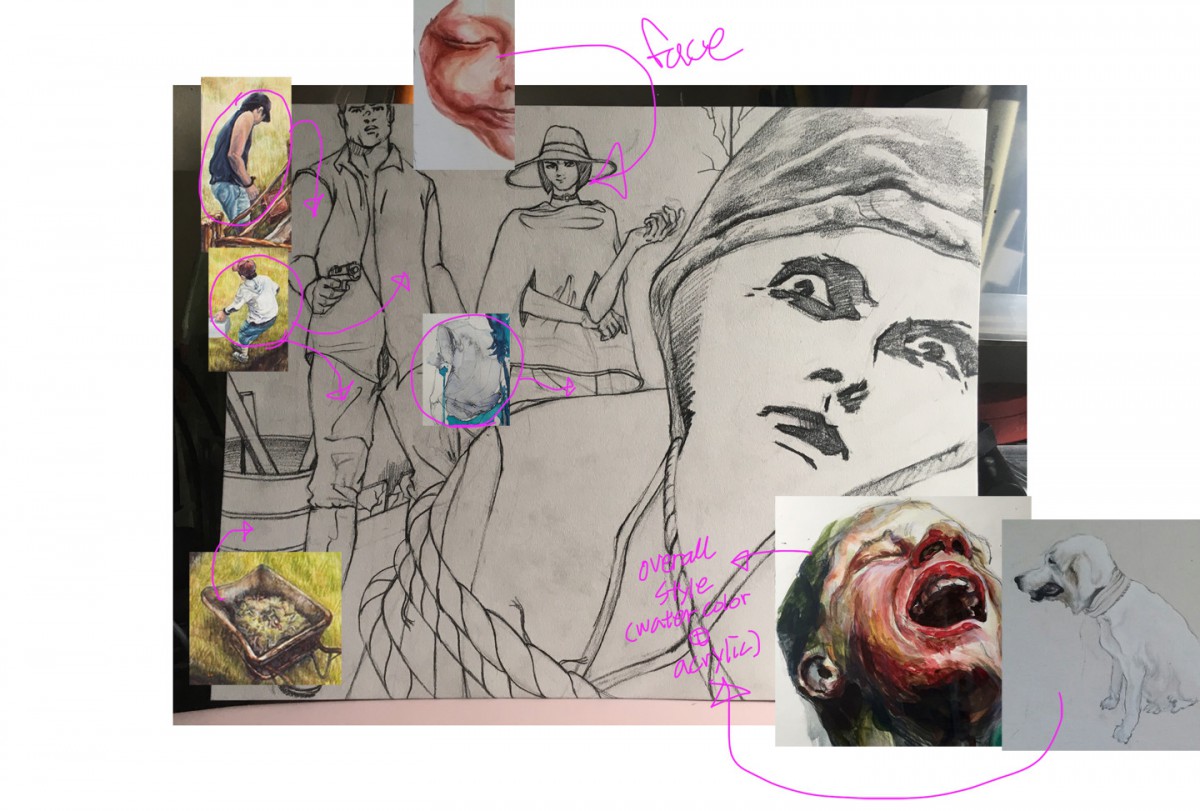
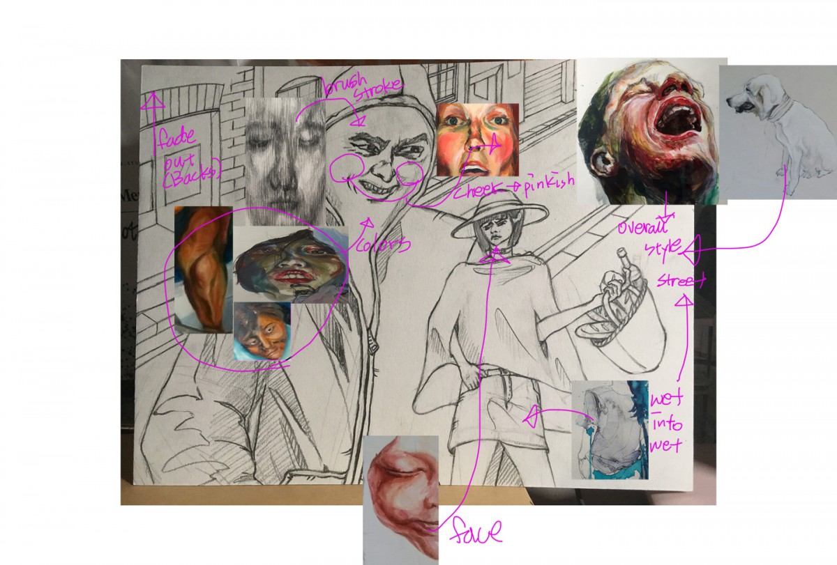
When I saw Scott Brundage’s selfies for his paintings, he just add some photos of him onto his painting directly using Photoshop. So I decided to put my reference photos onto my concept sketches and add some comments for textures(fabric), brush stroke, color palette, and overall style.
<Color, Brush stroke and Materials Refs>
Material : watercolor mixed with white acrylic

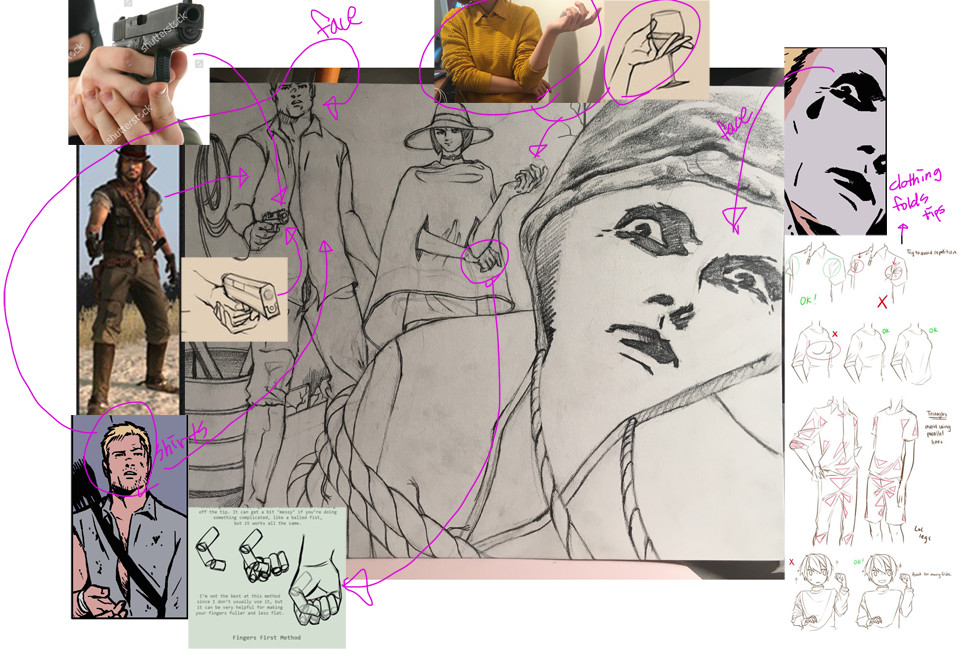
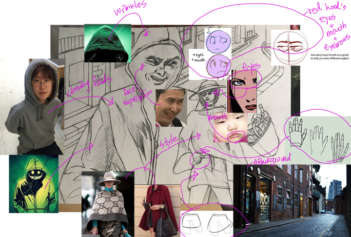
Also, for my figures and backgrounds, basically not only I found bunch of images from Google, but I took a lot of selfies, and referred some tutorials.
<Figures(face expression) and background Refs> 

Mostly I found about creases on clothing.
<Tutorial : Clothing folds(Wrinkles)>
<Tutorial : Clothing folds(Shirts)>
https://www.youtube.com/watch?v=RbHFC-P9n4A
<Tutorial : Drawing Hoodies>
<Tutorials : Rope Drawing>
http://muddycolors.blogspot.com/2014/04/process-to-people-part-1.html
Working traditional
Reading this blog post of different techniques was kind of cool.One aspect of sketching that spoke out to me was detailed sketching and value sketching because that’s where i’m most comfortable when creating a piece. Even it is said to start off simple with line drawing I personally like to get into details as soon as possible. It is helpful to have simplify drawing and then, go in but I get carried away sometimes. For this project I would like to work traditional because that’s my bread and butter. Digital has to be done either way , but I feel limited doing a digital piece as I like to do my values with some paint and brush it feels more authentic.
Looking at my drawings I can tell you that I need improvement with my proportions and perspective. There are some point while drawing I get really lazy and say what the heck and go with the flow. Watching these tutorials helped me realized that you shouldn’t rush art or any flow of ideas because it’ll just come to you. I mostly watched Proko’s video of proportion because enjoy all of his videos as it is enjoyable to watch and also helpful . So what I need to do now is stop being lazy and bullshitting with my drawings and actually put everything I’ve learned to good use.
http://muddycolors.blogspot.com/2012/08/goddess-of-antiquity-process-breakdown_17.html
The process I would like to use is basically start of with thumbnail sketches pick my best one and then use lines and shading. But mostly shading. Instead of painting, my ideal was to basically convert my illustration digitally because I feel as if my art work is stronger in digital work. My main focus on my illustration would be the characters and indicate which character or subject is more dominate. In other words as it was shown in this picture by Eric Fortune. In this illustration, the author demonstrates that the most relevant or the main focus of this picture would be the subject that’s standing over the objects that’s on the floor. That’s how I want to show in one of my concept sketches. My main focus will be more on the subjects then the surrounds so that’s why you would see more details on the characters then in the setting. Just like concept 2 is showing.
When watching these tutorial videos, my main focus would be learning how to draw one of my concept drawings in a worms eye view and a eye level shot. I found it very interesting to use worms eye view because it allows the audience to see what subject in the illustration is more dominate then the other and that’s what I’m going for. There were times when I would use a eye level view for my illustrations but for some reason it turned out that eye level views don’t workout out for all drawings. In other words what I’m trying to say is , there will always be one specific angle that will best fit a drawing depending the setting. For instance, I did a revised version of one of my concepts using a worms eye view.
Revision
I would use this also as one of my reference to create my concept sketch.
Proposing Working Method: Digitally
My Overall Proposal for this project would be to work Digitally. Although im a beginner on Illustrator, I am a very fast learner. I have done multiple projects Digitally, which they come out really well done compared to when im attempting to color my drawings in myself in manual. Besides Working digitally would be much faster since I do own a Tablet that will give me the extra lift.
Examples: