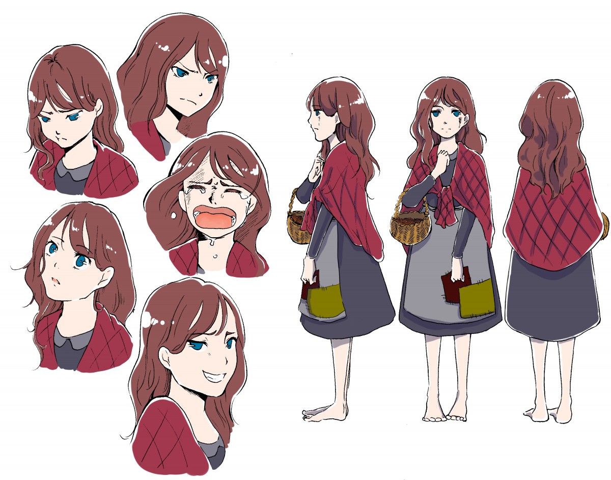
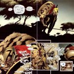
character-design-black-and-white
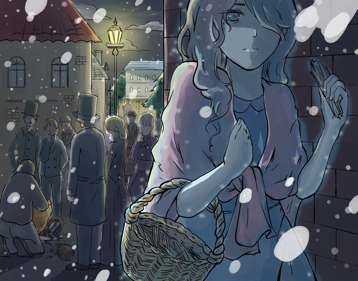
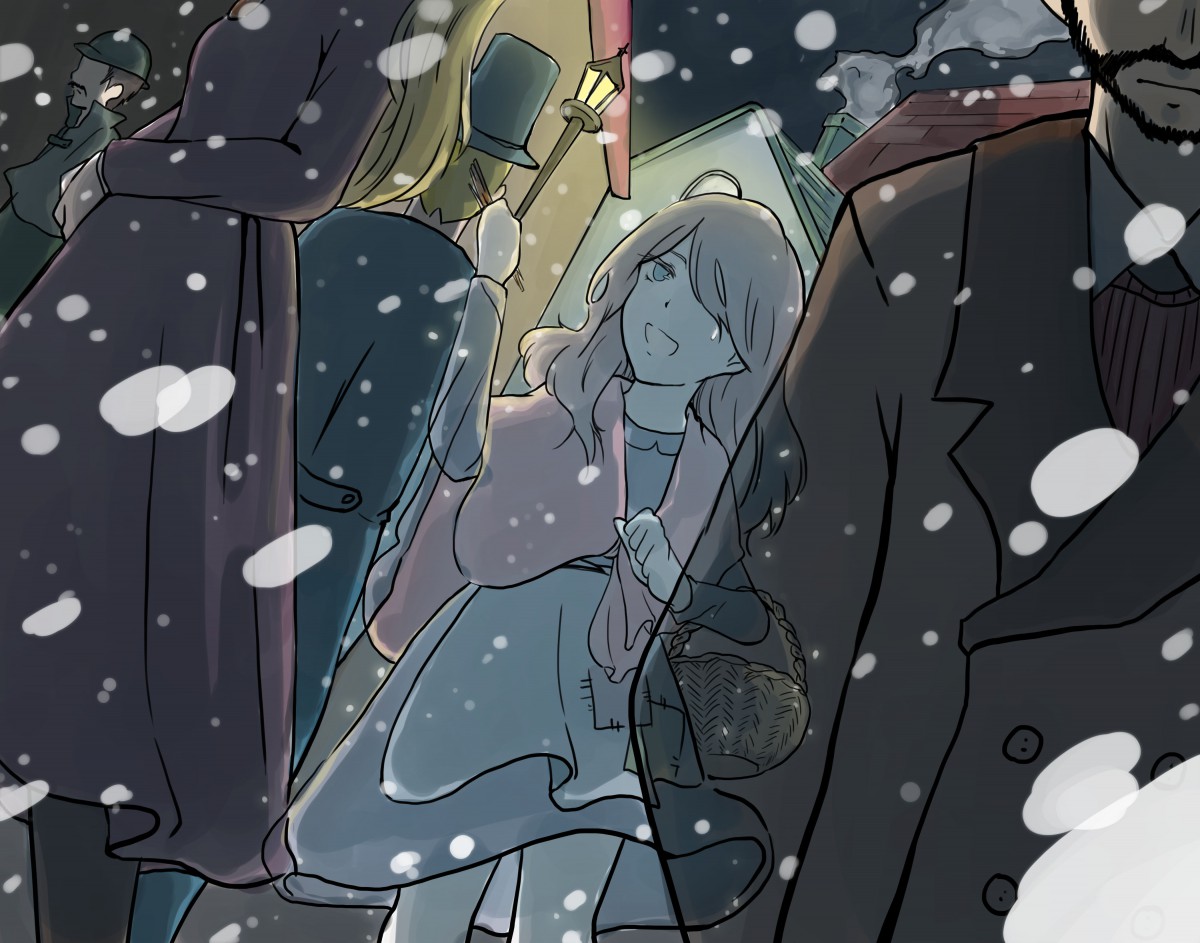
final-illustration-2-her-dieng
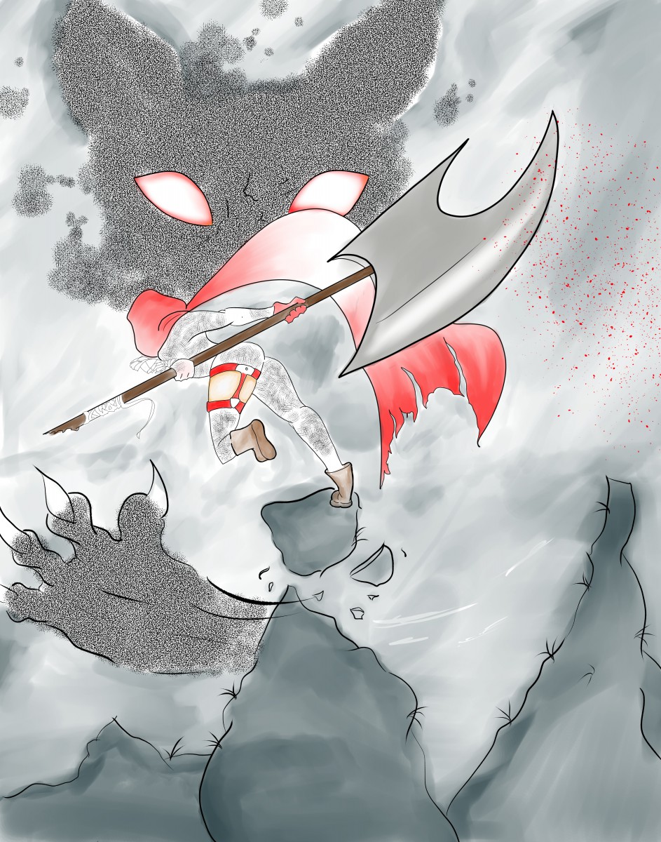
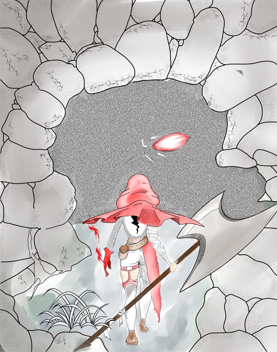
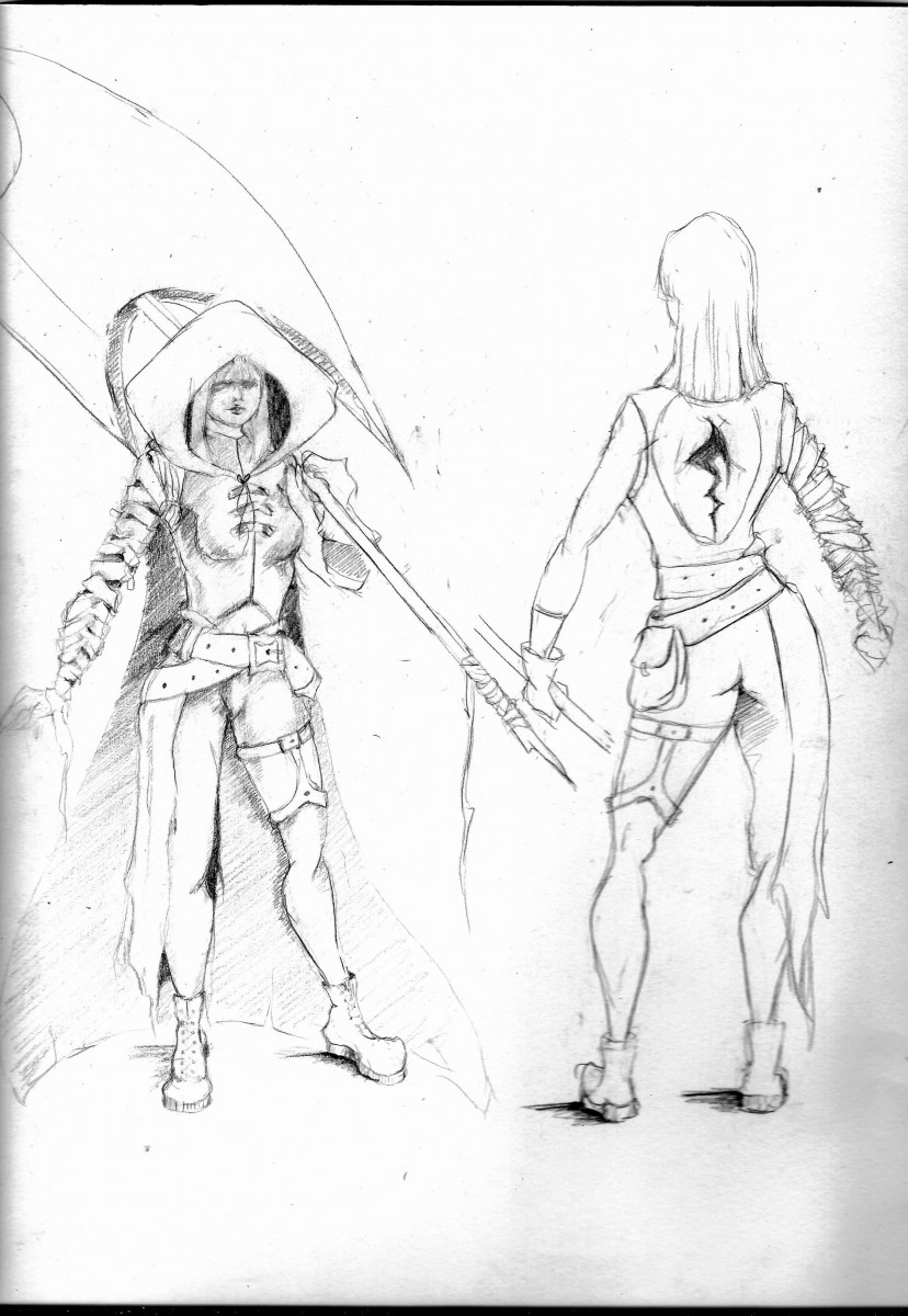
The Final 1+2 is on top while character design is at the bottom
Character Design:
Final 1+2:
Hey Class-
You all asked so here we go…
If you want another crack at Project 2 Editorial Illustration, you may resubmit to DROPBOX until 12/20/2016. DO NOT resubmit if your final is not complete and REALLY WELL DONE… its more important that you do a great job on the final.
Also PLEASE DO NOT resubmit if it is not BETTER than the first attempt. You will get a lower grade than you started with. 🙂
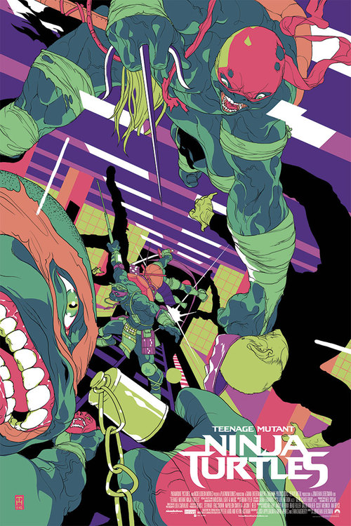
Hey class I showed you this piece as an example for limited palate during my lecture on COLOR … but check out the process behind creating the digital line art for this one too!
Process Work DUE 12/ 13 VIA EMAIL:
Project Description:
In this multilayered assignment you will reinterpret a classic folk tale or fairy tale through your own creative lens. You will, through the course of the assignment develop characters, setting, and finalize 2 illustrations featuring the same character in two very different settings and situations.
FINAL PROJECT GRADING BREAKDOWN:
50 % project grade :PROCESS BOOK
Carefully SCAN and Format your process work. This should include: Story Pitch, Thumbnails, Concept Sketches, Value Roughs, Color Roughs, Related Sketchbook Work, and Final ART. Label each image. Provide text where necessary to explain your thought process, where changes were made, and how research effected your approach to the project.
Label all of your work! Be sure all of it is presented well! I.E. facing the right way, no shadows in the picture, good contrast, etc.
50 % project grade – FINALIZED ART
OPTIONAL EXTRA CREDIT: COLOR BOOK COVER (only do this if EVERYTHING else is done)
File naming protocol:
Arocho_FinalProject_1.jpg, Arocho_FinalProject_2.jpg, Arocho_CharacterDesigns.pdf, Arocho_ProcessBook.PDF, Arocho_BookCover.jpg
Upload BOTH parts to Dropbox.
https://www.dropbox.com/request/OBSvV6rJvr92PV1NjZca
_____________________________________________________________________________
PLEASE BRING HIGH QUALITY PRINTS OF ILLUSTRATIONS AND CHARACTER DESIGNS ON 12/20 FOR CRITIQUE!
* Remember to convert your files from RGB to CMYK before printing!
As Promised … Today’s Lecture.
Power Point: model-sheets
PDF: model-sheets
Model Sheet Sample:
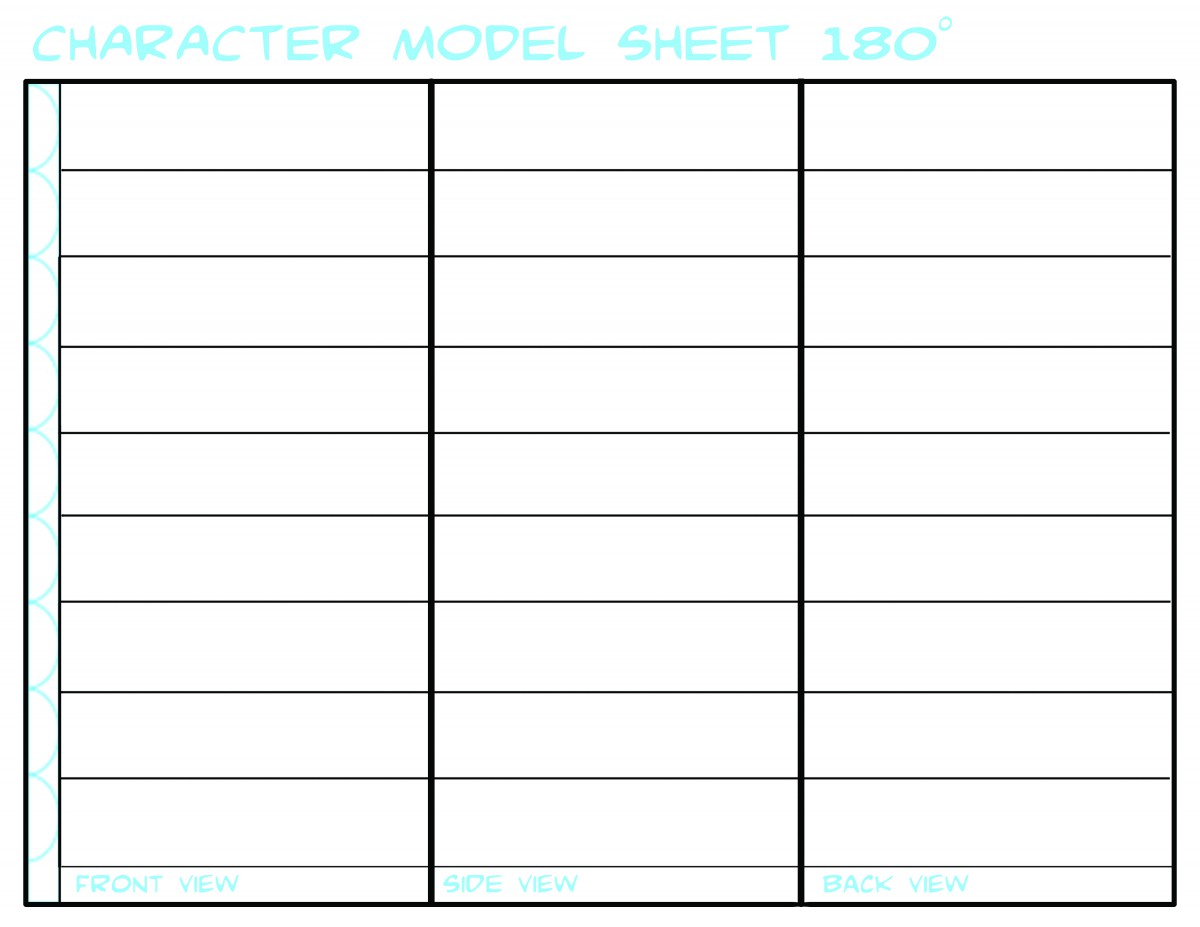
You may use this OR search for another/ design another better suited to your needs.
WHOoooo ARE YOU?
As Promised … Today’s Lecture.
Power Point: character-design-intro
PDF: expressionguide
PDF: character_heads_and_features
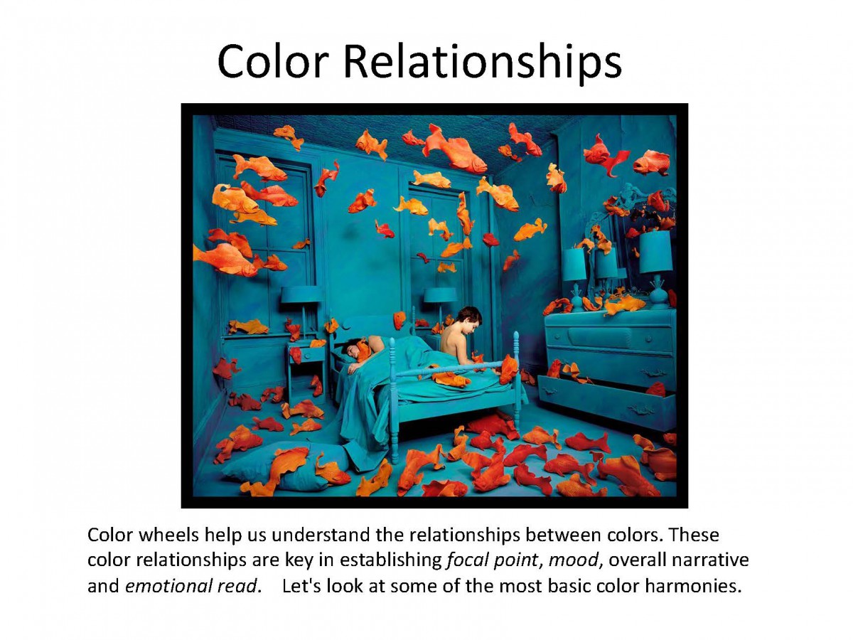
We already know that great composition will guide our viewer, allowing us the illustrator to direct the overall read of the image. We’ve also looked at how strong value contrast establishes clear focal points. Contrast and intensity in color works exactly the same way.
Strong differences in color and highly saturated color will pull your viewers eye, every time. Remember you are making deliberate choices to tell the best story you can. Using color to both tell the story by establishing mood and setting, and creating places of emphasis to guide your viewer is critical.
Color used for emphasis can be very dramatic.

But contrast can be used to guide the viewer subtly too.
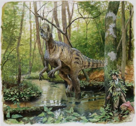
Consider this image called Camouflage by James Gurney, creator of Dinotopia. Take a good look and be aware of where your eyes travel.
Gurney conducted an experiment concerning focal points and how different people look at the same image. By adding together the eye movement data from a group of test subjects, he was able to observe where people look in a given picture.
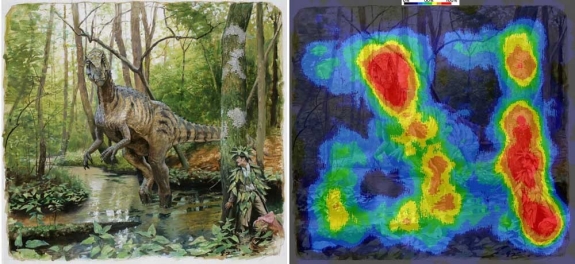
To create the image below, eye-tracking technology recorded the data of sixteen different subjects and compiled the information into a composite image, called a heatmap. The red and orange colors show where 80-100% of the subjects halted their gaze. The bluer or darker areas show where hardly anyone looked.
The heatmap for Camouflage shows that everyone noticed the dinosaur’s face. They also quickly spotted the hidden man and the small pink dinosaur. According to data connected to timing, these three faces drew almost everyone’s attention within the first five seconds. The dinosaur’s face was statistically the first thing most people looked at, followed quickly by the hiding man.
Why do we look the same way at this image? As humans we are drawn to faces. This is a given. However, though the contrast is subtle, the only pink things in all that foliage, (remember green’s complement is red) are the hidden man’s skin and the small pink dinosaur.
The OpenLab is an open-source, digital platform designed to support teaching and learning at City Tech (New York City College of Technology), and to promote student and faculty engagement in the intellectual and social life of the college community.