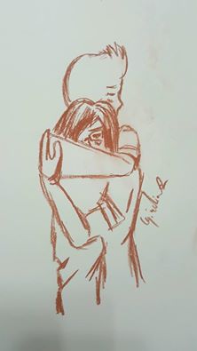
How To Draw People Hugging:
My own practice:
How To Draw People Hugging:
My own practice:
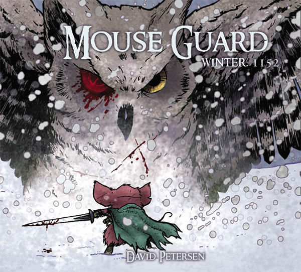
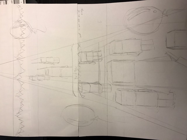
I found this tutorial of making one point perspective where this video shows the similar eye level that I am going to use for my parade scene. I also saw David Petersen who draw a book called Mouse Guard that has a fight scene between a mouse and an owl. I think these two are most important for my reference, since my placement in background and the the character perspective of where the viewer is looking.
I want to make my approach on using traditional and digitally on my final work. I am definitely want to use water color to make this background color was smeared rainbow or pastel color and just layer them in Photoshop to show fantasy. Including sparks and lights on the fighting scene, other then that I think doing it others in Photoshop it is comfortable for me working on.
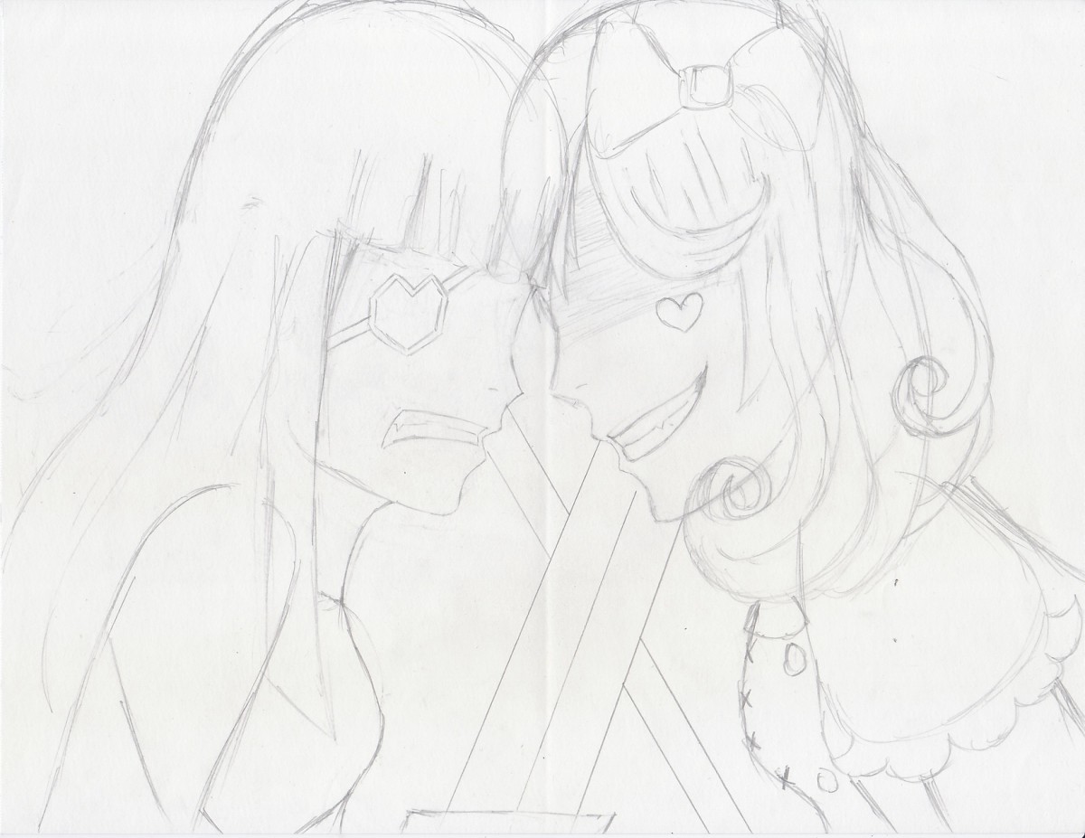
My revised drawings:
I personally like Alice better then the Queen since it was difficult to draw. Since my proportion is off, I hope I can change them through photoshop. I also did what professor asked to put one point perspective and draw boxes so that I can just put characters in there. Since I think its better to do vertical for the parade, I am going to try applying that to the fight scene.
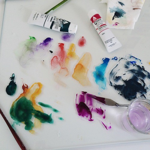
Watercolor is a flexible medium. It can also be applied directly over a pencil drawing, and can be used thinly as a glaze or opaquely like a traditional gouache. It can accept a variety of media layered on top of it too, such as colored pencil or ink. When dry and treated with a fixative it even allows the artist using it the flexibility of painting or glazing over previously painted areas without fear of disturbing those earlier layers.
GLAZE
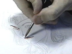
When using Watercolor as a glaze, dissolve a small amount of pigment in water until you achieve the transparency level you are looking for, just as you would when working in watercolor. You can use this technique as your first layer of color, directly over your pencils as shown here in this step-by-step creation of the Incredible Wonder Woman portrait by Alex Ross.
Alex Ross Step by Step
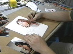
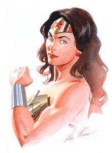
As you can see, when in the right hands glazing is a very effective technique!
When glazing, remember:
Helpful Tip
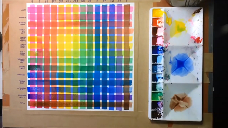
Try this: Make yourself a glazing guide by brushing a stripe of each of your colors as a glaze. Wait for it to dry (or use a hair dryer!). Then brush a second stripe of each color to form a grid. Don’t forget to label your colors for easy reference.
WATERCOLOR & PENCIL LAYERING TECHNIQUE
Once dry, the paint has a matte finish. This allows for additional techniques to be layered right on top. For example, an artist may choose to draw over the top with colored pencils. This technique is easy to see in this illustration of root vegetables by Lizzy Rockwell.
 Lizzy Rockwell, illustration of root vegetables
After Rockwell traces her drawing onto the watercolor paper, she fills in, using the gouache as a flat, opaque medium. Afterward, shading and details are added with Berol Prismacolor colored pencil over the painted areas. It is particularly noticeable on the carrot, the radish, the tips of the asparagus and on the lines on the onion.
Here comic book legend Alex Ross, whose process we just looked at, combines Watercolor and Gouache (opaque watercolor) with pencil and India ink. His painterly style is unique in the realm of comics. Ross uses glazes of color over a pencil drawing, which in many places remains visible. Once dry, the blacks and the line work are finished off with a brush and ink.
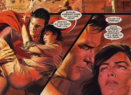
Alex Ross, illustration of Superman and Lois Lane
Helpful Tip
For the sake of permanency, a quick spray of fixative is recommended if you choose to use any of these layered techniques.
As you can see, you are about to begin working in a very flexible medium! These are by no means the only techniques to try, so feel free to experiment!

Successfully working with Watercolor depends on applying the same principles you used when working with any wet medium. There are habits you can develop and things to set up ahead of time that will make all the difference.
Painting in any water-based medium depends on the interaction among four key factors:
Begin by setting up your work area properly before you start.
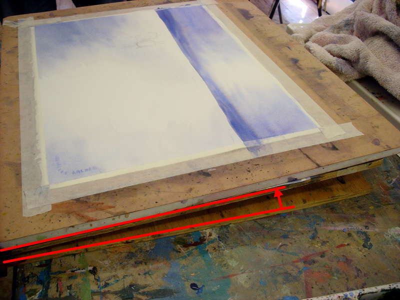
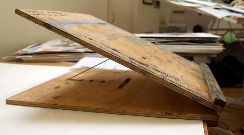
To account for gravity, set your art board at an angle. The steeper the angle, the stronger the force of gravity will be.
This angle is subject to personal preference. Some people like just 20 degrees (equivalent to a couple of textbooks propping up one end of your work surface) while others have a much steeper angle like this:
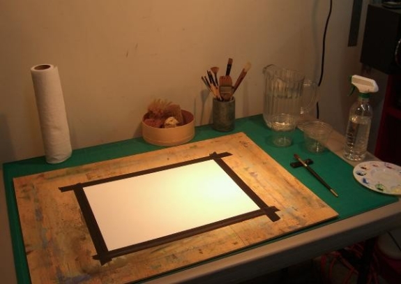
To prevent your work from buckling and warping you should tape your paper or illustration board down with artist’s tape, or work on a watercolor block. This will let the paper block or work board help the paper maintain its shape through repeated applications of wet paint.

Finally, if you’re working on a watercolor block and want to remove your painting, or you need paper for tests and roughs, you should remove your work by inserting a dull knife blade or a credit card into the opening at the top of the block and running it around the perimeter to break the adhesive bond and remove the page.
Hello Class. HAPPY THANKSGIVING!
For those of you who did not receive in person feedback, I have given you feedback on your assignments in the dropbox. I’ve emailed you links to view directly from dropbox. If you have trouble accessing PLEASE email me.
https://openlab.citytech.cuny.edu/ayanos-eportfolio/internships/illustration/project-3-narrative-illustration/
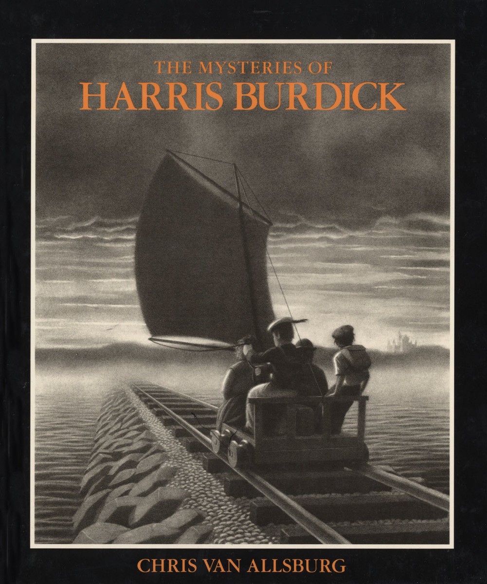 The Mysteries of Harris Burdick is a fascinating and unusual book. It opens with an introductory letter from Chris Van Allsburg himself, explaining the book’s origins. “I first saw the drawings in this book a year ago, in the home of a man named Peter Wenders,” Van Allsburg begins. He goes on to explain that many years earlier, a man called Harris Burdick stopped by the office of Peter Wenders, who then worked for a publisher of children’s books, choosing stories and pictures to be made into books. Burdick brought one drawing from each of fourteen stories he had written as a sample for Mr. Wenders. Fascinated by the drawings, Wenders told Burdick he wanted to see the rest of his work as soon as possible. Promising to bring the stories in the next day, Burdick left—never to be seen again. The fourteen pictures he left behind—and their accompanying captions—remained in Wenders’s possession until Van Allsburg himself saw them (and the stories that Wenders’s children and their friends had long ago been inspired to write by looking at them). The mysterious pictures, writes Van Allsburg, are reproduced for the first time in the hope that they will inspire many other children to write stories as well.
Synopsis from the Houghton Mifflin Harcourt Teacher’s Guide
Chris Van Allsburg’s celebrated and thought-provoking illustrations in The Mysteries of Harris Burdick have intrigued readers of all ages for the past 25 years. Each illustration highlights a critical moment of a story, accompanied only by a single line of text and a title, forcing the readers to create the rest of the tale for themselves. This book is a stunning case study in the power of using the technique of freezing a moment in time coupled with picking the right event, the right critical moment in the narrative, to drive forward the drama and storytelling of the image.
Please upload Project 3 to:
https://www.dropbox.com/sh/welhll641fo2bzu/AACuFGWXxXDJkFinnPfQUP3aa?dl=0
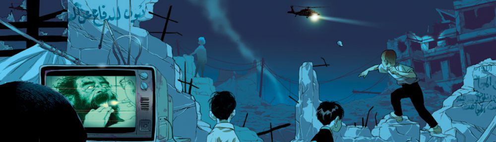
Shaping the Scene: Layout and Action
Action can often suggest the layout and framing of a shot. As always we go back to our story. Ask yourself: What is the character doing? How do they feel about it? How should the viewer feel looking at this scene? How can I make this action totally clear to the viewer? These questions will help to dictate your layout (another word for composition) as well as help you choose your POV.
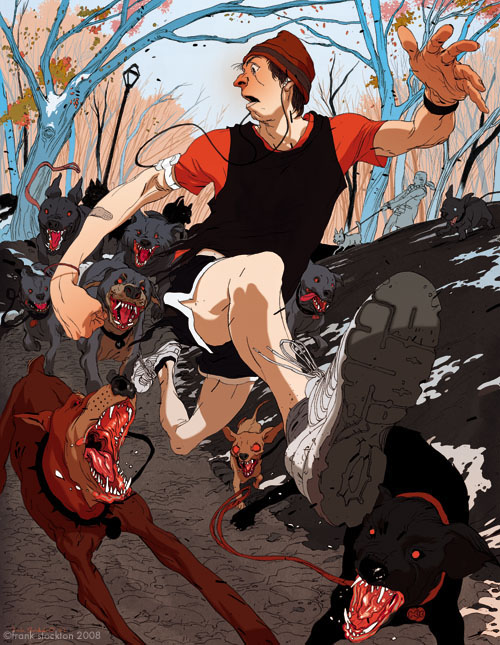
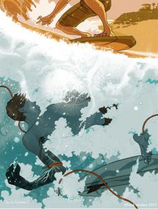
In this illustration by Frank Stockton notice how the action and feeling have dictated many of these decisions.
The Moving Camera
The world you see in an illustration can be very compelling, inviting you in for deeper analysis. Or not. Much of this depends of the point of view you see it from. After all, seeing a concert or play or a game from the nosebleed seats is not the same experience at all as being up close and personal with the action. Since in illustration you can choose your viewer’s vantage point, take the time to really consider it.
Frank Stockton is a comic book artist and illustrator who is known for using point of view like a boss! We just examined one of his images in detail on the previous page for exactly that reason.
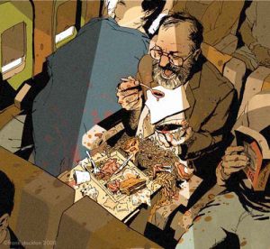
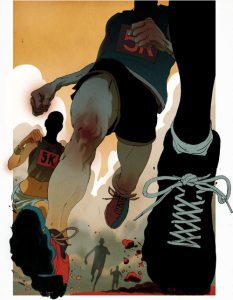
As you look at the next series of images ask yourself once again: the illustrator could choose any point of view from which to show this scene, so why did he choose this one?
The OpenLab is an open-source, digital platform designed to support teaching and learning at City Tech (New York City College of Technology), and to promote student and faculty engagement in the intellectual and social life of the college community.

