Inking Tips and Tricks

Ink can be a messy medium!

Before you begin your work in this medium, here are some helpful tips and tricks.

1472596863412

  • Always warm up.

Just as you would warm up before exercise, warm up before using ink. Take the time to work on your lines and strokes on a separate sheet of paper before you begin working on your actual illustration. This will ensure that you have proper command of your hands.

This image is of comic book artist Jacob Halton’s inking warm-up, which he does in the morning to “get command of his hands”.

1472596872881

  • Don’t tape down your page.

Marks are easier to make when moving your hand in certain directions, so move your page around in order to make this possible. Work your hands in the way that they move naturally.

  • Begin with thicker lines.

This is a way to keep warming up your hands. Thicker lines are safer to work with until you feel confident enough to move onto the drawing’s fine detail portions.

  • Work in a way that minimizes smearing.

Don’t try to work on the illustration in a left-to-right method, or in any order like that. Instead, think about where your hand may smear the ink, and work in a way that minimizes that smearing. Some artists place a piece of paper or paper towel under their inking hands in order to help with this process.

  • Address large areas of ink last.

All paper, including watercolor paper or Bristol board, will warp when wet. It’s much easier to draw controlled lines on completely flat paper. Therefore, draw your lines before soaking any large areas with ink, otherwise known as executing an ink wash. Another method is to fill in large areas of ink, and then either allow for drying time or use a hair dryer before moving on to finer details.


Pen and Ink Tools – Part 2

Pen-and-ink Drawing Surfaces

Pen-and-ink drawings are usually created on different types of paper. The tooth or grain of the paper can affect the marks made by the pen. Because of this, most illustrators prefer to work on smoother surfaces that are still absorbent to the ink, creating detailed ink drawings in this way.

You can use ink to draw on your sketchbook paper, but over time this paper will warp or fray with the wetness of the ink. The paper in this sketchbook simply isn’t heavy or absorbent enough. For final work, illustrators usually choose something with a little more heft.

Paper

Bristol Board is a smooth-surfaced paper that’s heavier than regular drawing paper. It’s a popular choice for pen-and-ink drawings.

1468363892784-1

Another popular choice for ink drawings, and the paper used for this class, is hot-press watercolor paper. Hot press refers to the method used to make this special kind of paper. This paper’s surface has been ironed smooth, and is very versatile, allowing artists to make fine details in ink as well as combine other media such as watercolors or colored pencils.

 1472596797004

Pen and Ink Tools – Part 1

In this class, for the most part we will be using a crow quill (or dipping pen) and/or a brush to make our marks.

1468363604377

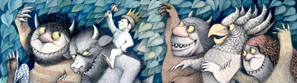
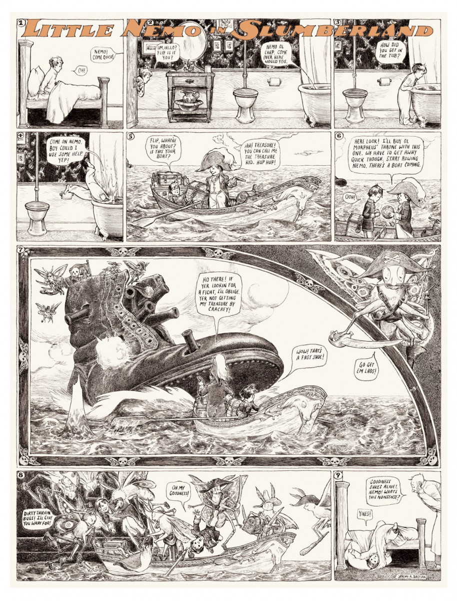
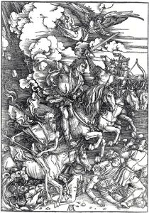
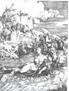
However, an almost endless number of pen and ink tools and techniques exist, and it’s highly recommended that you experiment with as many opportunities as possible within this amazing medium. Some substantial differences exist between tools; it’s likely you will prefer some over others. Take the time to experiment and discover your own interests and comforts


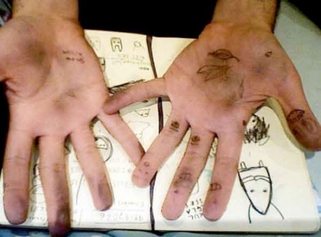
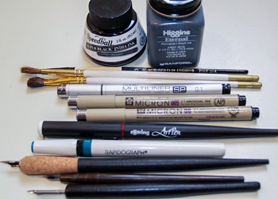
In this and subsequent posts, we’ll cover the most commonly used pen-and-ink drawing tools and materials. In addition to the obvious ink-specific tools such as pens, brushes, and paper, you may also need to acquire paper towels, white-out pens (useful for reproduction work), an old toothbrush, and a water jar.


Quills

1468363624880

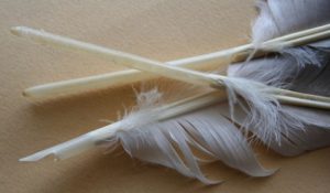
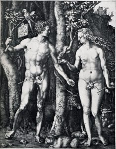
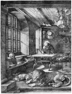
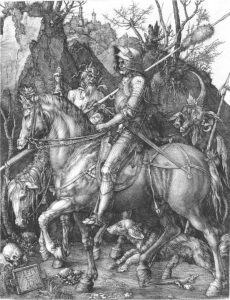
The first pens were made from feathers (quills), bamboo, or reeds. Usually, quills are created from the wing feathers of geese. Other common feathers used for quills come from the crow, eagle, owl, hawk, swan, and turkey. These feathers are carefully treated in order to retain their shape despite frequent wetting and drying. The hollow shaft of the feather acts as an ink reservoir, and ink flows to the tip by capillary action.

Crow Quill

1468363661842-11468363744341


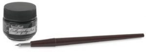
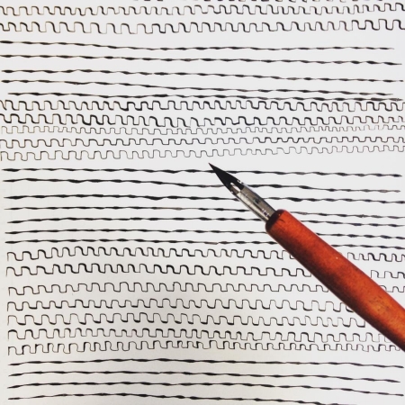
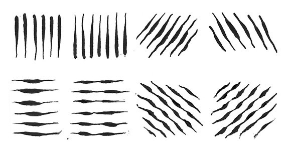
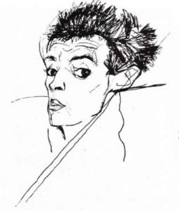
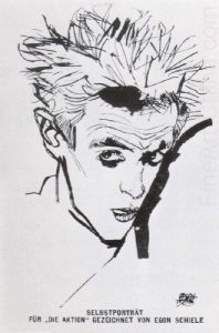
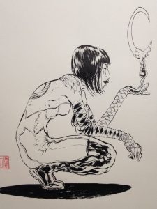
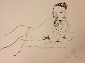
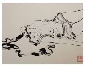
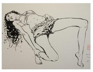
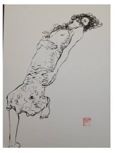
The modern version of the traditional quill—the steel dipping pen, or crow quill—remains widely used by illustrators today. This pen is included in your supply list and is the one recommended for use in this course. A quill pen can produce either very delicate lines or thicker, more dramatic ones. It can also produce lines of varying width. Check out all the varied lines produced by a crow quill in the next image. When you press down on the crow quill, more ink is released, making the line thicker. Apply less pressure, and the line becomes thinner. This allows your line to vary from thick to thin and visa versa without having to change the position of the pen.

1468363702955-1

Aside from the traditional look it gives an image, a crow quill helps to develop hand techniques that are needed for all drawing media. When working with a quill, you must learn to control the pressure that you apply to the nib in order to vary the weight of your lines.

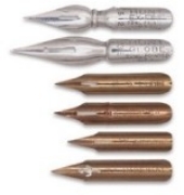
Crow quills are made of both a holder and a nib. The nib is the metal point that you dip into the ink. They come in a variety of sizes and with a variety of point shapes (pointed, angled, or rounded), but all are flexible, have a small hole or reservoir, and are split at the tip, thereby allowing the ink to flow onto the work surface. They also work on the same principle as the feather, sucking up the ink through capillary action. You’re encouraged to experiment with several different types and sizes of nibs in order to see how they all perform differently.

Caring For Your Crow Quill

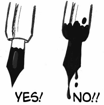
When using your crow quill, don’t dip it into the ink past the nib. Doing so will cause messy, uncontrollable drips on your artwork and will also damage the pen, shortening its life. Dipping in just past the reservoir is ideal.
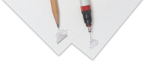
1468363763964-1


Drawing Pens

1468363823627

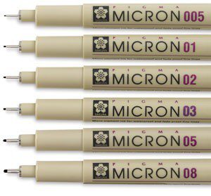
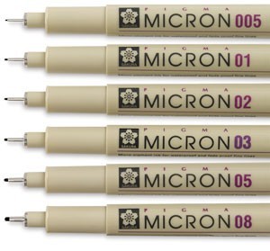
These drawing pens are similar to a felt tip pen, but they use archival ink. Several different brands exist but the most commonly used are the Microns pictured here. Various point sizes make it easy to control line weights. These pens are often used for sketching, particularly for comic book art and illustration. Again, note the consistent line weight and various sizes, each of which is ideal for different purposes. You’re highly encouraged to try using these pens if you haven’t already done so.


Brushes As Drawing Tools

1468363835813

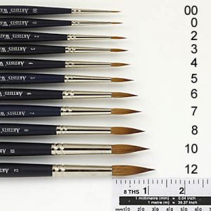
Watercolor brushes and brushes for working in ink are generally the same: they both use water as the dilution and clean-up medium. However, keep in mind that once a brush has been used for inking, it’s difficult to get perfectly clean again, so be careful that leftover ink doesn’t stain your artwork when subsequently using other media. Keep in mind we are specifically discussing drawing here; painterly brush techniques will be covered in later modules.

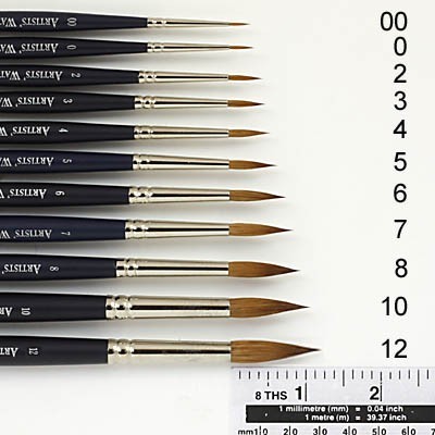
Brushes used for drawing purposes are generally of a smaller gauge. Though the sizes of brushes you’ll use will vary given the size of your picture (the larger the picture, the larger the brush, in general), good sizes for general inking—such as comic book style illustration—are the number 0 to number 3. These allow for both thicker and thinner lines, but will also give a “drawn,” as opposed to “painterly,” feel.

Also similar to the style produced via crow quill, a brush allows for line width variation based on pressure. For this course, drawing with a brush in addition to the crow quill is recommended. Take the time to practice with both.

Caring For Your Brushes

Don’t dip your brush into the ink all the way to the metal. This will make for a messy drawing tool and will shorten the life of your brush. Clean your brush every time you’re finished using it. If you plan to use it again in a short time, rinse it in water that’s completely clean. Don’t leave your brushes sitting in water for long periods of time, as this will damage your brushes’ tips. In general, it’s better to periodically wash brushes with soap and water, which will not only keep your brushes in good shape but will also ensure their ability to manipulate ink effectively. Don’t use turpentine or other hard solvents to clean, as they’re unnecessary with ink and will deteriorate the hairs on your brush.

Expressive Line : Master’s Study Egon Sheile & David Mack

Lines are where most people begin when first starting to draw. By themselves, lines are powerful drawing tools! They have shape, texture, and weight, all of which can add up to a very expressive drawing if you’re thoughtful about their creation.

1468363023016

When beginning a drawing, people often carefully inspect an object’s outside edge, or silhouette, as a starting point. They render each line representing an edge or contour. Next, people usually fill in those contours with value.

However, so much can happen using just line alone! A line by itself is capable of conveying all sorts of emotions. In your drawings, lines can and should have life.


Try this

ill_232_v9_m5_p6-lines

In your sketchbook, take five minutes to draw as many different kinds of lines as you can imagine. Try different movements with your hand, drawing lines from your wrist, your elbow, and then your whole arm. Try different amounts of hand pressure, creating straight lines, parallel lines, curves, and spirals. There’s no wrong or right answer here! This freeing exercise will help open up your expressive drawing skills, warming you up to this medium.

Egon Schiele

German expressionist Egon Schiele is a master of the living line. In these images note how he uses nothing but varying kinds of line in order to imbue these portraits with interest and emotion.

Line Weight

Part of what we see creating the sense of liveliness and emotion in Schiele’s lines is an incredible understanding of line weight.

Line weight is an important drawing concept. Different tools create different kinds of lines, and allow us different methods of varying line weight. A line’s weight, meaning how dark or thick it is, will make that line either move forward in an image (if it’s a strong, dark line) or sink farther back (if it’s light or thin). This is useful when trying to give the impression of something being closer or further away. A heavier line weight will also create emphasis on a particular area of a drawing, which is of course useful in creating our focal points.

In the two images shown here, note how the image on the left is logical. The closest block is also the one with the thickest contour line, which makes visual sense. However, in the image on the right, the line weights of the blocks don’t follow the correct hierarchy, as they don’t recede in space logically.

David Mack

David Mack, contemporary comic book illustrator and creator, is known for his linear figure drawing style. In the next series of drawings, notice how Mack uses only contour lines in order to describe the body. It’s useful to note that he cites Schiele as an influence to his work. His expert use of line weight is especially obvious in the implied shadows that convey a feeling of gravity entirely though varying thickness of line.

The Modern Art of Hatching

Print illustration continued to grow as time went on, with advanced technologies allowing for increasingly better image reproduction. Illustrators on both sides of the Atlantic were becoming household names!

1468354909900-1

Charles Dana Gibson, At the Beach

Artists such as Charles Dana Gibson were both depicting and creating the American culture of the time. His pen-and-ink drawings were reproduced in magazines across the globe, and his images found their way into both American homes and the American consciousness. His iconic ink drawing of the “Gibson Girl” was, he said, a composite of “thousands of American girls.” The image shaped the face of American femininity of his generation.

1468354934563

Charles Dana Gibson, The Gibson Girl

During the years between 1865 and 1917, a time known as the “Golden Age of Illustration,” books and periodicals were the world’s major source of entertainment. This stands as the publishing industry’s most dramatic period of worldwide expansion, and of course that expansion can be seen in the incredible use of inking techniques used by the artists of the time.

ill_232_v9_m5_p3-booth_1

Franklin Booth, A Continent Is Bridged, originally an illustration commemorating the 25th anniversary of transcontinental telephone service.  Note the similarity in technique to the work of Albrect Durer.

Hatching is as relevant to illustration now as it was at the advent of the print industry, though most artists use the technique in combination with some kind of coloring medium, either traditional or digital.

ill_232_v9_m5_p4-mayer_1

Mercer Mayer, One Monster After Another, pen, ink, and watercolor

Jeremy Bastian is an American comic book creator and illustrator best known for the book Cursed Pirate Girl. Each illustration is created at a 1:1 scale using a very fine brush and ink. His painstakingly rendered drawings are reminiscent of Dürer in their skillful use of hatching technique, but are perhaps more strongly connected with the pen-and-ink work of the Golden Age illustrators he cites as his influences, Rackham and Tenniel, who we will look at later in this course.

Look at the gallery of Bastian’s work.  When you look at Bastian’s illustrations, take the time to zoom in and really examine his use of line to create value and describe form. Also note how expressive and alive his lines are.

Jeremy Bastian, illustrations from Cursed Pirate Girl

Here you can take a look at a one-page comic created by Bastian for the Eisner-Award -winning anthology Little Nemo in Slumberland, an homage by modern cartoonists to the work of Winsor McKay.

ill_232_v9_m5_p4-bastian_6

Master Study : The Art of Albrecht Dürer

As the only way to represent value in printed books was through the use of line, we can easily see how the art of printmaking and that of pen and ink illustration are deeply linked.

To see an amazing example of this idea in action, let’s look at the German Renaissance printmaker Albrecht Durer (1471–1528). Durer demonstrated the true mastery that could be achieved in inked and printed line art. Through expert understanding of line and value, he created depth, volume, and mood.

As you examine the following images, take careful note of Dürer’s use of hatching, crosshatching, and stippling in these images. Consider the incredible sense of volume achieved, and the quality of light, created through masterful use of line.

Pen and Ink Illustration: an Introduction

We can trace pen-and-ink illustration’s roots back to the very earliest illuminated manuscripts.

An illuminated manuscript is a manuscript in which text is supplemented by additional decoration. The earliest known examples come from the Byzantine Empire, from 400 to 600 CE.

1472596584762

Illuminated manuscript

But regardless of the antiquity of the medium, pen and ink are used all the time by contemporary illustrators, with a spectrum of different results.

1472596592999

Yuko Shimizu Work Process Shot

Illustration and the Art of Printing

Illustration’s development has paralleled the art of printing and reproduction, with very specific moments in history periodically reinventing our medium. We can boil these moments down to a few landmark inventions:

  • the printing press
  • color lithography
  • photography
  • digital printing
  • digital media

Arguably, the invention of the printing press is still the most important thing that has occurred in the history of our art form.

press

When Johannes Gutenberg invented the printing press, developing a movable type system in Europe between the years of 1440 and 1450, he completely revolutionized the world of human communication. He also initiated the marriage between illustration and publishing that still exists today.

1468354318083-1

Just as type could be reproduced for print, so could images. The invention of illustrating by means of cut woodblock followed closely the invention of moveable types for printing.

1468354339982

Early Chinese woodblock print

It’s important to note that Chinese were the first by far to use woodblock printing, with the earliest known work dating back to before 220 CE. However, in Western illustration the first woodblocks date from the beginning of the 15th century and the invention of Gutenberg’s press.

Gutenberg added illustrations—usually woodcuts—to his printed books. Very soon after that, books with woodcut illustrations became commonly available.

These illustrations were limited to black ink on white paper, forcing illustrators to render subject matter and to represent dimensionality using only lines, leading to the development of hatching in the pages shown here.

1468354365186

Illustrations by Erhard Ratdolt, 1488, in a book written by Persian astrologer Albumasar

Yuko Shimizu on VISUAL VOCABULARY :

This short excerpt from Yuko Shimizu’s blog post considers the importance of developing a unique visual vocabulary. After reading this article, consider how you can use your sketchbook as a tool to developing your own visual vocabulary. What kind of things are you interested in drawing? What visuals might become important visual signatures for you?  Write a few sentences considering these things.

Post your thoughts on this along with your Sketchbook Pages.


“ I believe many of you who are reading my blog are aspiring illustrators. If you are, here is something you may want to remember, or to work on, if your art school instructors haven’t taught you already: we have to be remembered by something we are good at, so when a prospective client sees a topic that needs to be illustrated, they know who to call.


The most obvious themes prospective clients think of in connection with my work are Japanese or Chinese themes. I am Japanese, but I had also studied Cantonese for three years, and I have strong interest in Chinese culture. And people somehow see that in my work. There are other themes, like sexy girls, action and sports, comic-book look, snow, and water and underwater themes.”

Figure Drawing Reference

Getting the right reference is key in creating a great final art piece!

Though we some times don’t know how to get our figure drawing exactly right… we can sure see when it has gone wrong! Poor drawing is one sure way to ruin a great idea.  So, lets get the right reference so that we can do out best work!

NOW of course the BEST thing to do is go and draw a REAL LIVE PERSON… but you may not have access or may not be able to get just the right pose for your visual concept.  FEAR NOT!  there are some great resources out there!

ART POSE APP

screen696x696  artpose_male_worms_eye-675x1200  screen696x696-1

Art Pose and Art Pose Female Edition are perhaps the most practical and intuitive artist anatomy reference applications for iOS and Android.  You can pose your figure, see musculature and move your camera all around it.  You can even go to a silhouette view.  Pretty good stuff!  Learn more! 


figure-8-1303874382

Pixelovely Is probably my favorite reference site. It has figure great drawing poses, choose between kinds of models, clothed or nude male or female etc.  Plus animal poses!  MEOW! Within each category are sub-categories. For example, under the animal category, you can choose the species of animal – and whether or not to time the session.


figure_woman_bend

Quick Poses is a great figure reference site. You can choose between gesture drawings (timed poses) or random pose studies (not timed). There is a healthy selection of both clothed and nude models to choose from.  The site also includes tips to improve your study.


Life Drawing in New York

Since we are in New York City artists have many options to improve their life drawing skills by drawing from a model outside of this class.  Most of these options offer a student rate. Practicing our craft is VITAL.  Take advantage of the resources in our city!

sketch11sept

title

The New York Society of Illustrators is an incredible resource for up and coming commercial artists.  The sketch night is a great way to get to know this institution.  Its lively with great models,live music, pro illustrators, and often comes with FOOD!  This one is wonderful and is the cheapest option I’ve found.