For this assignment we were asked to choose a quote and visually communicate a message using type in creative ways. I chose the quote “Here’s Johnny” from the famous horror film “The Shining”. I chose this quote because it is famous enough when people see it they know where it’s from. This would allow me to mess with the quote and design in ways I couldn’t with an unknown quote.


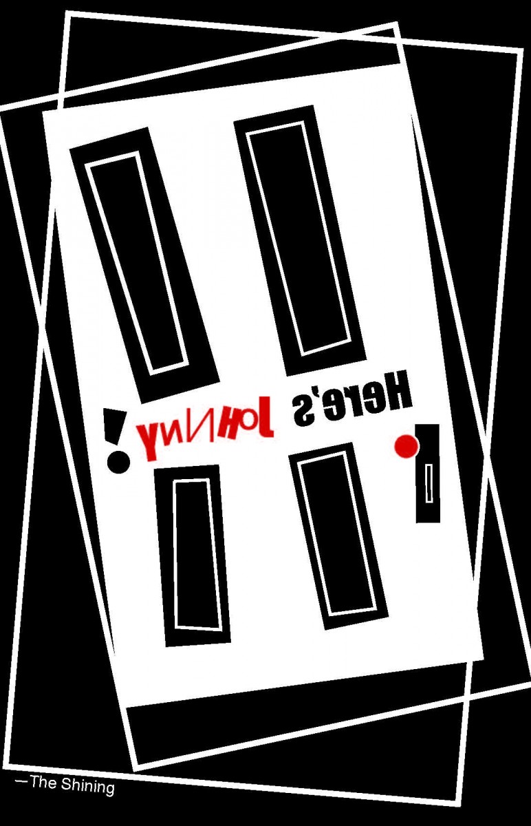
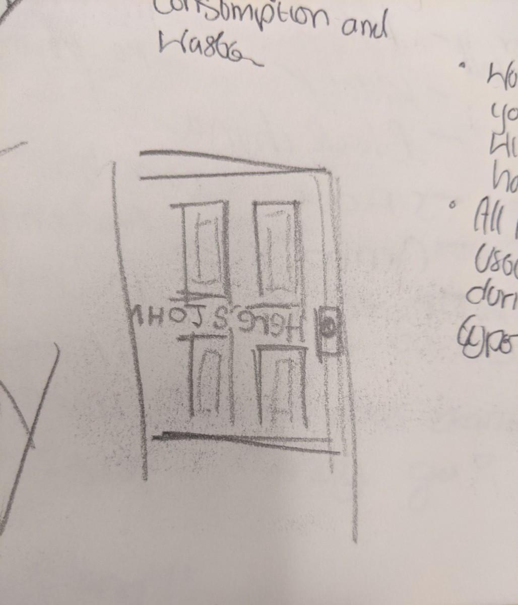
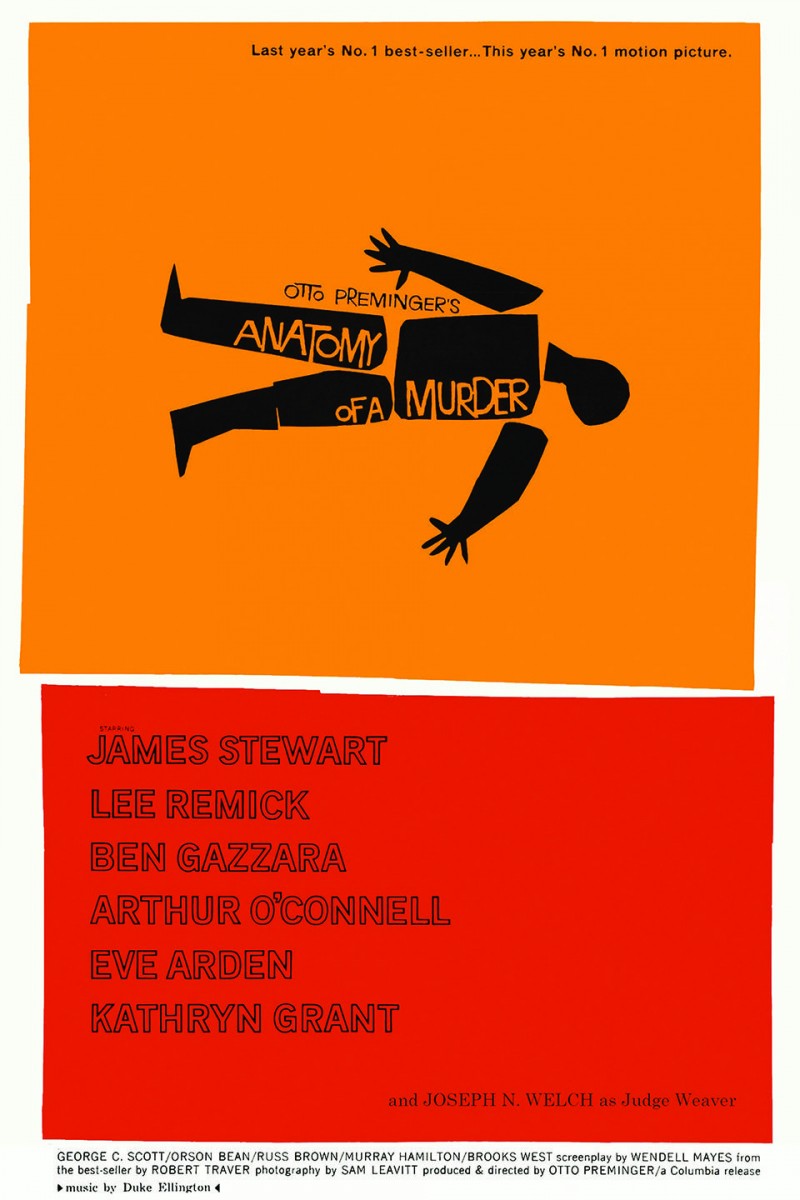
For my first concept, I created an illustration of an odd-looking door. I was inspired to create an illustration similar to the poster by Saul Bass for the film “Anatomy of Murder”. Coincidentally, Saul Bass had also created the poster for “The Shining” from which I got the quote “Here’s Johnny!”. This door, along with the mirrored text, is a direct reference to the “redrum” scene in “TheShining”. Aside from the red “Johnny” and doorknob, the image is entirely black and white.
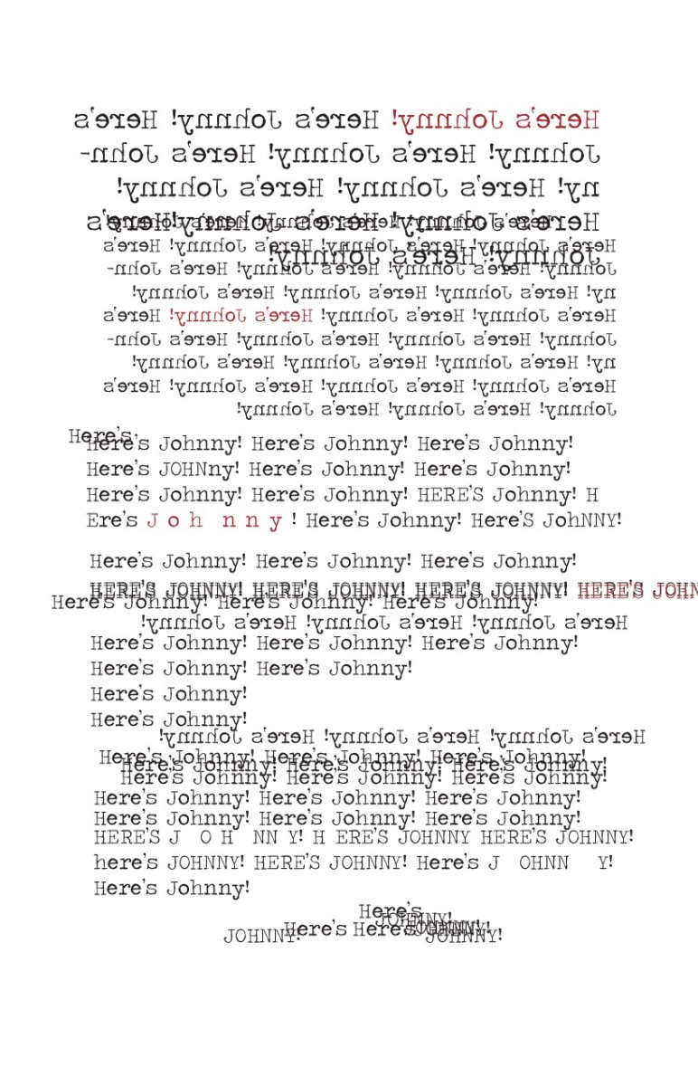

My third concept is a reference to the “All work and no play makes Jack a dull boy.” scene. In this scene it is discovered, by Wendy, Jack has been rewriting the same sentence a concerning amount of times. To replicate this scene I decided to use a typewriter font and repeat the quote “Here’s Johnny!”. To represent Jack’s state of mind is not well I made one of the quotes red in a different font.
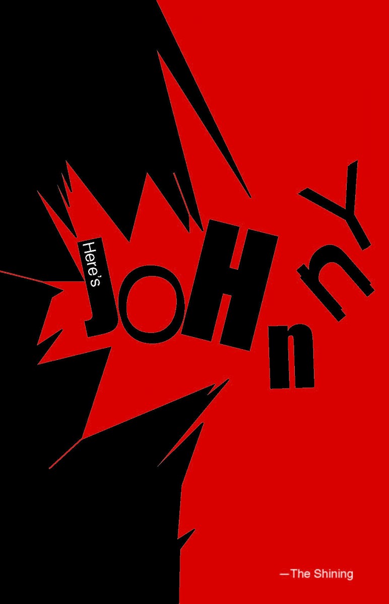
In this fourth concept, I reference the iconic scene from which I got the quote from, the “Here’s Johnny!” scene. I created an illustration of a broken object to represent the door. For the text, I paired different fonts and different sizes to represent Jack’s state of mind.
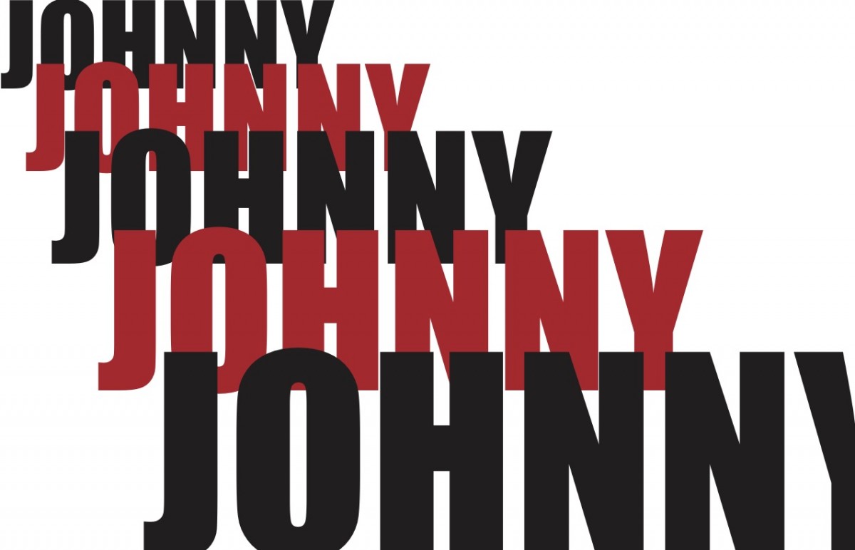
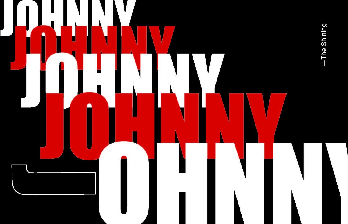
For my second concept I wanted to make the text “Johnny” seem threatening. To accomplish this I used the impact font, slowly increasing the size of the text. This way I could insinuate the text is coming closer. To throw the observer a little off I changed the letter “J” in the largest, closest, “Johnny”.
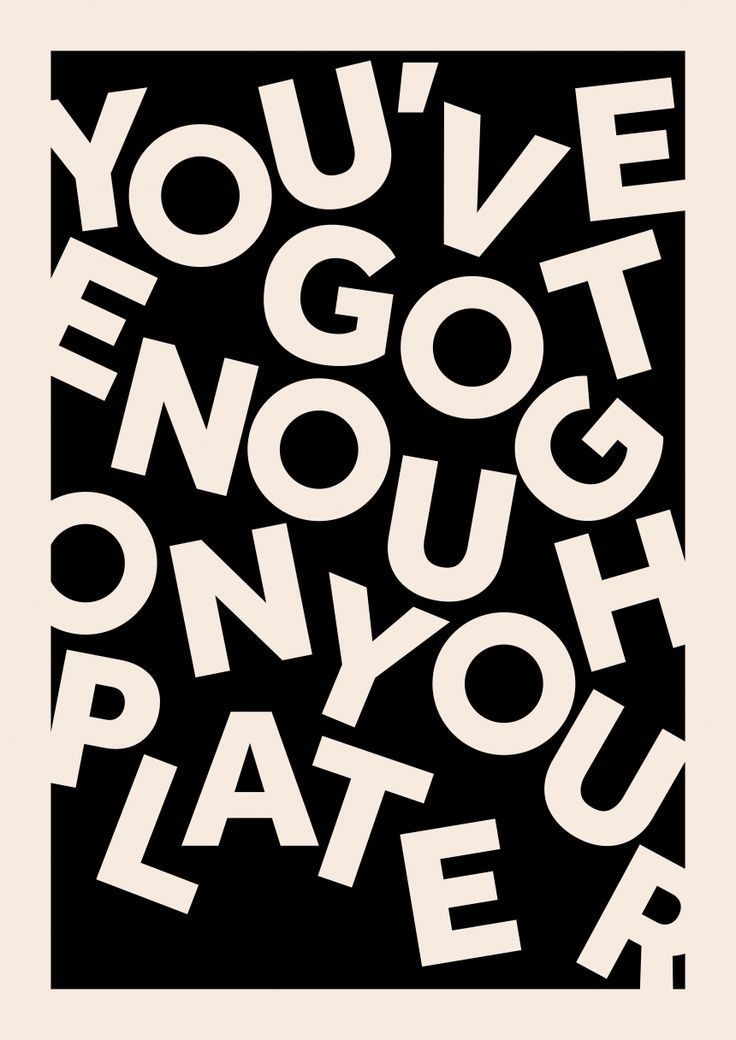
Scott Townsin – You’ve Got Enough on Your Plate, Know Your Shelf, Love Your Leftovers
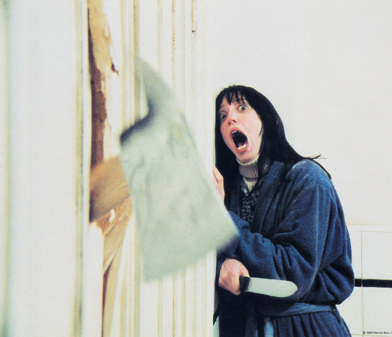
 For my sixth concept, I used an image. This image is a shot of Wendy looking over Jack’s work in the “All work and no play makes Jack a dull boy.” scene. It is at this moment Wendy realizes Jack is not well. To represent Jack’s insanity I used two different types of fonts and sizes. To represent Wendy’s sudden realization of her situation, I made the text seem as if it is surrounding and weighing down on her. I was inspired to place the type this way by Scott Townsin’s Design “You’ve Got Enough on Your Plate”

