Logo History Assignment
For this assignment we were required to write an essay on the history of a company logo of our choice. The essay would need to cover who had created the design and why some changes occurred as well as contain images of the logo and its changes. I had decided to choose the company Nestle because it is an old company with a rich history, likely to have many interesting changes to it’s logo.
Virginia Sanchez
09/15/19
CDMG 1112
NESTLE Company Logo History
Nestle was founded in 1866 by Heinrich Nestle, formerly known as Henri Nestle. The company had its breakthrough in 1867 when Heinrich Nestle created ‘farine lactee’, or flour with milk, with his medical knowledge as a pharmacist. This formula was created to combat high mortality rates among infants that could not be breastfed. At the moment the Nestle company sells a larger number of products such as bottled water, cereal, chocolate, coffee and much more.
Nestlé family coat of arms [Source nestle.com]
The original logo for Nestle was based upon Henri Nestle’s family coat of arms. This original illustration contained a knight’s head, a shield, and a single bird in a nest. The nest is a direct relation to Henri Nestle’s last name which means “Nest” in German. Although this logo was personal to the Nestle family, it wasn’t to the public.
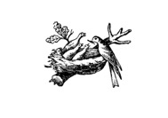
1868: Illustration of birds and nest [Source nestle.com]
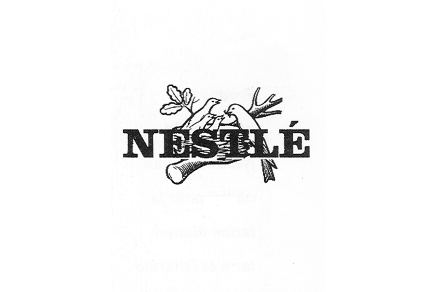
As successful as this logo was at communicating the company message, it was far too detailed and was missing the company name “Nestle”. The company name was added to the logo to unify all brands under the Nestle company. However, this text was added directly in front of the, now slightly lighter, illustration of the birds. Likely to improve legibility the text was moved below the illustration.

1938 Left 1966 Right: Wordmark is added on top of illustration [Source nestle.com]
Despite these photos having detailed illustrations of the classic birds, some ads would focus on the silhouette of the birds during this time. Others would focus more on the nestle wordmark. Looking at the ads for the Nestle company through the years, you can see there are a number of wordmark and color variations depending on the product. This was likely done to give each product its own sense of identity while still connecting it to the company.

Nestle chocolate bar advertisement from 1967

Nestle advertisements from 1939
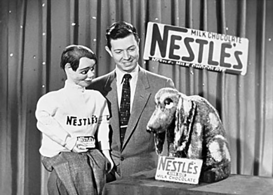
Ventriloquist Jimmy Nelson advertising Nestle
Nestle Baby powder 2019
In the latest versions of the logo, there are only two birds instead of three. As the years pass the logo continues to simplify to adapt to new trends. Overall, the Nestle company logo was only slightly changed over the years because it so brilliantly connects the company to the consumer.
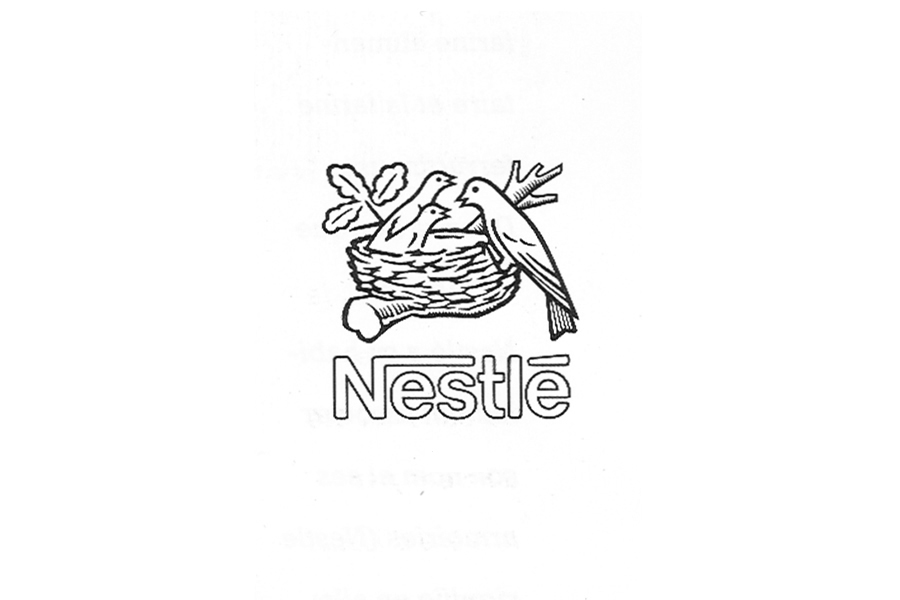
Nestle logo 1988
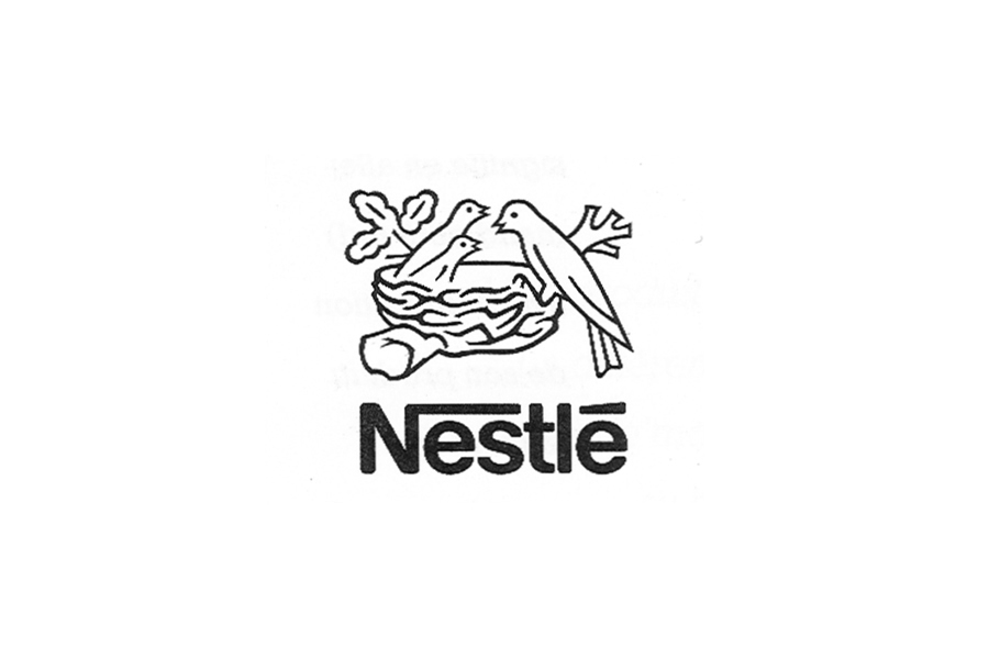
Nestle logo 1995

Nestle most recent logo 2015
References
https://www.nestle.com/aboutus/history/logo-evolution
https://www.flickr.com/photos/nestle/14212774816/in/photostream/
https://brandculture.com/insights/using-right-ingredients-nestle/
https://en.wikipedia.org/wiki/Henri_Nestl%C3%A9
https://en.wikipedia.org/wiki/Nestl%C3%A9
https://1000logos.net/nestle-logo/
https://www.nestle.com/aboutus/history/nestle-company-history

