Inspiration
The quote used for this project comes from League of Legends’ Burn It All Down ft. PVRIS. The lyrics are sung from the perspective of an underdog who is looked down by those around them whilst they bide time to strike back and show the world their potential.
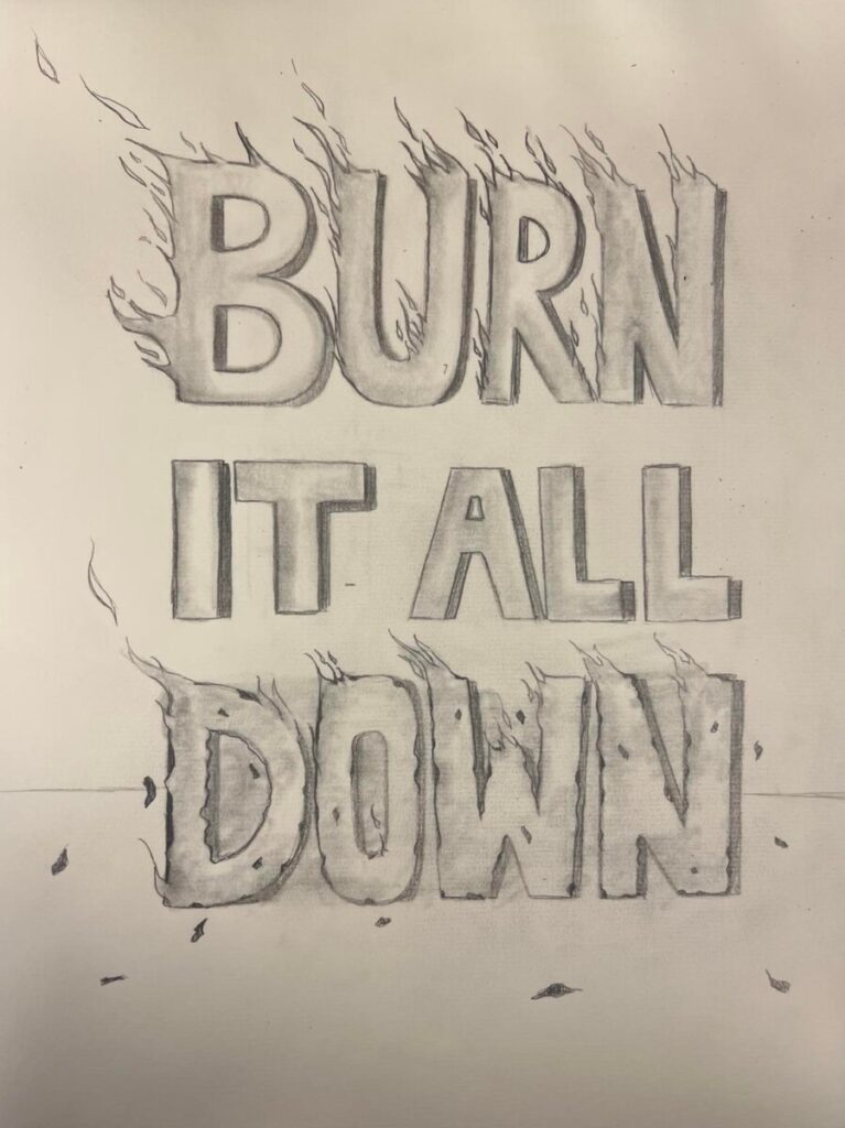
Sketch Concept
For my initial sketch, I focused on the literal meaning of the quote and drew fire burning from the words of “burn” and “down.” I left the words “it all” in tact as I was unsure of how to assign meaning that phrase. I decided that I wanted the phrase to stand out just like the attitude of the song itself, so I chose to sketch each letter out to resemble a condensed bold sans serif typeface. I smudged each letter as well to give the text dimensionality.
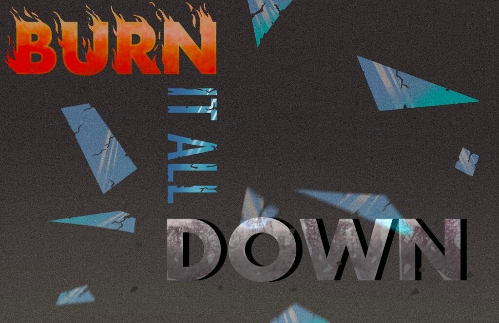
Draft 1 Concept
For this draft, I had decided to rearrange the text so that it is more dynamic rather than just floating at the center of the page. The typeface chosen is Futura. I decide to keep the idea of the flames coming off of the word “burn,” but I forewent this idea with the word “down.” Instead, I wanted the word “down” to hold the image of the aftermath of what is left after it has been burnt by the fire. In order to depict this, I drew ashes around the word and added a grunge texture to it. For the words “it all” I wanted to show that the things around us are fragile and will break if we seek for and work towards a way to accomplish the act—just as the song implies. To portray fragility, I decided to have the text “it all” appear as glass—a highly fragile material. I also added shattering pieces of glass in the background and added a motion blur effect to some pieces.
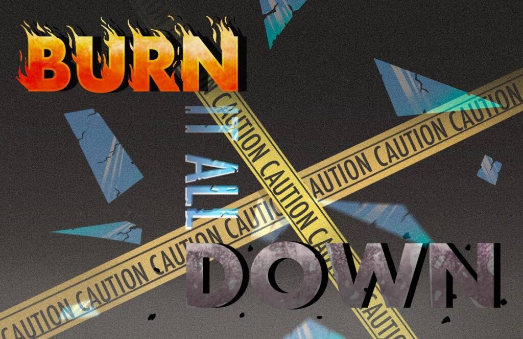
Draft 3 Concept
In the second draft, I added caution tape to the background as the previous draft’s background felt too plain. I wanted to convey the feeling of danger. I also realized that the texts “burn” and “it all” were difficult to read. To remedy this, I darkened the top of the graphic by airbrushing a dark gray under the the text “burn” and changed some values of the HSB for the “burn” layer until I was satisfied. For the text “it all,” I raised the opacity of the layer whilst maintaining the glassy look of it by gently erasing the bottom of the text with an airbrush. I also readjusted the text altogether as it was not centered to the canvas in the previous draft.
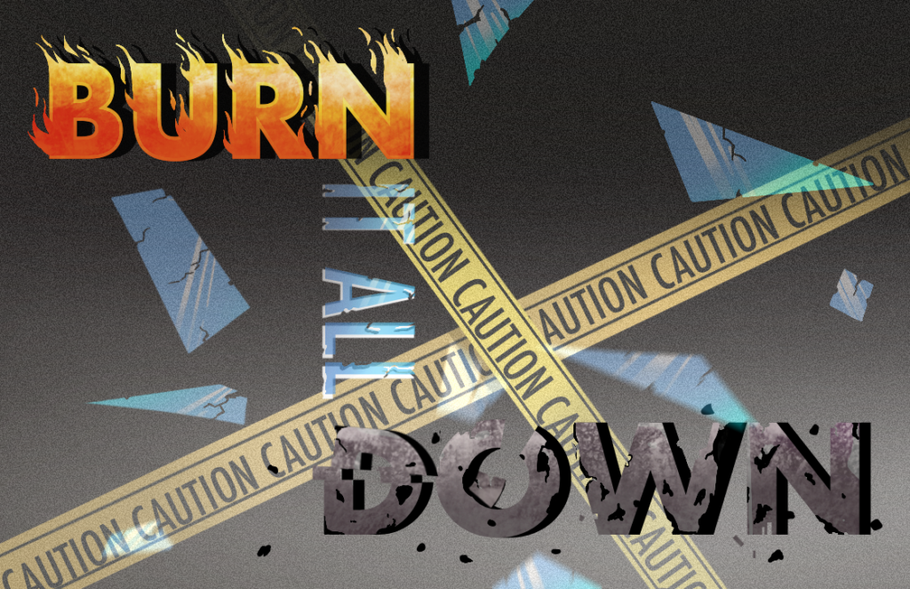
Draft 3 Concept
In the final revision, the issues addressed were in reference to the word “down” in that readability was impaired due to the closeness of the color of the word and the background. The second issue was that the word “down” was not consistent with the chaotic theme in the postcard and appeared too structured. I added visibility to the word “down” by brightening the bottom of the white portion of the background gradient. A damaged effect was also created by selecting pieces of the word and either deleting it or moving it so that the word looks less stable.

