Week 10: 4/2/2023–4/8/2023 | Featured Image by Angel Cuevas
text-to-speech
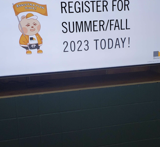
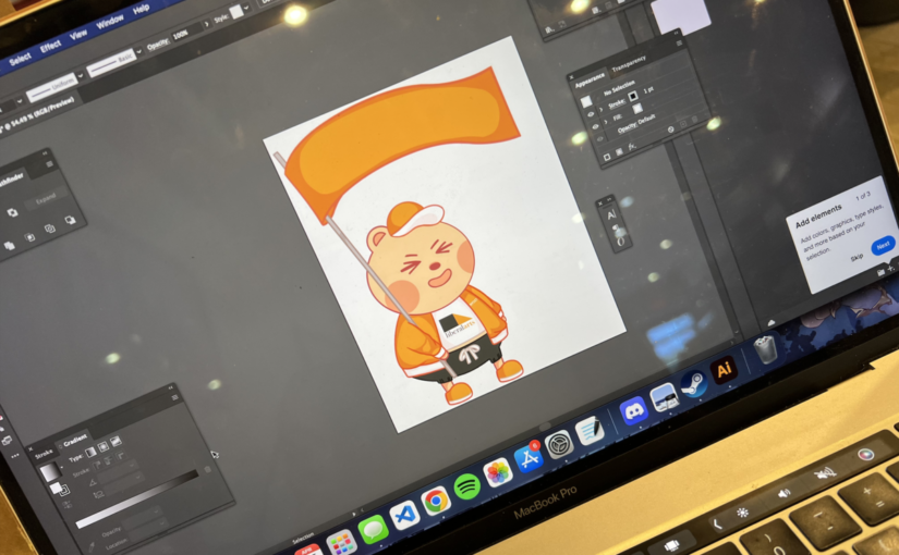
The mascot project has been completed finally. One of my friends saw my mascot design while walking through the school and kindly took a photo of it to show me (see featured image). It’s interesting to see my design in a new perspective. I hope that the future designers of my internship’s team will be able to reuse the design of Techy Bear for many years to come.
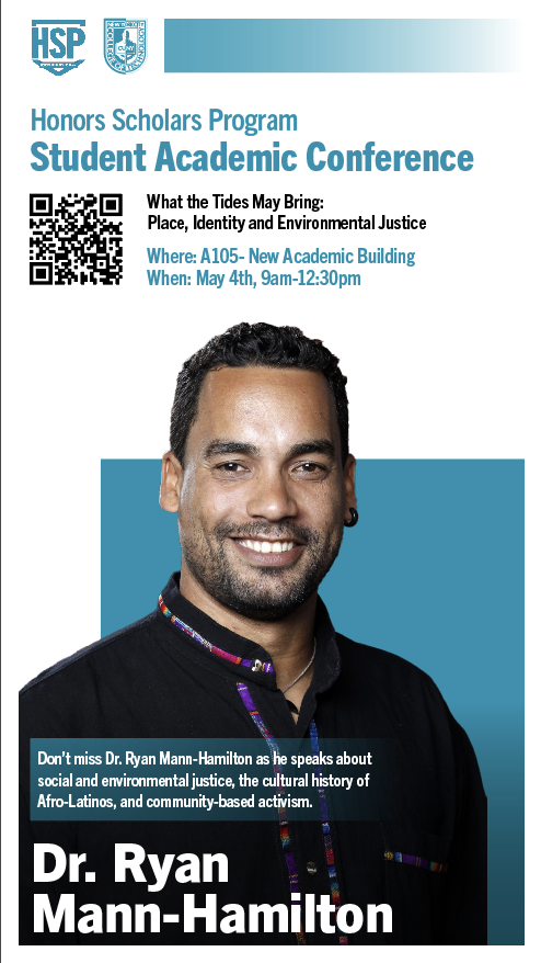
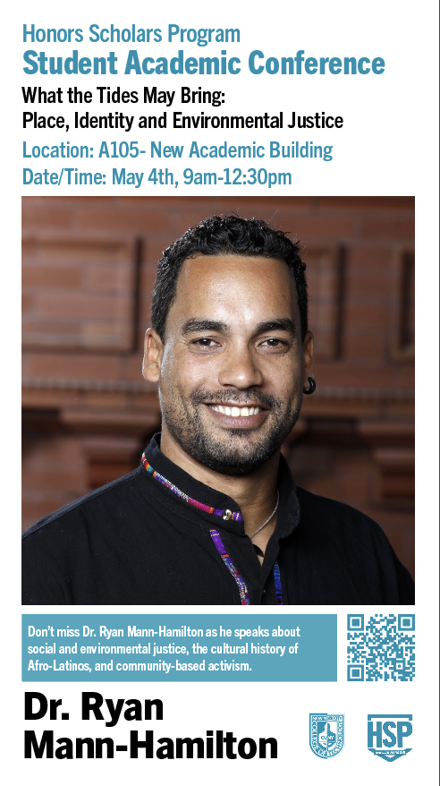
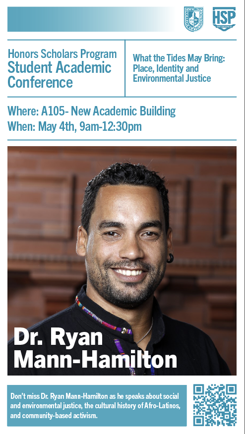
The client for the new project has also finally got back to me after a long weekend. While she initially expressed that she wanted to go with the second concept I provided in the three drafts, she later changed her mind after speaking with my mentor and proceeded to go with the first concept. See photos below.
Concept 1
Concept 2
Concept 3
At the moment, I am working on the other deliverables based on the conventions of concept 1. I hope to have all work completed before the 10th so that it can be sent to my mentor and supervisor for revision.
Week 9: 3/26/2023–4/1/2023 | Featured Image by Vivian Li
text-to-speech
For this week, I returned to working on the mascots project once again. Although I initially believed that I had finished the project, the mentor who I had ultimately handed off the deliverables to had reached out to both the client and myself. He informed that it might be worth producing a version of the mascots flipped horizontally so that posters and monitors that would feature the graphic may be designed prioritizing the hierarchy of the type rather than prioritizing the placement of the image. He had also suggested additional edits to one of the poses for the mascot so that text may be incorporated superimposed onto the banner (see featured image).
At the same time, I began working on drafts for the new client. For this project, I was initially instructed to produce three concepts for the poster so that I can establish branding. However, I was later contacted by the client and asked to prioritize working on the digital monitors because she wanted to have the event advertised to students before Spring Break ends. I communicated with her that doing so should be of no issue as I can easily translate the work I have done thus far for the poster design to the design of the vertical monitor slide. The work was then submitted to my mentor for review, and I was informed that all three designs were strong. Small adjustments were made in terms of hierarchy.
At the moment, I have submitted the designs to the client, and I am currently awaiting for feedback.
Week 1: 1/29/2023–2/4/2023 | Featured Image Yama Holocaust Memorial by Yaniv Ben-Arie
text-to-speech
For this semester, I will be working with the Faculty Commons Design Team at City Tech, which assists with providing work to faculty and staff within City Tech. While I am not going to be graduating for another two semesters, I wanted to start taking on internships as early as possible so that I would be able to earn more experience before I graduate. As such, I obtained permission to take the internship course last semester from one of the department’s advisors. I was recommended by my Communication Design Theory professor from the previous semester to apply for this internship, and after refining both my resumé and portfolio, I submitted my all necessary documents along with my application. Two weeks later, I was given the opportunity to take on the position and join the team.
At the time, I have completed training for my internship in January. The team and I also met this Wednesday, and it was determined that myself as well as the other intern would be assigned a mentor for the first project we are given.
I was tasked with designing a poster/flier for an E-Mail blast, a web banner, and slides for monitor displays for an upcoming exhibit, which means that I will be working in the RGB channel for the most part. So, I won’t be limited with color usage. Still, I will first need to develop an identity system/branding for the project, which will be a welcomed challenge.
I am excited to work with my current mentor as I have previously received feedback for my work before from her, and I found her to be very honest and straight to the point. Her portfolio also shows work that I am interested in learning how to create myself. I’m sure I will learn a lot from her and I’m looking forward to developing my existing skills as a designer.
Before I get started with the project, however, I must first meet with the client. Thus, I have touch-based with my mentor and sent out an E-Mail to introduce myself to the client. It seems that they already have an image that they want to work into the deliverables. (See featured image above post). I am currently waiting for their response to set up a meeting time either via Zoom or in-person. During my training, the senior designers as well as my supervisor reviewed the basics of professionalism when working with a client. Although I am quite introverted and not much of a speaker, I intend to apply this to my meeting with the client so that I can produce the best results to my abilities.
It is slightly nerve-wracking, but I am aware that public speaking is a hurdle I must overcome and grow accustom to—even if I would prefer not to do it.
A Look Into Digital Artist and Designer Yuumei and her Influence
Wenqing Yan A.K.A Yuumei
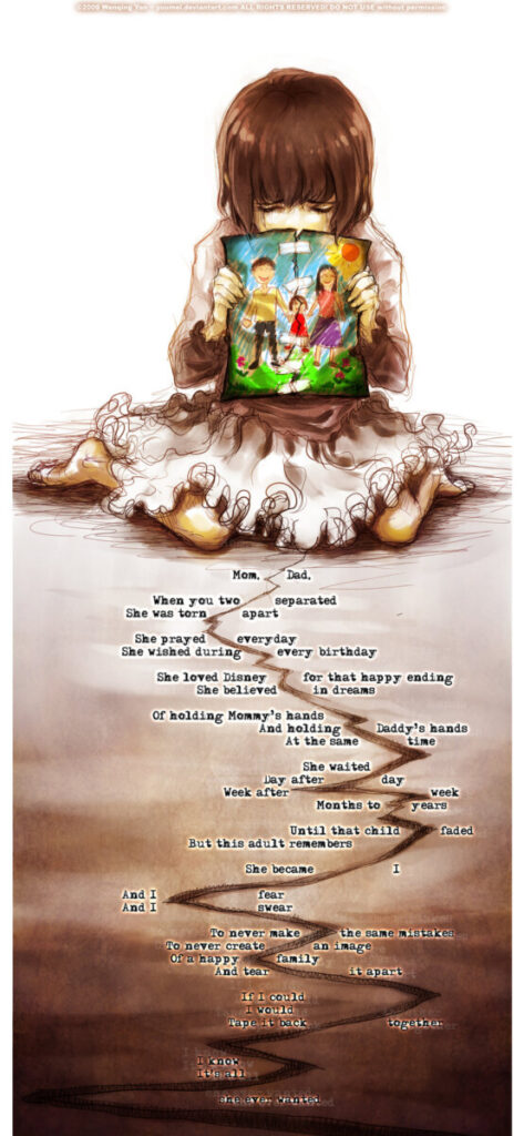
The artist chosen for this assignment is Wenqing Yan, who is better known as Yuumei to her fans online. Yuumei is a Chinese-American digital artist and designer who became popular in the early 2000s via the online art community DeviantArt. It was some years later when I, an awkward teenager who spoke more words to online trolls than to my own family at the time, found myself making an account in that same online community where I discovered her work. The work that captivated me was an illustration titled “Tape It Back Together” which depicted a young girl (who is presumably Yuumei herself) holding up a torn up drawing of her family that she had desperately taped back together followed with cleverly placed text that both tells and shows of the rift between the little girl’s torn up family. The illustration had struck a nerve within me because while my own family was nowhere near the physical separation depicted in her illustration, there had always been a divide that separated us from one another despite our façade of a happy family. The more I learned about Yuumei, the more I began to realize that “oh, I relate to her because she’s like me. There’s others like me out there. I’m not the only one suffering.” Her works helped me recognize my depression, which in turn prompted me to desperately work towards a better outlook in life lest I wish to spend my life wallowing in self-pity.
“Tape it Back Together”
The creative process is an interesting journey to explore because no matter which artist one might ask, the response for said process is always different from one artist to another. In the words of Yuumei, “Art is the language through which I interact with the world and with myself. It is a flurry of emotions, a stream of consciousness and subconsciousness. The creation process is also a journey of introspection. It helps me process and understand the events in my life, the society around me, and where I stand within it all.” For Yuumei, art is something that is closely linked with her emotions and outlook. In her retelling of her childhood, she explained that she created her first activist drawing titled “Selfish” when she had returned to China to visit her father. At the time, the government had issued an order for all dogs in the neighboring provinces to be slaughtered and had explained that it was done so as a precaution of rabies despite the fact that vaccinated dogs were not excluded from the tragedy that took place and despite the fact that the international free vaccines that were offered were refused. Yuumei’s activist drawing “Selfish” received countless responses from netizens who expressed that Yuumei’s art had “opened [their] eyes.”
“Selfish”
Due to a split in her family, Yuumei grew up in the care of her grandparents and spent the first nine years of her life in China where she had attended Chinese art classes that focused on realism. She eventually obtained her visa and traveled to America to live with her then single mother. Yuumei was at the center of a custody battle between a father who had one too many lucrative get-rich-quick schemes in China and a depressed and suicidal single mother in America. At the age of 12, Yuumei joined the online art community DeviantArt and began to garner much recognition there. Much of her work is influenced by nature, personal experiences, and the “beauty and complexity of life” in her words. She is known for her webcomic “Fisheye Placebo” and her participation in founding the Axent Wear company. Despite having a very apparent gravitation to illustration, Yuumei also practices sculpting, photography, design, and storytelling when she is not illustrating.
Yuumei’s Axent Wear Headphone Design
Much if not all of Yuumei’s works are created with purpose. She has previously described herself as both an activist and a lover of animals and nature, which is apparent throughout her works. One of her first activist drawings, “Selfish,” was done so in response to China’s choice to indiscriminately slaughter all dogs in her neighboring provinces. The positive response to this piece is what propelled her to continue her expressions of activism via her art. In her webcomic “Fisheye Placebo,” she tells the story of how the main character is roped into a conspiracy to expose the corruption of an authoritarian regime in a world overrun by extensive censorship. Despite this webcomic being vastly successful at first, it was eventually linked to the 2019–2020 protests in Hong Kong. As a result, Yuumei was spammed with hateful and negative comments over her social media platform which even led to her being temporarily shadowbanned on Instagram. Not once did Yuumei stand down, however. In fact, the artist, spoke up against the wumaos (internet commentators who are hired by authority figures in China to essentially manipulate the public opinion) who tried to discredit her, solidifying her stance in support of Hong Kong and earning the much approval from her growing audience.
Fisheye Placebo Panel
Yuumei’s art is inspirational and she has served as a role model for me from my early teenage years. As an introvert myself, I resonate with her thoughts on the creative process in that art is not just something to look at. It is a language, it is an expression of emotions, and it is something that can deliver a powerful message. Through her activist drawings, I had my eyes opened to the ugliness and cruelty of the world countless times. Through her art, I am encouraged to express my emotions in its truest forms. Rather than just inspiring me to be a better artist, I feel that Yuumei also inspires me to be a better person overall.
Brand Identity Timeline: A Look into the Rise of Adidas
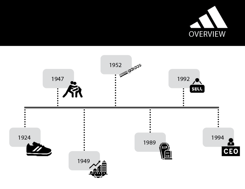
Today, Adidas is known as one of the largest sportswear manufacturers in the world, but this was not always the case. The story of Adidas began in 1924 when Adolf “Adi” Dassler and his elder brother Rudolf Dassler dove into the business of shoe making from the depths of their mother’s scullery. At the time, Adidas was not known as “Adidas.” Rather, they went by a different name—the Dassler Brother Shoe Factory.
The brothers went on to set their first few successful milestones that ranged from providing the 1924 Gold Medalist Lina Radke to assisting in the development of the spiked running shoes for multiple athletic events. During the 1936 Summer Olympics, Adi Dassler had gifted the U.S. sprinter Jesse Owens one of his own handmade spikes to use. As a result, the Dassler brand began to receive more recognition around the world.
In 1947, the Dassler brothers split up due to a personal disagreement. The brothers branched off, forming companies of their own whilst remaining in the sportswear industry. In 1948, the elder Dassler brother, Rudolf, had gone off and formed his own company then known as Ruda, which was later rebranded to the more widely recognized Puma of today. Meanwhile, Adi Dassler formally formed a company of his own and registered it under the name Adidas AG (an abbreviation of his own name) just a year later on August 18th, 1949.
The Dassler Brothers
In 1952, Adidas registered its first out of the many logos used to represent its brand—the three stripes. Dassler had intended to register the 3-stripes logo as a trademark of his brand only to learn that the 3-stripes logo had already been registered under the Finnish sportswear brand, Karhu Sports. With some luck, Dassler was able to acquire the 3-stripes logo through a trade of two bottles of whiskey and the equivalent of 1600 euros at the time.
In 1970, Adidas worked with the FIFA World Cup. In order to improve visibility of the ball during soccer matches displayed on black and white television, Adidas had both designed and delivered the TELSTAR soccer ball to the 1970 FIFA World Cup. This consequently resulted in Adidas’ delivery of the official match ball for every FIFA World Cup thenceforth.
TELSTAR Soccer Ball
Adidas’ second logo, the trefoil design, emerged due to a rebranding campaign in 1971. At the time, each leaf of the trefoil was meant to symbolize North America, Europe, and Asia—the three continents that Adidas shoes were sold in. Presently, the trefoil is associated with the Adidas Originals collection which have symbolized performance in the past. Now, instead represents lifestyle and street.
On September 6th, 1978, Adi Dassler passed away, leaving the company behind for his son, Horst Dassler, and his wife, Kathe Dassler. Horst Dassler’s reign over the sportswear empire was short lived, however. Three years after his mother’s passing, Horst followed suit in 1987, leaving the company to become a stock corporation. Adi Dassler’s daughters resolved to sell their shares in 1990 and exited the company after doing so. With so many changes in leadership, the company faced bankruptcy until being rescued by their then new CEO, Robert Louis-Dreyfus, and brought back into popular demand in 1993.
In 1997, Adidas changed its name to Adidas-Salomon AG as a result of their acquisition of the Salomon Group, which included brands such as TaylorMade, Mavic, and Bonfire. Herbert Hainer became the new CEO in 2001 and continued his efforts into innovation. From his efforts, ClimaCool, Adizero, and the F50 Football Boot were launched.
At the same time, Adidas began to branch out into streetwear apparel and opted to collaborate with Yohji Yamamoto (2001) and Stella McCartney (2004) to promote their new campaign. David Beckham and Haile Gebrselassie joined to promote one of Adidas’ largest marketing campaigns in history “Impossible? Just a Big Word” which centered on the idea of facing one’s fears, defeats, and challenges head on to disprove impossibility.
In 2006, the Salomon Group exited the Adidas team when the group and its brands were sold to Amer Sports. In turn, Reebok joined just one year after these events and with it came the brands: Rockport and Reebok-CCM Hockey. Adidas was once again known as Adidas AG. In 2011, Adidas acquired Five Ten footwear.
Brand Identity: Adidas’ Logos
Adidas Logos
The most recognizable aspect of Adidas’ many logos are its 3-stripes. However, those 3-stripes had not always been the trademark of Adidas. Dassler did not start off Adidas with the intention of having the 3-stripes representative of his company’s logo. In fact, the stripes that had been placed on some of the earlier shoe designs served a functional purpose to stabilize the spikes of the cleats. Dassler had experimented with the design of the shoe having it range from 2 to even 4 stripes on each shoe. Eventually, the 3-stripe logo was acquired through Dassler’s trade with Karhu Sports.
The 3-stripes motif then branched out into other logos that were each meant to be representative of different aspects: the trefoil design (casual apparel and shoes), the mountain design (performance line), and the circle (style collections). The trefoil design is often associated with the large success of the 3-stripes company as the design appeared on the back of the Superstar shoes worn by Run DMC, which garnered much popularity for the brand. The mountain design is featured on products meant for performance for professional athletes, and it promotes the messages of “the challenge to be faced” and “the goals to be achieved” when wearing products from the performance line. Lastly, the circle design is featured in products created in collaboration with famous designers such as Yohji Yamamoto.
Brand Identity: Adidas’ Marketing Strategy and the Message Behind It
Adidas’ success can be credited to the hard work and perseverance of Adi Dassler in the 3-stripes company early years. In 1924, the German Runner Lina Radke became a gold medalist while wearing the Dassler shoes. Consequently, this propelled the company on its way to the beginning of its success.
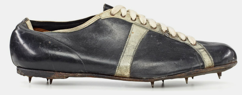
The 1928 Modell Waitzer worn by Lina Radke.
Similarly, in 1936 Adi Dassler had gifted the U.S. sprinter Jesse Owens one of his own handmade spikes to use, and when Owens had emerged victorious with 4 gold medals, the brand’s popularity grew once again.
Moving forward to the present, while Adidas’ marketing strategy has become more refined, it remains to be a company that appeals to athletes. In these modern times, campaigns such as the I’MPOSSIBLE movement was launched to empower women and break the limitations society has placed on women with the word “impossible.” Adidas also explores sustainability in its End Plastic Waste campaign. In each one of these marketing strategy, Adidas opts to appeal to its audience through inspiration. In the case of the I’MPOSSIBLE movement, Adidas is appealing to women and inspiring female empowerment. In the case of the End Plastic Waste campaign, Adidas appeals to its global audience by calling them to action to take a stand against waste and work towards sustainability. At the same time, doing so also cleverly places the 3-stripes company in a good light, building up their reputation.
“Story of Adidas – Article.” Historydraft, 1 Jan. 2020, https://historydraft.com/story/adidas/article/418.
Maguire, Joseph Anthony , Rowe, David Charles , Guttmann, Allen and Thompson, William N. “sports”. Encyclopedia Britannica, 16 Sep. 2021, https://www.britannica.com/sports/sports. Accessed 8 March 2022.