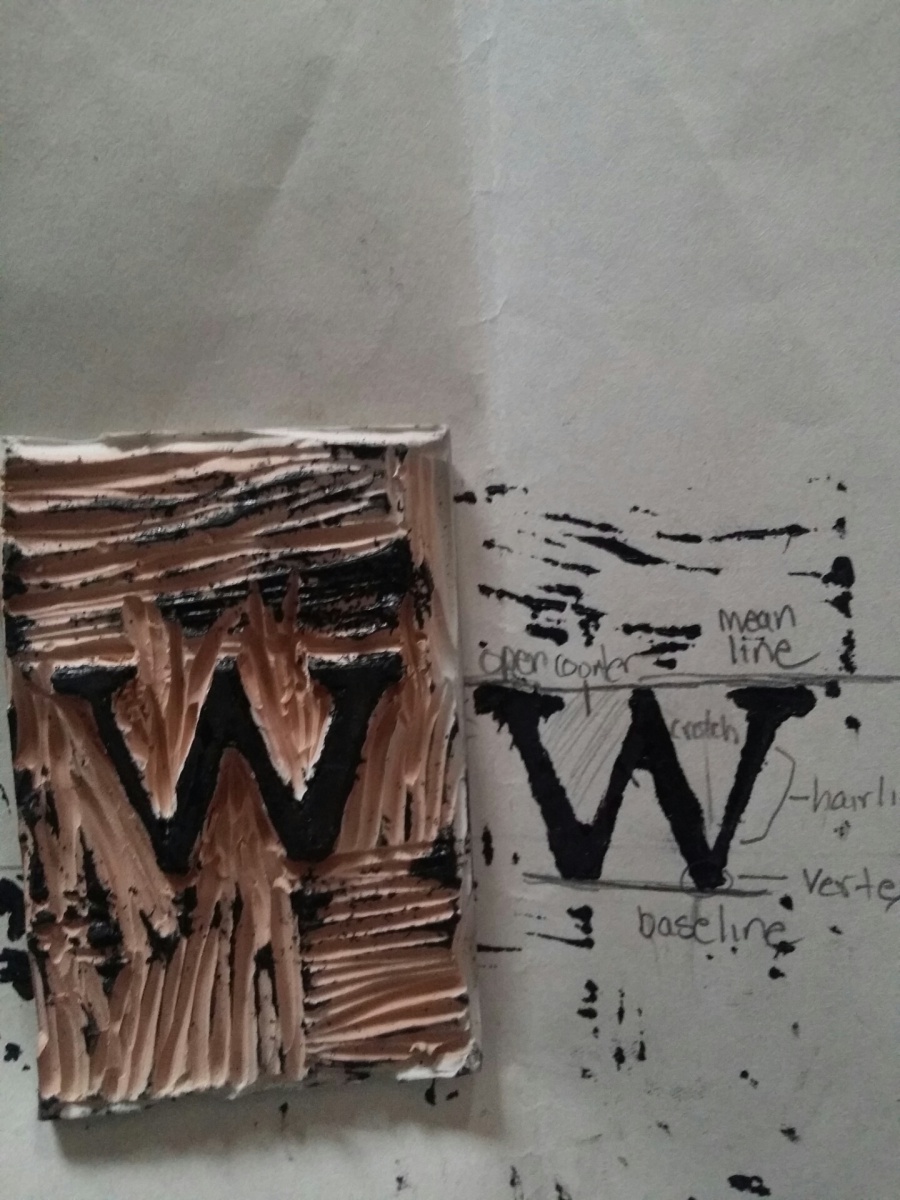
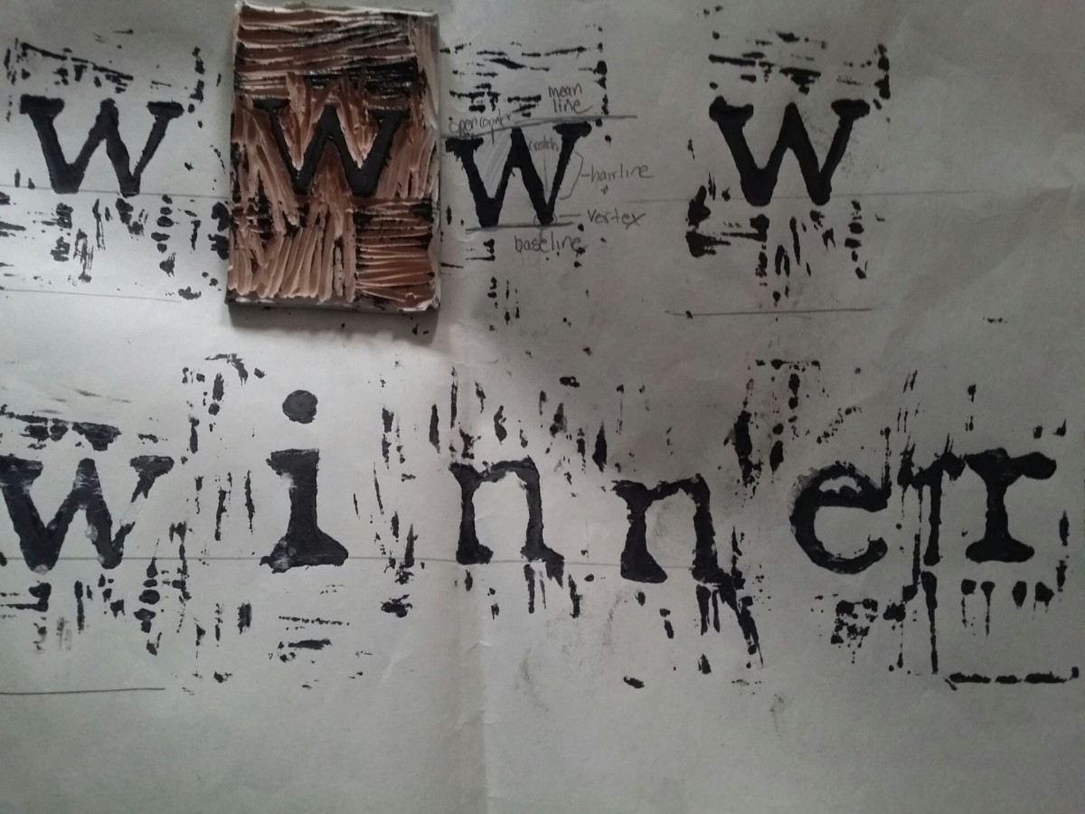
Monthly Archives: February 2014

Week 5, Class 2

Classwork

Text

  • Alignment
  • Analysis of which ones work best and under which circumstances.
  • Tracking
  • How it is measured
  • Its impact on meaning

Type Book: Alignment

Create a 1-page document. I will supply text to be positioned using all 5 main alignments. Here is the Type Book: Alignment handout.

Homework:

Journal Research Project, Due March 14:

Pick a culture, either one from which your family derives or one you are interested in. Research the typography that that culture uses, find videos or samples, names of graphic designers or typographers, posters, ANYTHING you can find on that subject. Write at least 3 paragraphs in your journal on what you have found. I will show you how to link to files and such today. We will have a class discussion, showing what everybody turned in on the 14th.

Journal for next week:

  • Find examples of a lightface immediately placed after a bold face or vice versa
  • Regular and italics on the same paragraph.
  • Examples of the five different kinds of alignment discussed in class.

Week 5, Class 1

Classwork

Today, we will start with our quiz, the first one of the semester. I tried ti trim it down to really ficus on what we actually covered in class.

Text ŸŸ

  • Review of some material: leading, history of typography
  • Width/Weight/Posture
  • Stress/Contrast/Serifs
  • Introduction to the main visual differences of type
  • Analysis of visual characteristics of a font based on weight, width and posture and on letter stress, contrast and serifs

Type Book: Variations
Create a 6 page document. Each page must show a sampling of 3 characters comparing variations of type within each category discussed in class. Here is the Type Book: Variations handout, in case you lose yours. Here is the Class Template.

Example/Weight:
One character in a light face, one character on a regular face, one character on a bold face

Homework

Finish Classwork: Please READ THE INSTRUCTIONS. I am getting a lot of assignments that are just inexcusably messy or off base. You need to care more about what you produce.

Journal (due tomorrow):

  • Find three instances of bad kerning, why do you consider these bad?
  • Find three examples of varied leading (tight, comfortable and loose). Are these appropriate to the layout? Does the leading add any meaning to the message?

More Type in the Wild

There is just so much to see… More type I noticed out in the world, served up hot for you!

Some great advice on getting a job

You may be a while away from needing this advice, but I found this so invigorating:

How to Get a Job at Google

I’ll sum it up very quickly. Grades are not helpful in choosing great candidates for Google (or any employer, if they are doing things the right way). What matters are these skills:

  1. General cognitive ability, or the ability to learn: not I.Q., as that does not measure an individual’s determination or grit or anything beyond a few specific skills. Intelligence is in fact NOT a fixed attribute. It is grown, cultivated, and maintained over time. Your brain literally changes on a molecular level when you stimulate it. No matter what your fifth grade teacher may have told you, you have an infinite capacity to change things and kick butt.
  2. Circumspect leadership: when the poo hits the fan, can you step up and lead? When you are not the right choice to lead, can you step down and be a team member without drama?
  3. Intellectual humility: Stay teachable and take responsibility for your continued, lifelong learning. Be ready to teach and learn with all of your teammates. Even the lowly intern!
  4. Ownership: Learn how you learn, develop metacognitive skills, make yourself a joyful and willing learning machine! When you make a mistake, own up and correct it immediately and openly.
  5. Expertise: This is literally the least important because it is in fact a byproduct of the first four and the least lasting. You have to constantly renew your expertise, so maintain beginner’s mind. No ego!

To quote:

“Your degree is not a proxy for your ability to do any job. The world only cares about — and pays off on — what you can do with what you know (and it doesn’t care how you learned it). And in an age when innovation is increasingly a group endeavor, it also cares about a lot of soft skills — leadership, humility, collaboration, adaptability and loving to learn and re-learn. This will be true no matter where you go to work.”

Week 4, Class 1

Hello everyone! I missed you guys!

Classwork

InDesign

  • Multi-page documents: please use this template as i found a little mistake in the old one.
  • Page Panel
    • Master pages
    • Pagination
  •  Downloading and installing fonts
  • Well-crafted fonts vs. badly-crafted ones
  • Types of font files

Note: If you do want to grab a new font please download and install fonts from Font Squirrel or Lost Type Co-op. They are well drawn, legal, and usually pretty darn lovely.

Type Book: Assignment 2
Create a 5-page document. Each page should have 1 layout with specific characters of each of five families of type. Each page must display a sample of a font within a specific family, and list characteristics. See the Typebook, Exercise 2 handout for more details.

Homework

Finish Classwork

Study for Quiz 1

  • History of Letterforms
  • Typographical Anatomy
  • Drawing a Letterform
  • Kerning, Leading
  •  Five Families of Type

Relief Printing

My first time doing relief printing was bit of a challenge for me, but at the same time it was quite exciting. Being exposed to this kind of art was very eye opening. I was unable to identify ten different types of typographical anatomy with my letter, and was only able to find six. It was interesting to find out the different names for the terms and how similar some of the names are related to human body parts.2014-02-21 12.43.59

Again I repeat, this being my first time attempting relief printing it was a tough task.  I believe I could of done a lot better with the kerning. The spacing was to far apart and I was not able to get some of the letters on the baseline. I still had a lot of fun part taking in this and I feel like I have a better understanding of type and its anatomy. I find myself now more aware of how the type looks off and how it should look.2014-02-21 12.38.12

More type on the fly

I was in Queens getting my taxes done and the typography was just amazing: some great, some bad, and all of it pretty dated. I suspect the neighborhood is pretty working class, not a lot of new revenue coming in. Good people with mainstream tastes, maybe.

Then I found myself in Park Slope, not in the frou frou part, but the still fairly middle class area near 15th Street. Once again, there was some great work–mostly from a while ago when the neighborhood was up and coming. The more recent stuff was pretty blah or badly designed.

Week Three, Class Two

Let’s get back into the groove! Here’s a lovely video that will get us back into the mood for type:

Lecture:

Layout

  • Working on the Grid
  • Rules, strokes
  • Exploring InDesign: review
  • Guides, margins, and other layout aids
  • Project #1: The Type Book: Choose a performer, famous person, or fictional character about whom you will write your type book assignments. You will use this person’s name or text about them to tie the exercises together thematically.
    • How to create Type Book assignments:  
    • Type Book: Create a 1 page document which labels the following type components: baseline, meanline, capline, serif, counter, x-height, ascenders, descenders.

A note about the Typebook:
You need to collect all your assignments at the end of the semester to print the project out as a spiral bound book. I will have a sample today in class for you to see. You need to keep track of all the pages, and you need to turn them in on time.

Homework

Reading
Review The Five Families of Type

Journal: Due by Next Thursday

Find examples that use a typefaces that belong to each of the five families of type. In what scenario are they used? Put the printed examples together with paragraphs describing the family to which you think it belongs and why.

For example, find and identify a typeface that belongs to the Modern family. Describe what helped you classify it and why it may have been chosen for that particular layout.