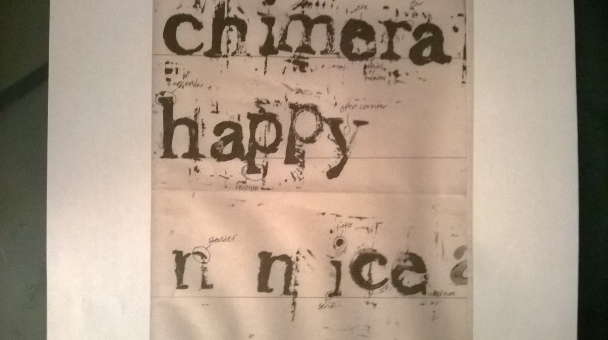
The word “nice” that is on the bottom does not work. The leading is misplaced and slanted. As well as the kerning being too far apart between the “n” and the “i” meanwhile the rest of the word is placed well together. The word “happy” that is above it is better but the kerning is much too tight between the two “p’s”. The word “chimera” on the very top works the best out of the three. The work is well spaced and the letting is well done and spaced well.


Excellent breakdown of the work you did during the printing! I would like to take a moment to go back over the term “leading.” It refers to the amount of space between the lines of type. The baseline is what I think you were referring to when you examined the word “nice.” You are absolutely right, the letters are jagged and not sitting on their shared baseline evenly.
You are definitely developing a sensitivity to the typography you are producing. Keep it up!