William Luperena
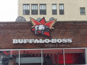
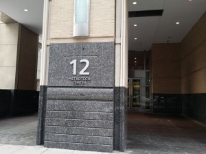
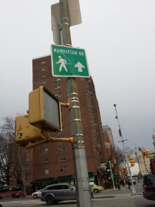
Being that I spend most of my time in or around City Tech, I consider this my neighborhood. The type in the neighborhood varies completely because of what this neighborhood consist of. Part of it is commercial because we have the Fulton mall, but then we also have court and school buildings. I have learned the type varies due to make up of the neighborhood. While walking through the Fulton mall area, I have seen all kinds of extravagant type. However, while walking by the court and school buildings they seem to be a little simpler. In addition, the colors of the type in the Fulton mall are much more vibrant than the colors of the court buildings, which are dull.
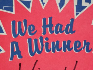
As far the type being well crafted, the school buildings and courts had type that was done professionally. I can say the same for the bigger stores in the Fulton mall such as Gap, H&M, Macy’s, and Footlocker. In addition, there are some fast food restaurants that have their type professionally done as well, such as Mc Donald’s, Burger King, and Wendy’s. However, when it comes to the mom and pop shops, their type looks not as skilled. With the mom and pop shops, some of the type looks like it was handmade. They also seem to have the same kind of type.


William, I like the fact that you are noticing the difference between the professional-looking type on the big stores, courthouse, etc. and mom/pop shops. It would be interesting for you to try and identify the different typefaces you selected by taking your images and uploading to the website at http://www.myfonts.com/WhatTheFont/ and see if you get any matches in their database or from their “type expert.” All the best, T. Goetz