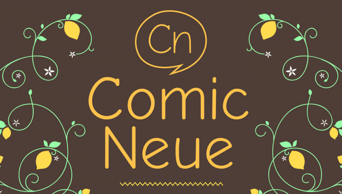
Someone has redrawn Comic Sans, it is looking pretty darn good!
Category Archives: Amazing Typography
Typography from Saturday
- Hand Lettering from the old Fulton Mall glory days
- It’s rusty but lovely…
Signage Comparison from my Apartment Building
- In the old days, people apparently really valued maintaining a consistent, friendly tone at my apartment building. This sign was designed with a great deal of optimism. The signs that follow were added in later years, proving that the management is no longer so concerned with tone.
- This one is the least effective from a design standpoint. The bulleted list throws the whole thing off, the leading bugs me… Nice use of mixed type sizes, though.
- This one is so dour, but the layout is reasoned, effective, and consistent.
More Type on the Run
- This information is so important, not one of the 459 people who have painted the door has obliterated it. That is one important number…
- The type is fine except that the legs are so odd… are they on the same person? Was that person terribly hurt???!? It troubles me.
A moment in Type
- I know, it’s a bad match, but it adds a lot of character! The question is, is it the right character? How can mixing typefaces work for a client?
More Type in the Wild
- I know its hand lettering, it’s not strictly typography. But WOW. Beautiful.
- This is a mouldering sign at the laundromat near my house, hand painted on disintegrating poster board. It’s so lovely the owner can’t seem to bear to replace it.
- This is an odd one for me. Some good things, some bad things.
- Man, who let this happen? This guy is obviously working his butt off but he looks really unprofessional because the designer didn’t know what he/she was doing.
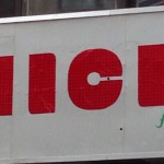
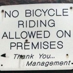
There is just so much to see… More type I noticed out in the world, served up hot for you!
More type on the fly
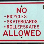
I was in Queens getting my taxes done and the typography was just amazing: some great, some bad, and all of it pretty dated. I suspect the neighborhood is pretty working class, not a lot of new revenue coming in. Good people with mainstream tastes, maybe.
- Gorgeous, probably hand drawn, but the paint job is so even, I think it was screenprinted.
- So sad and lifeless. Not terrible, but no soul.
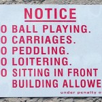
Then I found myself in Park Slope, not in the frou frou part, but the still fairly middle class area near 15th Street. Once again, there was some great work–mostly from a while ago when the neighborhood was up and coming. The more recent stuff was pretty blah or badly designed.
- Gorgeous! I love this so much!
- This terrifies me as a parent, offends me as a designer, and nauseates me as a person. SO much wrong here in my opinion…
Oh, this is just so WRONG…
Human type for KEROZEN
This design agency realized it had seven team members and seven letters in its name. Hence this CREEPY set of human-inspired letters… I am so skeeved out.
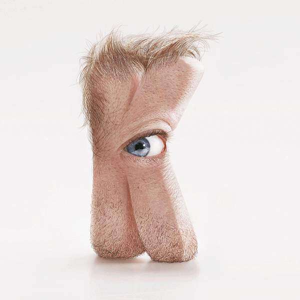