Monthly Archives: February 2014

WP_20140213_002

The word “nice” that is on the bottom does not work. The leading is misplaced and slanted. As well as the kerning being too far apart between the “n” and the “i” meanwhile the rest of the word is placed well together. The word “happy” that is above it is better but the kerning is much too tight between the two “p’s”. The word “chimera” on the very top works the best out of the three. The work is well spaced and the letting is well done and spaced well.

Our class is cancelled today

Once again, to clarify:

I am not able to make it to school. Therefore, our class is cancelled. I have notified the office, but have not heard back, so I do not think there will even be an attendance sheet on the door. School has yet to be cancelled, but I am canceling our session for today as I cannot be there. We will be meeting tomorrow.

Journal Homework & the Weather

Hey there!

  1. As far as the CUNY system is concerned, we have class today. Absences will count the same as always, but seriously do not risk your lives if it gets too dangerous. Do the work, contact your professors, make every effort to keep up with your classes. If we do get cancelled, I can easily meet you on Skype to answer questions. Snow days are not breaks from doing the work, they are just safety precautions in terms of the commute.
  2. I am not getting many journal entries at all, nor have most of you completed them. Just to remind you, they are counted as a part of your grade, so step up! If you need help with anything, tell me in class. I am glad to help!


Week Two, Class Two

Today we PRINT!!!

Homework:

Journal: 

  • Take your best print of a single word, draw in and neatly label at least 10 parts of type anatomy. Scan it or take a good photo of it and post the results on Open Lab. Use the handout from last week as a reference.
  • Take your best and worst prints of stacked words and write a paragraph about why one works well and the other does not in terms of leading. Once again, take a picture and put it on your Open Lab site.

Carving Our Letters!

Okay, can I just say today was an excellent class!?? We did have 2 small boo-boos, but other than a teeny tiny little bit of blood loss, the letters are looking AMAZING. Here are a few I was able to immortalize today:

Typography in my Neighborhood

William Luperena

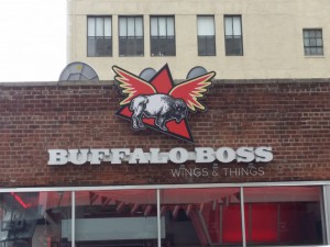
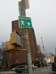
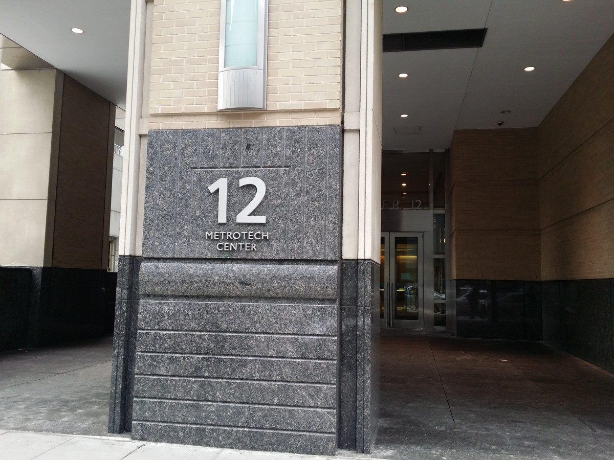
Being that I spend most of my time in or around City Tech, I consider this my neighborhood. The type in the neighborhood varies completely because of what this neighborhood consist of. Part of it is commercial because we have the Fulton mall, but then we also have court and school buildings. I have learned the type varies due to make up of the neighborhood. While walking through the Fulton mall area, I have seen all kinds of extravagant type. However, while walking by the court and school buildings they seem to be a little simpler. In addition, the colors of the type in the Fulton mall are much more vibrant than the colors of the court buildings, which are dull.

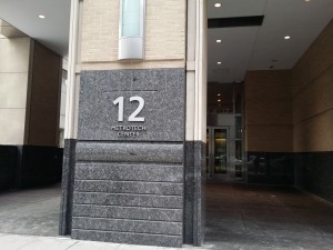
As far the type being well crafted, the school buildings and courts had type that was done professionally. I can say the same for the bigger stores in the Fulton mall such as Gap, H&M, Macy’s, and Footlocker. In addition, there are some fast food restaurants that have their type professionally done as well, such as Mc Donald’s, Burger King, and Wendy’s. However, when it comes to the mom and pop shops, their type looks not as skilled. With the mom and pop shops, some of the type looks like it was handmade. They also seem to have the same kind of type.

20140131_11172920140131_11111420140131_11194820140131_110812

Week Two

Classwork

Software introduction

  • Introduction to Font BookŸ
  • Introduction to Font Squirrel, the only approved source of downloadable free fonts
  • Introduction to InDesign

Text

  • Arial is a Font (Short Documentary)
  • ŸBounding boxes and their implications
  • ŸKerning

 InDesign

  • Ÿ Creating a new document
  • Ÿ Orientation and setup
  • Ÿ Rulers and measurement
  • Ÿ Controlling kerning digitally
  • Ÿ Bounding and text boxes

Printing in Class!

Relief Printing

  1. Carve and print at least 2 individual letters (I will give you the letters for you to transfer onto your  blocks). Work to make your letters  as crisp and clear as possible.
  2. Print single words, concentrating on kerning. Use each other’s letters and feel free to print nonsense words.

Homework

Reading

Journal

Take your best print of a single word, draw in and neatly label at  least 10 parts of type anatomy. Scan it or take a good photo of it and post the results on Open Lab. Use the handout from last week as a reference.

Typography In My Neighborhood

IMG_1322IMG_1325IMG_1323


For this assignment, we were asked to take pictures around our neighborhood of the various types of typography displayed on stores. The first picture is the sign on a building for a medical office.  The second shows a small candy store.  The final picture is of the corner store that everybody around where I live visits.  After analyzing the different kinds of fonts and sizes, I realized that my neighborhood is pretty bland compared to an area like Time Square where a plethora of large and lavishing signs resides.

The first clear observation is that none of the typography seems to be made from hand lettering.  It’s all printed, which takes out a lot of creativity and excitement, especially considering all of these use generic fonts.  The lettering is also placed on dull backgrounds, which doesn’t allow it to pop.  Ironically, I think this says a lot about my neighborhood.  I’ve lived here for ten years, and it’s always been very quiet and boring.  Nothing exciting has ever happened, and this kind of typography displays that.  It’s boring and dated, much like the area around me.