
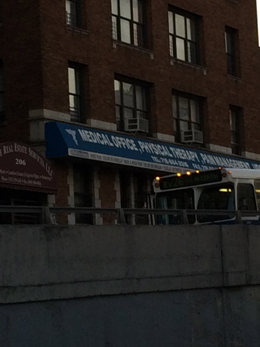

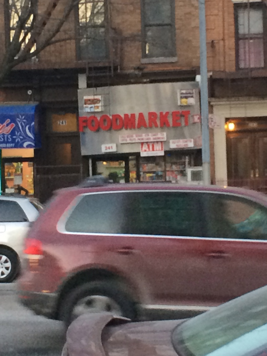
For this assignment, we were asked to take pictures around our neighborhood of the various types of typography displayed on stores. The first picture is the sign on a building for a medical office. The second shows a small candy store. The final picture is of the corner store that everybody around where I live visits. After analyzing the different kinds of fonts and sizes, I realized that my neighborhood is pretty bland compared to an area like Time Square where a plethora of large and lavishing signs resides.
The first clear observation is that none of the typography seems to be made from hand lettering. It’s all printed, which takes out a lot of creativity and excitement, especially considering all of these use generic fonts. The lettering is also placed on dull backgrounds, which doesn’t allow it to pop. Ironically, I think this says a lot about my neighborhood. I’ve lived here for ten years, and it’s always been very quiet and boring. Nothing exciting has ever happened, and this kind of typography displays that. It’s boring and dated, much like the area around me.

