https://docs.google.com/presentation/d/1P3TW-wbHWjObb8d3UGZx-RcEUGXfniGAFRx022TcYc0/edit?usp=sharing
Week 16
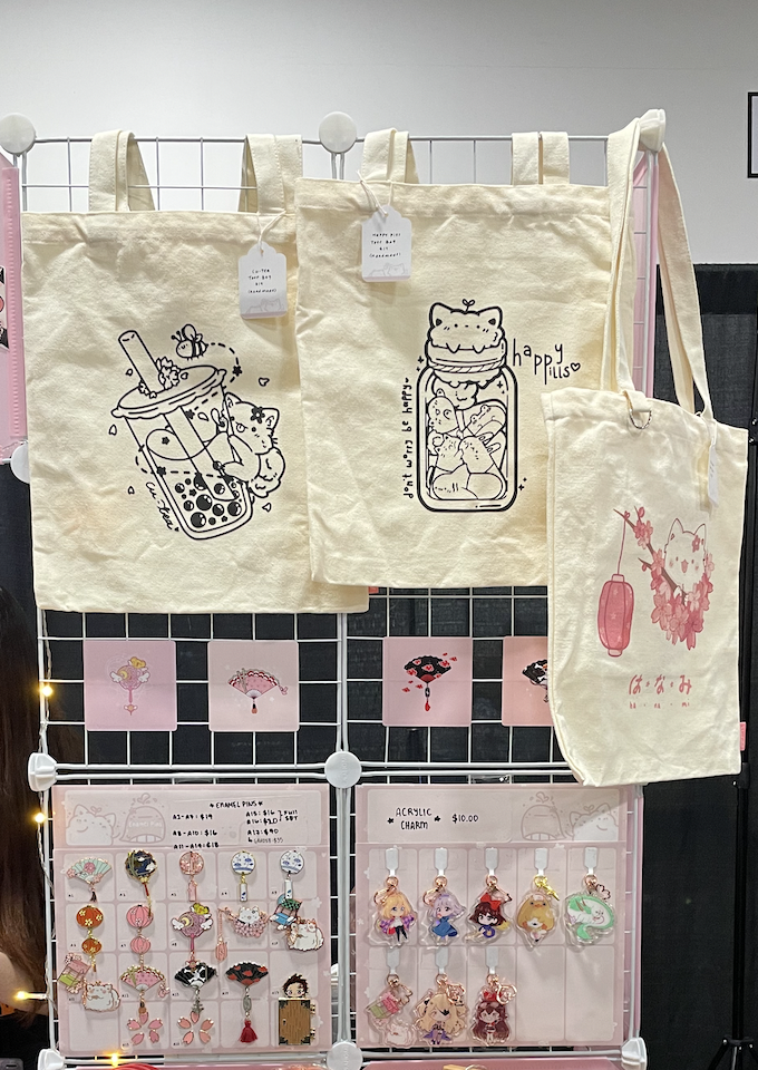
Last week, I was working on designing the gift ideas. I took the feedback I got and incorporated them into the new design look. It was hard to use every little feedback I got. However, I did my best to keep it simple with the latest changes. Sometimes less is more, and more does not mean it will work out. This sentence is what I learned and applied to my design works.
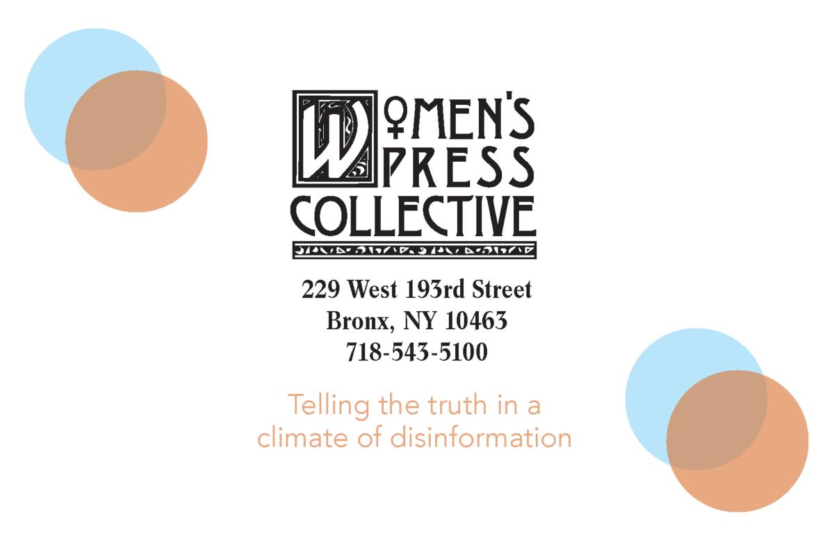
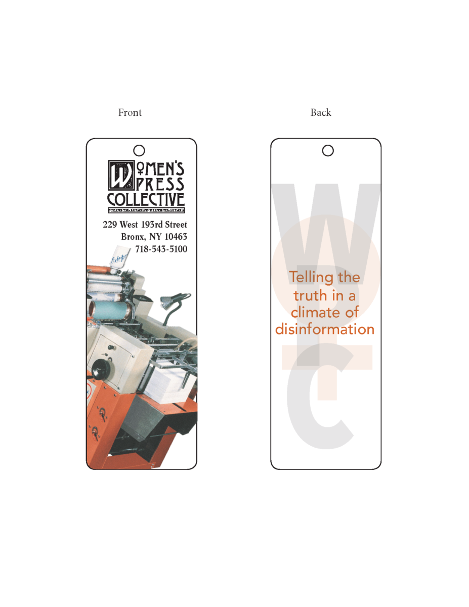
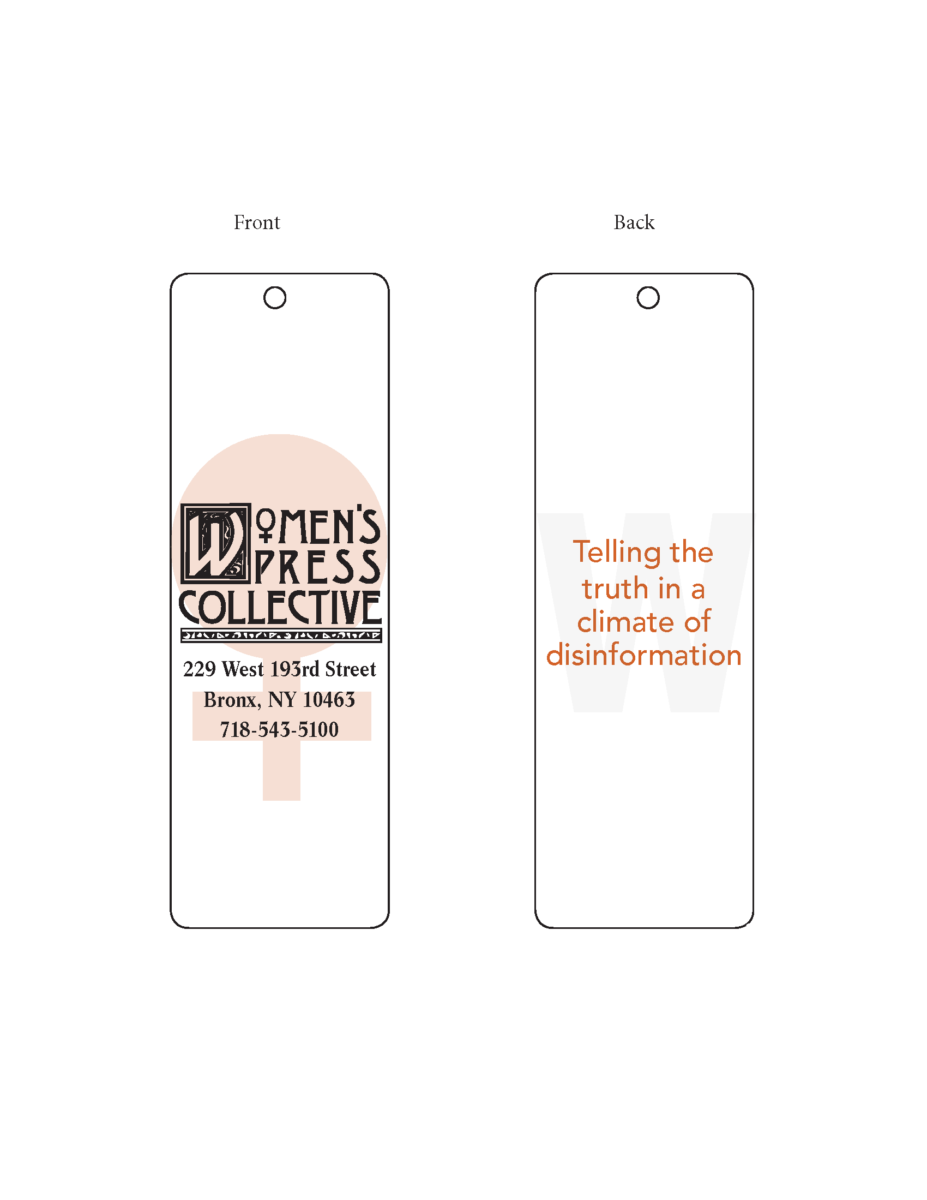
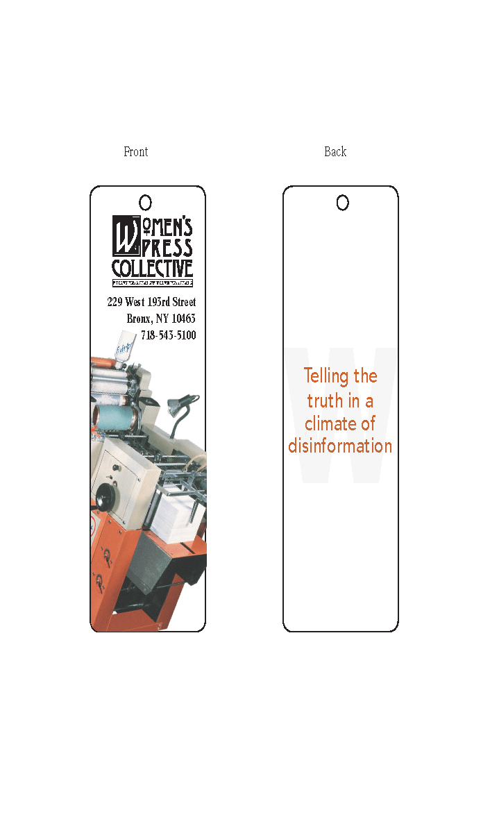
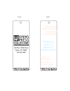
The new designs were simple yet effective. I added lines and their slogan starting with the postcard, so it wasn’t so bland. Along with the bookmarks, I took out a few of those decorative lines and combined them into using one in the front/back. The bookmarks I used and changed with an image to show that Women’s Press Collective is a printing organization. In addition, I came up with a few new layouts for the planner with some advice and help from others. No matter how much I changed the layout, I still was able to keep it to my style.
As I self-evaluated, I realized I shouldn’t be afraid to ask for help, such as when I’m stuck, because it’s most likely other people would have ideas to help. Communication is the key, and without it, I don’t think I would be able to perform well in my internship. Another thing I realized was that there was always a challenge for me to overcome. I learned new things and was allowed to see how real-life printing production happens. As well as, I was able to gain experience. I can say it’s not easy for sure. I learned that no matter what happens, I can improve my skills as long as I give it a shot and keep practicing.


Week 14
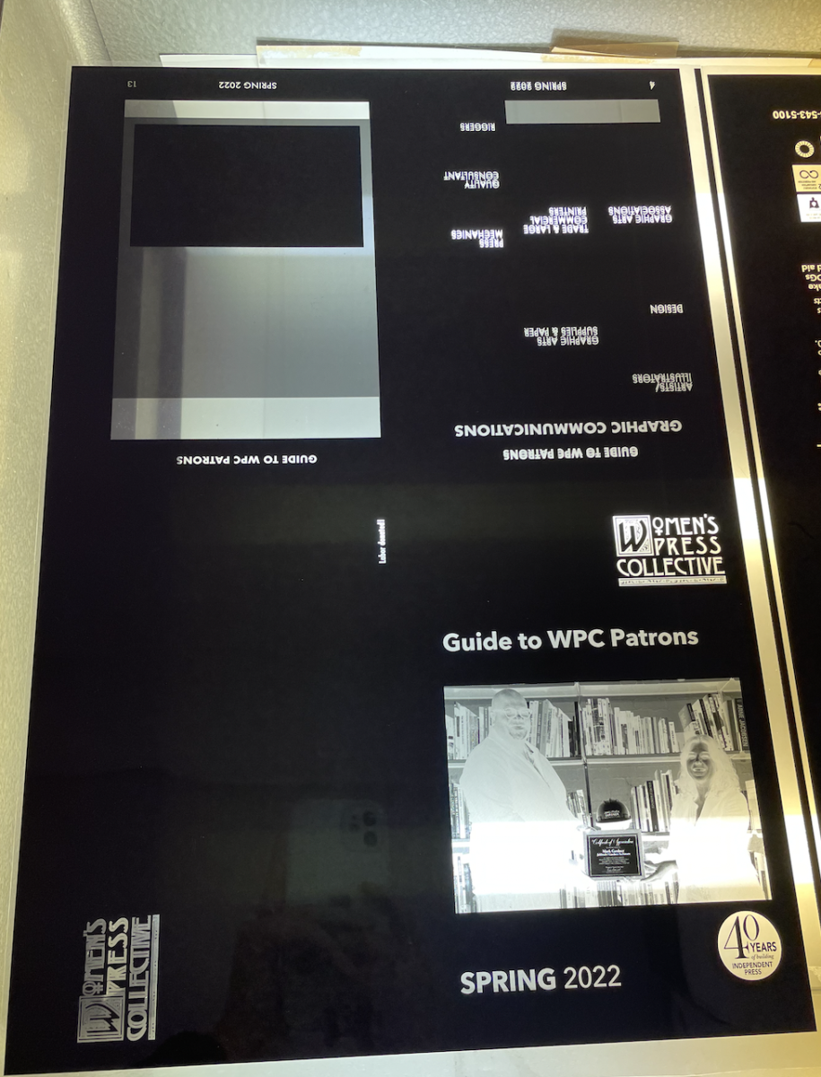
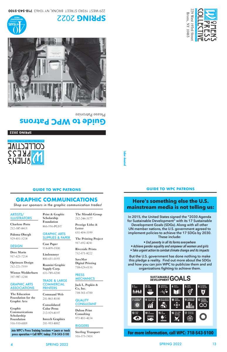
This week was tough. I didn’t think I could get through. The moment I stepped into work, I had tasks to do. I was thinking in my head, what new challenge will I have to face because every week seems to be something new for me to learn. Last week, the team printed out the Guide to Patron, a booklet where they shout out businesses and people who supported and donated to the Women’s Press Collective. My job was to help with printing. However, my boss said we couldn’t print it because of a mistake with the film.
Mistake. The moment I heard the word, my mind was blank and thinking, “Did I make a mistake,” “Did I size the file wrong,” or “Did I not separate colors?” You can say one million things was running through my head. My boss took out the film and asked me what was wrong with the film. At first, I couldn’t tell because the film was dark, and it made it difficult to see without light. Therefore we placed it in the light, and I was able to see the mistake. In some places, the letters were duplicated, making them harder to read. As well as, one film was supposed to show only letters that were supposed to be in the color black, while the other film was supposed to show only the color, Cyan. However, they were all mixed up. I wasn’t sure what had happened in my head or how I could let myself make that small mistake.
So when I went back to look into the file to check what had happened. The images that were placed in its order were duplicated. It overlapped, and you can only see it if you zoom in. I was thinking to myself why I didn’t catch that, and the colors were all mixed up. The film that should only show the color in black, shouldn’t have any color image or texts in that film. It should be separated. The same for the film that is supposedly to be in color, shouldn’t have texts or images on the film that is only in black. Files were messed up because more than one person worked on them. Especially when it comes to color, everyone was using the eyedropper tool to make things easier. After realizing my mistake, I quickly and carefully redid everything so then we could further move on with the printing of the book session.
Week 12 – App Review 1
For this week, I had to review an app. The app that I chose was Canva. Canva is a well-known app that is used on computers or mobile for designing. Whether something small as a thank you card or creating slides for a presentation, Canva has your back, it has free templates that you can style to your liking.
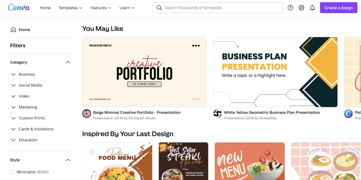
To get started, I looked through templates on what I wanted. I picked one out, and it brings me to a new page where I can design the template.
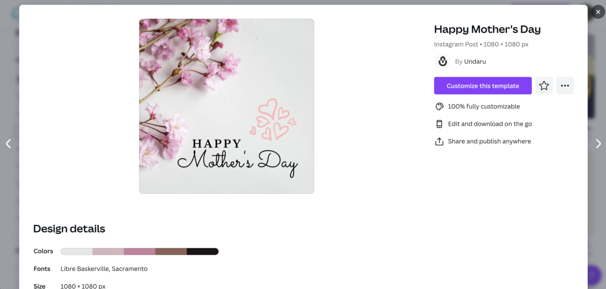
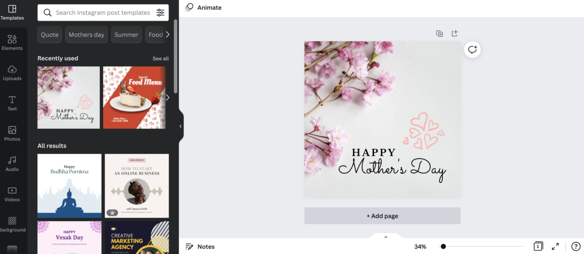
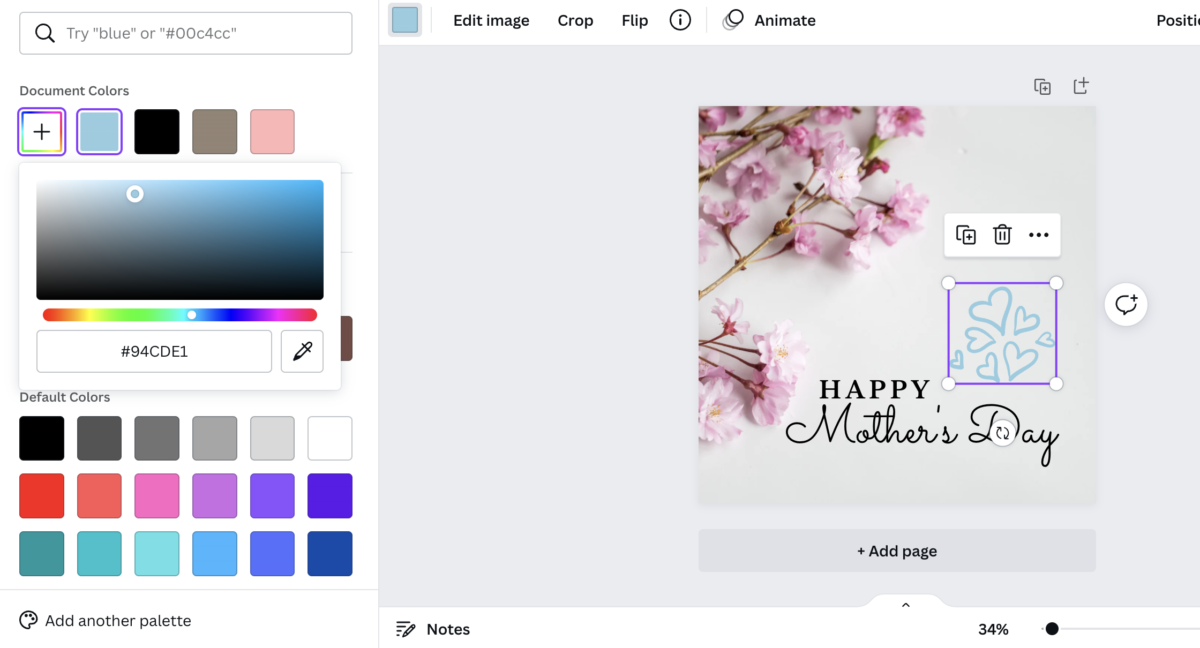
I started to play with the app to see what else I could do besides picking out templates. You could change the colors to your liking and add elements to the design if you wanted to. It doesn’t just show one color. It offers more than one like it gives a color block to pinpoint what color you desire. You click on one of the blue colors if you want blue, and then if you want a particular tinted blue color, you click on the plus sign where it drops a color block out. Drag your mouse around the color to see if you want the color blue to be lighter or darker.
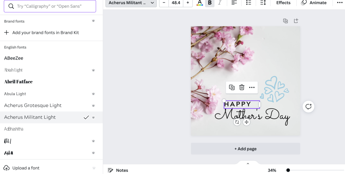
In addition to changing colors, you can always change the fonts to what you want. What I like about this because if you can’t find the font you like, there is an option to upload your fonts.
Overall, I think this app is very interesting. It’s another way of designing for non-designers if they ever need to put something together. Canva is very helpful, especially with the number of elements and colors people can use to create.
Week 11
Presentation. To some people, the word presentation is an enemy. While others enjoy them, I can say presentations are my enemy. However, it can change to having a mutual feeling towards it with time and practice. Reading the presentation section from the “Business Etiquette Text” book was interesting because it talked about what should be first and whatnot for the presentation. The 92 percent rule was something I had never considered because once I made a mistake, my brain continued to dwell on it, which led to more mistakes. The 92 percent rule is don’t think it’s over if you make a tiny mistake.
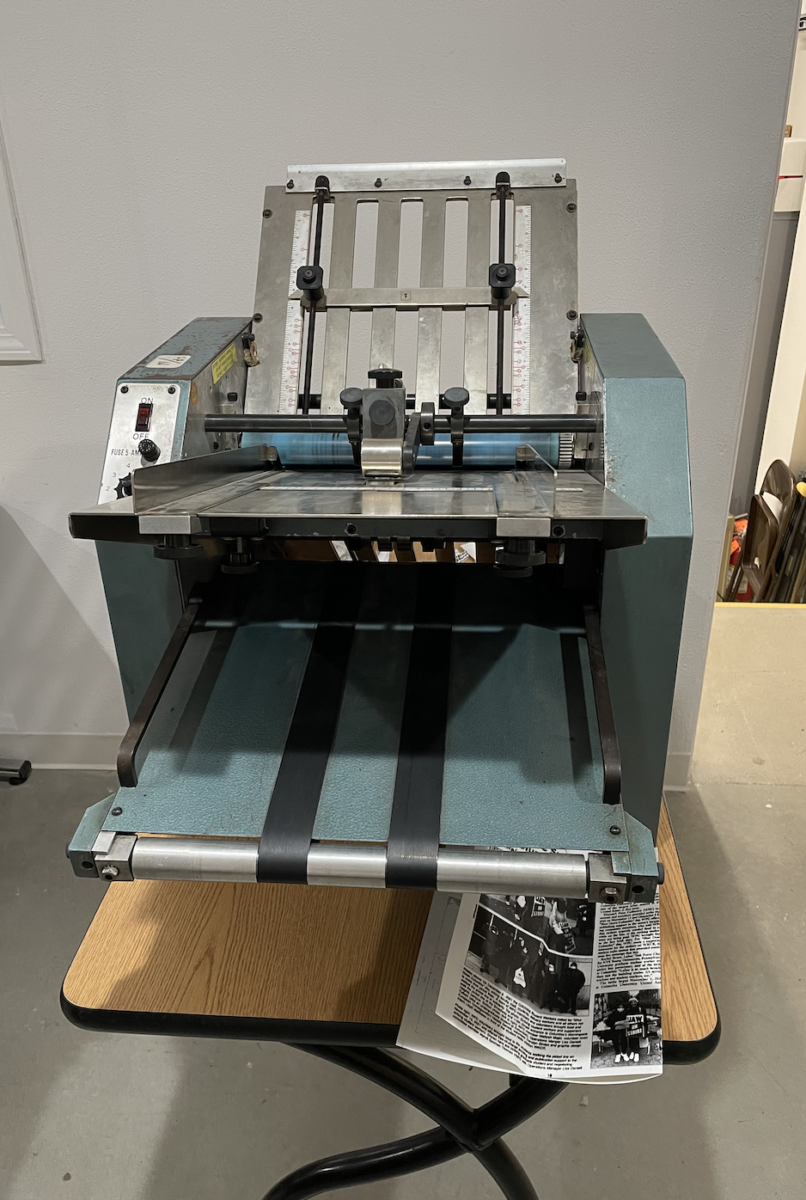
Halfway into this week of my internship, we had to fold the Collective Endeavor inside pages. There was a folding machine; however, I didn’t know how to use it. I only knew the traditional way of folding by hand. The machine didn’t look difficult to use, but it was more complicated than it looked. Of course, the first try was always a fail.
We had to move the two blots on the measuring line to the correct sequence to use the folding machine. The last time the machine was used was not on a two-fold, but it was on a three-fold for a brochure. Each time I moved the blots to find the right fold line, the outcome would come out with uneven folds. After some time, I had to ask for help because I tried everything and wasn’t sure how to get it to work anymore. Every time, I would change the settings on the machine. It would either get close to the fold or completely the opposite. We called for help, and the helper said we had to flip the plates and put the blots on a different line where it measured the folds. Thankfully, I was able to get the job done, after asking and understand how it works.
Week 10 – Event
This week, I attended an event which was the Castle point Anime Con. I have to say; it was an interesting experience. Different panels had interesting roles but could come together in the same industry. The topic was anime, but it connected the world with anime, cosplay, and manga culture. Anime Con hosts the event. However, they get Ardawigs, Idolfest, AnimEigo, and Japan candy box sponsors. Attending this event has given me a chance to talk to more people. Even though I was scared, I was able to gather my courage still and talk to people who were showing their artwork. I learned about their process and how they came about, especially connected with them by giving social information.
The panel that I attended was LilyPichu, a voice actress, musician, and online content creator. She participated in Genshin Impact by lending her voice as Sayu. She talked about her passion and how her journey began there. In the end, what I learned is that it takes to process and time to your journey. You don’t just get results right away, as well as practicing to keep up your skills is a great thing. In addition, a few panels have kept repeating this “networking” is something that is needed for people to see how great your work is. It’s a chance where you might get opportunities, and they explained that they talked about us having to be the one to take the step first for it to get the opportunity.
Week 9 – Met Museum
This week we attended the Met Museum, where we went to see the “Before We Can Fly Away” Exhibit. The exhibit was interesting because it showed an inside home of African Americans. Especially, there were little accessories or parts of an object shown through the exhibition while showing the significance of the items. The met showed the homes of the African Americans based in the Seneca Village.
As I was looking through the exhibit, the hair comb caught my attention. The hair comb was small and was made with “Malaysian gutta-percha resin.” The design of the comb showed a chain, which symbolized the agonizing past that Blacks had to go through. The comb lines are short because they represent the little freedom they had before thinking they were endangered again.
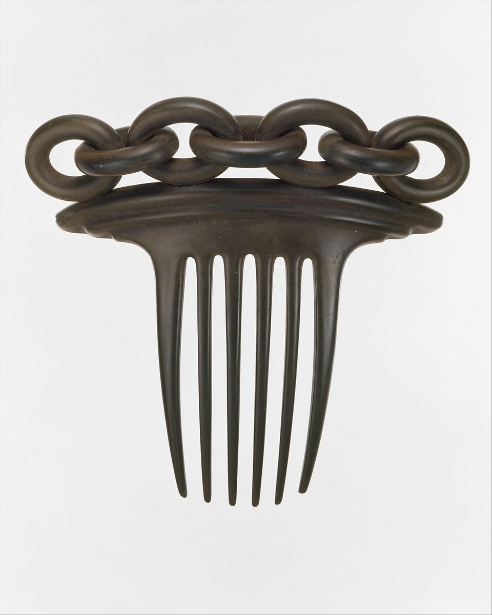
Title: Hair Comb, Date: ca. 1851, Medium: Vulcanite (India rubber and sulfur), Dimensions: 4 1/4 x 4 1/2 in. (10.8 x 11.4 cm).
Another piece that I found interesting was called “Shine,” which Wille Cole did. Cole used many “high heel leather shoes” and combined them all. He wanted to show that he took unwanted items into gave them a new meaning. As well as he played with the word “sole,” which can also sound like “soul.” He took that and demonstrated how the shoes are another way of remembering those memories. The reason is that many different people wear shoes, regards who they are. You can see the bunch of heels combining and creating a face as if it shows a person or whoever has worn them. It was becoming one.
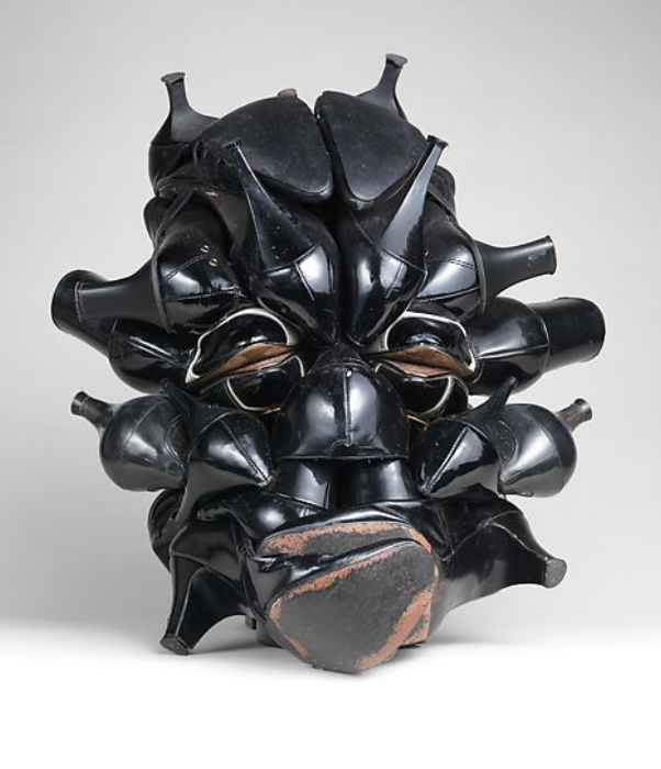
Title: Shine, Artist: Willie Cole (American, born Newark, New Jersey, 1955), Date: 2007, Medium: Shoes, steel wire, monofilament line, washers, and screws, Dimensions: 16 × 14 × 16 in., 11.7 lb. (40.6 × 35.6 × 40.6 cm).
Besides looking at the “Before We Can Fly Away” exhibit, I checked out the Asian exhibit section. I took a look at the Korean exhibition, which showed a bunch of amazing and unique designs on a box and vases. As well as, I was able to watch a small clip of how it was created. I found it fascinating how they work step by step to create a beautiful natural design on the box representing the Asian. One thing that caught my eyes was the “Palanquin,” which was a transportation kind of form. Women mostly used it. In the mid-twentieth century, the Palanquin was used for ceremonial purposes. It was used for the bride to go to her wedding. It was huge, so there was enough space where the women sat. There are two sticks in the front and back to use the Palanquin. The men lifted that part to carry the women to their destination. As well as, there is a big window if the person wants to look outside.
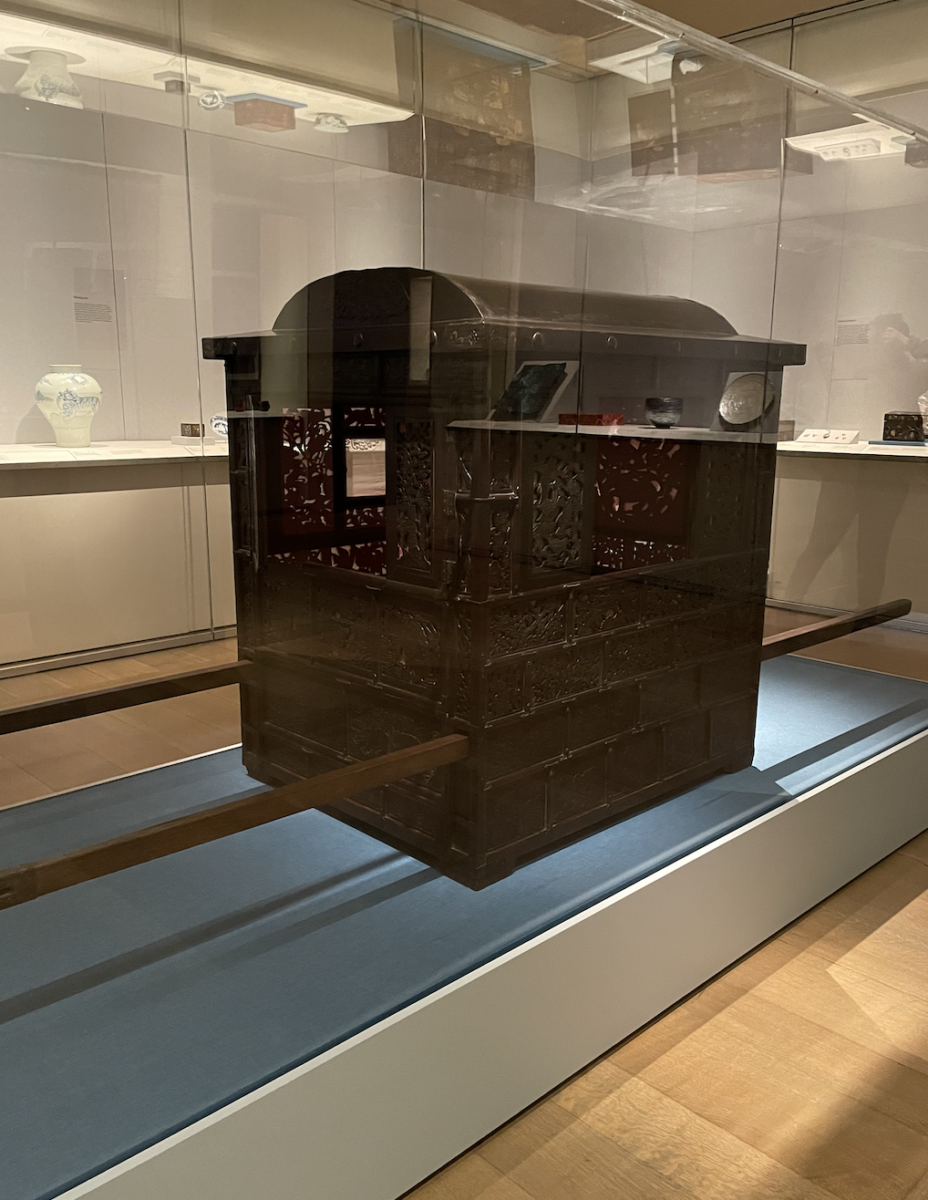
Title: Palanquin, Date: 20th century, Medium: Lacquered wood with paper, cellulosic acetate and silk cushion, Dimensions: Rectangular housing (incl. domed top): 43 1/2 × 33 3/4 × 29 3/4 in., 88 lb. (110.5 × 85.7 × 75.6 cm), Dims & weight of the poles (each): 1 1/8 in. × 8 ft. 9 5/8 in. × 1 1/2 in., 7 lb. (2.9 × 268.3 × 3.8 cm, 3175.179g).
Week 8 – Networking Event
I attended a virtual networking event, Understand Cranbrook Design: The Networking Effect. The Cranbrook Design was based on type; however, there are different types of design surrounding type. There are various topics every time, but I stumbled across the networking effect event this week.
The speakers: Lorraine Wild, Kelsey Elder, Nicole Killian, and Lucille Tenazas. They are all graphic designers but work with graphic design differently, such as type and linguistic or typographic technologies.
They were all interesting panels, and their talks were inspiring. The event started by asking, “what is the pedagogy of Cranbrook design in their view?” Each answer I found was interesting because everyone always has their explanation the way I see it. In addition to one of the panels that said this, “we represent different points in the history of the program,” which got me thinking that it is accurate. Every day the program is developing, and the way they see the design differs from their experience.
The speakers dove into the Cranbrook program during the event versus other programs out there. I found it interesting how the panels did the pros and cons. Everyone knows that every program is different, so what Cranbrook offers might not be the same as other programs. One of the panelists, Kelsey Elder, touched upon how he got inspired by a guest speaker who was invited during his time, which opened his view of how queer theory and typeface can be combined. He explained how Cranbrook would benefit from having a close bonding setting with individuals compared to others who would have different types of bonds that aren’t as close if someone wanted to understand more about the programs. I agree with him, as well as I think it depends on how someone teaching ways would help the learner. For example, it depends on the person to choose what program. However, it does lean towards how the person learns or what they prefer.
Overall, this event talked about different perspectives on Cranbrook designs through their past and experiences. In addition to their insights on how Cranbrook Design would develop in a way or how they would influence people’s creativity and expressing their design in the industry.
As well as it gave me a deeper understanding of the program, what it is, its history, experiences, and what other programs out there are different for design.

Week 7
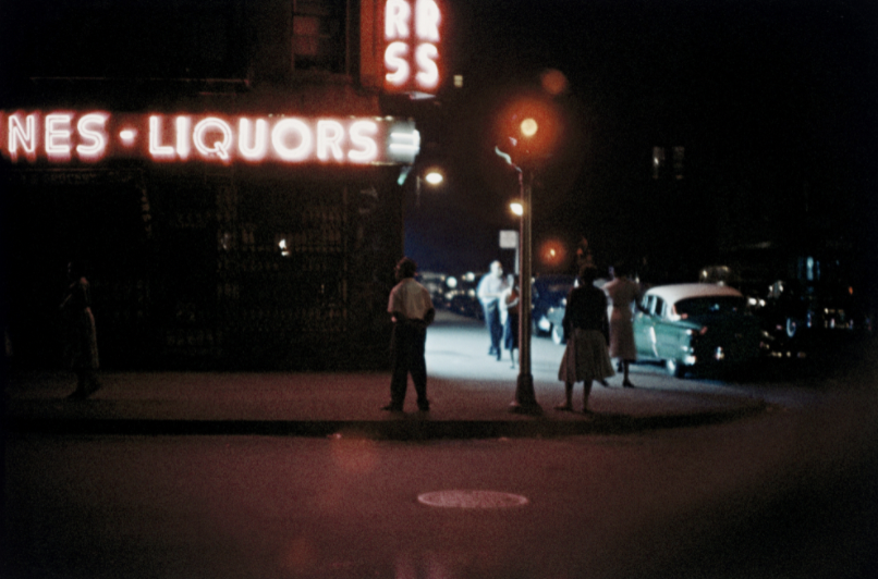
Gordan Parks traveled across different places in America. During his trip, he would capture the moments of different “crime scenes” he would see. He was using his camera for people to noticed the various of crime scene that he capture through his lens using his perspective.
One of the images I picked because it stood out to me was “Gordan Parks Harlem Gang Wars” (1948). The medium is Gelatin silver print with 10 15/16 × 10 1/2″ (27.9 × 26.7 cm) dimensions. The piece is demonstrating a group of people fighting with each other. Back then, there would be gang groups that would cause problems whenever they want, it would lead to bigger issues. The way Parks captured this image was printed in back and white, as well as the motion of what is happening. The black and white film gives a sense of danger vibe to it.
Another one of his pieces that was interesting was, “Gordan Parks, Untitled” (1957). The medium is Inkjet print, printed 2019 with 11 7/8 × 17 15/16″ (30.1 × 45.6 cm) dimensions. This piece is interesting because the way it was angle to shot. Especially the lighting of the image giving a certain vibe/expression when one looks at it. The danger sense of feeling at night that Parks wanted to show others when they look at the photo.
This week, I learned a few new things: the printing session. We had to print our magazine, and I never did or knew how printing worked more like the old printer. There are many steps to prepare before being able to print everything. The first was to strip your film, then put it into this platemaker box where it is engraving the letters onto the metal plate. After that, you would need to pour a solution to wipe off the top layer so that the ink is being shown. The following process is hole punching it to get tied onto/with the blots when you put it on the printer. After all the setup, you put ink, ensure you get enough, and then spread it around. Lastly, you start your printing process.
We did run into a few issues when running the printing. We would adjust and redo multiple times until we realized it was impossible to do. So we had to stop and wait for the experts that had experience with the printer to come in and help us. On weekends, the organization runs classes where you can get training, learn how to do/use the printer or design programs, etc.
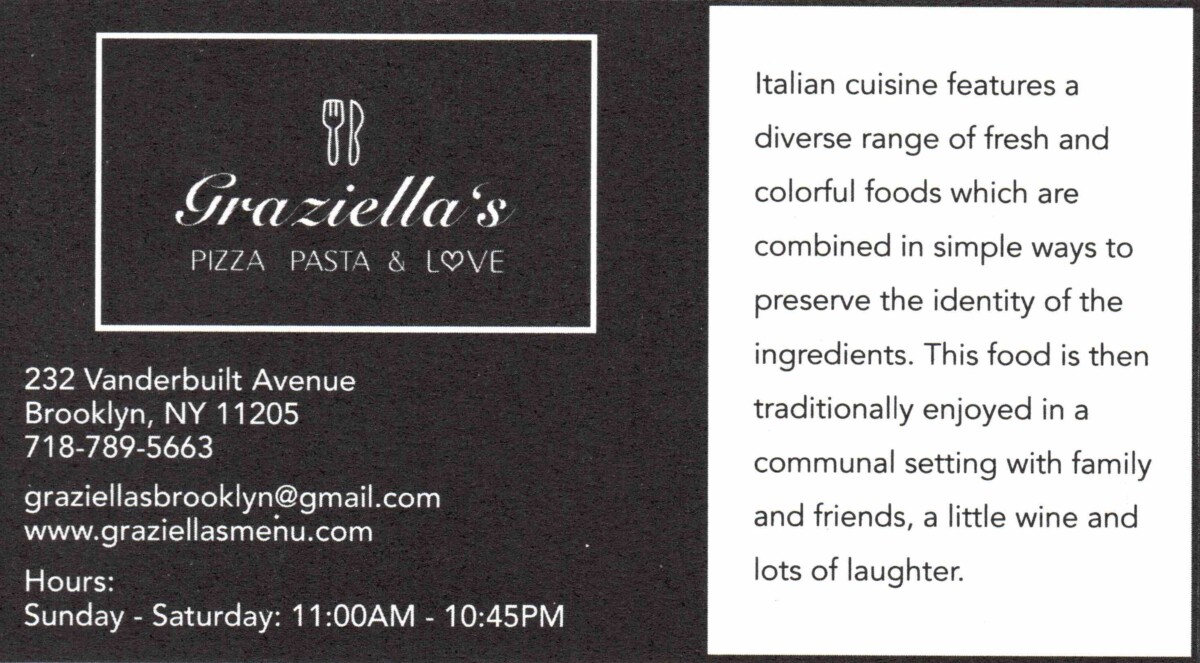
Lastly, I had to redesign a card for another sponsor. It was for an Italian restaurant. As I was designing, I made a few different ones, so my boss could choose what was best for our client. It was good, but it was too much, and the restaurant didn’t shine through. Which got me thinking after a while; my boss gave me the idea to go simple and don’t overthink it. I took that approach, and we came up with something we all liked and workable.
Week 6
In the Hope Poster Study Case, I think Shepard Fairey should have credited the photo. He was still using the original piece of Obama, even though his style and form were there. However, Fairey didn’t credit the person who took it; therefore, it was wrong. He used the photo as a good cause. However, he disregards that the photographer took time and effort to take that photo.
In the design industry, it’s tough to say who is who, but it is essential to have design ethics. People should have the freedom to design their ideas with their style; however, it is important to remember to do research and credit someone’s work if you are using it because it was their hard work, just like how someone would want to credit your work.
As I continue to read the book “Business Etiquette,” I find it interesting and relatable. It opens up new points that I never thought of myself thinking. One of the points that stood out to me was how the image is important. I always knew how important an image was, but I didn’t realize how deeply it could go. I think the way I dress is casual and formal. For instance, I would see the situation of where I am going. I would dress formally for an interview because I am presenting myself and letting them see/feel the vibe on me. Something I did not know was accessories play into your outfit. I thought the way we dress and look was all to it; however, after reading, I understand that every piece of accessory plays a role when wearing it.
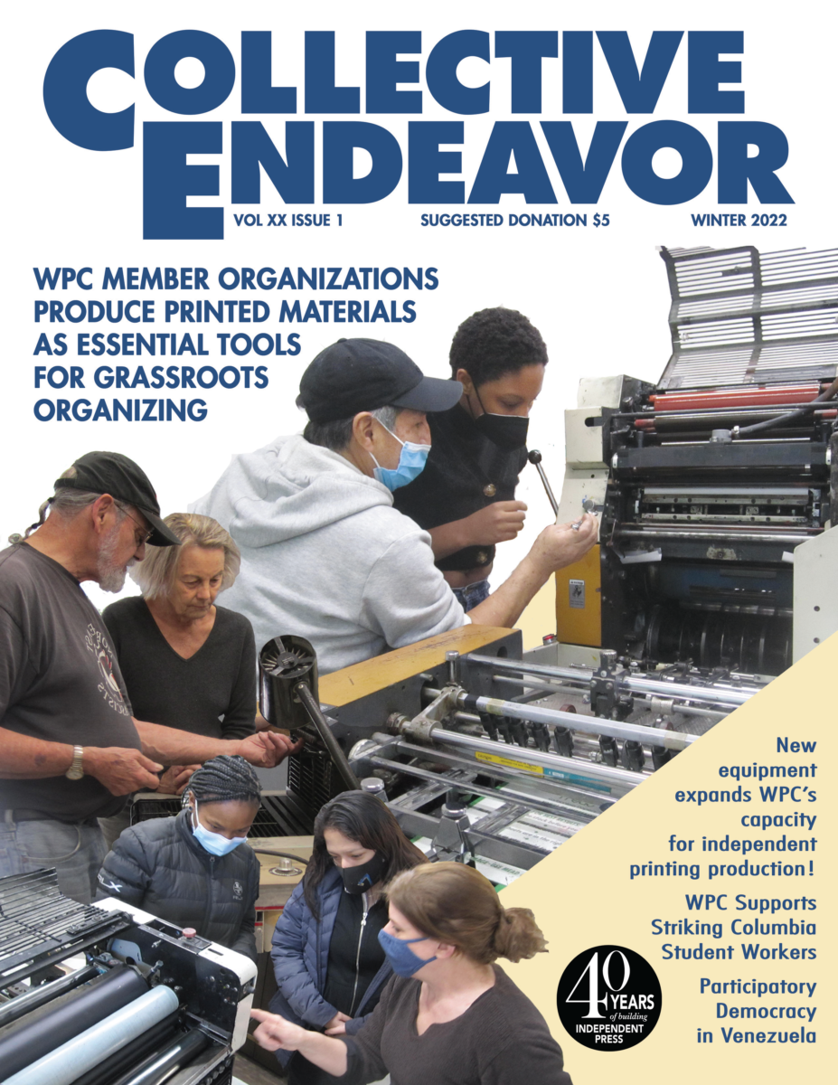
Into the new week of my internship, I discovered there is a challenge for me to take on, whether designing or not. I had to be a typewriter this week; however, I never knew how to type on an old fashion typewriter. So, I was taught how to use it, and when I tried it out, it was a quick experience. It’s one saying that “as you keep doing it, it gets easier.” Besides learning the typewriter, I finished designing the cover for the collective endeavor last week, and it went into the final stages of printing out. I saw the results on how it turned out, which was great.