Week 7

Gordan Parks traveled across different places in America. During his trip, he would capture the moments of different “crime scenes” he would see. He was using his camera for people to noticed the various of crime scene that he capture through his lens using his perspective. 

One of the images I picked because it stood out to me was “Gordan Parks Harlem Gang Wars” (1948). The medium is Gelatin silver print with 10 15/16 × 10 1/2″ (27.9 × 26.7 cm) dimensions. The piece is demonstrating a group of people fighting with each other. Back then, there would be gang groups that would cause problems whenever they want, it would lead to bigger issues. The way Parks captured this image was printed in back and white, as well as the motion of what is happening. The black and white film gives a sense of danger vibe to it. 

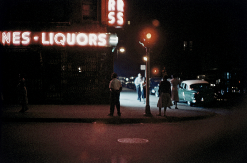
Another one of his pieces that was interesting was, “Gordan Parks, Untitled” (1957). The medium is Inkjet print, printed 2019 with 11 7/8 × 17 15/16″ (30.1 × 45.6 cm) dimensions. This piece is interesting because the way it was angle to shot. Especially the lighting of the image giving a certain vibe/expression when one looks at it. The danger sense of feeling at night that Parks wanted to show others when they look at the photo.

This week, I learned a few new things: the printing session. We had to print our magazine, and I never did or knew how printing worked more like the old printer. There are many steps to prepare before being able to print everything. The first was to strip your film, then put it into this platemaker box where it is engraving the letters onto the metal plate. After that, you would need to pour a solution to wipe off the top layer so that the ink is being shown. The following process is hole punching it to get tied onto/with the blots when you put it on the printer. After all the setup, you put ink, ensure you get enough, and then spread it around. Lastly, you start your printing process.

We did run into a few issues when running the printing. We would adjust and redo multiple times until we realized it was impossible to do. So we had to stop and wait for the experts that had experience with the printer to come in and help us. On weekends, the organization runs classes where you can get training, learn how to do/use the printer or design programs, etc.

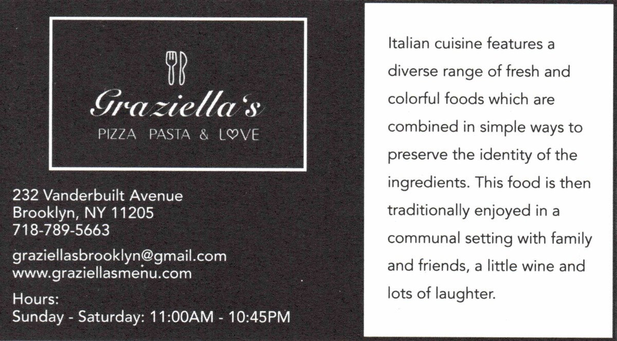
Lastly, I had to redesign a card for another sponsor. It was for an Italian restaurant. As I was designing, I made a few different ones, so my boss could choose what was best for our client. It was good, but it was too much, and the restaurant didn’t shine through. Which got me thinking after a while; my boss gave me the idea to go simple and don’t overthink it. I took that approach, and we came up with something we all liked and workable.

Redesign graziella’s card


Week 6

In the Hope Poster Study Case, I think Shepard Fairey should have credited the photo. He was still using the original piece of Obama, even though his style and form were there. However, Fairey didn’t credit the person who took it; therefore, it was wrong. He used the photo as a good cause. However, he disregards that the photographer took time and effort to take that photo.
In the design industry, it’s tough to say who is who, but it is essential to have design ethics. People should have the freedom to design their ideas with their style; however, it is important to remember to do research and credit someone’s work if you are using it because it was their hard work, just like how someone would want to credit your work.

As I continue to read the book “Business Etiquette,” I find it interesting and relatable. It opens up new points that I never thought of myself thinking. One of the points that stood out to me was how the image is important. I always knew how important an image was, but I didn’t realize how deeply it could go. I think the way I dress is casual and formal. For instance, I would see the situation of where I am going. I would dress formally for an interview because I am presenting myself and letting them see/feel the vibe on me. Something I did not know was accessories play into your outfit. I thought the way we dress and look was all to it; however, after reading, I understand that every piece of accessory plays a role when wearing it.

Into the new week of my internship, I discovered there is a challenge for me to take on, whether designing or not. I had to be a typewriter this week; however, I never knew how to type on an old fashion typewriter. So, I was taught how to use it, and when I tried it out, it was a quick experience. It’s one saying that “as you keep doing it, it gets easier.” Besides learning the typewriter, I finished designing the cover for the collective endeavor last week, and it went into the final stages of printing out. I saw the results on how it turned out, which was great.

Design Front Cover of Collective Endeavor


Week 5

My second week at the internship was interesting. I met some new people and worked with them. Since this week, we have had an International Women’s Day event. Every year, the organization celebrates this event to appreciate the women in the workforce. Due to the pandemic, the event has been hosted online for the last two years. However, this year, they could get the yes to hosting an in-person international women’s day event with, of course, following the COVID 19 guidelines. I couldn’t participate in the event due to personal reasons; however, I got an opportunity to work on some designs for the event.

We had to get everything ready, meaning designs needed to be final and event preparations of what you would need at the event. I had to complete the final stages of the International Women’s Day Flyer, redesign signage, and design new signage we would need at the event. Besides that, I was allowed to design the front cover of the Collective Endeavor magazine that they release every semester.

I found it interesting, but at the same time, I was afraid of the results. I intend to think of what if they don’t like it or what if it doesn’t look good. However, I realized there was no time for that and had to do it while trusting that I would do well.

Redesign Signage
Fixed color for flyer
Redesign Signage

Week 4

It was my first day at my internship. My internship must be on-site; however, you need to be vaccinated. Since it was the first day, I didn’t know what to expect. Given some tasks to look and fix some changes for their magazine that they would release soon. I had to design a new card for one of the sponsors in the magazine. It took me a while to use InDesign since they had the older version. I fixed the changes and asked my boss to look at them again before finalizing the design changes. It took me a while to get things done for designing because of how detail-oriented I can be. I tend to overthink and fix the small details.

I started doing my readings and found some interesting points where I could learn and improve myself. As an introvert, talking to new people is one of the biggest challenges. The book pinpoints that people typically talk in small groups while ignoring the fact that meeting new people can change/give an opportunity, and we tend to miss that. Meeting new people was a way to connect, but the problem was starting the conversation. This relates to how I find it challenging to talk to my coworkers because I usually don’t initiate. It isn’t easy, and the reading explains how there are different ways to go about it.

Redesign Chiropractor Business card

Week 3

I finally got an internship, which is at Women’s Press Collective. Women’s Press Collective is a non-profit organization. Their organization helps the low-income working community, as well as giving a voice to the ones who don’t have one to see there is an issue. Women’s Press Collective’s mission is to tell the truth when false information is being distributed in that climate. WPC’s slogan is  “WPC is telling the truth in a climate of disinformation.”

The internship that I wanted has not replied to me yet, and I realized I might not even get a spot anywhere else if I kept waiting. So I had to rethink my process plan, and I found the Women’s press collective on the school blog. I was hesitant to call them because I was running the “what ifs” in my head. As well as, I wouldn’t say I like talking on the phone. However, I mustered up my courage and decided to call them. It went through, and they asked if I was available to come in for an orientation that same week I called.

On the orientation day, I had to wake up extra early to know my route. I wasn’t familiar with the location on the upper west side of Bronx. When I got there, I’m not going to say I wasn’t nervous because that is a lie. I was feeling anxious, stressed, and wanted to run away. Anything you can think of, I was and was ready to leave. I knew that it was normal to feel nervous, so I was greeted with a warm welcome when I went to the site. I think that’s when I slowly let my nervousness go a little by little. Orientation happened for about an hour or so before leaving for work.

Week 2

In the second week of the course, I’m still waiting for emails saying I got an internship. However, it is still the waiting game that is happening. In my mind, if I didn’t get an internship, I feel like I might fail this class anytime soon. Stress was piling on me and anxiety, so I decided to revise my portfolio. If I felt like my work wasn’t good enough, I tried to make my portfolio a little better if possible. With this habit I gained, I would try to develop mini-projects to do or improve on my projects.

Week 1

Before taking this class, I thought I would fail since I didn’t have an internship. I heard from others that we had to have an internship going into this class already. This led to me thinking that I would fail or I couldn’t take this class. However, when taking this class, I was relieved when Professor Goetz said we had time to look for an internship. I was a little stressed over not having an internship yet, and I had applied to many different ones. The challenging part begins because it is the start of the waiting game.

CAFE GRUMPY

For this project, I had to pick a business of my choice to help them advertise, since COVID 19 pandemic took a lot from people.

Cafe Grumpy is a cafe that creates coffee art and sells coffee too. I created motion graphics to advertise, so more people can visit them.

This sticker gif is to promote the cafe shop of their speciality on coffee drinks.
Cafe Grumpy Sticker Gif
Animated Timeline Ad that help promote the cafe
Cafe Grumpy Animated Timeline AD with social media Mock up

Collaboration with Sweets & Squeak

Sweets & Squeak is a pepper jelly jam that can be put on almost everything. Sweets & Squeak requested rebranding their business, and to elevate it. Collaborate with Evelyn Ng on her recreation of their mascot, Poppy. They didn’t like how dull their brand were, so we use their same color palette but making it brighter. Their own packaging for business cards and thank you cards didn’t have some personal connection with the audience, so we recreated them.

Polaroid stickers that goes into packaging boxes.

IG mockup with Poppy polaroid gif.

Sweets & Squeak Menu card.

Recreated Thank You cards.

Recreated Business Card