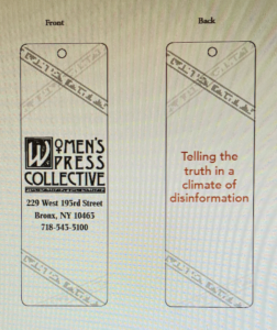
This week I had a new small project where my boss wanted me to design some small gift ideas. Women’s Press Collective is getting ready to have its 40th anniversary. Therefore my boss wanted us, designers, to develop some ideas that she could produce and print independently.
I found this a challenge because I had never done anything like this. Brainstorming and research were for sure something I had to do. The common gift ideas that popped into my head were notebooks, notepads, and postcards. I started writing down ideas, sketching ideas, and using colors that fit their logo. As I was designing the notepads, another thought popped into my head: planners. Everyone seems to use notes and plan out their week to stay organized. After planners’ ideas got into my head, the idea of a bookmark for people to use was a lovely gift to put onto the list.
The tricky part was how to start and what would look nice. Instead of worrying, I decided to put everything down on the page that came to my head. However, the first and second rounds of the drafts were not too great. The logo was nice and big, as well as placement of the words was legible to read. The problem with the bookmarks was too many decorate lines that didn’t look appealing. The postcard seemed a bit too bland, while my planner was strong, but there should be a different version of planners. I added my style of clean-cut and minimalist to the planner.


