Overview
For our next reading assignment, we will be reading and annotating texts written by architect-designer-artists affiliated with the Bauhaus, and a contemporary essay about Bauhaus designers.
- Madeleine Morley; Master László Moholy-Nagy Saw Photoshop Coming, 90 Years Ahead of Time (2019), AIGA Eye on Design
- László Moholy-Nagy; Typophoto (1925): found in our main text Graphic Design Theory: Readings From the Field by Helen Armstrong on pages 32-34.
- Jan Tschichold, “The Principles of the New Typography” 1928: found in our main text Graphic Design Theory: Readings From the Field by Helen Armstrong on pages 35-38.
Due Date(s)
- Your reading response is due the day before the next session.
Key Themes and Takeaways
Madeleine Morley; Master László Moholy-Nagy Saw Photoshop Coming, 90 Years Ahead of Time (2019)
The writer discusses the reconstructed 1929 exhibition curated by László Moholy-Nagy ‘Where is Typography Headed? at the Berlin’s Kunstbibliothek in 2019.
- Moholy-Nagy anticipated how the aesthetics of communication would change in the future.
- His exhibition outlined key ideas and approaches that influenced and defined the current graphic design field
- During this time, advertising had begun to be taught in art schools, and Avant-Garde designers started embracing commercial advertising using a style known as “The New Typography.”
- Advanced printing processes allowed designers to integrate photography and type; “typophoto,” in which type and image could be arranged simultaneously with transparent films; text and image could be fused using photomontage.
- Moholy-Nagy predicted that in the design process of the future, there would no distinction between letters, images, and other elements, and text could be easily adaptable and scalable.
- Early 20th-century advertising designers appropriated subversive avant-garde ideas for commercial purposes.
László Moholy-Nagy; Typophoto (1925)
The artist and Bauhaus instructor articulated his vision for a new form of art that would incorporate a range of media.
- Artists must participate in society’s ‘collectivity of interacting events.’
- Printers, Photographers, and all artists must consider ways that art can connect people
- ‘Typophoto’ is a new form of making, combining typography and photography for ‘the most exact rendering of communication.’
- The combination of these printing technologies will create new possibilities for visual expression, thereby creating a ‘new visual literature.’
Jan Tschichold, “The Principles of the New Typography” 1928
Tschichold possessed a deep knowledge of traditional graphics and type, but rejected virtually all pre-modern conventions after visiting the first Bauhaus exhibition in 1923. He published The New Typography three years later. In 1933 the ruling Nazi party imprisoned him for spreading Communist ideas. Shortly thereafter, Tschichold fled to Switzerland, where he remained for the rest of his life, continuing to design but rejecting the modern typographic principles of his early work.
- The new typography is defined by clarity and economy of expression, as opposed to ideas of beauty and ornamentation
- Typography must not arise out of preconceived ideas, but by developing form from the function of the text
- Asymmetry is optically effective, as it establishes definite, logical relationships within the text
- Standardization of type achieves clear and objective forms, as standardized building materials are necessary for architecture
- For the typographer ‘the most important requirement is to be objective’
Instructions
1. Open the reading & enable Hypothesis.
In one tab, open the essay by Madeleine Morley; Master László Moholy-Nagy Saw Photoshop Coming, 90 Years Ahead of Time (2019), AIGA Eye on Design
In another tab, open the text Armstrong, Helen. Graphic Design Theory: Readings From the Field, Princeton Architectural Press, 2009. Navigate to pages 32-34 and 35-38.
The reading link above will automatically open Hypothesis. Login to your account and select our group COMD Theory Fall2023 Group (IMPORTANT!) from the dropdown to make sure your annotations and highlights will be recorded in the group. See Using Hypothesis for details.
2. Consider these questions.
Here are the questions to which you should respond in your reading response:
- According to these authors, what is their aesthetic approach, and why did they think it better than the traditional design/typography of the past?
- How did technological advances influence aesthetic forms and theories in early 20th Century design?
- What role did typography, photography, and other media play in shaping a new kind of design?
3. Read & Annotate.
Consider the questions/prompts listed above. Start to formulate the answers to these questions while you practice close reading with annotations. Share at least 3 annotations in the Hypothesis group, including your questions, definitions, and ideas with your classmates. See Using Hypothesis for details.
Add the tags: Bauhaus and Reading Response 3 to your annotations.
4. Draft your Reading Response.
Write a draft of your 200-word response in your Writing Portfolio. Check for grammar/spelling errors using Google Docs spell-grammar check or Grammarly. Use the word count tool too. Add a numbered or bulleted list of links to at least (3) of your Hypothesis annotations. In Hypothesis, select the Share icon and copy the URL. (see Using Hypothesis > Share).
Consider looking back at the Learning Graphic Design History videos or the AIGA Archive to see if there are historical examples that will help support your ideas.
5. Add your Reading Response in a comment.
When ready, add a comment at the bottom of this post. Paste your reading response from your Writing Portfolio into the comment box. Adjust any formatting issues that may have occurred while pasting.
Resources
More info
- Tutorials > Using Hypothesis
- Assignments > Writing Portfolio
- OpenLab Help > Commenting on a Site
Texts
- Madeleine Morley; Master László Moholy-Nagy Saw Photoshop Coming, 90 Years Ahead of Time (2019), AIGA Eye on Design
- Graphic Design Theory: Readings From the Field by Helen Armstrong from DesignOpenData
- Library Text: Armstrong, Helen. Graphic Design Theory: Readings From the Field, Princeton Architectural Press, 2009. ProQuest Ebook Central.


The new design aesthetic of the early 20th century was a great shift from traditional design. This was mostly due to the vast technological advances of industrialization, design now had a new function in society. Moving away from elaborate decoration and symmetrical layouts, new printing techniques allowed for asymmetrical compositions. And in 1929 this especially intrigued photographer László Moholy-Nagy, who “devoted himself to the idea of “typophoto,” playing with ways in which type and image could be arranged”. In his approach he aimed to make his new designs above all else, purposeful and unambiguous. Something traditional typography was not able to achieve with its added ornamental elements. In addition typographer Jan Tschichold author of The New Typography sought to create form through clarity. Tschichold believed that type should be a way of communicating effectively. He emphasized the need for type that followed logical order; this was a step away from the central axis composition of text in old design.
Traditional design featured compositions of ornamental serif typefaces that sat in the center of the page, with basic illustrative images, and oftentimes added borders. While pleasing to the eye the context was left to be deciphered. To solve this designers used
typography, photography, and other media such as film to develop a new visual language. Following the ideologies of Constructivism, De Stijl and the Bauhaus the use of sans-serif type became modern practice. It was easy to read and embraced the geometricity of newer layouts. Development in photography allowed for more interesting illustrative elements. For instance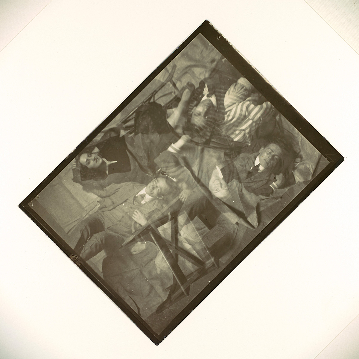 ” rel=”nofollow ugc”>El Lissitzky’s photomontages created active surfaces that made the illustrations just as important as the text. Lastly, the most important part in the shaping of new design is the popularization of printing. A demand for print media in advertising and book design challenged designers to create strong graphical layouts. And just like today there is always the battle of grabbing and keeping the viewer’s attention.
Moholy-nagy was very focused on the progression of type. He was a pioneer in using type as the design. He wished to make a fusion of photography and typography, hence the name “Typophoto”. Tschichold was focused on removing designers from the traditional ways of type. Showing them there is more to type than center-aligned characters. Moholy-nagy saw the power of the camera and the concept of photomontage. He believed his “Typophoto” is a visually most exact rendering of communication. Tschichold wanted to push the boundary of type because of the advancements that have been made in technology. Tschichold saw how old typography was all aligned in a central axis that it had been done since the Renaissance. Both of these designer’s methods changed design for the better. Photomontage changed the way that type and photos were looked at in regard to the communication of a message. It became a concept that is heavily used today. Moholy-nagy really did think of Photoshop before it was even thought of. Type alignment has changed completely between all cultures. There is no set alignment that applies universally. There is now a need for more understanding of the cultures of all to be able to have a successful design.
Annotation 1
Annotation 2
Annotation 3
Previous to the 1920s typography featured a very ornamental style, with a lot of unnecessary extras and frills. The Bauhaus style (named after the Bauhaus school) was emerging, and more designers adopted a simpler and more functional style. Typography also saw this change, Moholy-Nagy, a Bauhaus professor, was innovative and accurately predicted the future of typography. Tschichold was an expert in typography and was accustomed to working in a traditional style but completely changed his mind after attending the Bauhaus exhibition in Weimar. After this Schichold advocated for the new typography.
The authors believe that simplicity and asymmetry were the way to go in typography, ornaments were pretty but taking them away made the message clearer for the audience. In addition, the new typography paired well with illustration and photography. As time went by the technology got better, and new printing processes were created that allowed to do better work with type, and better production. This new printing process also allowed the integration of photography and print. Moholy-Nagy called these new possibilities of typography and photography “typophoto”. Function was at the forefront of design, combining type and photography and making the message as clear as possible. Artists and designers were eager to implement the new typography but the commercial world was apprehensive. So a group of designers created an association to convince everyone else why this new typography was better and more impactful. Eventually, it caught on and this made possible the way we approach type now.
Great work, Lola! I’ve left a couple of comments in Hypothesis. Let me know if you have any questions.
NOTE: Private response is visible only to instructors and to the post’s author.
Moholy-Nagy predicted that typography would be simple, to the point, and cleaner, without many ornaments in aesthetic to focus on the messaging, which is what typography evolved to at the time.
The group of designers that created an association to convince everyone why the new typography was better was called der ring neue Werbegestalter – The Ring of New Advertising/Publicity Designers.
From what I can gather from this reading, because of the author’s advertising would play into the change in typography and photography. They saw advertising as a space to turn design experiments into a source of income. Through advertising, designers created a style called “The New Typography” which gave them more possibilities and breathing room. They had to convince the commercial world that audiences would be drawn to this New Typography which they did with strong and persuasive promotional impact. The arrival of Moholy-Nagy was a turning point in the development of art in the twentieth century. His ideas influenced the practice and attitude of fine art, photography, sculpture, architecture, and design education. With his combination of typography and photography in collage work, he is considered one of the founders of modern graphic design. Technology has undoubtedly affected art across various mediums. Undoubtedly, tech has expanded the horizon of creativity. It has increased accessibility – sharing images, performances, words, and thoughts on a global level has never been easier.
Annotation 1: https://hyp.is/ClJoQlgfEe6eY5_UnEPzjQ/eyeondesign.aiga.org/the-bauhaus-master-who-saw-photoshop-coming-90-years-ahead-of-time/
Annotation 2: https://hyp.is/cUMoDFgfEe6beH8J-3M-xg/eyeondesign.aiga.org/the-bauhaus-master-who-saw-photoshop-coming-90-years-ahead-of-time/
Annotation 3: https://hyp.is/vH-EUFgfEe66ZHdr4a4M7g/eyeondesign.aiga.org/the-bauhaus-master-who-saw-photoshop-coming-90-years-ahead-of-time/
Looking at what these avant-garde designers, you can really feel their excitement to break out of the old-school typography they’d been trained in. They were ready to leave behind those symmetrical, decorative styles from the past. Moholy-Nagy, Tschichold, and the others felt that bold, modern aesthetic was perfect for communicating in their fast-paced industrial age. They cared about clarity and function – not just beauty for its own sake.
The technological innovations of their time absolutely fueled these new radical ideas. With new printing methods like offset, they weren’t limited to arranging type neatly in centered columns anymore. Standardized paper sizes also freed them up to be more creative. And easy photomontage let them play with effortlessly blending text and photographs together. It really fired up their imaginations about future tech enabling adaptable, living typography.
Typography especially was transformed – no more handcuffs forcing symmetry! By ingeniously combining it with images in their photomontages, photography took on this exciting communicative role. For these pioneer designers, exploring new approaches to typography and photography was their sandbox for crafting a design style that perfectly matched modern life.
Annotation 1
Annotation 2
Annotation 3
The authors’ aesthetic approach is to create something new. In the essay written by Madeleine Morley, it said “Designers no longer needed to arrange type in symmetrical columns, and embraced their newfound ability to create strikingly asymmetrical compositions combining blocks of type and illustration as photomontages.” We write like a square or rectangle, it’s the same on both sides. This is saying that designers don’t need to follow that rule and can just write asymmetrically or from different angles. In the article “Graphic Design Theory: Readings From the Field” it says, “We believe it is wrong to arrange a text as if there were some focal point
in the center of a line that would justify such an arrangement. Such points of course do not exist, because we read by starting at one side…” This shows that they believe it’s wrong to make writing start from one side. They want to create something new unlike how we normally read or write and just make it so we can read from any point. When designing print, it is important to use pure expression in order for feelings to be best expressed. The role that typography, photography, and other media play in shaping a new kind of design is showing a different understanding of designs. Photography is very useful as a typographical material. They can be used to make people read and understand the same thing, no matter who reads it.
“Center justified” was a non-reader-friendly popular typography style in the past. Since most people read from left to right, Authors believe that typography cannot be limited to center justified and should not be applied to printing nowadays, better typography needs to be created for readers that is reader-friendly and delivers messages clearly. New typography refreshes the public from outdated and boring trends and also allows designers to be experimental in their design. “Typophoto” is one of the new styles that combines text and photography in their design. Adding text onto an image allows designers to come up with more combinations and be playful in their design, also helping audiences to understand a design better. Ornamental designs were a typography style that made them visually appealing. However, they will sometimes look messy and people will lose focus because there is too much to look at, therefore simplicity was going on trend. If designers make no progress and keep the same typography over and over again, design will not appear and people will start finding them tedious. Abandoning the old and unnecessary elements and starting a new design helps typography evolve to be better understood.
Annotation 1
Annotation 2
Annotation 3
The New Typography celebrated functionality of design. It was characterized by stripped down sans-serif letter forms and abandoned more ornamental aesthetic styles. In my opinion this shift in ideology helped create the design ethos we follow today, that design has a purpose beyond aesthetics, and that if that purpose is achieved the aesthetics will be derived from that. In other words, form follows function.
Advancements in technology led to more flexibility in design. Type no longer needed to be arranged in symmetrical columns so designers were free to experiment with asymmetrical design. Image and type could now be more easily incorporated together utilizing transparent film. Both these innovations lead to design styles that defined new aesthetic forms of early 20th century design.
Developments in printing technology allowed more freedom for designers to create multimedia designs. Photography and type combined together is a defining style of this new kind of design. It also opened up the idea that design could be used more commercially. Moholy-Nagy predicted that different kinds of media would become interchangeable, with no distinction between letters, images, and other forms.
Annotation I
Annotation II
Annotation III
The artists involved within the New Typography movement used a more aesthetic approach that focused more on functionality than form. For example, they got rid of the hand-drawn type styles and replaced them with cleaner sans-serif typefaces like Futura. They thought that this new approach would serve more purpose but also would showcase the modernization of the world occurring around them at the time. The technology advancements that were happening in the early 20th century influenced printing processes mostly by replacing hot metal typesetting with newer techniques like offset and intaglio printing. These new technologies opened the door for photography, typography, and more dynamic designs like the typophoto. Typography and photography were very important in creating this new design. The technology allowed for overlapping type with images without needing multiple prints. This created a new relationship between text and visuals. Designers took advantage of this and played with different elements of the design to make different dynamic compositions.
Annotation 1
Annotation 2
Annotation 3
This was the era in design where artists wanted to approach visual communication with clean fresh ideas. They believed that older ornate aesthetics did not make type easy to read. Avant-garde artists at the time were looking forward to convincing the commercial world that media should be designed to have energy and movement, but simplified styles. Maholy-Nagy, the father of Typophoto (using photo and typographic elements in design) curated a show in Berlin that highlighted applications of this fresh style on over 78 image and type plates. The show also introduced standardized paper sizes, sans-serif typefaces, asymmetrical designs, asset organizational systems, and “uncapitilzation.” Designer Herbert Bayer believed sans serif typefaces were easier to understand and potentially more economical.
Maholoy-Nagy predicted technologies that would allow easier creation of photomontage and make hands-on typesetting obsolete. This prophecy came true in 1930 when the first photosetting machine was created and into the 1960s more widespread use. These systems used a combination of photographic technologies that allowed photosensitive media against typesetting plates to scale and create type much faster than hand setting. The style, weight, and kerning were easier to create and modify.
The Berlin exhibition at Kunstbibliothek was a moment in history that marked the beginning of a new era in design. Simple fresh approaches at design and eventually the technology to create.
Jan Tschicold was the inventor of The New Typography. This new style used asymmetry, sans-serif type, use of and use of color, and photography. He believed necessary elements including type can be used in a “functional design.” He emphasized the “abolition of ornamentation,” which also ensures that messages can be understood en masse.
These new styles all sought to use a structured but modular format for laying out type and photography. Each of these artists sought to make type easier to understand and create.
Annotation 1
Annotation 2
Annotation 3
They believe it’s a better way, it’s a more economical way of expressionism Because nothing gets lost by uncapitalization, But writing is easier to read, easier to learn, and considerably more economical. Technology really helped advance design and influenced the aesthetic form by letting way for many new forms of design to be created.It helped shape what we know today like for example advertising. Advertising was never a thing before but we see advertising everywhere. I like to believe It’s a form of propaganda but in a way of spreading the word or news of other things other than bad information or brainwashing people. It helped create and grow many businesses and ideas at the time it came to be. Thought it was used for good things many still didn’t know exactly how to push the word out effectively like F.T. MARINETTI Poem “ Manifesto of futurism” And how it pushed a bit of geocide.