80s Design is Alive, Well, and Living in 2019” by Nadja Sayej, published in PRINT, March 6, 2019
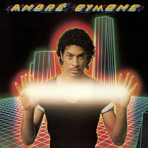
This album cover from the 80s shows some of the elements that are discussed in the article and are from the time period. The 3D-like font is very much of the time because during this time people wanted to experiment more with the new technological advancements and were interested in the future. Another thing I noticed was the background that has neon lights. It looks similar to other images where people were excited about the internet and the space that it created.
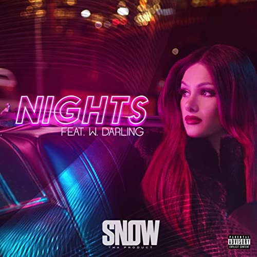
In this cover of the song, there are only subtle similarities to the 80s which are visible in the type. The name of the song is in neon lights font which is similar to fonts used in the 80s. I would also say that there are some lines that go from the top of the image and swirl around to the bottom which looks like something I saw on other music covers and posters. I would also saw the colors in the picture is similar how to other designers who want to do the 80s inspire content to use to make the image feel more like the 80s. However, the rest of the image is pretty modern a simple typeface for the name of the artist and the rest of the image without the graphics.
Annotations:


Leave a Reply