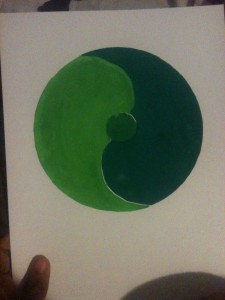
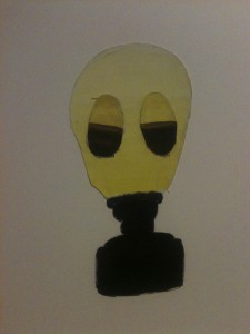
This project was done to show our understanding of color harmony and hierarchy. The first piece is an analogous palette. Since we needed some balance, I figured I’d signify that by drawing something similar to a yin yang circle. The first color is a light green, while the second and third are darker greens. I put a muted green in the middle as it was a color in between the other two, and I think it shows a balance between the two colors. The second piece is a gas mask because I have this strange fascination with gas masks (don’t judge me!) This piece was meant to show shades, tints, and progression. Shades are colors that go from prismatic to black. In this piece, the violet transitions to black. Tints go from prismatic to white as shown by the yellow. Progression has one color transition to its complementary color, as shown by the goggles where the violet turns into yellow.
Skye Fontanet's ePortfolio
A City Tech OpenLab ePortfolio


