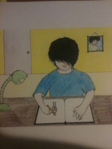
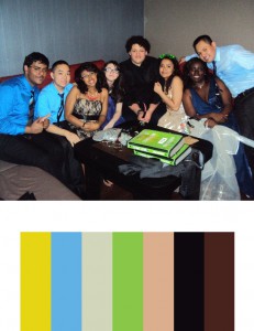
For this project, we had to make a color inventory and illustrate a harmonious moment in our life. For the color inventory, I chose a picture of my friends and I after prom. I felt that the bright colors and the joyous feeling in the picture depicts a truly harmonious moment where everything feels good. As for the harmonious moment in my life, I chose to draw myself drawing (mind blown!) I feel like when I draw, I really escape from any problems and just focus on making as good of a piece that I can. That’s when I truly feel harmonious with the world. The colors from the color inventory served well because bright colors generally give off a good vibe. They fit into the drawing where I’m really focused and happy.
Tag Archives: Hue
Color Harmony Palettes
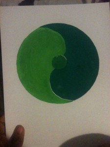
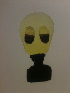
This project was done to show our understanding of color harmony and hierarchy. The first piece is an analogous palette. Since we needed some balance, I figured I’d signify that by drawing something similar to a yin yang circle. The first color is a light green, while the second and third are darker greens. I put a muted green in the middle as it was a color in between the other two, and I think it shows a balance between the two colors. The second piece is a gas mask because I have this strange fascination with gas masks (don’t judge me!) This piece was meant to show shades, tints, and progression. Shades are colors that go from prismatic to black. In this piece, the violet transitions to black. Tints go from prismatic to white as shown by the yellow. Progression has one color transition to its complementary color, as shown by the goggles where the violet turns into yellow.
Paired Color Identities with Simultaneous Contrast
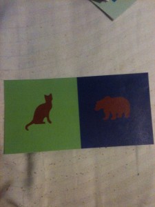
For this group project, I teamed up with Dez to show contrast in colors that were the same using different background colors and symbols. My symbol for Dez was a cat because they’re small and adorable but they can be quite ferocious. I also chose a green background for her as I felt it represented her down to earth side. We chose burgundy as a central color to represent how caring we are towards others, but have a side of us that we don’t like to show. Using burgundy to show the halo effect was quite difficult as burgundy is such a dark color, but we found that blue and green worked well; especially green as it’s a complementary color to red. For the cat, I see a sort of reddish halo, as that is the complementary of green. For the bear, I see an orange tint as that is the complementary color of blue.
Color Interaction Pairings
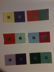
For this piece, I had to make a color appear as 2 different colors by changing the color behind it. This was definitely one of the most interesting projects we’ve done. I had no idea that I could make one blue look like 2 different shades of blue by changing what was around it. For some of the squares, I had to change the value of the surrounding color. I had to alter the hue instead of values for some. For others, I changed both hue and value. I found that this made the center squares appear either lighter are darker (lighter if the background was dark and darker if the background was light) even though they were the same colors. I also saw a “halo” of whatever the complementary color of the background, which was something new.

