Yeonseon Lee
COMD 1100
05.22.19. WED
Museum Visit
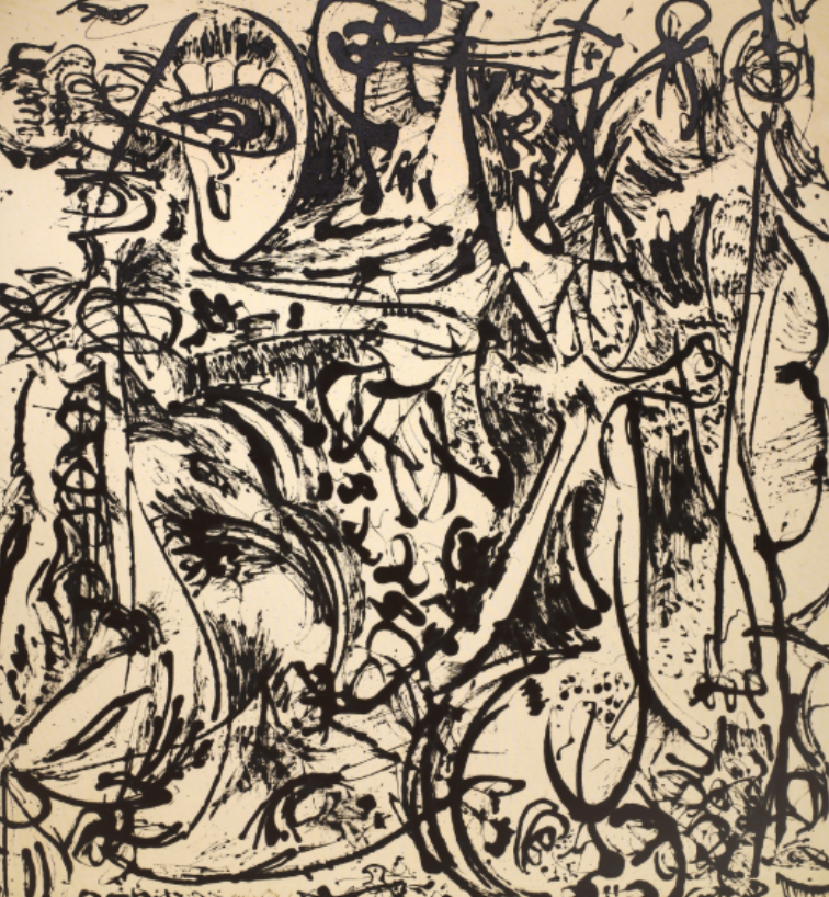
Artist name: Jackson Pollock
Medium: Oil paint
Date of the art piece: 1950
The date of visiting museum: 05.19.18
I went to the Museum of Modern Art to see “One: Number 31, 1950”. It has ambiguous
figure. It is hard to find out which elements go with foreground and background. This art piece
has texture. The feeling is so intensive and rough due to scatting painting. When seeing this
piece, it contains all the grayscales as well. It is really whimsical, active, and intensive. It has
quick and violence movements as well. Its color is in mostly through all the grayscales and some
brown. For using achromatic color, it gave us cold feeling; in the meanwhile, it gave angry
feeling. This artwork is covered the big part of wall. Despite of huge size of artwork, the feeling
became to increase. I felt that art work expressed the mixed feeling: angry, confusion, sadness.
People feel complex and several feelings not just one feeling. I think the artwork might look
differently to people depending on what people feel at that moment. It does not have various
colors, but I can feel many things and make me think rather than seeing color art works.
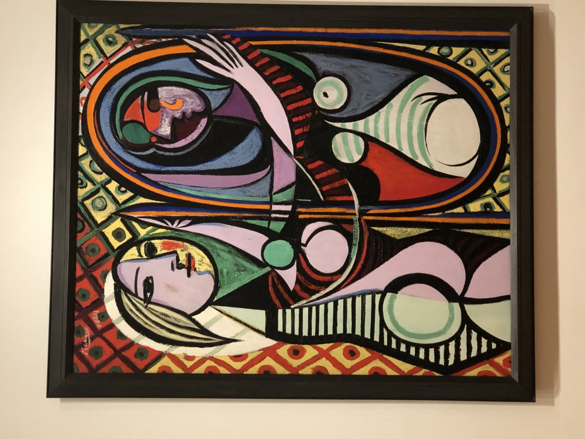
I chose the desert line work that I have done. This art piece has different figure than first
work that I saw in the museum. The art piece that I have done has obvious figure rather than art
work and also contains smooth and calm feeling. It, however, has same texture work and black
and white picture. Even though those of works are texture and similar color, they give me
completely different feeling due to material of medium.
Page 1 / 2
Zoom 100%
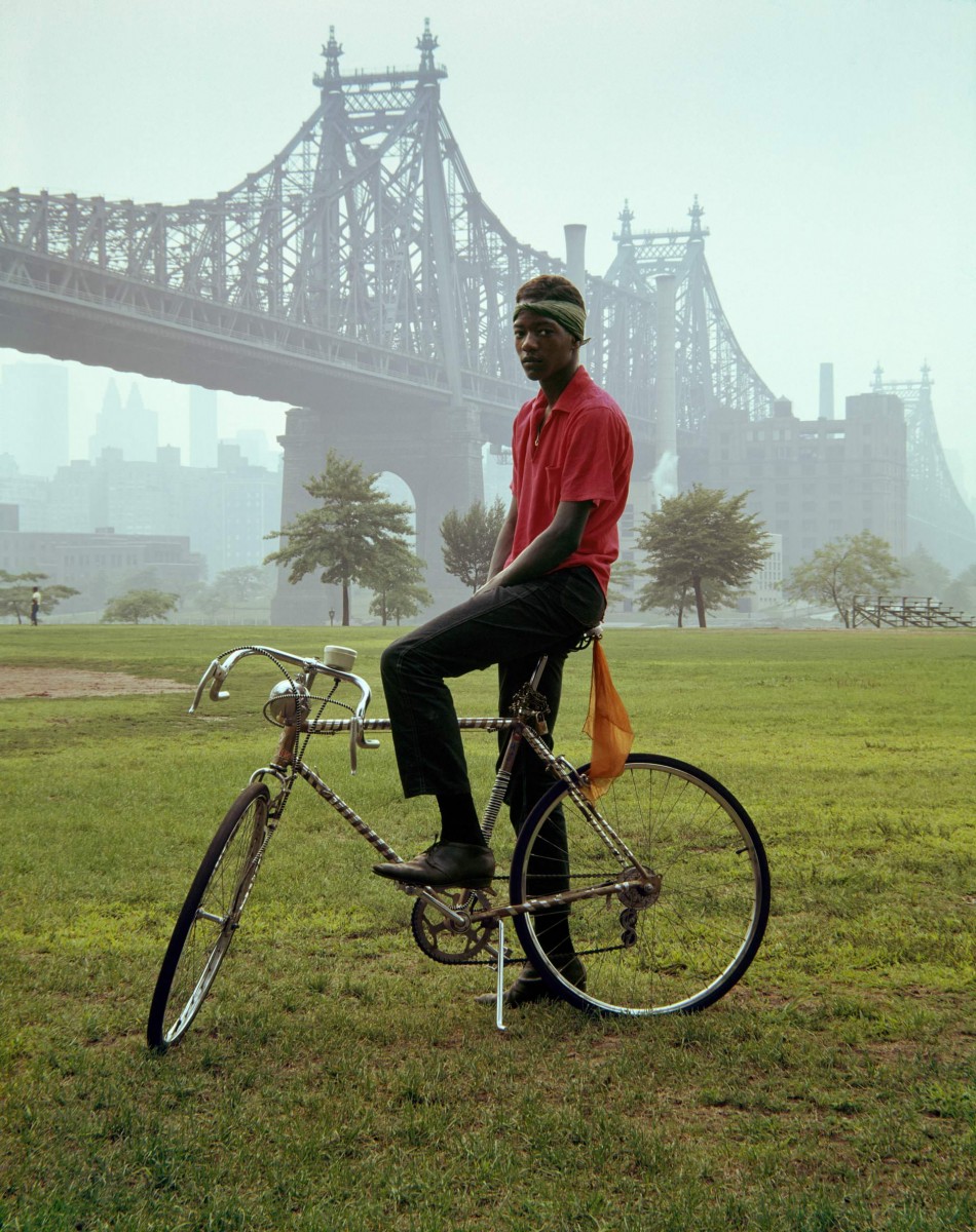
 The foreground in this art piece or photograph stands outs. From first glance all it is simple green grass. Its not so simple though, the grass brings out color in the photo and correlates with the background and helps the image overall and background. Showing contrast and layers of contrast throughout the photo. The background is foggy air with a bridge behind it (that u can see through the mist). The main subject of the subject is a black male wearing a bright shirt sitting on a bike. He positioned right in the middle of the bridge and is covering a tree u can see in the background only by a little bit. Being a very old picture the texture is very grainy, its not very clear due to technology/camera that was used in the 1960s. The motion the male is presenting and the overall picture presents is stiff and neural . There’s is no emotions in the males face and is posture and the way his body is positioned on the bike is stiff. One of the project Ive done n Graphic design principles 1 was project 3 SelfieMotion. In one of the beginning steps for the project we had to take a selfie presenting a emotion in front of a white bland background. Seeing this photo the differences was plentiful. My face showed my expression and the way my body was positioned made it look like I was ready and excited to take this picture. The male in the photo looked like he didn’t want to be there and somewhat sad. Just an expressionless face.