Author Archives: orangeboy

musuem

Michael Castillo

Design – Museum Visit


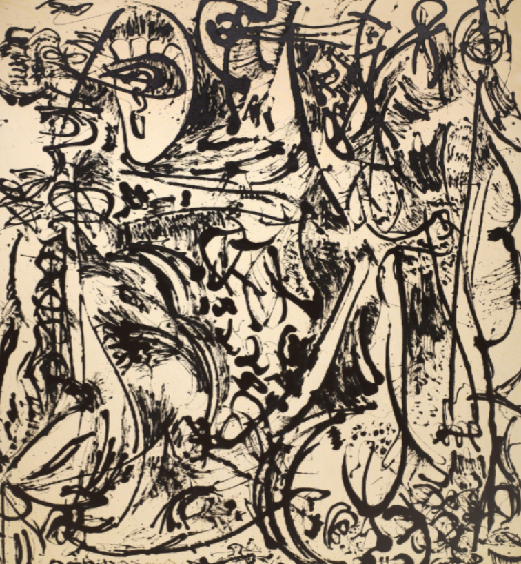
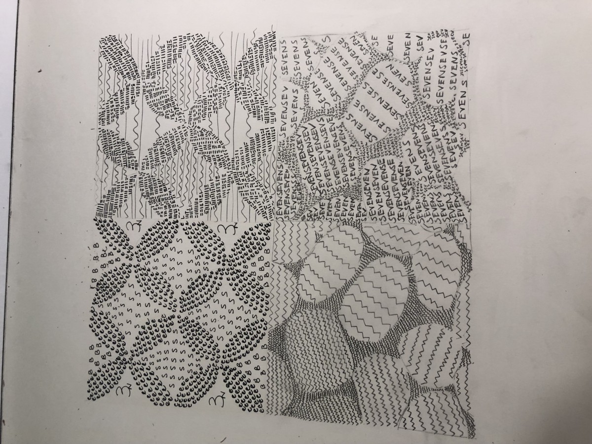
      The museum visit to the MOMA opened my eyes to the beauty and craft in art. Jackson Pollocks work in the museum was the main eye catcher! His art defies conventional explanation, in the words his pieces conveyed abstract expressions; similar to Project 1 where we worked with negative space and defined the foreground/background. In addition, his work can also be related to Project 3 where we were faced with having to translate an expression onto paper!


This semester has been one joyful ride. I learned many things! I learned how to manipulate the ink in a brush/pen, how to differentiate a foreground from a background, how to make nothing into something and anything between. Most importantly, im taking with me that patience is key. If I am patient enough with myself and my work, I can create anything. As a designer it took me awhile to understand that what works for someone else may not work for me, but knowing where to direct my focus is invaluable.


This image requires alt text, but the alt text is currently blank. Either add alt text or mark the image as decorative.


Red is the color of power and strength. Overtime red has been used to evoke emotion and passion. Humans have adopted the evolutionary meaning of red and use it as a warning color!

Favorite color is red! It represents resilience and passion which to me are two admirable traits!

I’ll be working with a green that is a complementary color to red.

A blue and yellow which is triad to red, and a orange and violet shade which are analogous to red!

This image requires alt text, but the alt text is currently blank. Either add alt text or mark the image as decorative.


Mood: Angry

Focal Point: Mouth

(Yes my project is to be looked at upside down)


I had fun with this project! I didn’t like it at first but when I actually sat down and got to work it started growing on me. The biggest thing I learned from this project is how gradients and space create some sort of movement within pieces. I learned how to manipulate these two factors to my benefit in which I could use later in life.


I think I tripped a bit capturing angry. Although I think I achieved the mood to an extent, I definitely could’ve pushed it further and shown my message clearer.

The mood I went for was angry! I’m a very edgy and assertive person with an aggressive side to me, so I thought going for angry would be the option I could work and do best with.

My focal point would be the angry mouth! I tried to achieve this by creating a gradient on an elongated neck (you’ll see this in my final piece) which forces viewers to look in the direction of the mouth.

The backstory to this is pretty simple. Me and my friends went out, bill came out to one thousand, and I was left to pay it. Because of this, I’m furious and have to say!This image requires alt text, but the alt text is currently blank. Either add alt text or mark the image as decorative.

I chose the four pieced butterfly pattern and the rocks image which show texture!

In the pattern image, 3 shades are shown symmetrically, showcasing four butterflies put against some sort of multi shaded background. The overall mood is calm and well balanced.

The rocks however give us a more uncertain feeling. One side gives off cool, while the other is depicting some sort of rough action.

Overall, the project was pretty easy once I fully understood how to capture and translate the feelings correctly with ink until a bristol board.

This project taught me the different ways to mimic objects in images. A few of these ways include: the space, size, and weight used in order to achieve the end product.