Museum visit
Museum Visit
Leave a reply
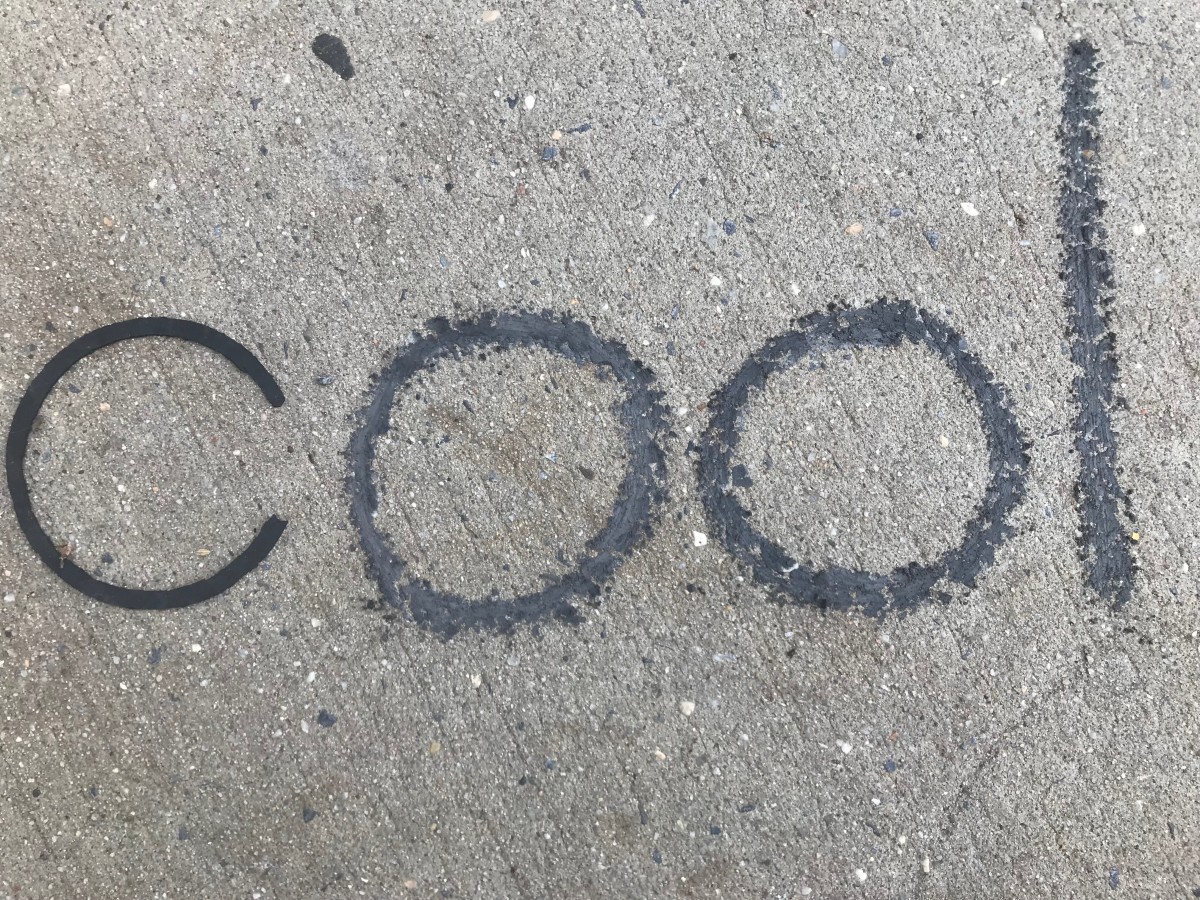
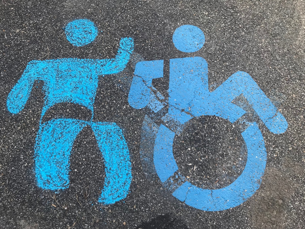

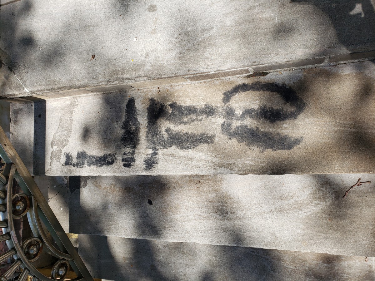
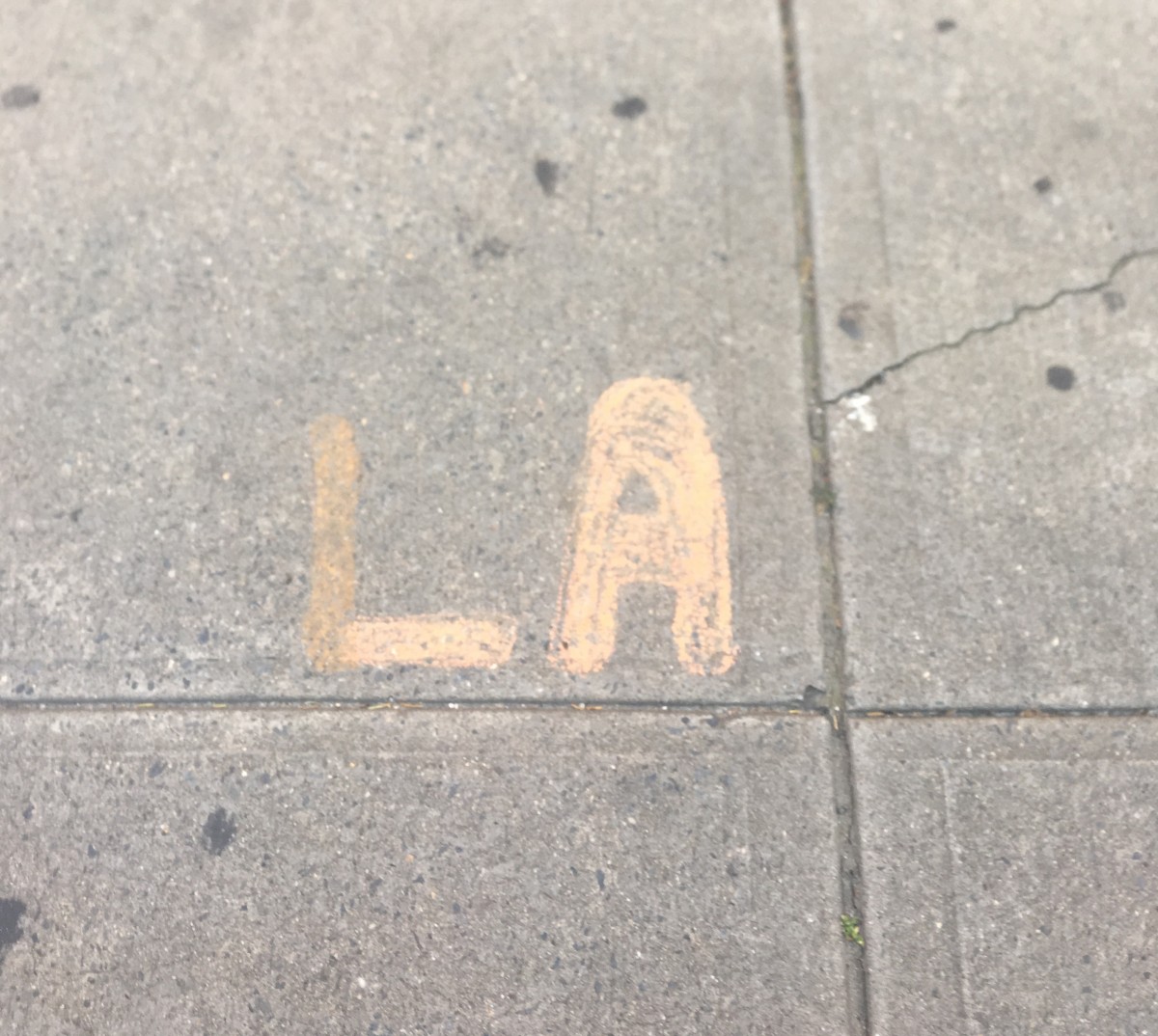
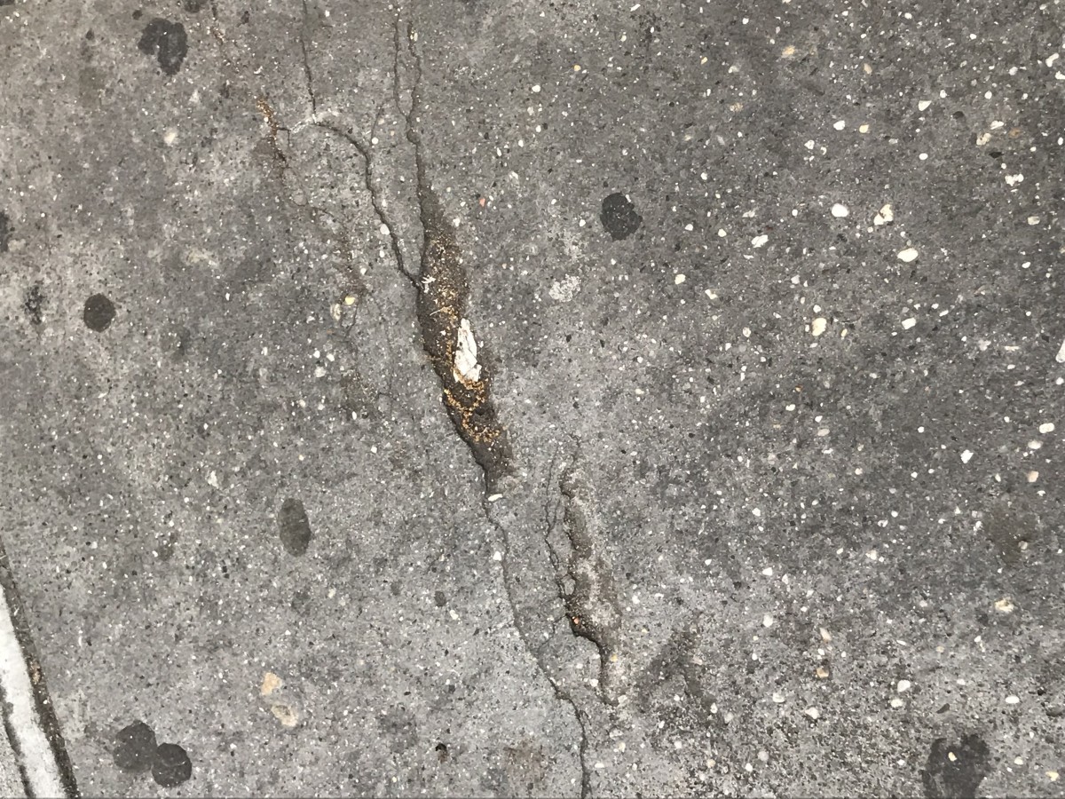
My starting point was the shape C rubber.
It was in front of a church, and when i started to chalk around it, someone passing by asked me what am I doing? and i am not allowed to do it because its the church. I answered back that this is the sidewalk and it’s for the public. He went inside and bring the priest. By that time i had finished and washed off the chalk , and left.
When I heard him feeding the priest lies i went back and i explained myself. turn out that the day before, there was a manifestation and they thought that may art was related to it. The person apologized and everybody left satisfied. Communication is key to tolerance
My starting point is obvious and decide to build a type based on it.
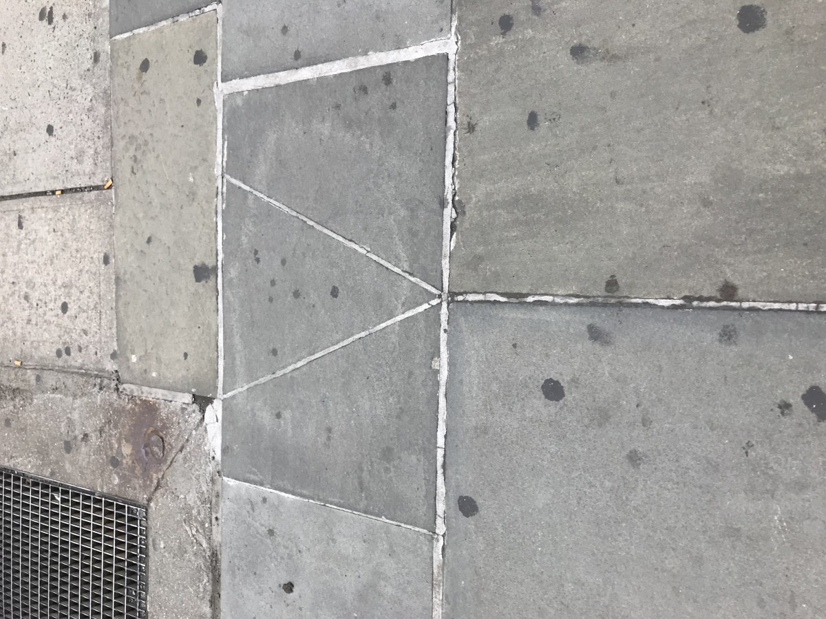
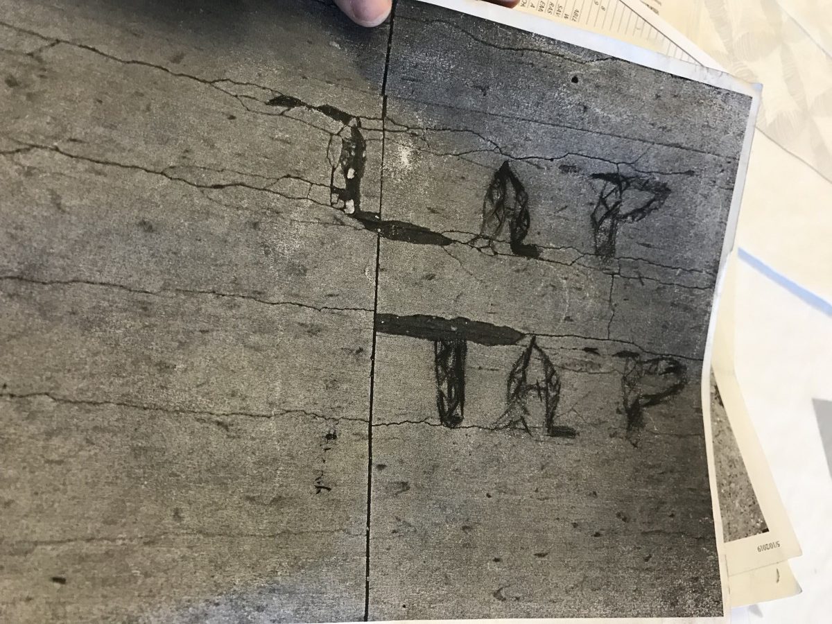
it was done on staples’ parking lot.
Believe it or not. the manager was not happy with it, and gave me a whole speech. I ended up washing it off.
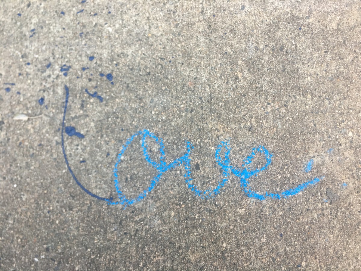
Fun was really FUN to do.
my starting point is the cast shadow of the sun over a street sign.
It looks like an F, so I find it interesting to build type on it.
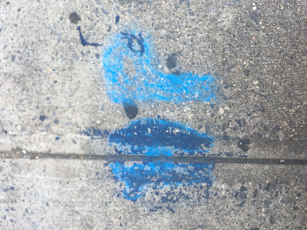
The funny part is that you have to work against the clouds.
It was a cloudy day that did not help. Moreover the time in between I finished wetting the letter and took the picture the chalk dries too quickly
I wished to achieve the actual color of the cast shadow
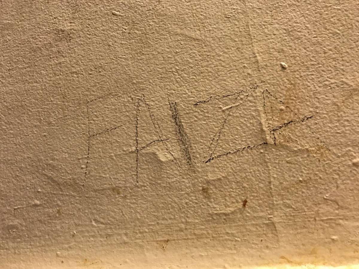
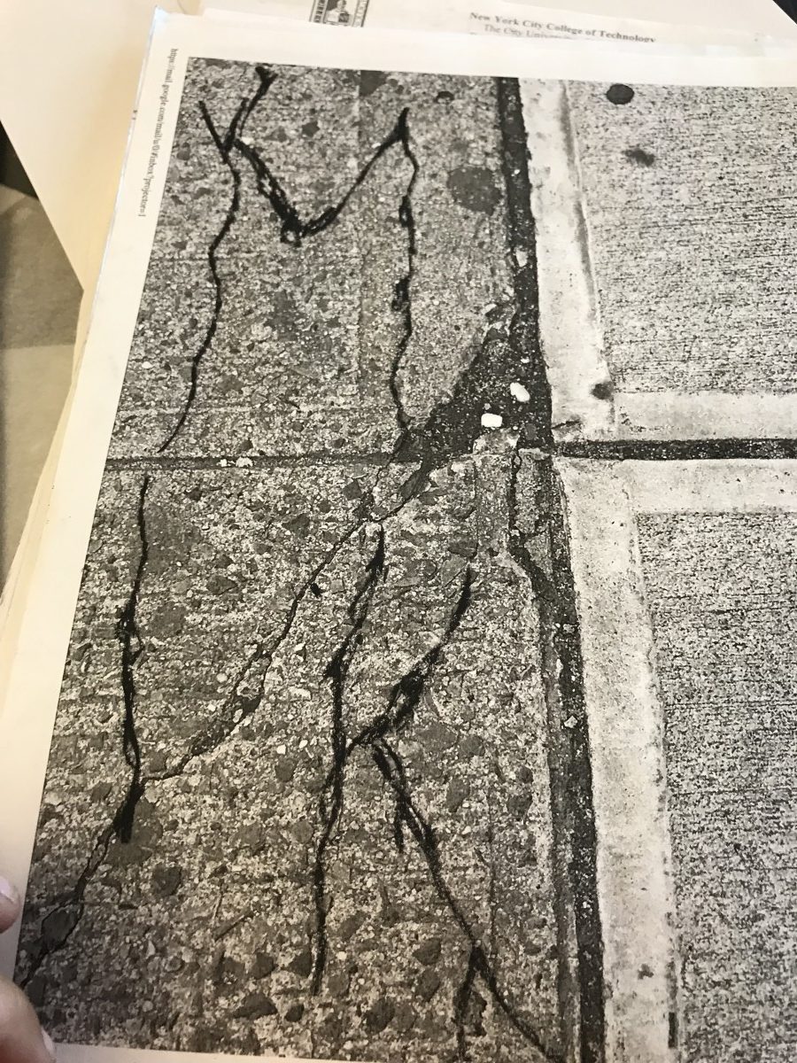
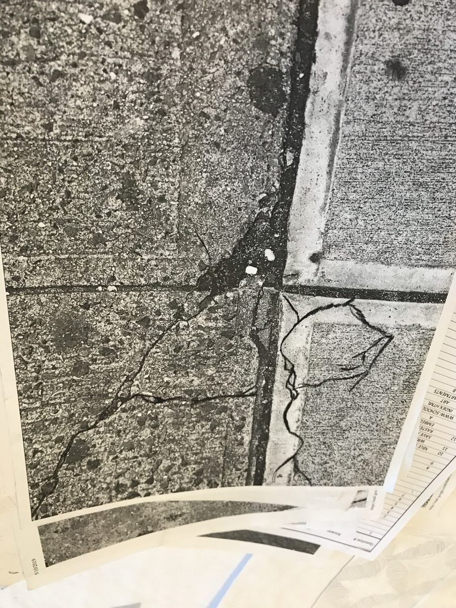
the starting point which is an Interrogation mark was in a quiet street.
I get really dirty to mix up the color and had that final result.
Averall. i am really pleased with the results.
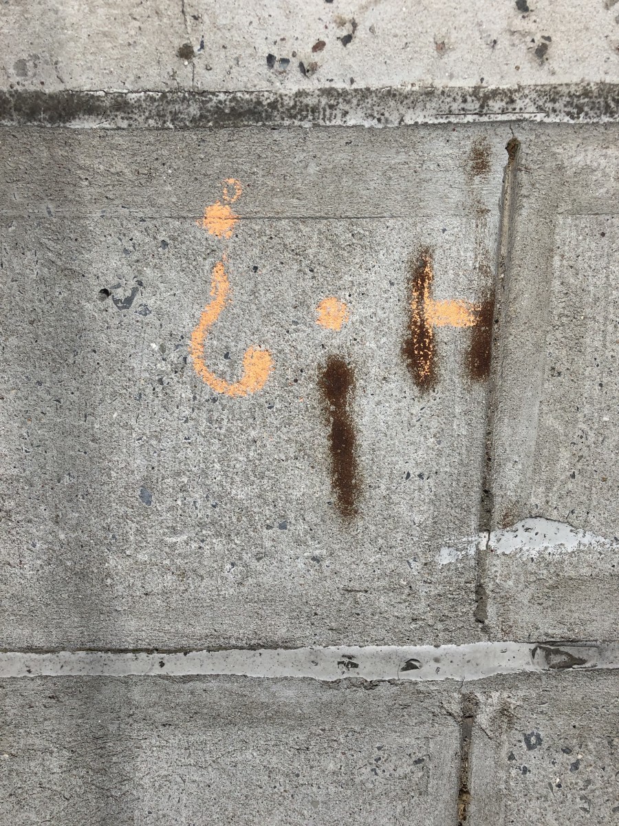
From the starting point, the first thing I did was to look at it from different angles to see what I could do with it. Then I saw an H but I noticed that the third line was too high up for any other letters but not for an exclamation mark so I drew that. The question mark was added because I want more to it but also keeping the simplicity. After taking the picture, I decided to explore for with it and found out I like it more when it’s flipped upside down.
It was great time to work on this project. Even though my work was not perfect, l learned a lot through the this project.
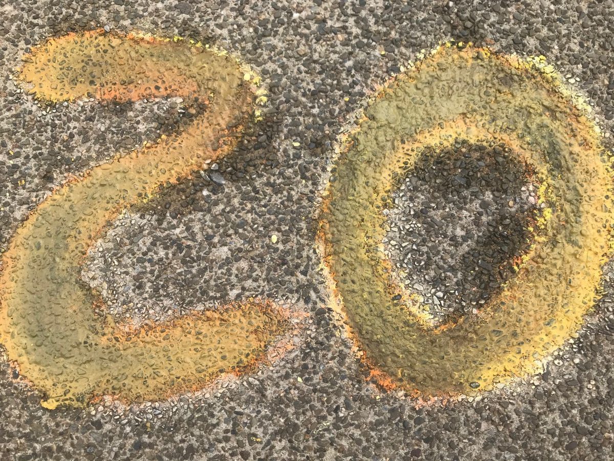
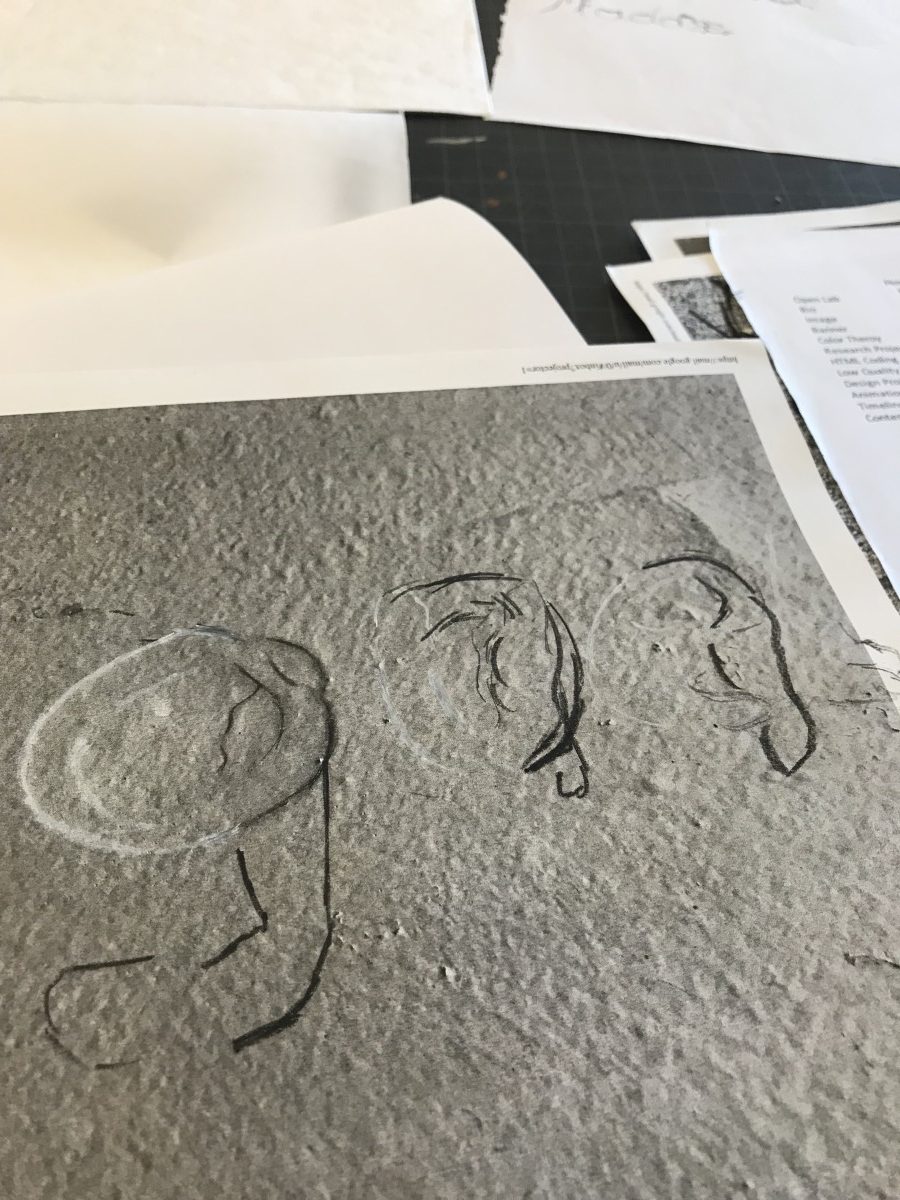
Starting point


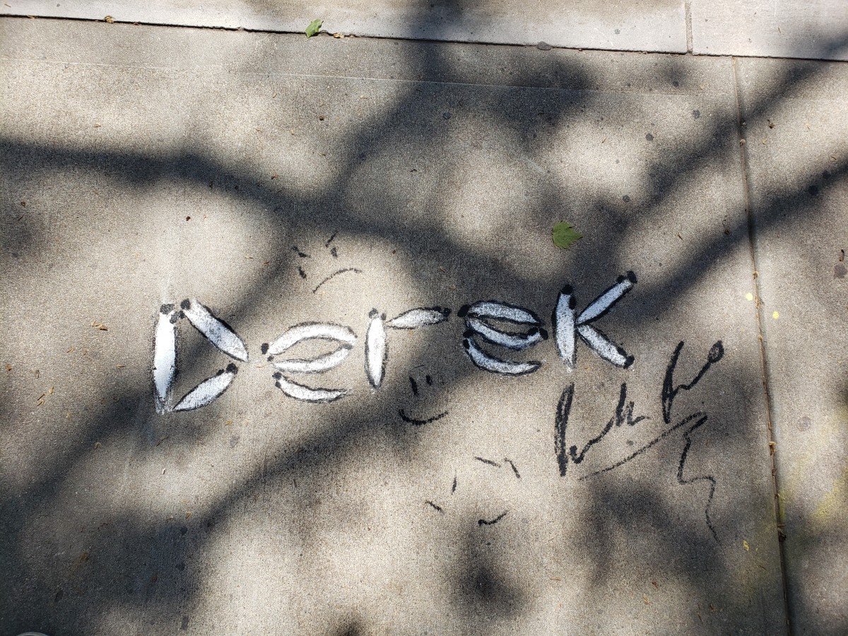
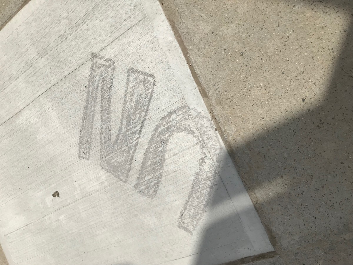
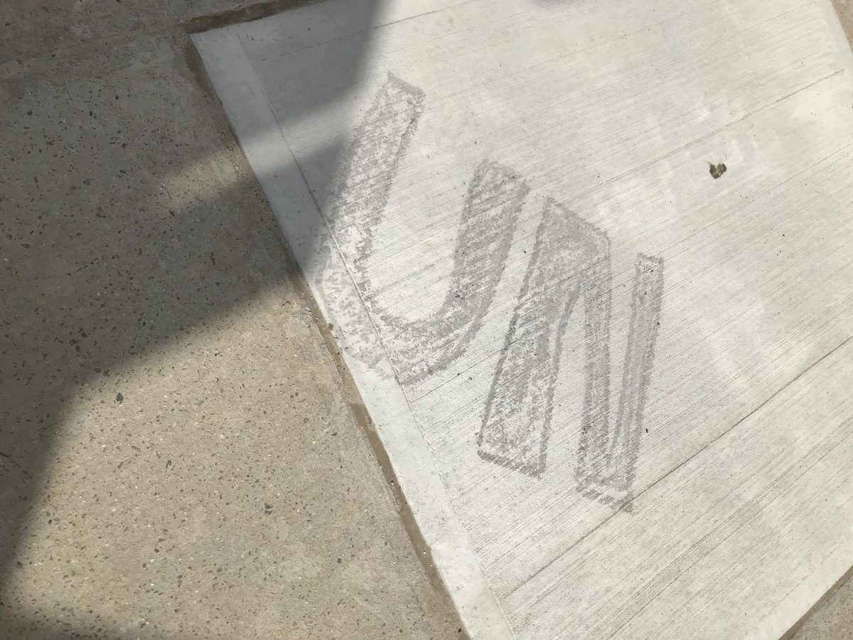
Honestly i had a lot of fun with this project. Although it doesnt look too pretty i realized my mistakes and errors and where i went wrong. if i receive this project in the future i will know what it shou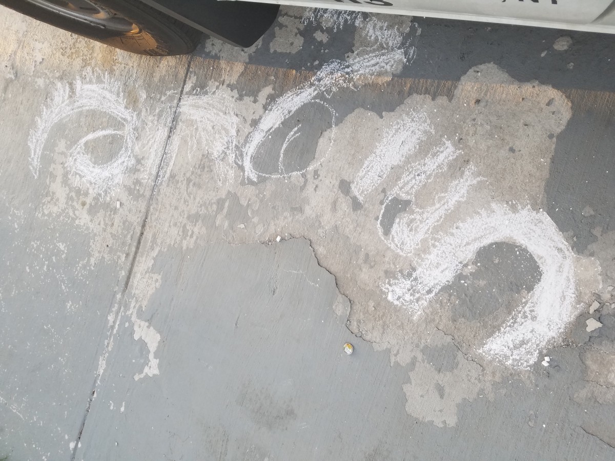
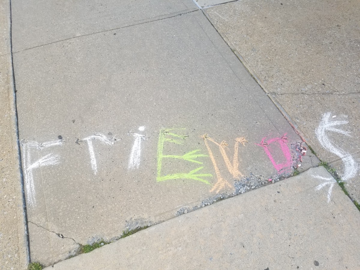 ld look like . Just in case you cant read the words they are Just, Unique, and Friends
Taurique Venson
5/22/19
Graphic Design Principles 1
Artist : Evelyn Hoffer l Date:1964 l Medium: Photographs dye transfer paint
Name of exhibit Evelyn Hofer in 3 parts: Portraits, Landscapes, Still Lives
Location: Danziger Gallery
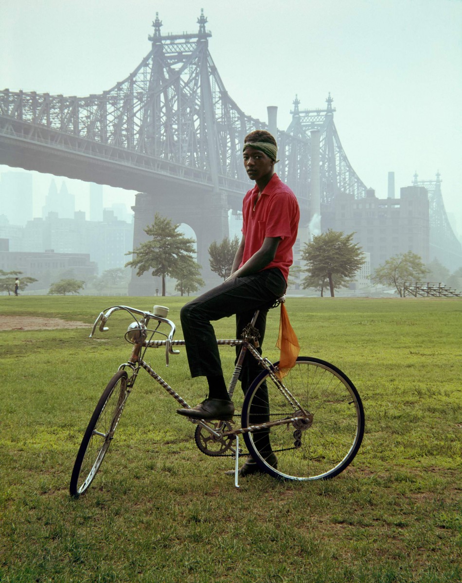 The foreground in this art piece or photograph stands outs. From first glance all it is simple green grass. Its not so simple though, the grass brings out color in the photo and correlates with the background and helps the image overall and background. Showing contrast and layers of contrast throughout the photo. The background is foggy air with a bridge behind it (that u can see through the mist). The main subject of the subject is a black male wearing a bright shirt sitting on a bike. He positioned right in the middle of the bridge and is covering a tree u can see in the background only by a little bit. Being a very old picture the texture is very grainy, its not very clear due to technology/camera that was used in the 1960s. The motion the male is presenting and the overall picture presents is stiff and neural . There’s is no emotions in the males face and is posture and the way his body is positioned on the bike is stiff. One of the project Ive done n Graphic design principles 1 was project 3 SelfieMotion. In one of the beginning steps for the project we had to take a selfie presenting a emotion in front of a white bland background. Seeing this photo the differences was plentiful. My face showed my expression and the way my body was positioned made it look like I was ready and excited to take this picture. The male in the photo looked like he didn’t want to be there and somewhat sad. Just an expressionless face.
The OpenLab is an open-source, digital platform designed to support teaching and learning at City Tech (New York City College of Technology), and to promote student and faculty engagement in the intellectual and social life of the college community.


 Sketch 1
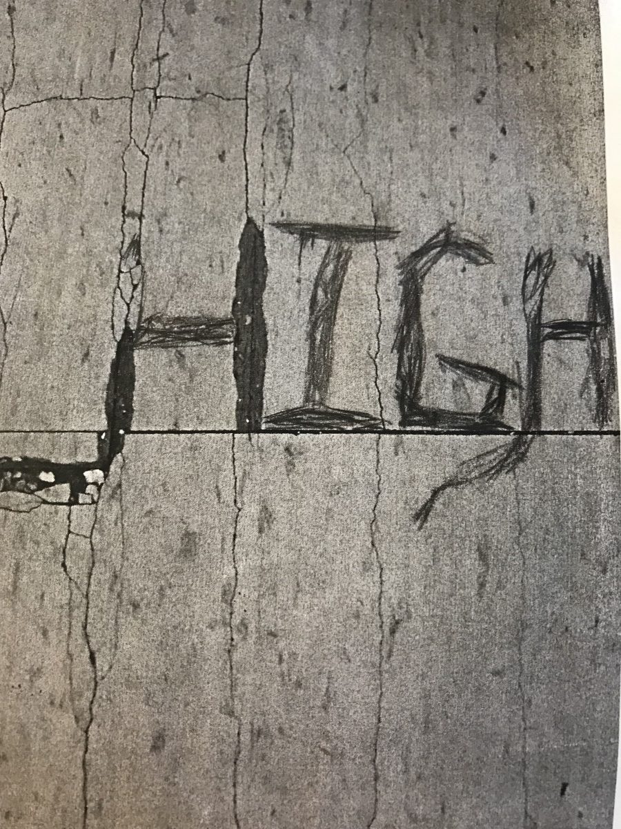 Sketch 2
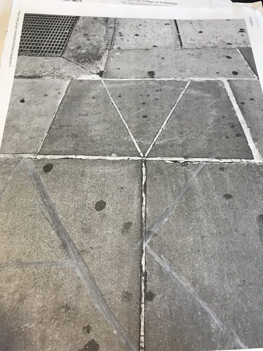
 Sketch 1
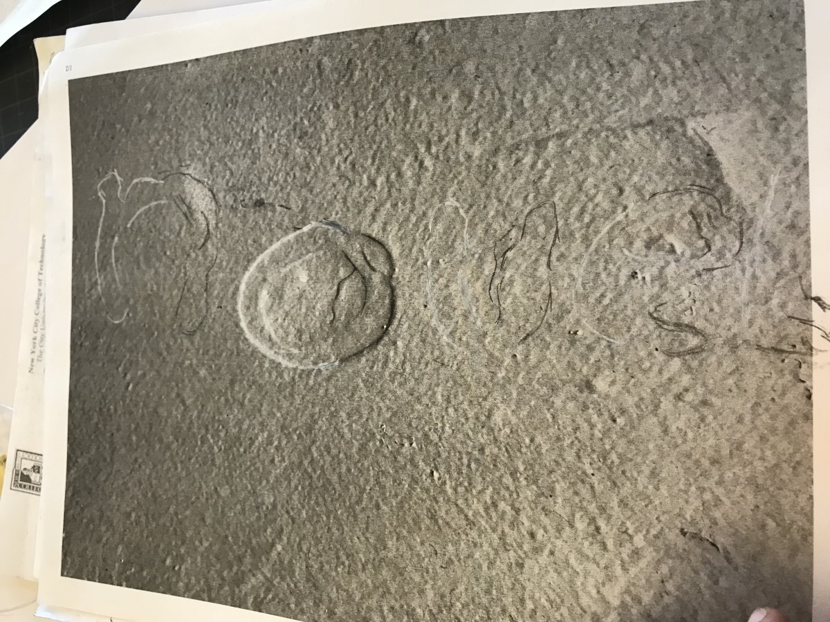 Sketch 2