Faiza’s Museum visit
Leave a reply
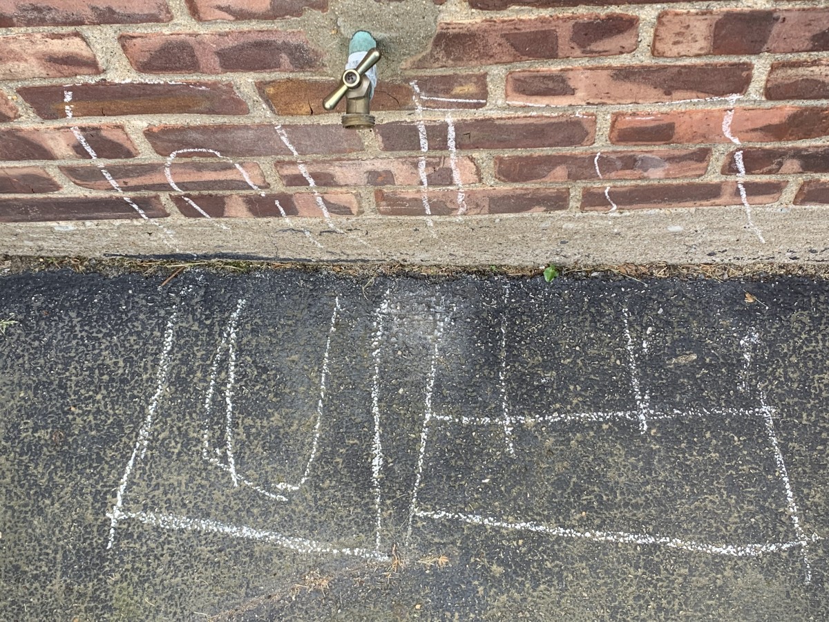
WT for WATER and the hose shows the ending of the W kind of a cool representation of WATER
U N ME no matter which way you see the letters it makes a U and N and it also kind of looks like a tunnel from the loony toons which is also pretty cool. and also there is a M and E both going the same direction which makes the viewer see the representation and kind of looks like something out of chalk zone .
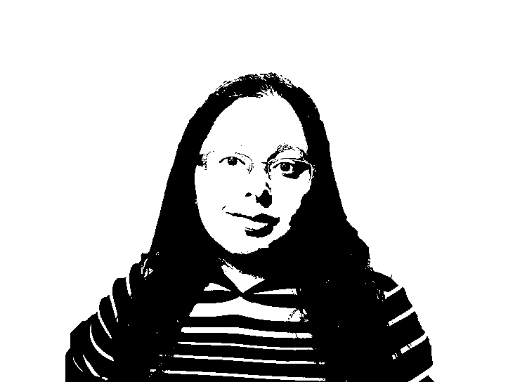
GUY the words were inside each other and cut off on the top of the porch. 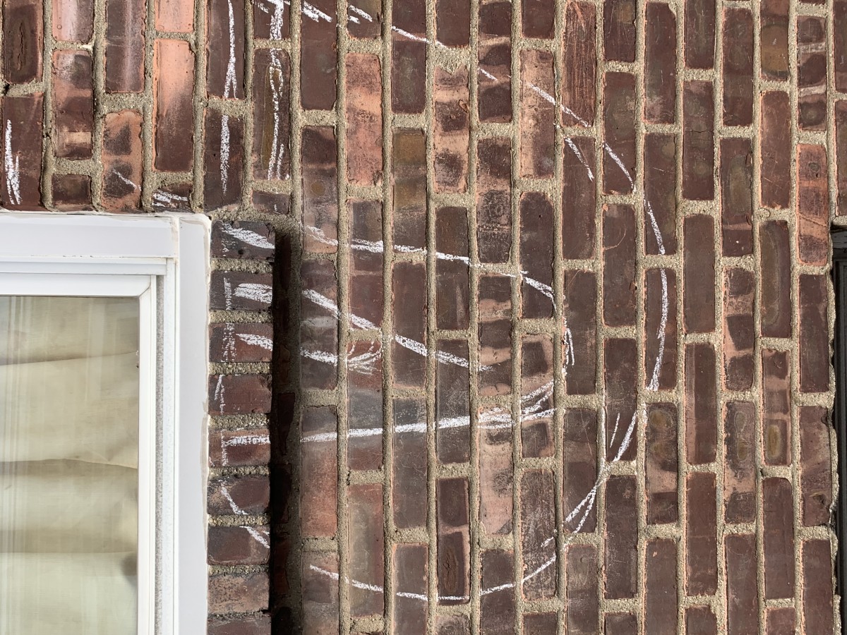

Gaethan Jean-Pierre
Graphic design principle
Paula
Final essay
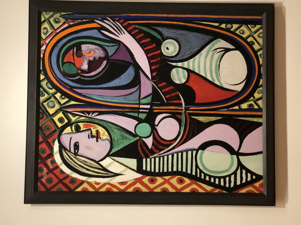
This piece of art that i have chosen for this project relates to many of the past projects that we completed. It is similar to the obvious and ambiguous project because the painting is ambiguous in a sense because of the colors. The vibrant shades of colors all mix together and if you just look at the patterns close enough you tend to get lost in the patterns and lose focus of the people in the painting all together. It also relates to the texture and pattern project because the painting is a bunch of shapes collaged together to make it into an object. Although that was not the full focus of the texture and pattern project it still had something to do with it because we had to make letters, shading, and spacing become objects as i did with the rocks. This painting also can be related to the selfie motion project because its a collage of objects on a person however it does not show emotion. It just gives the people features such as eyes and hair and clothing. Finally this painting can be related to the color your selfie project. Its related in the way it uses color to differentiate things like hair, clothing, objects, and body parts. Overall i enjoyed doing all projects because it was very hands on and taught me how to manipulate everyday things for example how anything on the floor can be turned into a ambiguous or obvious art piece. I also really liked how we used things we found on a magazine to show expression.
Michael Castillo
Design – Museum Visit
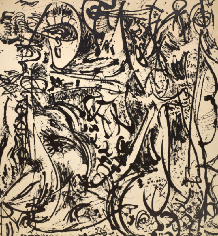
The museum visit to the MOMA opened my eyes to the beauty and craft in art. Jackson Pollocks work in the museum was the main eye catcher! His art defies conventional explanation, in the words his pieces conveyed abstract expressions; similar to Project 1 where we worked with negative space and defined the foreground/background. In addition, his work can also be related to Project 3 where we were faced with having to translate an expression onto paper!
This semester has been one joyful ride. I learned many things! I learned how to manipulate the ink in a brush/pen, how to differentiate a foreground from a background, how to make nothing into something and anything between. Most importantly, im taking with me that patience is key. If I am patient enough with myself and my work, I can create anything. As a designer it took me awhile to understand that what works for someone else may not work for me, but knowing where to direct my focus is invaluable.
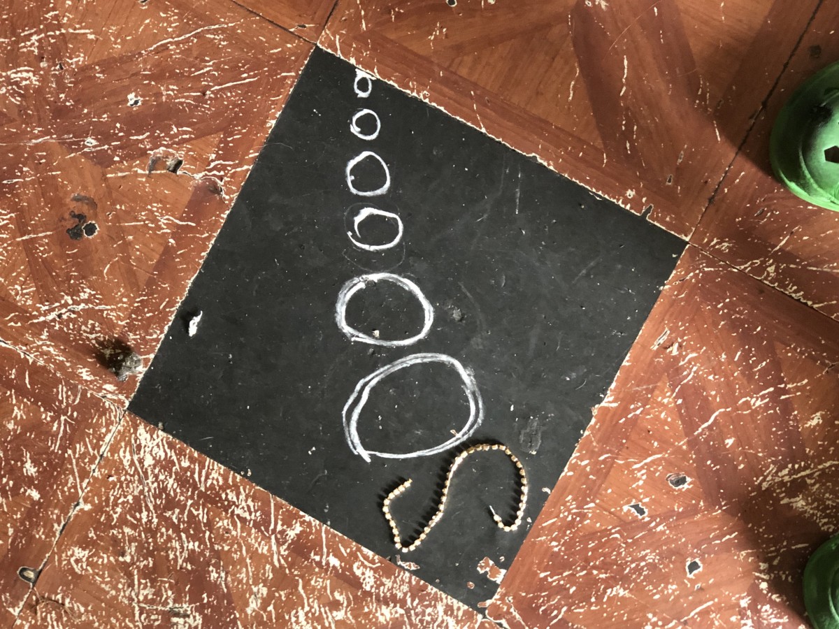
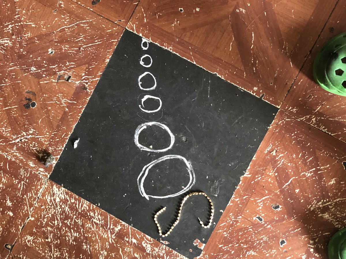
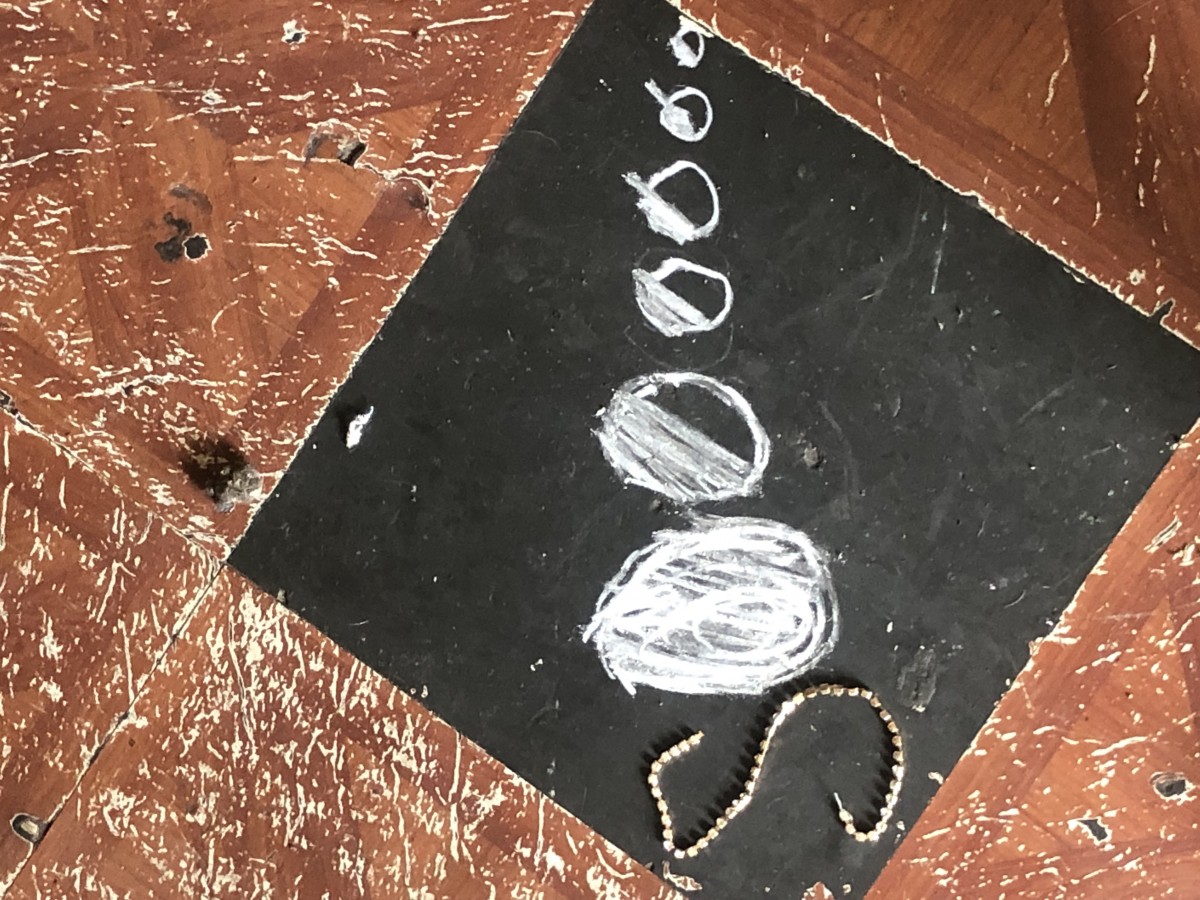
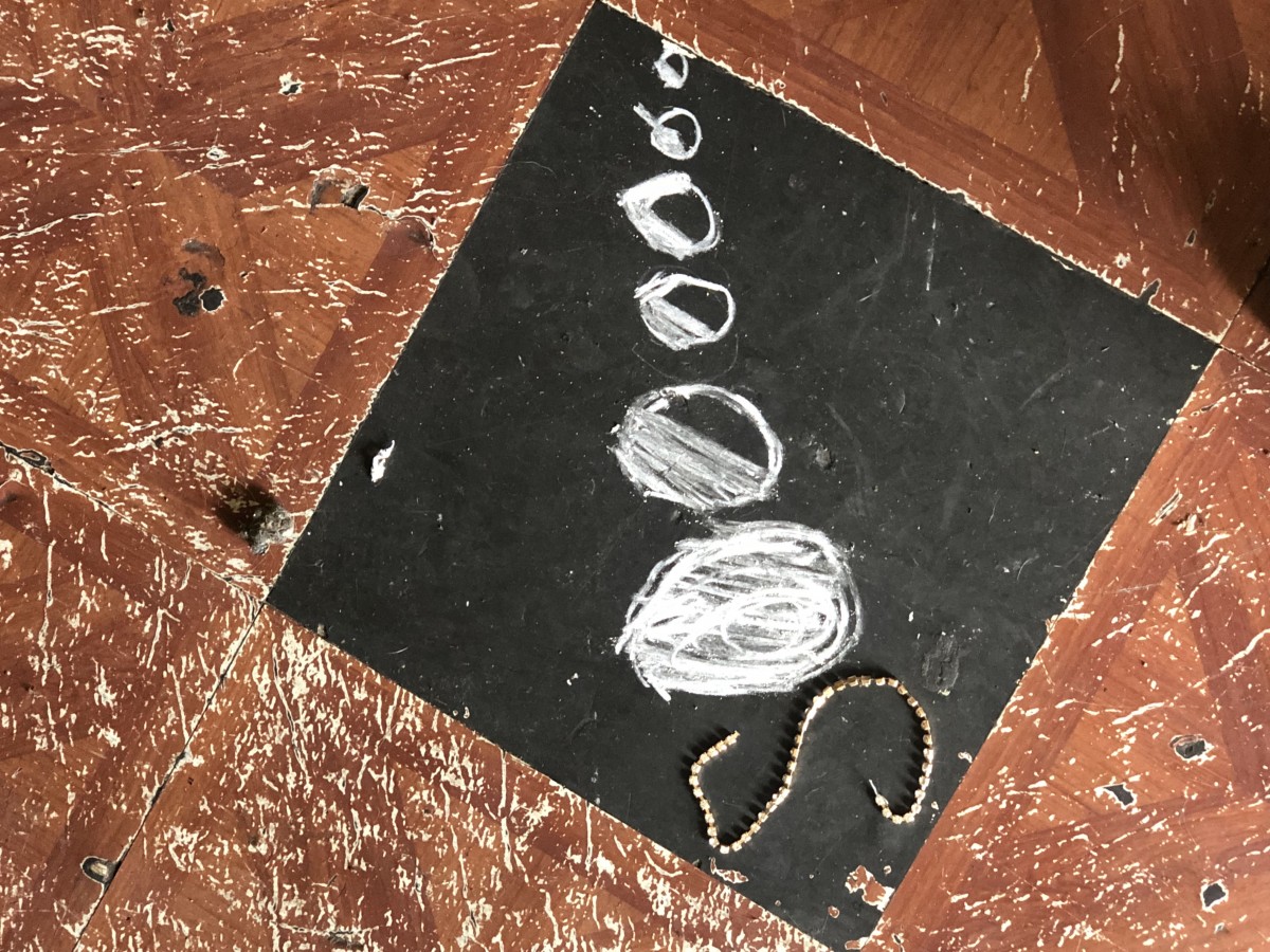
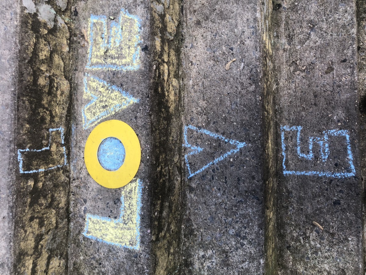
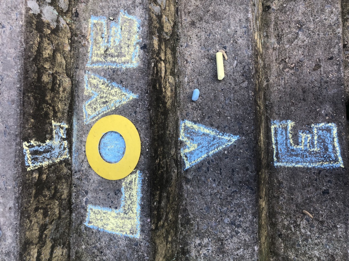
Here i wanted to create movement and sound! that explains the size and shade in the the O’s giving it a echo essence!
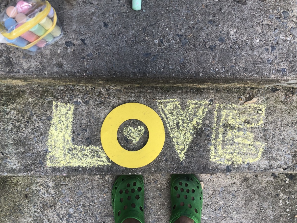
I decided to create a lively and energetic design with the word love! I added the contrast of yellow/blue outlines to allude the power and energy love has.
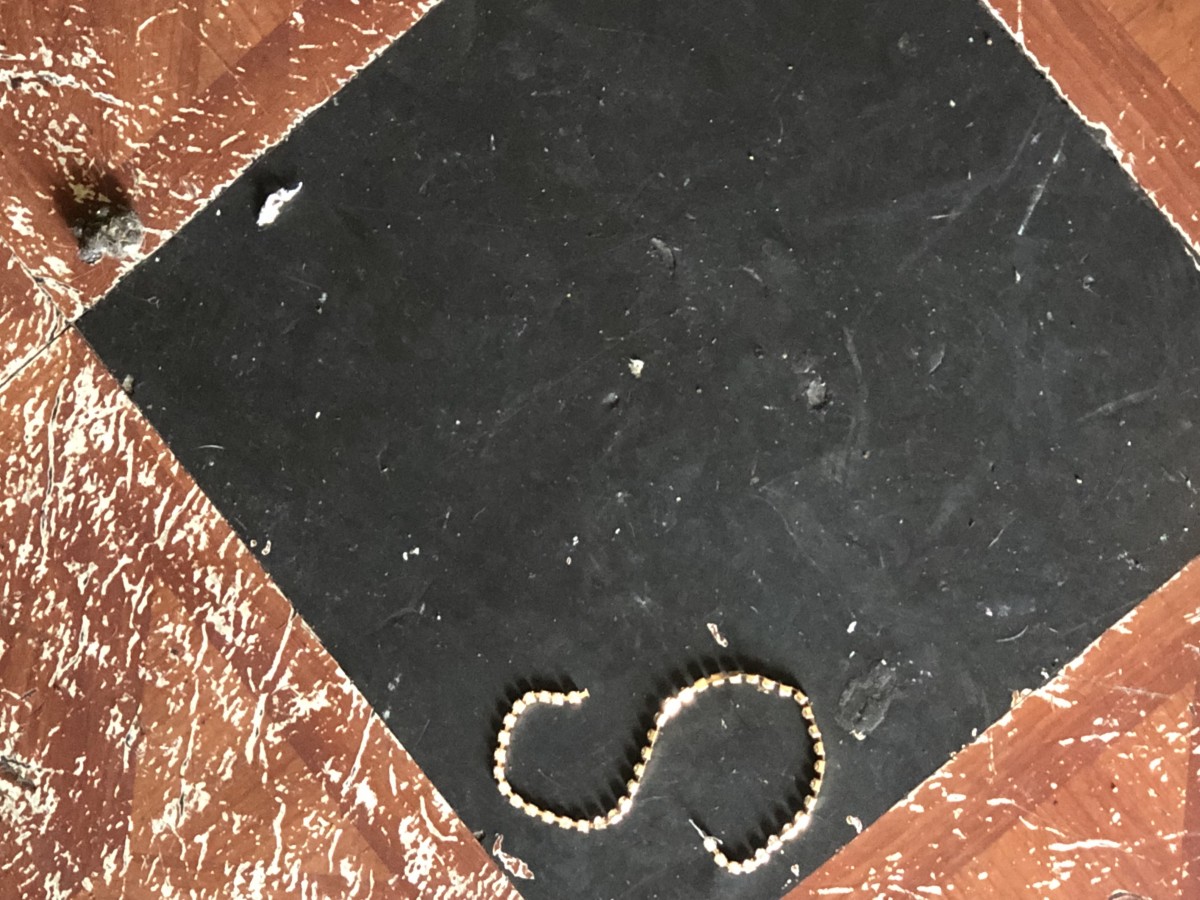
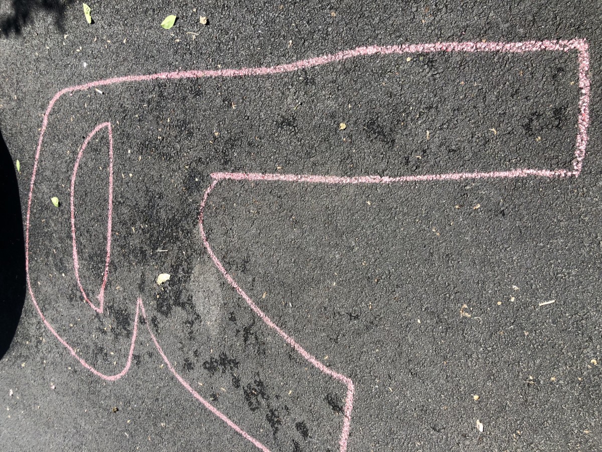
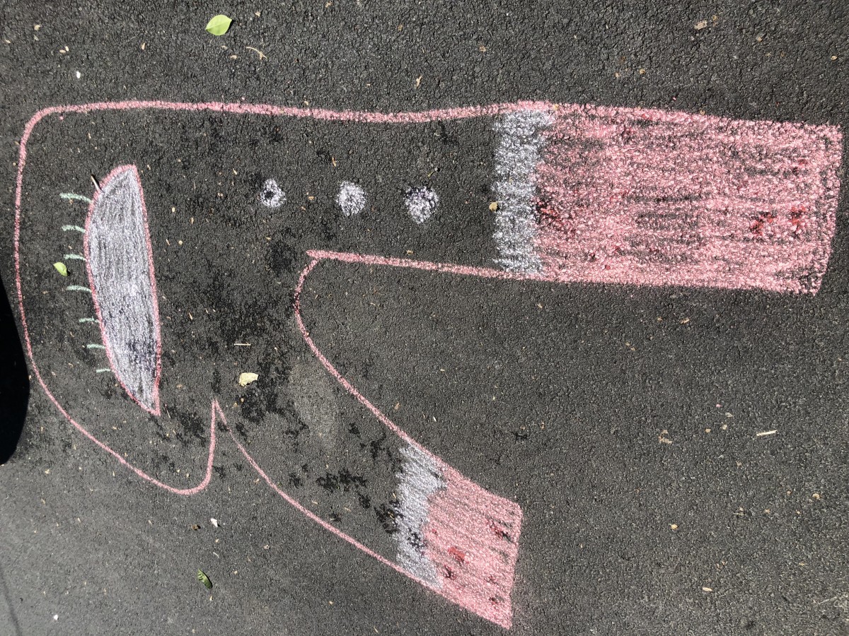
I saw a R within the blotches on the floor and decided to bring it to life! To do so I created a lifesize R and made it into a minion. The R’s legs represent the minions legs/pants, while the eye I added because I thought it was quite creative.


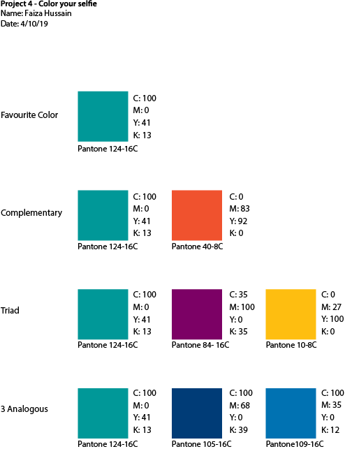
My favorite color is blue green. From where I researched the color, blue green is a color of creativity and is about balance. It is sincere like the ocean. It is a color that represents communication between the heart and spoken word. It also connects to focus and reflection on my own needs and thoughts and feelings. It can also be related to aloofness towards other people. However, it also shows that there isn’t much encourage emotional expression.
I choose this class this color because it represents me in giving me the feeling of creativity and calmness. I have always been about the creative art such as drawing and writing. Most of the memories this color for me mostly of creating my character and fantasy world in my novel Numen. I feel like this matches me very well since I have always been creative and in touch with my needs.
My favorite color is blue-green.

The OpenLab is an open-source, digital platform designed to support teaching and learning at City Tech (New York City College of Technology), and to promote student and faculty engagement in the intellectual and social life of the college community.

