Museum visit
Museum Visit
Leave a reply
It was great time to work on this project. Even though my work was not perfect, l learned a lot through the this project.
Starting point

I have never learned about color before, so it was an excellent experience for me. The color that I thought and I found through CMYK color is different, so it was surprised. It was hard to me make it neat and clear via using photoshop. It was terrific that several layers consisted of one image. Depending on the foreground and background colors, the picture shows a really different feeling to me. Finding the mood what I want is also fun. Through this project, I learned how the importance of color is. I was happy to doing this project as well.

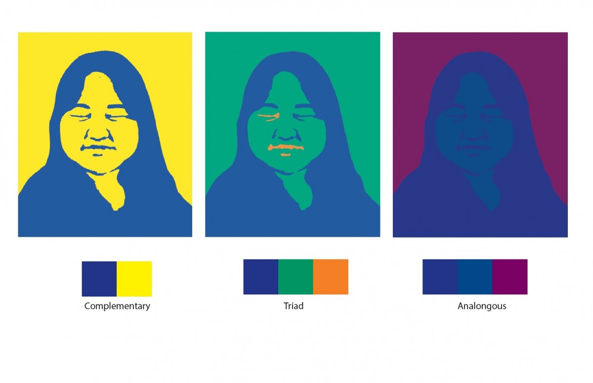
My favorite color is violet. I like the mood of the violet. I think it represents mixed feelings: calm, glooming, gorgeous, and etc. The light tone of violet is accompanied by a pink feminine and romantic atmosphere. On the other hand, the darker tone of violet gives the more subtle and elegant the image. It is more sensual than red violet, and is also called the visionary’s color.
Violet is a mysterious and beautiful itself so that I like.
Also, in history, violet has long been associated with royalty and majesty. Moreover, in ancient Rome, they used the violet for common funeral flower. It is is also interesting to me.
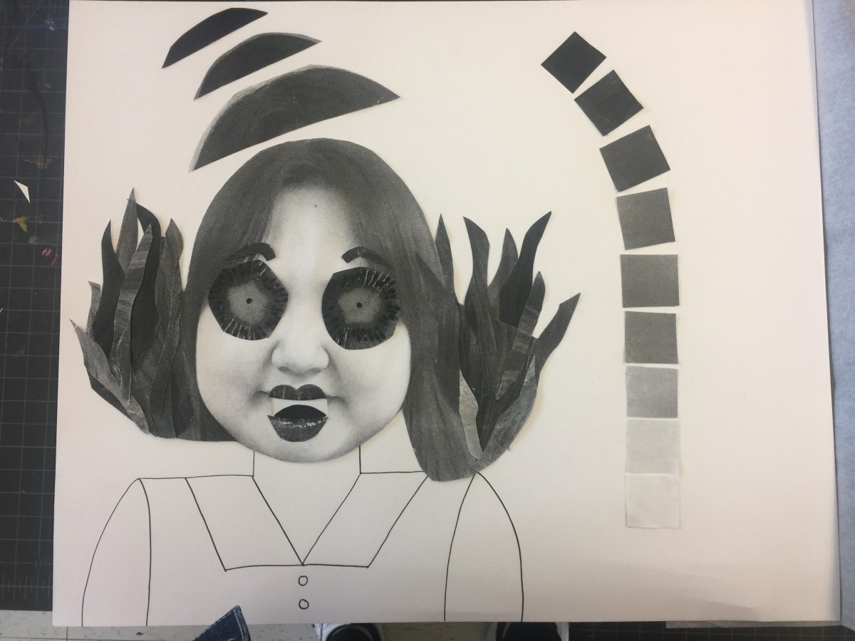
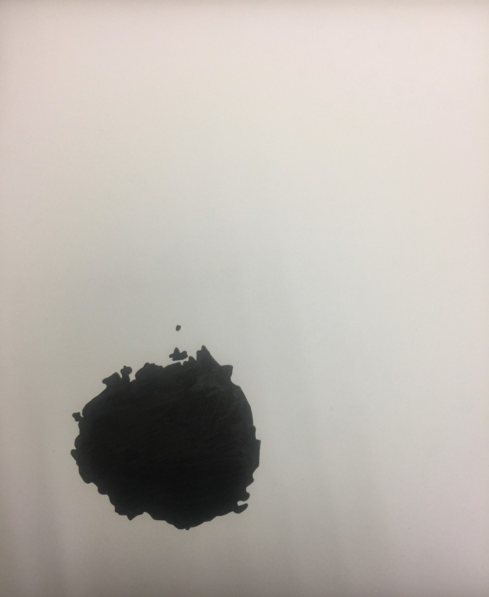
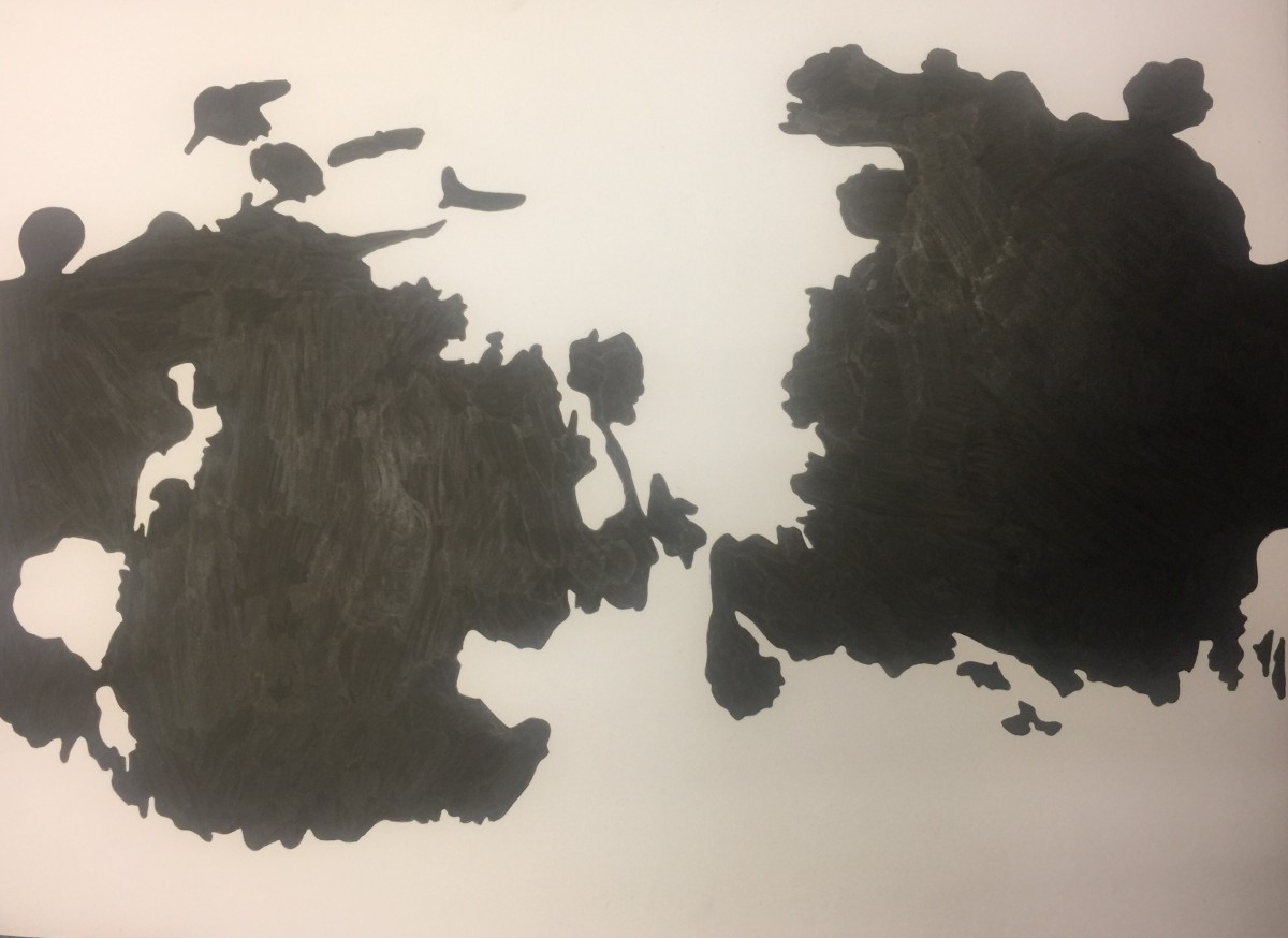
The mood I expressed is surprised. For the final work, I was trying to show the movement of the feeling: surprise. I was also trying to use different grayscale in my last job. It is hard to transfer and achieve emotion and motion at the same time, but It was fun!
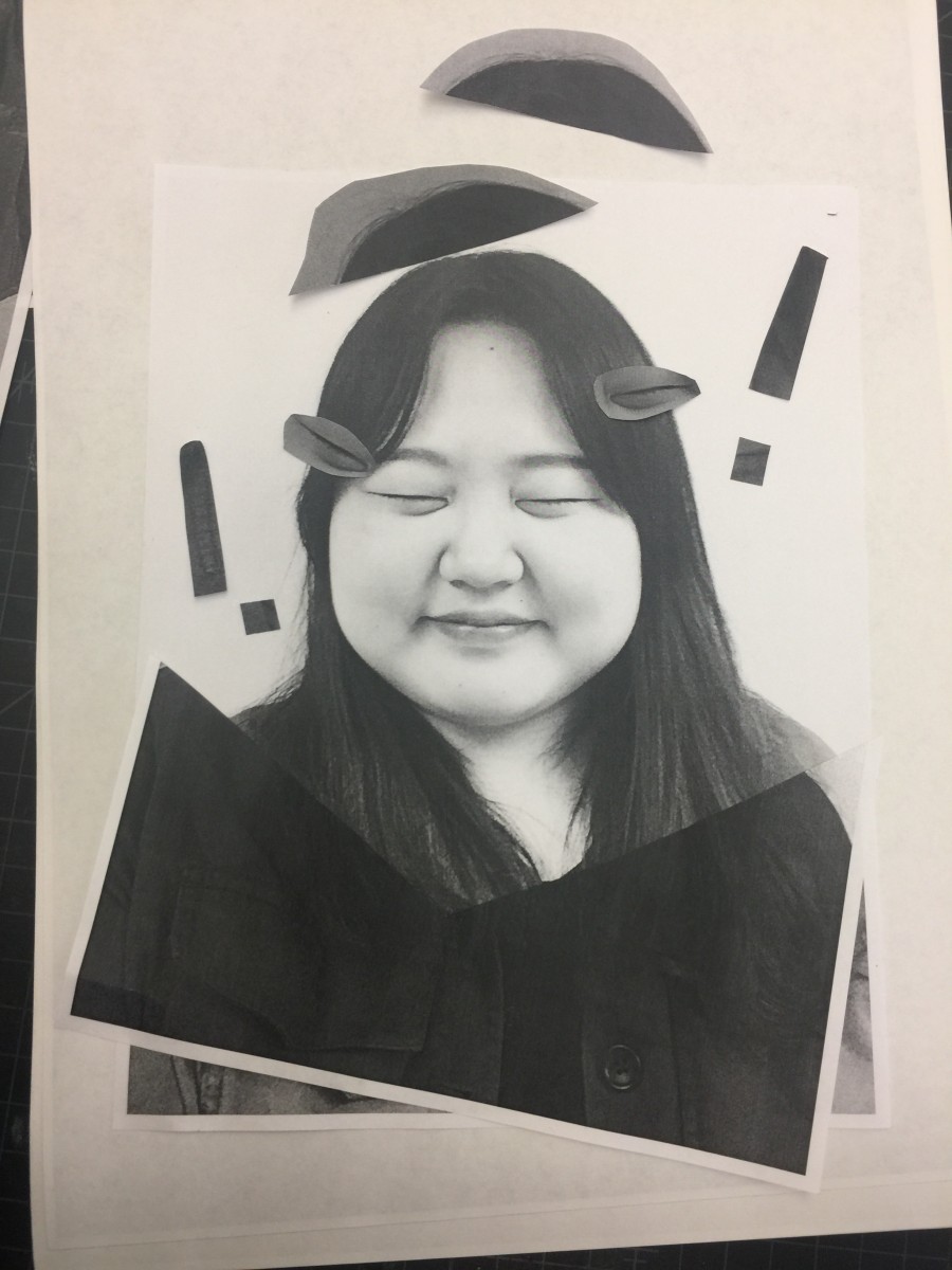

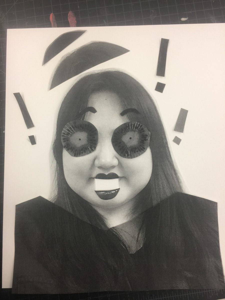
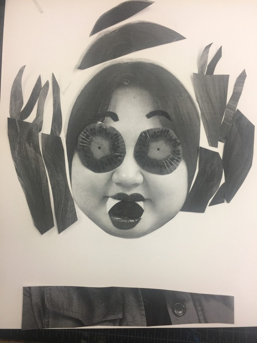
The mood chosen is surprise. My first collage seemed like happiness not a surprise. While all we discuss about each of collage, some said happiness, and other said surprise. The professor said, “ what is supposed to be in your eye and mouths when surprised?”
That gave me the direction for the next step for improving my works. For expressing the feeling of surprise, I started to crop and used magazine to show that feeling.
When we talked about each other work, that made me do further lovely work. I was not satisfied with my work at some points, but I was glad to see developing my thoughts to the collage.
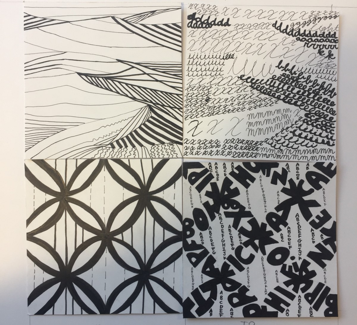
I have never thought that it would be possible to express the photographs by type letters. It was hard to transfer the exact same feeling into the letter, but It was a great time to try it. Through the project, I can see other people’s creative works. It was really touching me. I even could not draw that way. It was also hard to give the same feeling to line and type compositions.
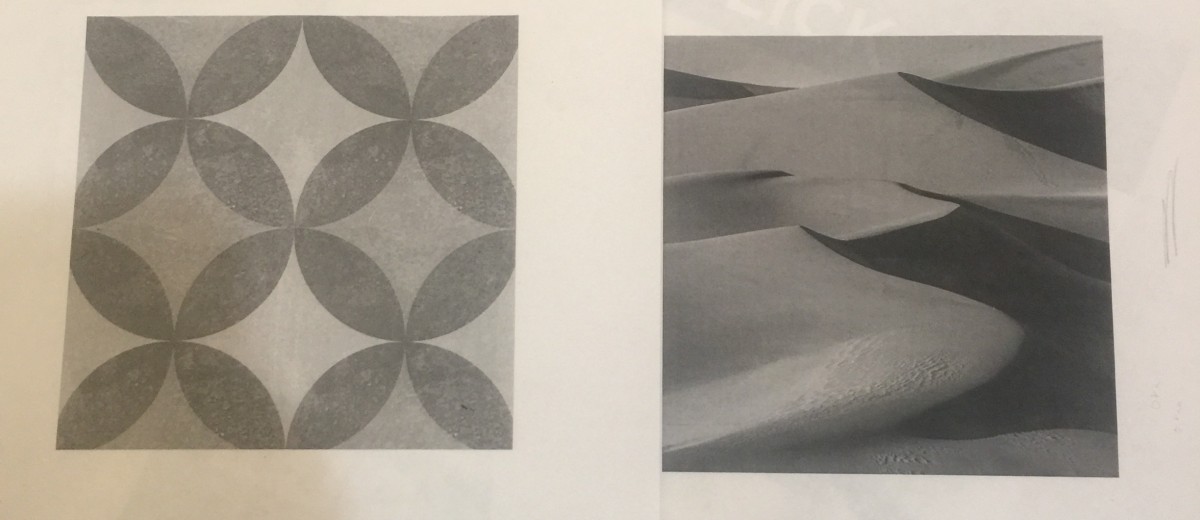
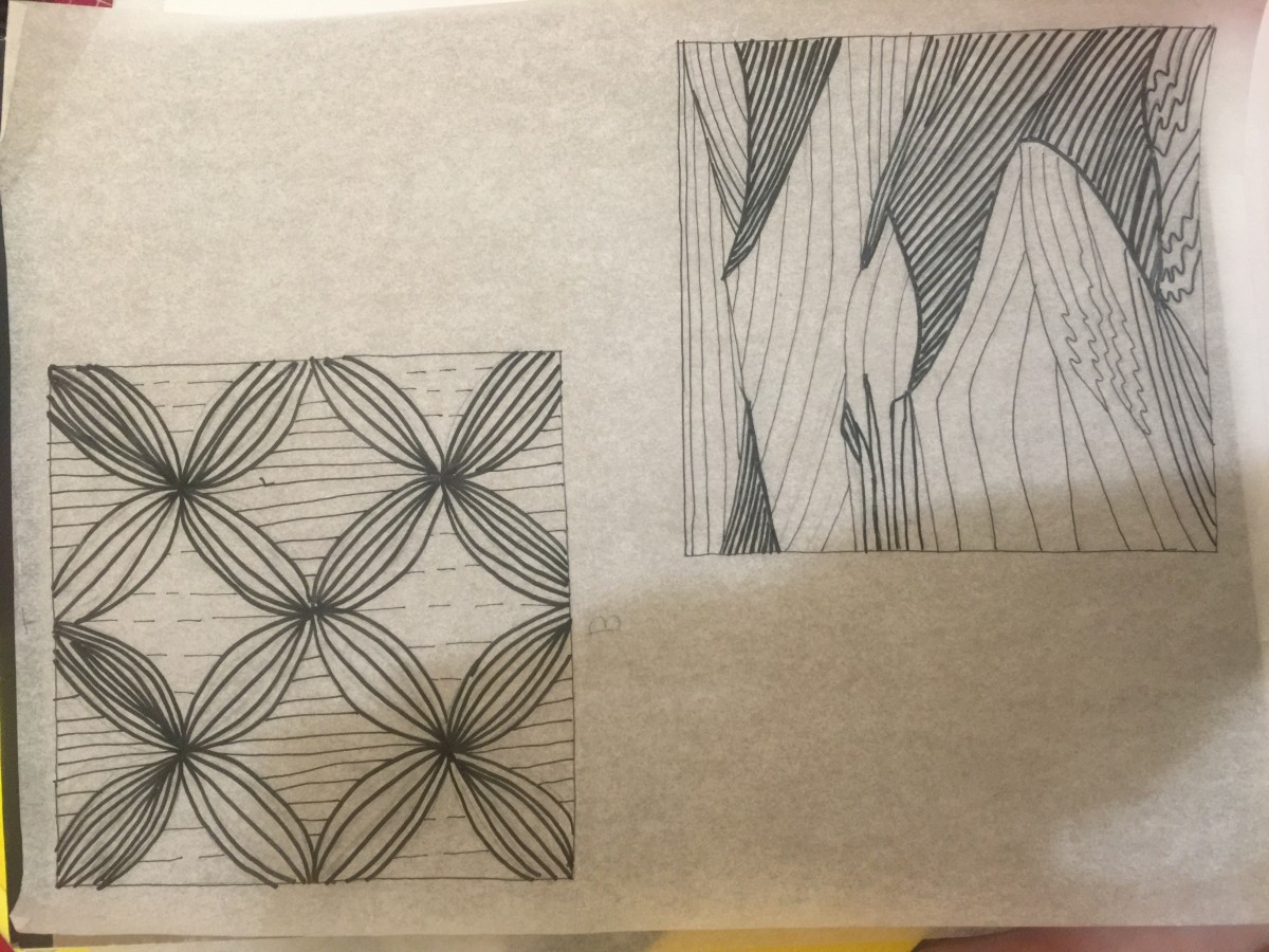
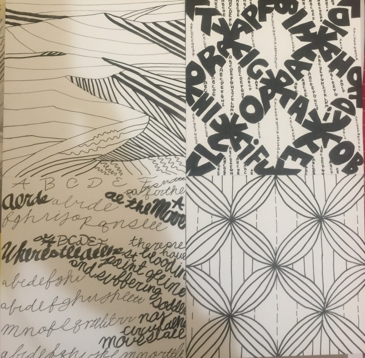
FLOWER PATTERN
When I was look at it, it looked like really calm and neat. The picture had repeatable pattern so that it made the picture more organized and unity. The image did not have strong movement and looked smooth and orderly.
DESERT TEXTURE
If seeing closely, the desert was not smooth. It, however, seemed to be very soft and smooth surface. Some points of image had wave surface because of wind. It was really attractive shape. That land looked like the bottom of the ocean. The contract of the image made it quiet and peaceful more. When I saw it, I felt like the photograph is resemble to the classic music. It had some rhythm but not too noise. I felt like there was flowing musical notes.
I have learned about what the graphic is and obvious, ambiguous figures. Seeing and disgusting about images helped me to understand what the concept was supposed to be. All the steps that I have done were new to me. I have never thought about what graphic design is. It was the first step to discover design.
Through this project, transferring photograph to graphic was interesting. It was the first time for me, so I could not do perfect inking that I have expected. While I reflect my final works, I think that I have to focus on detail things in my works more. I am exciting further actions that we will follow the projects.
The OpenLab is an open-source, digital platform designed to support teaching and learning at City Tech (New York City College of Technology), and to promote student and faculty engagement in the intellectual and social life of the college community.

 Pro
Pro