Gaethan Jean-Pierre
Graphic design principle
Paula
Final essay
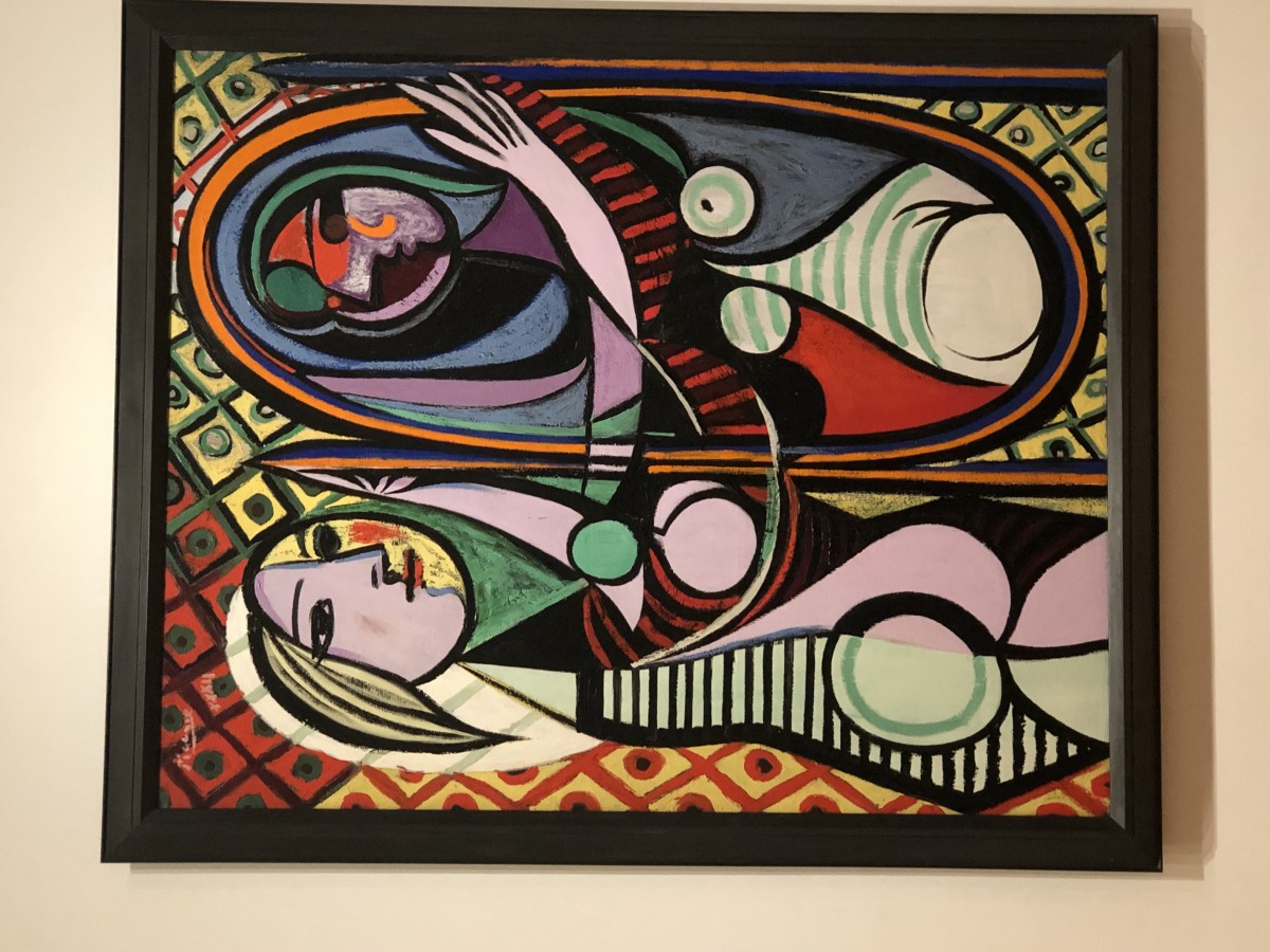
This piece of art that i have chosen for this project relates to many of the past projects that we completed. It is similar to the obvious and ambiguous project because the painting is ambiguous in a sense because of the colors. The vibrant shades of colors all mix together and if you just look at the patterns close enough you tend to get lost in the patterns and lose focus of the people in the painting all together. It also relates to the texture and pattern project because the painting is a bunch of shapes collaged together to make it into an object. Although that was not the full focus of the texture and pattern project it still had something to do with it because we had to make letters, shading, and spacing become objects as i did with the rocks. This painting also can be related to the selfie motion project because its a collage of objects on a person however it does not show emotion. It just gives the people features such as eyes and hair and clothing. Finally this painting can be related to the color your selfie project. Its related in the way it uses color to differentiate things like hair, clothing, objects, and body parts. Overall i enjoyed doing all projects because it was very hands on and taught me how to manipulate everyday things for example how anything on the floor can be turned into a ambiguous or obvious art piece. I also really liked how we used things we found on a magazine to show expression.