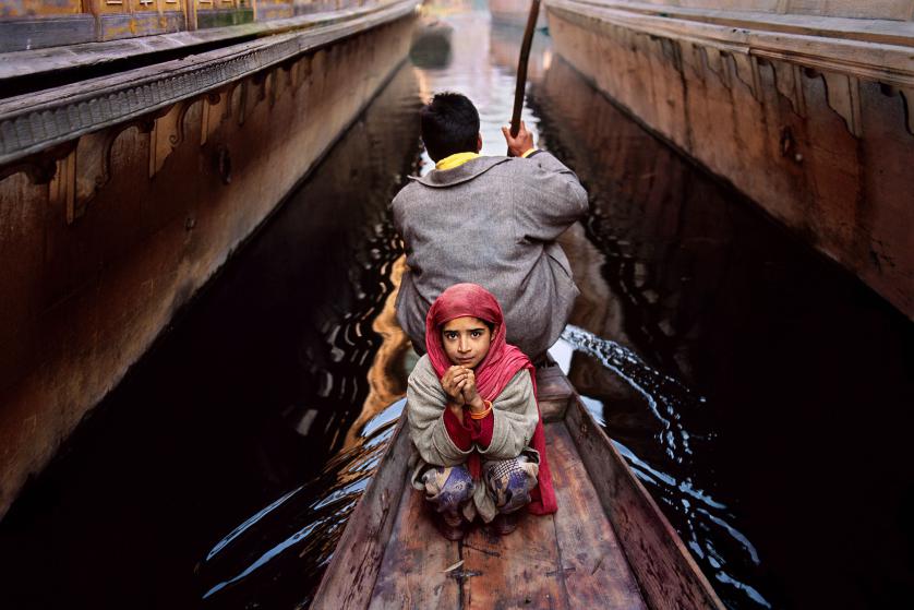
The exhibit of Steve McCurry was at the Rubin museum, the museum itself was a beautiful building with a grand staircase right in the middle that let to many exhibit from India. The walls of the exhibit were blue and the light was dim but the light focus mainly on the picture that were shown. I think this help bring the exhibit more into light as the light solely focus on the powerful images by McCurry. The way the pictures were spread around also bring to life the exhibit as which wall had no more than 4 and the space for the images was excellent. Another excellent thing about the exhibit I felt were the bench right in front of some of the strongest pieces as once can sit and take in the whole image slowly and look at it in details. Once you take in the setting of the exhibit the best part is when you start analyzing McCurry work, at first you see a perspective of how life in India can be as us living in America don’t really have an understanding of life in a third world country. Throughout the whole exhibit you see how life would be in India, from how the train work to taking a boat as transportation. Most important I felt that you get an understanding of life would be for individuals in India, as you walk though the exhibit you see how life for young boys, adults, parents, workers and everyday activity are if I personally have to in India. I though McCurry did an excellent job of showing us a very wide variety of locations as many of the shots were taken in different part of India. If I personally has to pick one image as my favorite or the one I though was my favorable ill have to go with “Women shielding themselves from a dust storm. “I felt this image was the strongest as the contract of color stood out for me. I live how depth of field places a major roll in capturing the women covering themselves from the storm but in the background you see the dust but if not as focus as the women, I also love the angle this was shot on a high angle just a bit about eye level, I thing this bring the shot to more focus you see more of the women. Another thing that I love about this shot is that all the women are wearing read and this strong color really takes over the whole shot and makes it so brighten and bring the bleak environment to life, as if the women were wearing a different color of clothes I think this shot would be as powerful as it is wit the red. Finally one more thing to that completes this shot is the black that fades with the brown with the trees, this goes well with the red and the brown and makes the trees stand out through all the dust that’s covering. Overall this exhibit was a fun experience and I’m pretty happy to been able to see this images in person, I feel there were many ideas that I could take and apply through my graphic design work.


-
Recent Posts
Recent Comments
Categories

