https://drive.google.com/file/d/1PSZSRAPFzZgCcNqGyLjGfAtE7GGdAFYQ/view?usp=sharing
Author: Nicole Biggs
https://drive.google.com/file/d/1Stpo5L44Ntc4czzpj7vOySHK3RrxNYyZ/view?usp=sharing
After reading and watching “How to design an enduring logo: Lessons from IBM and Paul Rand”, i found out that Paul Rand was a very detail-oriented designer who loved to play around with logos using different variations until it was perfect in his eyes.For example, it took him 10 years before coming up with the strip on the IBM logo he wanted to make sure the detail and the conceptual thinking of both the client and consumers would get it and it must has did the job because the logo has remained untouched since then. Paul Rand said “A great piece of design catches your attention with a certain amount of surprise” and i feel he did that with the playful and witty a witty rebus poster Eye-Bee-M; it was simple symbols along with the letter M from his original logo, his quote really summed up the poster.
When Rand designed a logo for a company he only focused on creating one logo and fine tuning it instead of coming up with multiple ideas to present to a client. However, he made up for the single designed logo by also creating booklets that showed how the logo would look on different spreads,he wanted to make sure that his logo worked in every thinkable application like stationeries,ads and packaging.Paul Rand made sure his clients couldn’t say no as he said “You hired me to do it , im telling you this is what you should use” he didn’t want to hear if the client didn’t like it so he made sure they did; wow is all i can say his level of experience and his value for precision made him the M.V.P in the graphic design world.
I feel when it comes to Paul Rand and Paula Scher they take designing anything seriously and have pays attention to details but Paul Rand doesn’t like to create a logo in 20 seconds he wants to create it ,research it ,play with it in different variations until it fits both what he wants for the company and for the clients. Paula Scher is different when it comes to designing. She can design a logo in 20 seconds and still have the same effect as Paul Rands designs. Both Paul and Paula are great designers but their experiences have taught them to look at things a certain way.
After watching “Paula Scher: Do What You’ve Never Done Before”,she explains that when it comes to design sometimes things get made accidental.Paula didn’t want to take the high line project because she thought it would be a waste of time and money but she wanted the watch world job so she figured if she did a high line she would get it so that was her motivation.The Highline logo was so simple using the letter H and adding an extra horizontal line to make it look like a railroad line, the logo definitely got straight to the point about who and what the company is about.It’s crazy how Paula Scher didn’t feel the Highline project would be successful but it ended up becoming an iconic tourist attraction.
When it came to the MOMA museum she mentioned that they didn’t have a brand guideline to follow so designs were all over the place because the MoMa design team was separated by departments that don’t communicate with each other. Paula came up with a way to break down the departments and who was in control of what design and who had the final say so.A company needs to have a good base structure like a team that understands each other in order for a company to be successful.
As Paula said “Sometimes ignore the brief and just go do it when you’re not getting paid”.she did that whem it came time design for north side.Her design concept for the northside in Pittsburgh Pennsylvania was to take the bridge and turn it into an art piece that can house art shows. Her idea was brilliant because not only did it turn a dule area into an interesting place it also brought the towns together.
The Metropolitan High School building was wrapped in typography based on her map paintings, it was very colorful.It was funny when it came time for MoMa to proofread the foriegn languages because all of a sudden turned into art work and didn’t need to be proofread they knew it was gonna be a lot of work; I wonder why the first couldn’t be considered art too. Can a piece done in a country’s spoken language can be considered art if they don’t proofread it first?.“Design has a purpose and art has no purpose” in her definition; with this quote would the answer to the question be yes?.
When it comes to designing one’s inner voice will try to stop the process but one should always push through because design may not be successful in the beginning but later may end up turning into something wonderful.William F. O’Brien said “Better To Try And Fail Than Never To Try At All”, People rarely get second chances in life so grab every opportunity because every experience is growth.
Graphic Designer Paula Scher explains in the artist series that experience plays a major part in her design process and how she is able to come up with ideas in just a second or as she puts it “It’s done in a second in 34 years”. When she was designing the CITIBANK logo for two merging companies she took the lettermark from one and a symbol from the other and merged it and that was it. Her experiences gave her the ability to be intune with herself that she is able to base all her designs on her instincts.
Paula map painting really gives an insight on who she is and how her career started; her map shows her attention to detail with the hand written type and the amount of patience. All of her original ideas were done by hand because at that time they had no computers,it’s not like our generation where computers are so accessible that we can go online to get inspiration from all over the world with a click of a button. Paula always got inspired by walking around manhattan.
One of Paula Scher’s influential pieces was the funk designs posters which she used typography to show noise surrounding an image.The funk posters reminded me of Filippo Marinetti Manifesto Les Mots en liberté futuristes Also known as Futuristic words in freedom that expressed enthusiasm for war using typography as noise.
“There is this one moment when you figure it out and you get it and you think it’s gonna be the best thing you ever did” if she feels this way about every design no wonder she is able to top her last designs. She loves what she does an it is expressed in her art.
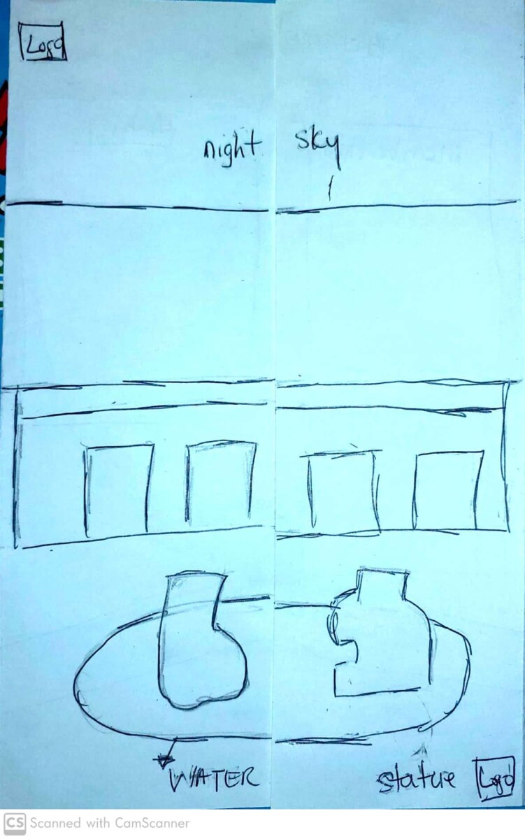
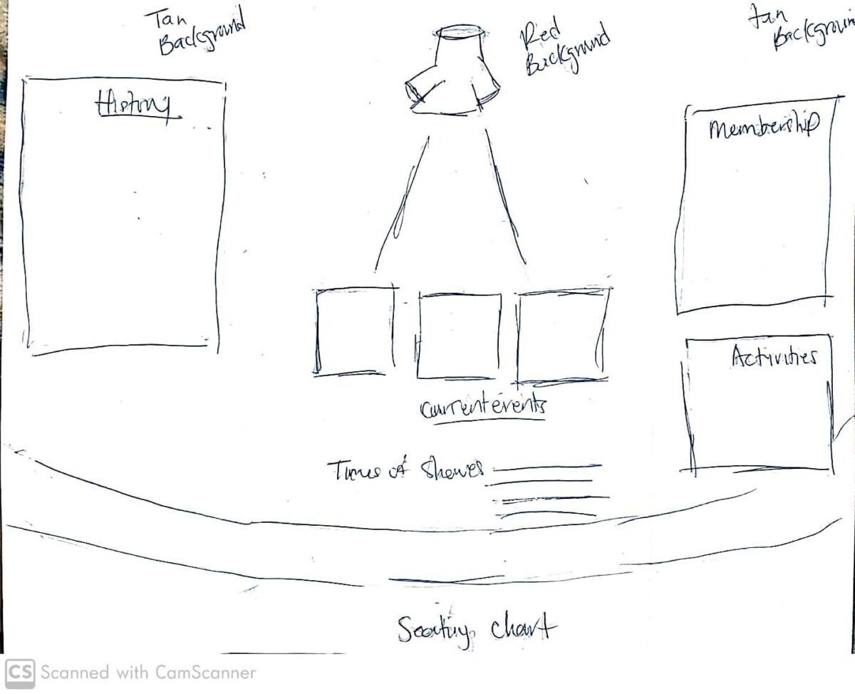
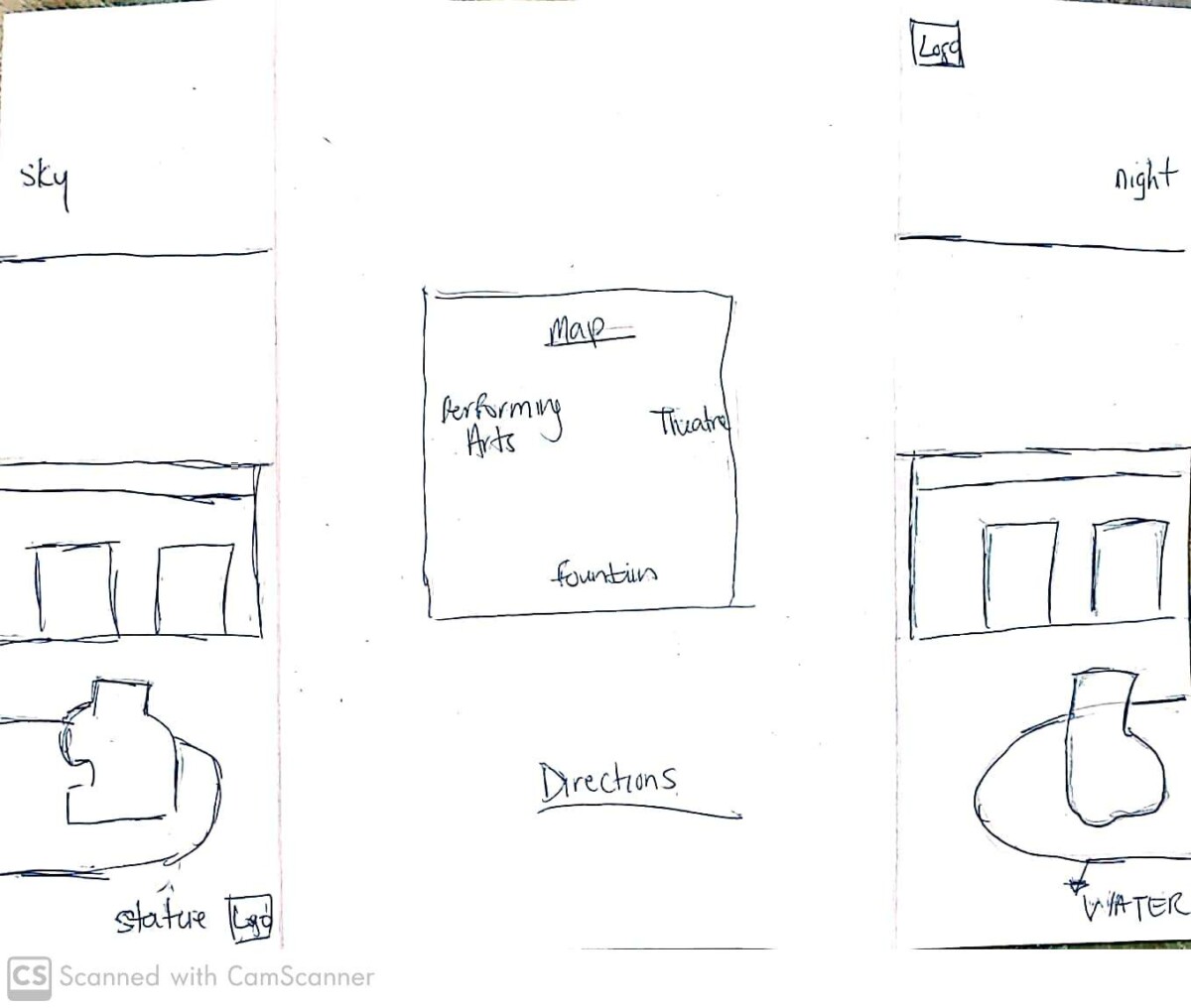
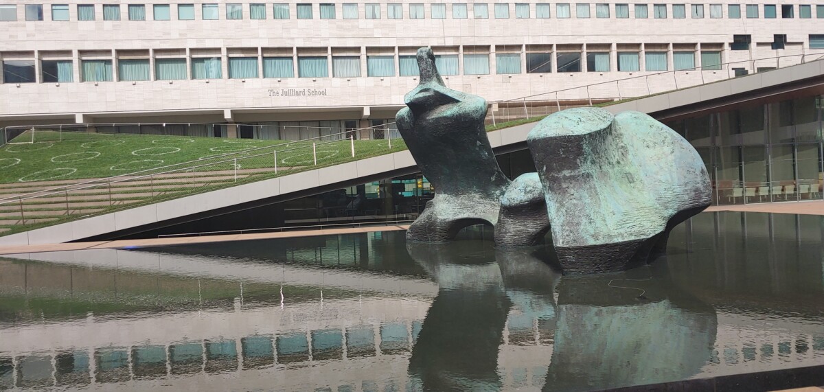
Kelsey Campbell-Dollaghan article “The Age of the Anti-Logo: Why Museums Are Shedding Their Identities” talks about how Museum logos no longer have the traditional look that would consist of using the building facade, company name, or even an emblem. A museum is an institution that preserves various collections from around the world, exhibiting both permanent or temporary pieces to the general public. A museum is meant to educate current and future generations but in order to do so they need to constantly change their exhibitions; would designing a logo for a corporation like a museum be simple?No.When it comes to creating a logo for a museum it would never be a simple task as Campbell-Dollaghan said “developing a museum “brand” is a complicated chore”, in general People have their take on what is art and if it’s worth being in a museum that alone can be more stressful for the person who has to pick it, right!. Graphic designers have to go through the same thing when designing a logo because a logo is designed to give people an idea of a company’s identity while still being minimalist in shape, size, proportions and even its exterior. Sometimes logos need to be revamped to show adaptation in a company’s interior and exterior, a logo is supposed to conform to society’s expectations while still being adaptable in every context that may arise. Do you think it would be easier to design a museum logo using both traditional and modern styles?.
The video of “The Art of Logo Design” explains how pictorial symbols known as Pictographs were used as the earliest form of writing. Pictographs was used to identify who a merchant was, pictographs was what is known as logos today. When you think about it graphic design has always been around even if it was a simple line on a rock. The video explains that a logo is supposed to tell you who the company is and what is all about its supposed to be a mask of the company, it is something you will always see first before you see what’s under the mask like what the company is all about, down to its CEO. People should be able to identify what the company does based on the logo, visual is everything. Logos are not the brand but rather a part of its identity, there supposed to adapt to current styles whether it victorian,contemporary or modern.A good logo can both be simple and memorable that it can transpire through time in any color, it should be timeless. In order for a logo to get to a level that both the client and consumers can visually understand the designer has to look at other logos and its typeface and play around with it; take both the clients idea and yours combine them and start to have fun with it by messing around with the shapes , color , angles and transparency. At the end of the day just have fun when you’re designing.
Hello everyone, my name is Nicole Biggs and my major is Communication Design ( graphic design).I chose this major because I knew I wanted a career in the Arts but didn’t know what field would best suit me; Communication Design would give me the opportunity to learn a little of everything and apply it to graphic design.This is my senior year at city tech and my estimated graduation spring 2021 with my Bachelors Degree.When I graduate from City Tech I hope that I would both freelance and work for a corporation.I hope this class will help me understand how to identify what’s good for both me and my future clients.


Recent Comments