https://www.dropbox.com/s/vb0v2p0kdezkrot/Basic%20Animation.swf?dl=0
Category Archives: Uncategorized
CDMG 1111 Video Project
Illustration Project: The Story
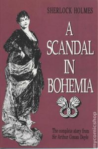
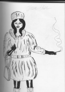
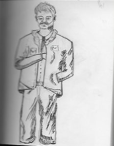
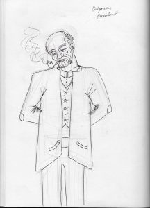
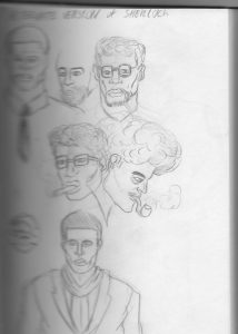
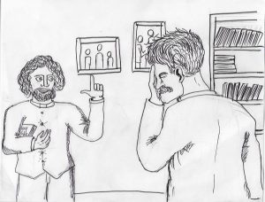
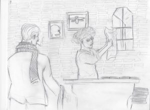
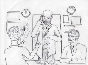
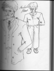
The story I will be using for the illustration project is “A Scandal in Bohemia” by Sir Arthur Conan Doyle. It is part of his Sherlock Holmes series. The things I will change is the title, setting, time period and characters. My version of the story will be called “A Scandal in Bulgaria”, It will take place in 1980s New York City, and instead of Sherlock Holmes being an English man, he will be an African american and instead of Irene Adler being an american, she will be Russian, and the prince instead of being German, he will be Bulgarian.
Working Process for Illustration Project
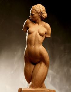
 The work process I will most likely do is traditional mainly because I am comfortable with it and another reason is because I’m still learning to get used to using a tablet and the illustrations will most likely look better traditionally compared to me doing them digitally, As of now I currently looking at environment references such as 1980s-1990s New York City, I am also looking at what people would wear around those times. I’m also working on getting better at drawing the female anatomy by looking at references and also looking at art books that specify that area.
IDEAS FOR ILLUSTRATION FINAL PROJECT
Minimalism: Could it be used in storytelling?
One thing my group and I discussed is based on Molly Bang’s Picture this, is could minimalism be used well and how so and one thing we were all discussing is based on our stories that we’ve chosen how so we looked at some examples that sucessfully used minimalism and able to tell a narrative.
Thoughts on “La Vie en Rose” U supermarket
After watching this commercial I have to say that it was brilliant to use the sound of babies to recreate the song “La vie on rose” and it was effective because throughout the commercial there were moments where you feel as though you’re listening to the song just in the sound of babies and it was also effective because they used the different type of cries to fit the keys of instruments and it worked well. Another thing, it was effective because it went with the flow/transition of the song and it didn’t sound broken at all. It was a smooth transition.
Field Trip Thoughts
While I did not have the opportunity to go to the Ralph Steadman exhibition a the society of illustrators but I have to say looking at his work through the website makes me upset that I did not have the chance. His line work and his use of ink is truly eye catching I would say what caught my attention was his illustration of the movie fear and loathing in Las Vegas because I loved watching that movie when I was younger even though I did not know what was going on at the time.
AIGA’s Get out and vote campaign

I would say out of all of the vote posters this has got to be the one that caught my eye. Things that I like about it is that it makes the democrat donkey and republican elephant look like chess pieces and it make sense because they always seem to fight each other on different views and another thing I found interesting is that they have different issues as chess pieces and I think it’s clever and says a lot on how america’s system government is like.
Thoughts on Graphic Principles class
Graphic principles class has taught me a lot about graphic design and the different ways you can create a design by using color, shape, point, plane, and illusions and different ways you can attract someone and how you can control someone’s eye using visual hierarchy, it’s all interesting. Ever since I started learning about these things I’ve started to notice these principles in subway ads and knowing what rule/principles and color combinations that were used to make the ads to attract to the eye. Overall I enjoyed this class and the information I received from it.

