One thing that I wish that I really did better at was sizing the images better than I did. One thing that I can take from this is being positive that everything is to perfection. I really enjoyed this project and showing how not every design has to do with shading and you can get the same design through lines and text and not only shading.
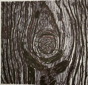
Tree – Line
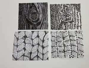
On the Left is the example design and on the right is my line design. I feel like this was the easiest one for me, but a lot of rethinking went into it. The hardest part of this was finding how to makes the dark’s, dark with out shading anything in. The way that I did it was by thinker lines with smaller lines in the filler spots. I feel like this is the best design that I did throughout this project.
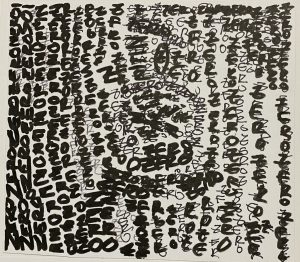
Text
On the right is my text version of the tree design, this was the most difficult out of all the designs, because trying to catch all the details with text you have to be able to shift the words and letters in a way that it matches the design. For the effect of darkness I used a darker ink pen rather than finer. Also adding extra letters helped me out with trying to create the shadow and dark effect that it needs.
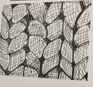
Yarn/ Rope – Line
My line design is what gave me trouble with the yarn/rope design I found my self getting in trouble with the spacing of the actual design. I do feel like that I did portray the feel of the original design. Finding the dark spots in the design and trying to do them in line was hard because in the original it is so fine that it makes it look like it is shading.
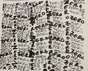
Type
In my design I feel like the way that I showed the spacing was good by making the letters and words in darker ink going the same way as the original. One place that I wish I would have done better in is there are some open spaces that could have been added with more letters. This design was overall my favorite that I did throughout the whole project, due to the fact that it shows how everything can be blended together.





I feel like the Yarn/rope line background needed to look a little bit less like shades and more like lines. It is hard to spot a few lines. However, I feel like maybe, leaving a tiny distance between them to show that they are lines would help. Great Work though! ^^
Amazing detail great job especially on the tree bark for line’s.