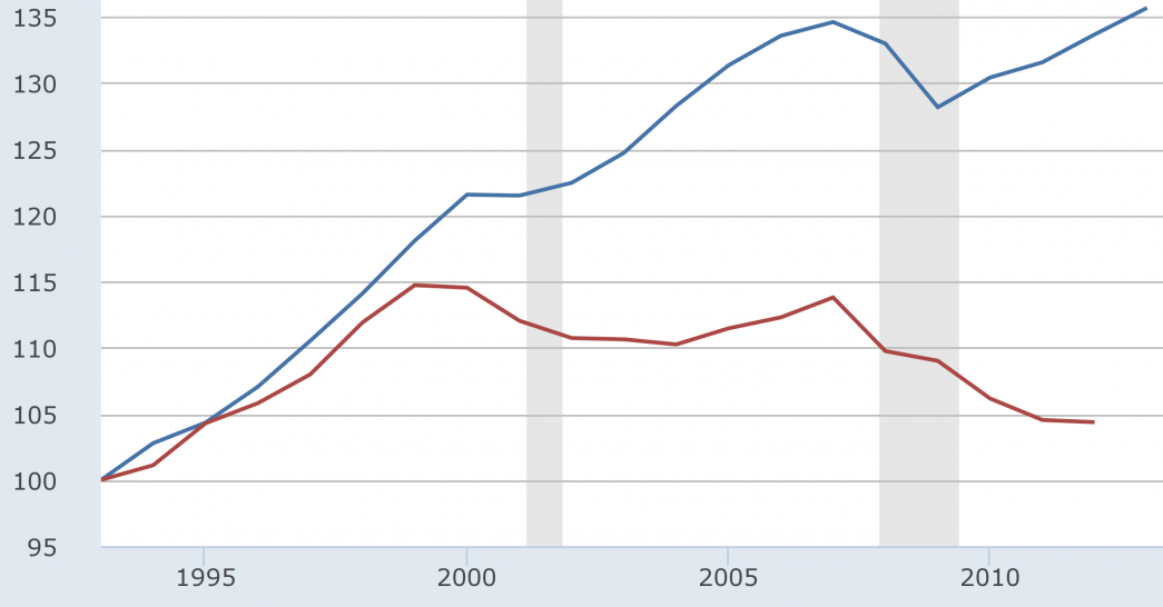
Incarceration is not an equal opportunity punishment
The increase in organ donations due to drug overdose deaths
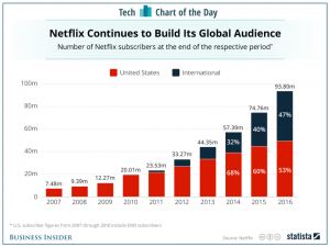
Netflix users International vs United States
The reason why I chose this graph is because I know that Netflix is a very popular streaming service within the U.S and I was curious to know if people in other countries are subscribed to Netflix as well. On the graph it shows low numbers for the amount of international subscribers when compared to the U.S, so that makes me wonder if they are using another streaming service that is exclusive to their country. On the graph you can see that the number of subscribers in the U.S. has been over 50 percent while the percent of international users is less than 50 percent. In 2017 it seems that the percentage of international subscribers is growing close to 50 percent. I predict that it will reach at least 50 percent after 2018 ends. From 2007 to 2010 there is an absence of international subscribers. This could mean that Netflix was less known back then and so eventually it gained popularity and went international in 2011. I’m guessing that the international subscribers were using another streaming service at from 2007-2010.
http://www.businessinsider.com/netflix-subscribers-chart-2017-1
Daily Media Consumption
Energy Graph
I received this graph from:
https://cleantechnica.com/2014/04/22/7-interesting-nuclear-energy-graphs/
This graph shows us the electricity produced in TerraWatt hours in Germany from the year 1991-2012, either by Nuclear or by Renewable sources. We can see that the energy produced by nuclear has gone down in recent years while renewables has gone up almost linearly starting from the early 1990’s. The article cites that this chart, among others which were featured in the article, came from World Nuclear Report 2013.

Edit:
In reference to Ronald’s comment. From 2006 to 2012, a span of 6 years, Nuclear Energy consumption went down 67 TWh. We can say say this because 167-100 TWh= -67 TWh. 2012 to present is 6 years, that is another 67 TWh consumption has gone down. So we can say that from 2012 to present NE consumption has gone down 67 TWh.
Esport Graph Article
newspaper graphs
Welcome!
The graph in the header is taken from here. While some of the features are not so straight forward to make, given the raw data, the calculations and the basic features of the graph should be pretty easy for us to make using Excel, R, python, etc. I plan to demonstrate this to you early in the semester.


