I received this graph from:
https://cleantechnica.com/2014/04/22/7-interesting-nuclear-energy-graphs/
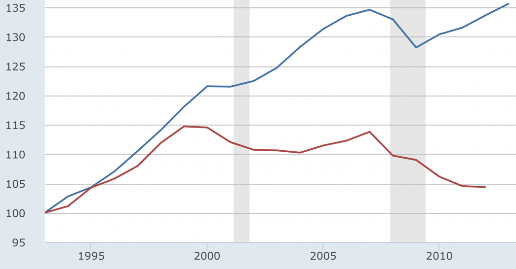
This graph shows us the electricity produced in TerraWatt hours in Germany from the year 1991-2012, either by Nuclear or by Renewable sources. We can see that the energy produced by nuclear has gone down in recent years while renewables has gone up almost linearly starting from the early 1990’s. The article cites that this chart, among others which were featured in the article, came from World Nuclear Report 2013.
![]()
Edit:
In reference to Ronald’s comment. From 2006 to 2012, a span of 6 years, Nuclear Energy consumption went down 67 TWh. We can say say this because 167-100 TWh= -67 TWh. 2012 to present is 6 years, that is another 67 TWh consumption has gone down. So we can say that from 2012 to present NE consumption has gone down 67 TWh.


The graph clearly showed the energy produced in terawatt hours by nuclear in Germany from the year 1991-2012 has decreased while the use of renewables has increased. The article also showed a graph with new renewables being favored when it comes to global investment decisions versus nuclear power.
How much lower do you think has energy produced by nuclear had gone down in Germany from 2012 to present?