1. Photographer: Matthew Pillsbury, Exhibit: City Stages
this was my overall favorite gallery that we saw. I loved the collection because everything was so similar. Everything was at a slow shutter speed and it showed a lot of movement in the area being photographed. They were all taken with a wide depth of field, high black and white contrast, and at an eye-level. I felt like I could relate to them because I get anxiety attacks and that’s how I feel when I’m surrounded by large amounts of people in this big city.
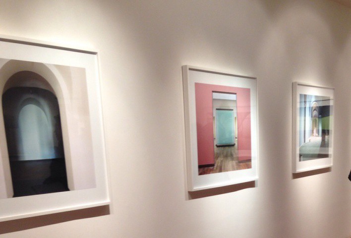
2. Photographer: Wijnadoo Deroo, Exhibit: Rijksmuseum
this collection was taken with a lot of symmatry, eye level, medium shot, and wide depth of field. This group of photographs were extremely different from the rest because of the simple fact that it focused on the architecture of buildings where the galleries were at.
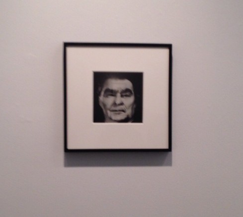
3. Photographer: Nancy Burson, Exhibit: Composites
this collection was more of an experimental style rather than getting a point across like the rest of the collection. These were taken with multiple film negatives to form a composite. I thought it was really unique because I hadn’t seen things like that in person, rather than the modern day photoshop styled photography. I’ve only learned about it in history of photography. I thought it was great how you could still see faint sections from the other negatives. I thought it was pretty neat.
4. Exhibit: the Heart and The Eye- Henri Cartier- Bresson & Robert Frank in the World
Art history of photography was my favorite class last semester. I had some knowledge on some of the images in that gallery. It was a lot cooler seeing them in person rather than seeing it in a textbook. All were taken on film and I just thought it was cool to see the gelatin prints in person. All were in black and white and had a story behind them showing mostly people and taking record of the time period that the photograph was taken in.
5. Photographers: Reiner Gerristsen, Adam Magyar, David Molander, Exhibit: Metro
Out of all the galleries, this was the most modern set. I compared this set to the Composites gallery because you can see the improvement of merging images together with technology. My favorite piece was the subway one, just because you can see the people in everyday life. All were taken in a wide angle. I thought it really gave a lot of detail of the setting.