The Brooklyn Historical Sociaty

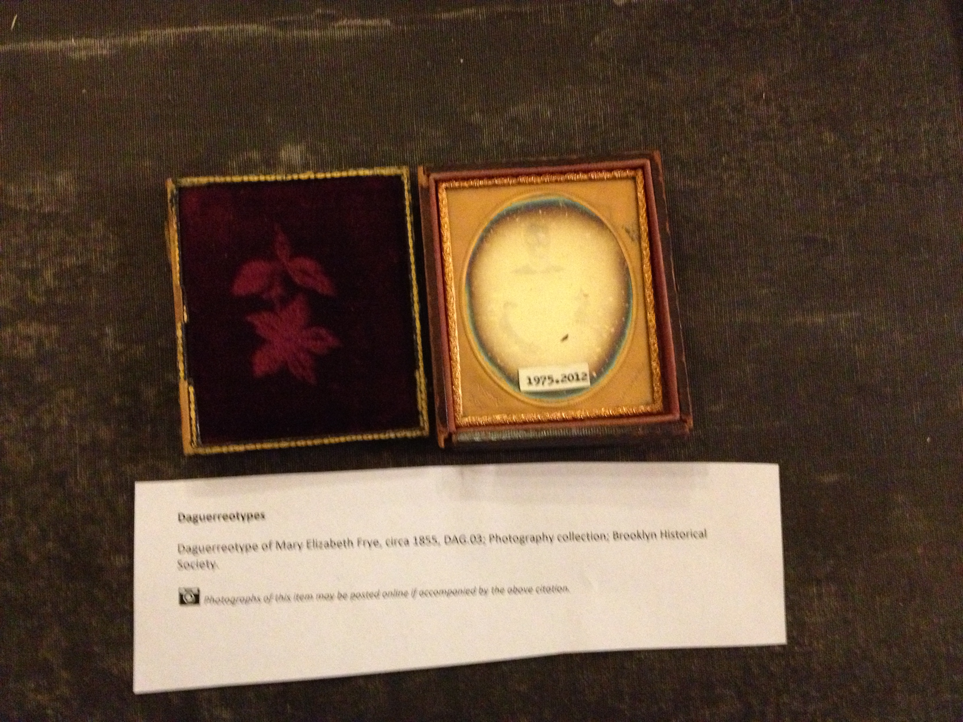
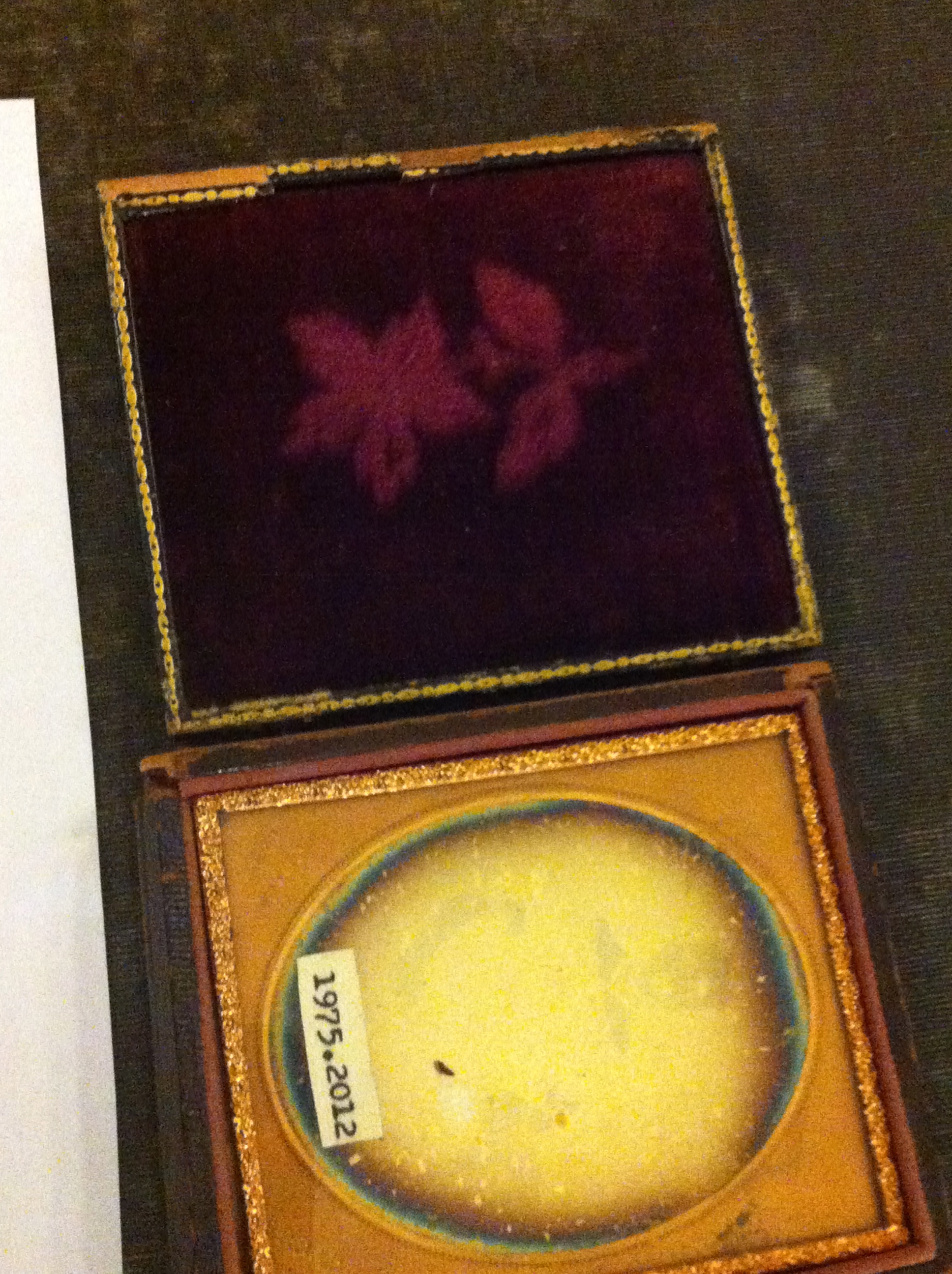
In the following paper, I will make several observations about the significant differences between “Danguerrereotype” picture and a digital photograph.

The “Danguerrereotype” picture does not offer vivid details to the viewer, anywhere close to the level of Digital photography. These pictures are in black and white or solid colors which are in direct contrast to today’s modern digital photography which allows for the full spectrum of color. In fact, in many cases it  almost seems to be a cloud and there is an aura around the subject matter of the picture. These qualities do not allow for a completely accurate representation of the person or subject matter, in the same manner that a digital photograph would. However, the same qualities which might make the picture look less representative of the subject matter also add an artistic appeal to the picture. This is especially true when viewing “Danguerreotype” pictures of people. These black and white representations of people seem to capture the soul of the person but not necessarily does the viewer feel like they are looking at the person himself. When a person views a picture of a person that is taken digitally, you can see that person’s outward appearance in plain and sometimes painstaking detail. It is the same as seeing a person in passing on the street or at a restaurant. The “Danguerreotype” picture makes the viewer feel like you are viewing something spectral…”real” but “other worldy”. That is what makes the “type” pictures appeal to me against digital photography. They almost appear haunted the viewer loses the detail of the subject matter and you see the essence.

Conversely, Digital photography is excellent for capturing subject matter that contains vivid colors and detail. I compared a picture of a flower that was done in the respective mediums. The “type” picture feels like the colors bleed and they are not very vivid. When you view the flower, it is pretty but looks more like a smudge on paper then the digital photograph. The best analogy I can make is that the “type” picture has an abstract quality to it which makes it appealing but not necessarily representative. The digital photograph of similar subject matter just pops of the page at the viewer. You can see the color and all of the details of the flower. Each petal is clearly demarcated from the next, you can see all of the different parts of the flower. This compares much more favorably to the “smudge” of the “type” picture. With a digital photograph you can also see other elements of the background very clearly. Thus, the viewer is able to really consume and relate to the subject matter presented in digital photography. The evolution of digital photography has evolved so greatly that if you put a picture of the subject matter next to the subject matter itself, the viewer would not be able to identify the real flower. This is in direct contrast to the “type” pictures that we see.

In summation, both types of representations having redeeming  and interesting qualities. The “type” representations just have more of an abstract feel. The digital photography is representative of what a person actually views in real life.

Leave a Comment

Filed under Learning Logs, Photography Formats

Learning log 4 (Brooklyn Historical Society) – Regina Torres

Daguerreotype of Christina Payne Hallock, circa 1855, DAG.04: Photography collection; Brooklyn Historical Society.

Last class we went to Brooklyn Historical Society, and it was a really interesting trip. First of all, it took us no more than 15 minutes to get there, and once we got there we were able to enter the library in order to analyze the daguerreotypes. It was really nice seeing them in real life because if you have ever seen a daguerreotype image on a book or online is nothing like the actual thing. It was a really interesting experience because those are historical objects, and we were able to see them in real life and even touch them! One of the most impressive things about them is that they are quite reflective, and very detailed and of course, they have no color unlike the pictures we have been taking during the semester. Also, another difference between them is the exposure time, as we can see on the daguerreotype, the woman looks so serious, and that is because the exposure time was too long (it could lasted up to several minutes) and nowadays, the exposure can even go up to a small portion of a second. Even though, nowadays the technicals of taking a pictures have improved, I really liked the daguerreotypes because they look so artistic and had a meaning behind them, not like today pictures that sometimes we just take pictures for the sake of taking them.

Leave a Comment

Filed under Learning Logs, Photography Formats

Learning log 4.

The trip to the Historical Brooklyn Library, was interesting. The library was a lot different than other libraries I have attended. It’s a lot more strict than other libraries, and it has a lot of interesting old and antique books and maps. etc.

We looked at a very interesting daquerreotype, which was very old from 1975.
It was a image of a young girl who looked very serious, and is not smiling.
The other side of the frame has a flower print on it, its on a martial and its very nice and interesting.

I had a good experience at the Library, it was definitely worth going to.

The experience of looking and taking photographs have changed a little, when i take photos its usually just to take a picture of something see if it looks good and if it doesn’t than retake the picture. But I have learned that I can take a picture that’s close up of an object with a blurry background or other interesting pictures with other use of day light or lamp light.

I hope to learn new things about photography along this semester, which Im sure are gonna be great and exciting and new to me. Looking forward to it.


Leave a Comment

Filed under Photography Formats, Uncategorized

Botanic Garden – Favorite Photo

Out of all of the photographs I took on the trip to the Botanic Gardens, this one happens to be my absolute favorite. I love the contrast of the light pink rose, bright blue sky, and hint of white clouds, to the darkness of the leaves of the flowers and trees in the back. I also love how the rose looks almost “majestic” up so high in the sky. Also how the rose is the main object in focus, how you can’t really make out the trees in the background, almost like a silhouette.

Leave a Comment

Filed under Learning Log 3 - Botanic Garden

Botanic Garden

This picture was a total surprise for me. I had happen to come across a random spider in it web and even though I din’t have a really good camera, I didn’t think I’d catch the spider in the image. When I got home and was finally able to look at my pictures, I came across this and not only did the spider appear in the image, but so did the web! I love this picture because of what a treat it was and what a surprise it came out to be.


Leave a Comment

Filed under Learning Log 3 - Botanic Garden

Botanical Garden Favorite Photo

This is my favorite picture because its in a perspective view which towards the camera the pathway is wide apart but further away from the camera the pathway gets smaller. Also, the greenness of the grass and trees are shown very clearly which gives it a nice and clean photograph.  I also like that it gives a sense of emotion; loneliness, darkness and a never ending path.


Leave a Comment

Filed under Learning Log 3 - Botanic Garden, Learning Logs

Botanic Garden Favorite Shot

This picture is my favorite of all the pictures that i have taken because of the focus on the flower in this shot. The amount of focus allows you to view the flower in detail with good lighting. In addition i feel that the blurred background of mostly green and darker colored flowers and plants really help the bright pink flower stand out from everything else.

Leave a Comment

Filed under Learning Log 3 - Botanic Garden

Botanical Garden Favorite Picture

This is my favorite picture that I took from the Botanical Garden because the flower looks like it is laying wide open on top of those leafs. I love how everything in the photo is in focus and how you can see the textures on the leafs and the pedals.

Leave a Comment

Filed under Learning Log 3 - Botanic Garden

Botanical Garden – Best Shot

This picture was the most favorite picture I took at the Botanical Garden because I like how the rays of sunshine appear in the photo. I also really liked the detailing of the leaves and how it was the focal point of the overall picture.

Leave a Comment

Filed under Learning Log 3 - Botanic Garden

Botanic Garden: Best Shot

Out of the whole bunch this was my best shot. I did crop it a little, the bee was centered and i decided to crop out part of the top and right side of the frame. In my opinion what makes this shot most interesting is how the flower is leaning, it makes it seem like the bee is actually pushing the flower down. The light is coming from behind the bee which gives it a interesting halo effect and the sharp focus removes the background and lets the viewers eye completely focus on the bee.

2 Comments

Filed under Learning Log 3 - Botanic Garden, Learning Logs, Uncategorized