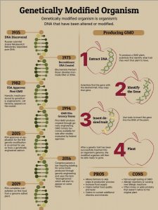
Genetically modified organism is organism’s DNA that have been altered or modified. There may be economic benefits to genetically modified corps, but it still holds an unknown risk to our health. For my info-graphic, audience will be able to learn GMO history (timeline), the steps to producing GMO and its pros and cons.


Hello Carmen,
I’m basing my feedback based on what you put in the Final Comps google drive.
Your topic is clear and catchy: Getting the audience to know more about how GMOs work.
You have a timeline of GMOs on one side and a diagram explaining how GMOs are created on the other. The focal points are clear as the line divides the two types and there is a visual brown border showing the titles and dates of important information. Good job on hierarchy as you include a small pros/cons section toward the bottom right.
I also really like the visuals on the right. The crayon etched figure of an apple and how DNA is duplicated, spliced, and rearranged from the inside.
The color scheme gives a earthy naturalistic vibe which is right on the mark for a info graph about GMOs. Your grammar seems to be good and I like the bold slab serif font for the headers/title.
Hello Carmen,
I love your infographic. I love how you made it very easy to understand. I like how you changed it from all apples to different fruits to show that GMO’S are not only about apples. The overall message of the infographic is very clear its simple and not to overcrowded none of the informations is fighting each other. They all work together to make your graphic stand out.
-Your design is very effective in showing your facts. I love the one, two, three that you put in the producing GMO section it was easy to follow along and it told you everything you needed to know. Your point got across very clearly.
-The hierarchy of your information is also very nice it leads me from the top of the page to the bottom very smoothly. I can tell that you really thought about it. All in all I really like your project.
Hey Carmen,
I think your topic is very interesting, the way you displayed your information was spot on and easy to understand. I like how on the left side your timeline is easy to read and has a flow to it. My eyes continue to go down the page and make my way back to the top on the next section. I also enjoy your illustrations they were the first thing to catch my attention. Here are some things I think you should consider.
-If your going to add a stroke on your numbers I would make them bolder just so they stand out more.
-Some of your text especially on your time line seems yo have some widows but those r just minor things.
-The paragraph on the top right has a different leading and point size then the rest of your text, I would change that and make it the same as the rest so everything looks cohesive and clean.
-I would also change G.M.Os to G.M.O’s just so it looks more grammatically correct.
other than that I think this is a great piece for your portfolio and a job well done!
Carmen,
I am basing my feedback on the version of your poster that is saved in the google drive folder week 9:
Well done! It’s coming along nicely. I agree with all the feedback you received from Islam. I think those little tweaks will really prefect things.
I would add:
1. Your header is a little tight and close to the right border, can you you make it a touch smaller and nudge it to the left. I also think the header read’s a little awkwardly, maybe “Understanding GMOs” or “A Closer Look at GMOs” would work better?
2. You have number of typos and a few grammatical errors in your text, please re-read and correct.
3. There are too many awkward hyphens and widows.
4. I agree with Islam about the stroke on your numbers, either make it more visible or get rid of it.
5. And make sure your leading and point size are consistent in all your paragraph text.