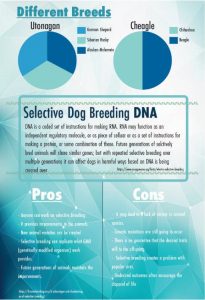
My thesis statement are including three things regarding selective breeding. First, to begin the research in which I’ve discussed before in selective breeding in dogs; the term to explain to the audience what it is. Facts about the common trouble in breeding dogs and what the pros and cons of doing that can be harmful to the dogs in the future. Lastly, to include the two differences showing graphs of what breeds are the most harm to being selective in breeding.
The OpenLab at City Tech:A place to learn, work, and share
Support
Help | Contact Us | Privacy Policy | Terms of Use | CreditsAccessibility
Our goal is to make the OpenLab accessible for all users.
top


Amaris,
I think your poster is missing a clear focus. Revisit the thesis of your poster: What is the purpose of your info graphic? Who is your audience and what are you trying to make them understand about Selective Dog Breeding? How does DNA play into that? I think reorganizing the content into past present and future would make more sense. Selective Dog Breeding is nothing new. I think you have to present its history and all the problems that have already been created in the DNA of different breeds to help shed light and how DNA editing could potentially help to fix some of these problems, or alternatively make them even worse in the future.
A. This is how I think it might help to structure your topic:
Section 1: Provide an overview about what selective dog breeding is and how it has evolved over the years. How many breeds of dogs have evolved?
Section 2: Current state, after hundreds of years of selective dog breeding what does that mean for dogs? Genetic diseases? What about the cost per life? Is a mixed dog less desirable and more likely to end up in a pound? Is a ‘bred’ dog more likely to have serious genetic problems and or diseases?
Section 3: Is there something about DNA editing that could play into the future of dog breeding? Good? Bad?
B. Once you have more clearly presented the story you are telling, (section A) defined your audience and the information are you trying to make them understand,
I think you need to think about how the principles of design: hierarchy of information, etc. can help to more effectively guide the eye. What comes, first, second, third, etc.? How can the design help to clarify what you want the viewer to take away?
For example currently the two charts you show at the top make no sense to me. You have provided no context or explanation about why you are showing them.
It is also currently unclear how your sections relate to each other? What is the story of your info graphic? How does each section support your thesis?
Hi Amaris,
I don’t quite understand what story or concept you are trying to showcase. I’m sort of confused. When I read different breeds at first, I had imagined something along the lines of a timeline line chart.
A few things:
1. Visually my eyes naturally go to the center copy of Selective Dog Breeding DNA, as that is the only thing that caught my eyes at first.
2. In terms of your Venn Diagrams, a color variation between the two would add more of a pop, appealing look.
3. I’m noticing multiple widows in your Pros and Cons copy. For instance in your cons copy the word ‘species’ stands alone.
4. Just a nitpick, your copy gets lost at some points with the image you used. Maybe lower your image transparency; making it more of a decorative element.
Hello Amaris,
Im a bit confused by your infographic. When I read the title different breeds I get the idea of different animals. I think you should change your title.
-I do like the blue theme that you have going on in your infographic but I do think you should make your pie chart a different color so that it can stand out more. You can also give a little detail for why your showing this pie chart is it suppose to be a break down of what those two dogs DNA make up is? if so then I would like to suggest why not use a silhouette of a dog and then color the dog in with a different color to show how much percent of DNA makes up the dog like 10% from this breed and 30% from that breed, etc.
I do like your idea of dog breeding.