Thesis :The main focus of my inforgraph is to explain the process of reproductive cloning along with the highlighted ethical concerns it may raise to society 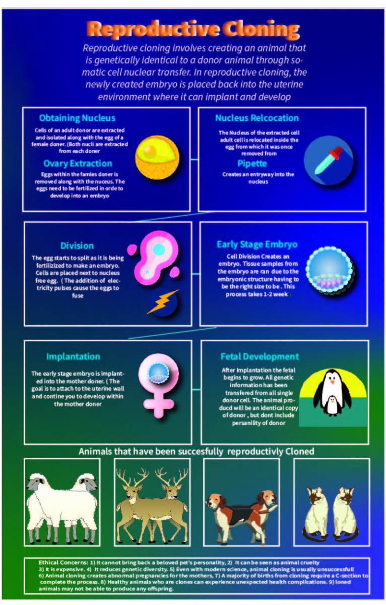
The OpenLab at City Tech:A place to learn, work, and share
The OpenLab is an open-source, digital platform designed to support teaching and learning at City Tech (New York City College of Technology), and to promote student and faculty engagement in the intellectual and social life of the college community.


top
Hey Daniel!
I really like your poster, I like the vivid colors you used, the icon choices and the boarders you used to break up each section. I feel that your poster has a nice flow to it and is very easy to read.
Daniel – we did not get to discuss yours. I have thoughts for you. Will try and type of some a little later.
Were you able to catch some of the other critiques?
Hope all is well. More to come…
Nice work on your info-graphic. I think you’ve done a great job researching, understanding and organizing your subject. It’s coming along nicely.
I have a several thoughts about how you might tweak the design a little to make the information flow more clear. I was able to mark up your PDF, it was easier to make the comments directly into your PDF (in the google drive folder Week 7) then trying to type up comments over email. Don’t be overwhelmed by all my marks – they look like more than they actually are:
https://drive.google.com/drive/u/1/folders/1-8dLBHSngTMMkhoacmIF47RBN8YW7VIn
A couple of general things:
1. I think the background color you use makes reading the actual content more challenging. You might tweak it to see if you can tone it down, I like the color scheme but gradients are always difficult when printed. If you keep make sure you add a bleed so that the white border around the edge of the page does not appear.
2. I think you should set the header and the intro paragraph side by side. That should open up more space and allow you to move everything up so things at the bottom don’t get too tight.
3. The white boxes feel a little claustrophobic, do you need them them, or could you give the bg of them a slight white opacity? And get rid of the stroke? Or maybe make the stroke much thiner so it is not so overpowering.
4. The middle section could use a small header, i.e. ’Stages of Reproductive Cloning’.
5. And each stage should be labeled sequentially i.e. ‘i,2,3,4,5 or a,b,c,d, etc.
6. Read carefully for typos
7. I think the allignment of all copy would work better flush left, ragged right
8. The bottom section: Ethical Concerns, feel too small and a squished after thought. How can you better walk your audience through them. Maybe through an organized bulleted list? Take a look at the poster of charts and graphs for ideas about organizing your list of the ethical concerns: https://openlab.citytech.cuny.edu/hitchingscomd3601f2019/files/2019/10/ChartDiagrams.pdf
or this one: https://www.r-graph-gallery.com/index.html
I can’t wait to see your next draft! Keep up the good work
If you have any questions feel free to reach out to me.
Best wishes,
Prof. Hitchings
Daniel –
Nice work! It’s coming along beautifully. I think the colors work and read well. I love your icons.
Here are my thoughts:
1. I think your header text ‘Reproductive Cloning’ should be flush left, ragged right. I also think the blurred effect is not working so well – makes it harder to read. It feels like you are implying motion, but I’m not sure motion is relevant for the topic -?
2. I also think the paragraph to the right of the header should be aligned flush left, ragged right not centered.
3. Make sure the space between all boxes top to bottom and left to right is the same, they all seem a little off from each other.
4. There seems to be a very thin line directly under ‘been’ in the last header, it feels like a mistake -?
5. The bulleted list at the bottom does not line up perfectly and still feels too squished – tight, also to teh edge of the page. Can you nudge everything else up to give a little more space? Another option would be to make the dimensions of your poster a touch larger – maybe 13×19.”
6. Make sure to get rid of any awkward hyphens and widows.