Marcel & Gregg

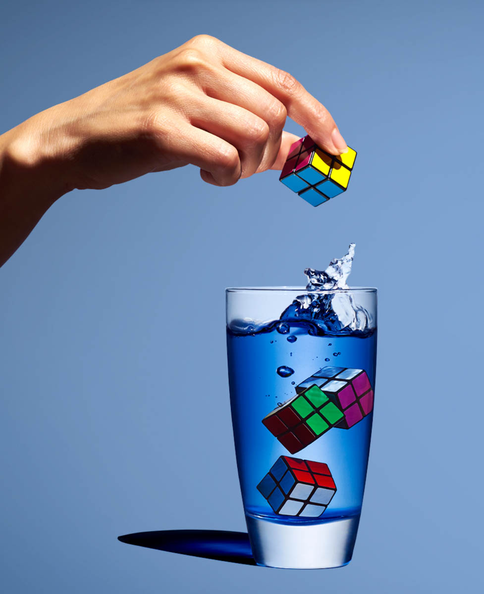
Marcel Christ and Gregg sschapps has two different taste when it comes to photography. As any other photographer you have your distinct style that no one else could copy. Marcel & Gregg took the approach to photography glass with a difference in lighting. Marcel took his approach of photographing glass that seems to be more of a natural light, the reflection is subtle and isn’t harsh, but soft. However, even though the picture of the milk pouring into the glass was manipulated to be a tree it’s disturbing to look at. Greggs, approach was subtle, but bold with color, prompts and the lighting of the glass. You can tell that this image was extremely photo retouched. The cast shadow is pitch dark. And the rubrics cube made everything thing look sharp,but fun. All in all I would try to merge their style into one photograph

Marcel Christ and Gregg SSchapps

Marcel Christ’s glass photo is a beautiful glass photo because the milk splash doesn’t only show a perfect reflection but also in my eyes the milk splash looks like a tree. However, Gregg SSchapps  took a different approach to his glass photo. SSchapps’s photo is more darker with more colors. His photo has more of a sharp contrast especially the blue color in the cup and the lighter blue background which brings it together. Marcel Christ chose to pour the milk in the glass and took the photo while that was happening which captured this beautiful motion. Also his photo is lighter than SSchapps’s  with the reflection of on the bottom of the glass. SSchapps’s photo also shows reflection on the glass but with a dark shadow on the side. Unlike Marcel Christ, SSchapps chose to drop the rubik’s cube in the water to get this motion and took the picture while the forth one was in mid drop and showing the hand dropping the rubik’s cube

Final Project Proposal

I read this poem called “Life Without Technology” at this site www.powerpoetry.org/poems/life-without-technology and its all about we as human beings are being held captive by the technology thats all around us. Even I get caught up in this problem. I officially became a zombie when I got my first cellphone in high school. Even to this day which is mostly my fault but try to get out of it by distracting myself with healthy activities like yoga, cleaning, cooking, and all sorts of everyday stuff that we as human beings need to survive in life.


Inspiration: Marcel Christ & Gregg Schapps

The reflection of the glass of milk has a stunning reflection on the surface. I even like how it fades as it goes towards the bottom. Mark Christ creates a wonderful splash effect when pouring milk into the glass. The splash on the bottom looks believable but as you go up it looks like a close resemblance of a tree which makes the photo look fantastic. In Gregg Schapps’ photo it looks more natural and vibrant. The colors are popping out at you from both the water and the rubix cubes. The splash was spot on target.

Final Project- Paul Laurence Dunbar

Paul Laurence Dunbar a son of Emancipated African Americans and writer who lived from 1872 thru 1906. He wrote and published several books of poetry written in broken English as tribute to his parent’s roots of plantation life. For this final project in Advanced Photography I am creating visual content for a poem in Dunbar’s book, Joggin’ Erlong entitled Spring Fever. This book was published the year of his death.
While a complete collection of Dunbar’s poems is on the internet, my inspiration comes from the physical book. The cover is fitted with red fabric with a pattern that resembles ameba, reminiscent of bandanas worn by select groups as a fashion and symbol allegiance to their set. Within the book are light, and modest illustrations that border poems and embellish pages, along with photographs of black people.
Spring Fever is a poem about what it is like to wake up on a spring day on the plantation. Opening with the complaints of being woken up by the birds fighting and expressing the want for more rest. The result of lack of sleep is the urge to sleep in but work needs to be done and the “Mastah” is yelling. Yet still, they move slow. The result is violence.


The images I will be creating for this project will consist of both still life and models.

Shoot 1: As representation of the squabbling birds we will use two models on a grey background with a single light over head or from the side. They will interact a short distance from one another in a mock dominance display.

Shoot 2: Still life of spring flowers on a dark background lit from the side, high contrast dramatic.


Shoot 3: Self portrait consisting of flower elements. Dark Silhouette image, light through floral print fabric.

Final project proposal

For our final project, I chose ” Why a cup of coffee in the morning is good for you” and the brand that I chose is Nescafe. NescafĂ© is a brand of coffee made by NestlĂ© and it has a unique blend of Arabica and Robusta. I like this kind of coffee because is easy to make, and it has a good taste. Some of the ads that I have seen from Nescafe for me they are great, but I feel like they look almost the same. I wish to change that by taking new photos and giving them my own style.

These are some of the examples that I chose for my project:


This is the first ad and my favorite that I chose as an example. I like how they took two cups of coffee and with the beans create an owl. Animals can show the emotion of a product than having people in their ad.


The second ad is really interesting because the cup of coffee has a face. I think that the lighting is perfect for this shot because it looks like the day is starting. I wish I could try that in my project. Also, the typography is good for this shot because it doesn’t disturb the photo.


For my final ad, I chose a more creative shot that it has a lot of photoshop. It has three cups and each one show the level of your coffee. It’s almost like the first ad that I chose but they have a different concept. If I create something like this I would use animals toys.


How my audience will be people who drink coffee in the morning, I will only take photos of a cup of coffee and for a dramatic look, I will try to use beans. Also, for my shot, I will use a soft light because it shows the beginning of the day.

Inspiration: Marcel Christ and Gregg Shapps

For our homework, we have to compare and contrast their work. The first photo is from Marcel Christ. He’s a short film director and still life photographer.

The work of Marcel Christ is really pleasing to see. What I like about this photo is how he took the right time to take the perfect shot. When a liquid is pouring in a glass you don’t really think that it will make cool shapes, just the water going crazy in a glass. But, in this glass is different because the milk is forming a tree shape and is totally understandable because milk is good for our bodies and this photo is like saying “milk is life”.


The second photo by Gregg Shapps ( specializing in Product/Still Life and Healthcare) is interesting because the color of the water is really blue and when we were taking photos of a glass of water our water was not blue. Somehow I think that this photo could have some photoshop because the cubes don’t look like they were inside the cup of water.


In total, I think that these photos have something in common. When they pour/drop their objects into the glass, they want that splash for the photo to look more interesting. That is the only thing I think that they have in common. Their work could look the same but they have a different concept. Base on Marcel Christ’s work, his work is more like chemistry and forming shapes with liquid. However, Gregg Shapps has already the object to take photos.


Avedon and Mannion

The natural lighting in this image is emaculate.

Richard Avedon uses natural lighting in most of his portraits. His subjects use their face to convey a message to him. The emotion and the feeling in their face sets the mood for the portrait. With his portraits being about sex, money, drugs and/or emotion, Avedon gives chance to the subject to use the body as a symbol for their life. For example, the lighting on the image is great. Even though we know they are not in black and white, the image takes you for a great ride while making us still interested.

Johnathan Mannion uses front lighting in his projects of urban icons and album covers. When taking an image his artists uses various emotions in their body movement. His use of natural lighting when taking an image outside is emaculate. Being able to use the light of the outside to get the strong lighting on their hair and body is a special skill. I enjoy learning that Mannion was responsible for all the artists album covers images. I listen to most of the albums that he produced.

Philip Lorca – Dicorcia Hustlers

The photographs which Dicorcia took, were set it up with a couple of lights. But I feel like is the strongest one from all of them is the third photograph, where there is a woman standing out with rembrandt light and full of background with a blurry effect. Even though he used one light, he made the composition and the photograph stronger with other elements. Also the subject really pop-out and can seen separately from the background. I am not sure if the blurriness was necessary for this photograph, because the light on the subject is strong enough, which will not make the composition busy on the image.

Leibowitz and Erizku

LEBOWITZ AND ERIZKU

Annie Leibowitz made an image that celebrated pregnancy with Moore’s courage on showing how she is still beautiful with pregnancy. This photo was the first mass-media picture to sexualize pregnancy. The photograph was used for provocative magazine cover, and purpose was to change the culture even it was a relatively private affair. Use of lighting was rembrandt light, and low background light to pop-out the subject more to the viewer. The highlight on her face and the gestures that she made, does show the power of the emotion or the message of the content.

Awol Erizku went to the next level on his career when he became the photographer behind the most-liked Instagram post, from Beyonce. The composition is made out o floral arrangement, wearing an underwear and a green veil to best showcase her impressive baby bump. The use of lighting was broad light. But also we can see that Erizku used hair light, background light, because there is no shadows which does not make any contrast in the image. The difference from Lebowitz’s photo is, Erizku made the contrast with other elements which are surrounded Beyonce and also with colors.