Philip Lorca-Dicorcia’s photos are very intriguing in the sense of how he set to capture a particular message through his set up with his photos. One of his photos that stood out the most to myself on this specific collection was one that featured the young man by the name of Tim who was 27 years old at the time living in Orange County, California. In this particular photo you see this young man standing in what looks like a hotel room just staring out the open door of the room, he’s still and it can almost be felt that he is hesitant, hesitant to walk out that door and have to work as a young man in the prostitute business. He stands there with his hand against the wall, his body casting this shadow giving the idea that he wishes to stay back while he continues looking outside which almost appears to have a blurred affect to it which goes to make this impression that the world outside which he was looking at is filled with so much of the unknown.
Category Archives: Inspiration
Inspiration: Marcel Christ and Greg Shapps
 Marcel Christ was born in 1969. Christ is a short film director and still life photographer, based in Amsterdam. The first photograph by Marcel Christ is very clean, and pleasing to the eyes. The photographer maybe used Photoshop on image in order to get the ‘just on the right moment’ shot. Here we see that, he’s not advertising any brand of milk but he’s trying to say milk is life; is organic. I didn’t expect that pouring milk to a glass makes some cool and significant figure or shape.
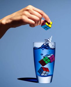
 The second photograph is by Gregg Shapps; who takes photos of products, pharmacy, healthcare and more; did a great job in this photo of the glass of water with and the Rubik’s cubes. We can see the clear and natural water in the glass; almost representing the ocean because of the blue tones. Even though we do not see an important shape of the water, (like the milk that look like a tree); we still can see something great. The shape of the water in this photo, have a feeling of a wave from the ocean.
Both photographers, play around with shapes and compositions; which is a great. Also both images uses a solid background. Furthermore, both images looked edited. The first image with the glass of milk, seems to be 1/4 full and the glass of water is 3/4 full.
Inspiration: Michael Paul Smith
Getting super closer to the subjects and making sure to keep the right angle and perspective; Michael Paul Smith make his images or photographs visually compelling. With the perfect angles, he’s able to use the real life environment for his background. Also, he matches nature with his miniature objects. We can also see lots of details in his work. I might try some of his tricks or ideas for next week shooting.
Inspiration: Richard Avedon & Jonathan Mannion
Richard Avedon’s portrait style is unique because most of the times he only uses front light; He places above the subject most of the times. Jonathan Mannion who was Richard Avedon’s assistant, uses the same technique for the photograph of Jay Z; Front light and it was placed above the subject. We can tell the light was placed above the subject because of the harsh shadow of the hat on his forehead. Not just for Jay Z Mannion uses the same light style but also for Ice Cube. We can tell it was front light placed above the subject.
Inspiration: Philip Lorca-Dicorcia Hustlers
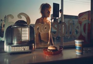
 The image of Philip Lorca-Dicorcia from the series ‘Hustlers’ is a white man without a shirt on; he’s standing in front of a restaurant. We can tell is a restaurant because we see a burger and a cup of soda on top of a container or table. The man is outside of the restaurant; he can be seen through the glass of the store clearly. This composition was setup because the sun is not visible and the image has a simulation that the sunset is lighting the subject. A bright key light was placed on the side, to light side view of the man. Another light was placed inside of the store; short enough to light the burger and the cup. Color wise, the composition has a blue/green and orange/red look, which I like.
Inspiration: Annie Leibovitz & Awol Erizku
 The photograph of Demi Moore by Annie Leibovitz, we can tell that Demi Moore is proud to be a mother. She’s looking up like to the future. Her hands are covering herself and holding the baby. The lighting style in this photo is broad light. We can tell is broad light because the light is falling on the visible ear. We can also see that Annie Leibovitz just uses a simple plain background, and the subject is completely nude.
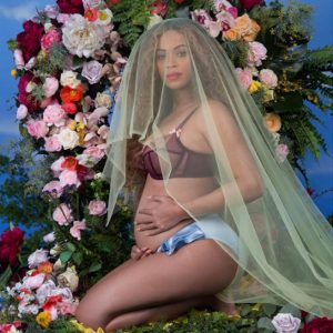
 The other photo of Beyoncé by Awol Erizku show more a religion view. Beyoncé look like Virgin Mary because of the flowers around her and the veil she’s using. We can tell that the background was painted to represent the sky. Lots of props were used.
These two photographs have some similarities such as both women are holding the baby, proud to be mother, and facing same side. The differences are the different lighting style, one has more harsh shadows than the other, and different composition.
Marcel & Gregg
Marcel Christ and Gregg sschapps has two different taste when it comes to photography. As any other photographer you have your distinct style that no one else could copy. Marcel & Gregg took the approach to photography glass with a difference in lighting. Marcel took his approach of photographing glass that seems to be more of a natural light, the reflection is subtle and isn’t harsh, but soft. However, even though the picture of the milk pouring into the glass was manipulated to be a tree it’s disturbing to look at. Greggs, approach was subtle, but bold with color, prompts and the lighting of the glass. You can tell that this image was extremely photo retouched. The cast shadow is pitch dark. And the rubrics cube made everything thing look sharp,but fun. All in all I would try to merge their style into one photograph
Marcel Christ and Gregg SSchapps
Marcel Christ’s glass photo is a beautiful glass photo because the milk splash doesn’t only show a perfect reflection but also in my eyes the milk splash looks like a tree. However, Gregg SSchapps took a different approach to his glass photo. SSchapps’s photo is more darker with more colors. His photo has more of a sharp contrast especially the blue color in the cup and the lighter blue background which brings it together. Marcel Christ chose to pour the milk in the glass and took the photo while that was happening which captured this beautiful motion. Also his photo is lighter than SSchapps’s with the reflection of on the bottom of the glass. SSchapps’s photo also shows reflection on the glass but with a dark shadow on the side. Unlike Marcel Christ, SSchapps chose to drop the rubik’s cube in the water to get this motion and took the picture while the forth one was in mid drop and showing the hand dropping the rubik’s cube
Pop those little suckers out!
Maternity photos are captivating and sweet, but celebrity maternity photoshoot people go crazy looking at it because to the audience it’s like it’s your own child. Their favorite celebrity gave birth to a 2.0 version of themselves.
These two photos of famous celebrities carrying their little ones had a huge impact through media channels to get to us audience that take in this content as something as a special moment. Anne Lebowitz who photograph Demi Moore’s maternity photo wanted to simply show off the baby bump while naked to make people aware that yes, she’s going to be a mom, but she’s still rebellious with an exceptional toned body figure. They’re little details that was incorporated in this shoot like how her hand were position so that Demi, could show off her “$$$$$$$” wedding ring. showing that she’s with child and a protector. To understand how Annie photographed Demie is not over the top but also dramatic in a sense; here’s why I say this. Demi, is standing up with the light source coming from the right giving her face a broad lighting. The media channel outlet is a magazine cover ad for vanity fair that mostly targets woman.
Awol Erizku who photograph Beyonce maternity photo wanted to show off the flowers as a concept of fertility and growth . They’re little details that was incorporated in this shoot like how there was a vail over her face to either show her purity, that she’s a virgo “The human nurturer” or just maybe to show that it’s not all about her and the main focus is her belly . To understand how Awol photographed beyonce is not over the top but also a breath of freshness ; here’s why I say this. beyonce, sitting down surrounded by various flowers and green matter that depicts that she’s one with nature and she carries two human beings inside of her, this maybe telling us that beyonce see’s her self as mother nature in the flesh. The lighting of her is fairly hard to say but, The media channel outlet was through social media since beyonce is known to secretly keep whats going one and then, spontaneously share amazing news that immediately creates this buzz all around. and it works for her..in media and marketing people don’t want to be enticed, or anticipation/ tease they want to see the product in the lime lights.
Richard Avedon and Jonathan Mannion
Richard Avedon was an American fashion and portrait photographer. In Avedon’s photography, he uses lighting, composition, contrast and having the subject create emotion. Richard Avedon portraits were in black and white photographs. His photographs had the subjects expression or body movement stand out.
After seeing, Richard Avedon work you can see how Jonathan Mannion was inspired by. There is a clear similarity between the two photographers, the use of black and white, the lighting and composition. The difference between the two is that Jonathan Mannion has adopted a more modern version. Mannion has adopted and improved on Avedon’s style; he’s able to make the artist have an interaction with the audience. For example, in the Jay-z photo, he has a great expression as well as strong lighting which makes he a strongly determined artist. He was able to make Avedon’s style into his own and improved on it. It’s something that everyone should do.


